Rows, columns and layers
Stacks, spacers, and alignment
You will buildThe same card, arranged on purpose. You draw a border round every stack to see what it is doing, then choose the alignment, the spacing and the layers yourself — and make the card rearrange itself when the text is too large to fit in a row.
TimeAbout 80 minutes
WhyThis is the lesson that replaces Auto Layout. In UIKit you described a screen as constraints between views, and a solver found the frames. In SwiftUI you put views in containers — a row, a column, a pile — and each container has two questions to answer: how its children line up, and how much room is between them. There are no constraints to conflict, and nothing to debug in a console full of NSLayoutConstraint. There is one skill instead: seeing which container is doing what. In this lesson you learn to see it.
Open your project
Open your
Tripsproject as lesson 8 left it: double-clickTrips.xcodeprojin Finder, or use File ▸ Open… (⌘O) in Xcode.If you did not finish lesson 8, or would rather start from a known state, download Trips-lesson-08.zip instead. It is the project exactly as it stood at the end of lesson 8. Unzip it and open
Trips.xcodeproj.Run it (⌘R) to check that it builds. You should see where lesson 8 ended:
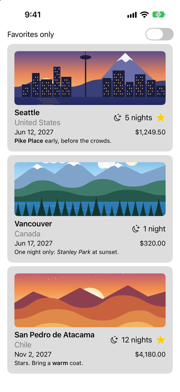
Trips, as it stood at the end of lesson 8Screenshot · iPhone 17, iOS 27.0
See the stacks
The card already has four stacks in it, and you cannot see one of them. The quickest way to understand a layout — yours, or one you have been handed — is to give things a border. It is the SwiftUI version of setting a background color on a UIView to find out where it is. In TripCard.swift, add the lines that say .border:
struct TripCard: View { let trip: Trip var body: some View { VStack(alignment: .leading) { Image(trip.imageName) .resizable() .scaledToFill() .frame(height: 120) .clipShape(RoundedRectangle(cornerRadius: 8)) HStack { VStack(alignment: .leading) { Text(trip.city) .font(.headline) Text(trip.country) .foregroundStyle(.secondary) } .border(.red) Spacer() Label("^[\(trip.nights) night](inflect: true)", systemImage: "moon.stars") .border(.red) if trip.isFavorite { Image(systemName: "star.fill") .foregroundStyle(.yellow) .border(.red) } } .border(.green) HStack { Text(trip.start, format: .dateTime.day().month().year()) .border(.red) Spacer() Text(trip.price, format: .currency(code: "USD")) .border(.red) } .font(.subheadline) .border(.green) Text(trip.formattedNotes) .font(.footnote) .border(.red) } .border(.orange) .padding() .background(.quaternary, in: RoundedRectangle(cornerRadius: 12)) .padding(.horizontal) }}struct TripCard: View {
let trip: Trip
var body: some View {
VStack(alignment: .leading) {
Image(trip.imageName)
.resizable()
.scaledToFill()
.frame(height: 120)
.clipShape(RoundedRectangle(cornerRadius: 8))
HStack {
VStack(alignment: .leading) {
Text(trip.city)
.font(.headline)
Text(trip.country)
.foregroundStyle(.secondary)
}
.border(.red)
Spacer()
Label("^[\(trip.nights) night](inflect: true)", systemImage: "moon.stars")
.border(.red)
if trip.isFavorite {
Image(systemName: "star.fill")
.foregroundStyle(.yellow)
.border(.red)
}
}
.border(.green)
HStack {
Text(trip.start, format: .dateTime.day().month().year())
.border(.red)
Spacer()
Text(trip.price, format: .currency(code: "USD"))
.border(.red)
}
.font(.subheadline)
.border(.green)
Text(trip.formattedNotes)
.font(.footnote)
.border(.red)
}
.border(.orange)
.padding()
.background(.quaternary, in: RoundedRectangle(cornerRadius: 12))
.padding(.horizontal)
}
}Run it (⌘R). The simulator shows
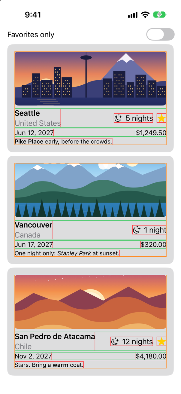
Read the picture from the inside out.
| Border | What it shows |
|---|---|
| Red | A Text, a Label or an Image is exactly as large as its content. Nothing stretches. |
| Red, round the city and the country | A VStack is as wide as its widest child and as tall as its children together. A stack hugs what is in it. |
| Green | An HStack — but these two reach from edge to edge. Each has a Spacer in it, and a spacer takes all the room it can get, so the stack that holds it does too. |
| Orange | The column that holds everything. It is as wide as its widest child: the picture and the two rows. |
That is the whole model. A stack asks its children how large they want to be, puts them in a line, and is as large as the result. Flexible children — a Spacer, a resizable image — are what make a stack grow. Apple's documentation says it of the spacer: "SwiftUI sizes a stack that doesn't contain a spacer up to the combined ideal widths of the content of the stack's child views."
Alignment: how the children line up
Look at the first green row again. The moon and "5 nights" float half-way down it, level with the gap between the city and the country. An HStack lines its children up by their vertical centers unless you say otherwise. For text, centers are rarely what you want. Ask for the first line of each to share a baseline:
struct TripCard: View { let trip: Trip var body: some View { VStack(alignment: .leading) { Image(trip.imageName) .resizable() .scaledToFill() .frame(height: 120) .clipShape(RoundedRectangle(cornerRadius: 8)) HStack { HStack(alignment: .firstTextBaseline) { VStack(alignment: .leading) { Text(trip.city) .font(.headline) Text(trip.country) .foregroundStyle(.secondary) } .border(.red) Spacer() Label("^[\(trip.nights) night](inflect: true)", systemImage: "moon.stars") .border(.red) if trip.isFavorite { Image(systemName: "star.fill") .foregroundStyle(.yellow) .border(.red) } } .border(.green) HStack { Text(trip.start, format: .dateTime.day().month().year()) .border(.red) Spacer() Text(trip.price, format: .currency(code: "USD")) .border(.red) } .font(.subheadline) .border(.green) Text(trip.formattedNotes) .font(.footnote) .border(.red) } .border(.orange) .padding() .background(.quaternary, in: RoundedRectangle(cornerRadius: 12)) .padding(.horizontal) }}struct TripCard: View {
let trip: Trip
var body: some View {
VStack(alignment: .leading) {
Image(trip.imageName)
.resizable()
.scaledToFill()
.frame(height: 120)
.clipShape(RoundedRectangle(cornerRadius: 8))
HStack(alignment: .firstTextBaseline) {
VStack(alignment: .leading) {
Text(trip.city)
.font(.headline)
Text(trip.country)
.foregroundStyle(.secondary)
}
.border(.red)
Spacer()
Label("^[\(trip.nights) night](inflect: true)", systemImage: "moon.stars")
.border(.red)
if trip.isFavorite {
Image(systemName: "star.fill")
.foregroundStyle(.yellow)
.border(.red)
}
}
.border(.green)
HStack {
Text(trip.start, format: .dateTime.day().month().year())
.border(.red)
Spacer()
Text(trip.price, format: .currency(code: "USD"))
.border(.red)
}
.font(.subheadline)
.border(.green)
Text(trip.formattedNotes)
.font(.footnote)
.border(.red)
}
.border(.orange)
.padding()
.background(.quaternary, in: RoundedRectangle(cornerRadius: 12))
.padding(.horizontal)
}
}Run it (⌘R). The simulator shows
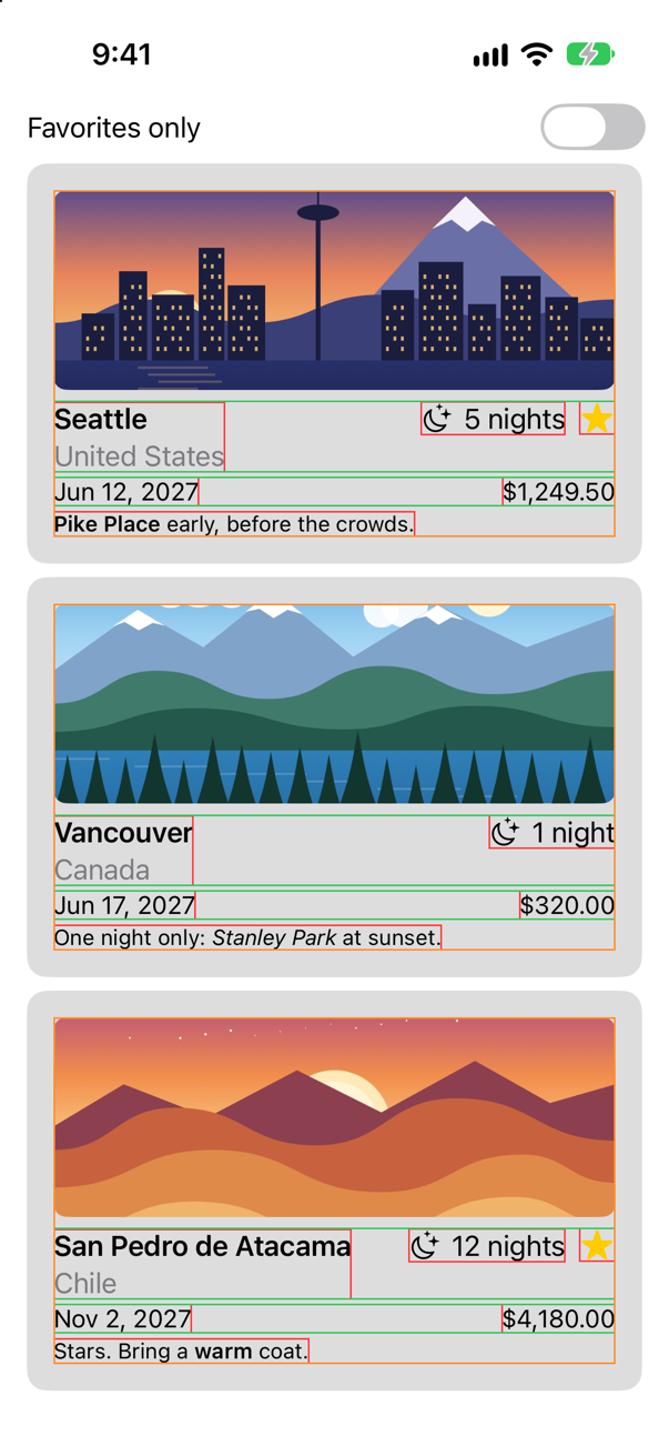
HStack(alignment: .firstTextBaseline): "5 nights" sits on the same line as "Seattle"Screenshot · iPhone 17, iOS 27.0One word changed: HStack(alignment: .firstTextBaseline). The nights now stand on the baseline of the city's name, and the star with them.
Be exact about what alignment is, because the name misleads everybody once. It is how a stack's children line up with one another, across the stack's own direction: up and down for a row, left and right for a column. It does not move the stack. Apple: "The alignment property doesn't position the VStack inside its container; instead, it positions the views inside the VStack." The column with the city and the country has been VStack(alignment: .leading) since lesson 5 — which is why the two lines start at the same place — and it is at the left of the card only because the spacer pushes it there.
| Stack | Its alignment is | The choices |
|---|---|---|
HStack | vertical | .top, .center (the default), .bottom, .firstTextBaseline, .lastTextBaseline |
VStack | horizontal | .leading, .center (the default), .trailing |
ZStack | both | .center (the default), .topLeading, .bottomTrailing and the rest |
Spacing: how much room is between them
The second question a stack answers is the gap between its children. You have not set one anywhere, and the card has gaps: a stack that is not given a spacing chooses one, and the choice depends on what the neighbors are. That is good for a first draft and wrong for a design. Decide: ten points between the parts of the card, two between the city and its country. And take the borders off — they have done their work:
struct TripCard: View { let trip: Trip var body: some View { VStack(alignment: .leading) { VStack(alignment: .leading, spacing: 10) { Image(trip.imageName) .resizable() .scaledToFill() .frame(height: 120) .clipShape(RoundedRectangle(cornerRadius: 8)) HStack(alignment: .firstTextBaseline) { VStack(alignment: .leading) { VStack(alignment: .leading, spacing: 2) { Text(trip.city) .font(.headline) Text(trip.country) .foregroundStyle(.secondary) } .border(.red) Spacer() Label("^[\(trip.nights) night](inflect: true)", systemImage: "moon.stars") .border(.red) if trip.isFavorite { Image(systemName: "star.fill") .foregroundStyle(.yellow) .border(.red) } } .border(.green) HStack { Text(trip.start, format: .dateTime.day().month().year()) .border(.red) Spacer() Text(trip.price, format: .currency(code: "USD")) .border(.red) } .font(.subheadline) .border(.green) Text(trip.formattedNotes) .font(.footnote) .border(.red) } .border(.orange) .padding() .background(.quaternary, in: RoundedRectangle(cornerRadius: 12)) .padding(.horizontal) }}struct TripCard: View {
let trip: Trip
var body: some View {
VStack(alignment: .leading, spacing: 10) {
Image(trip.imageName)
.resizable()
.scaledToFill()
.frame(height: 120)
.clipShape(RoundedRectangle(cornerRadius: 8))
HStack(alignment: .firstTextBaseline) {
VStack(alignment: .leading, spacing: 2) {
Text(trip.city)
.font(.headline)
Text(trip.country)
.foregroundStyle(.secondary)
}
Spacer()
Label("^[\(trip.nights) night](inflect: true)", systemImage: "moon.stars")
if trip.isFavorite {
Image(systemName: "star.fill")
.foregroundStyle(.yellow)
}
}
HStack {
Text(trip.start, format: .dateTime.day().month().year())
Spacer()
Text(trip.price, format: .currency(code: "USD"))
}
.font(.subheadline)
Text(trip.formattedNotes)
.font(.footnote)
}
.padding()
.background(.quaternary, in: RoundedRectangle(cornerRadius: 12))
.padding(.horizontal)
}
}Run it (⌘R). The simulator shows
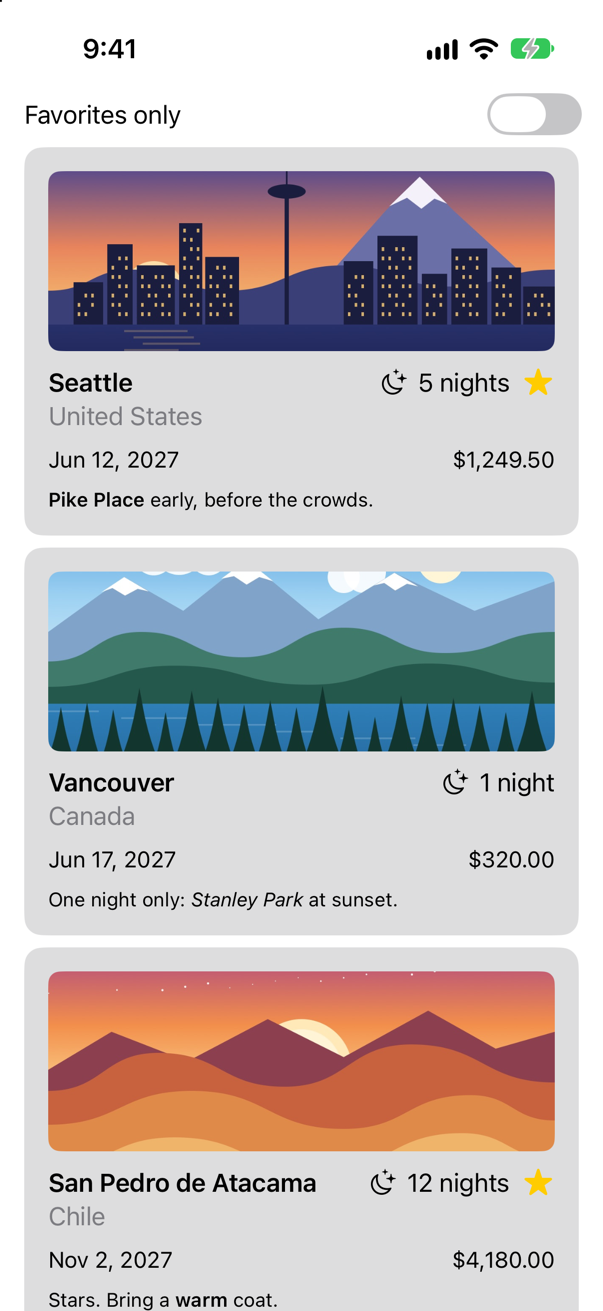
spacing: 10 for the card, spacing: 2 for the titleScreenshot · iPhone 17, iOS 27.0A Spacer is not spacing. Spacing is the fixed gap between every pair of neighbors. A spacer is one more child, a view with nothing in it, whose only wish is to be as long as possible. It is how you push things apart, or to one side — the answer to "how do I pin this to the trailing edge?" — and the stack grows to give it room.
Layers
The third direction is depth. The star says something about the trip as a whole, so put it on the picture, in the corner. There are two ways to pile one view on another, and the difference between them is a favorite interview question. Here is the one to reach for first. Take the star out of the row, and lay it over the picture:
struct TripCard: View { let trip: Trip var body: some View { VStack(alignment: .leading, spacing: 10) { Image(trip.imageName) .resizable() .scaledToFill() .frame(height: 120) .clipShape(RoundedRectangle(cornerRadius: 8)) .overlay(alignment: .topTrailing) { if trip.isFavorite { Image(systemName: "star.fill") .foregroundStyle(.yellow) .padding(8) } } HStack(alignment: .firstTextBaseline) { VStack(alignment: .leading, spacing: 2) { Text(trip.city) .font(.headline) Text(trip.country) .foregroundStyle(.secondary) } Spacer() Label("^[\(trip.nights) night](inflect: true)", systemImage: "moon.stars") if trip.isFavorite { Image(systemName: "star.fill") .foregroundStyle(.yellow) } } HStack { Text(trip.start, format: .dateTime.day().month().year()) Spacer() Text(trip.price, format: .currency(code: "USD")) } .font(.subheadline) Text(trip.formattedNotes) .font(.footnote) } .padding() .background(.quaternary, in: RoundedRectangle(cornerRadius: 12)) .padding(.horizontal) }}struct TripCard: View {
let trip: Trip
var body: some View {
VStack(alignment: .leading, spacing: 10) {
Image(trip.imageName)
.resizable()
.scaledToFill()
.frame(height: 120)
.clipShape(RoundedRectangle(cornerRadius: 8))
.overlay(alignment: .topTrailing) {
if trip.isFavorite {
Image(systemName: "star.fill")
.foregroundStyle(.yellow)
.padding(8)
}
}
HStack(alignment: .firstTextBaseline) {
VStack(alignment: .leading, spacing: 2) {
Text(trip.city)
.font(.headline)
Text(trip.country)
.foregroundStyle(.secondary)
}
Spacer()
Label("^[\(trip.nights) night](inflect: true)", systemImage: "moon.stars")
}
HStack {
Text(trip.start, format: .dateTime.day().month().year())
Spacer()
Text(trip.price, format: .currency(code: "USD"))
}
.font(.subheadline)
Text(trip.formattedNotes)
.font(.footnote)
}
.padding()
.background(.quaternary, in: RoundedRectangle(cornerRadius: 12))
.padding(.horizontal)
}
}Run it (⌘R). The simulator shows
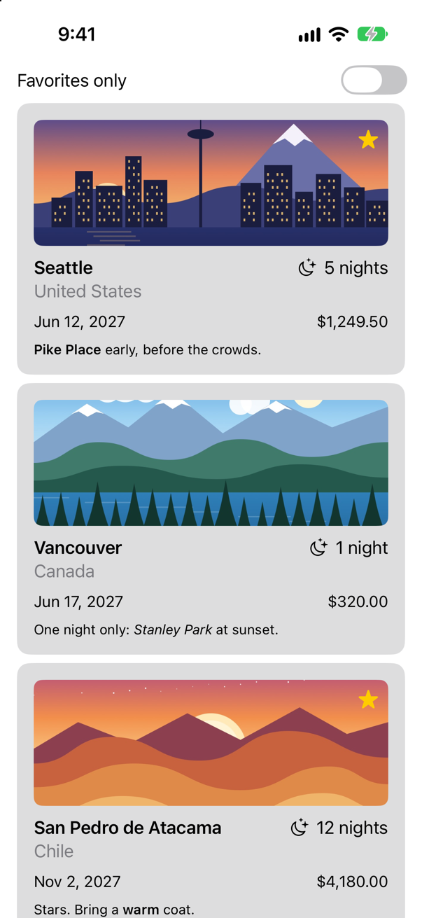
.overlay(alignment: .topTrailing) { … } draws its content on top of the view it is attached to, lined up with that view's top trailing corner. The picture decides the size; the star is a guest. A card that is not a favorite simply has an empty overlay.
The other way is a ZStack, which piles its children up as an HStack lines them up — and, like every stack, is as large as its children make it. Apple gives the rule for choosing: "If your layout has one dominant view that defines the size of the layout, use the overlay(_:alignment:) or background(_:alignment:) view modifier on that view. If you want the final view size to come from an aggregation of all the contained views, use a ZStack." A picture with a badge on it has a dominant view.
When it does not fit
On lesson 5 you made a preview of the card in dark mode, at the largest text size there is, and it was broken. It has been waiting for this lesson. Open the canvas (⌥⌘↩) and choose the preview named Dark, largest text:
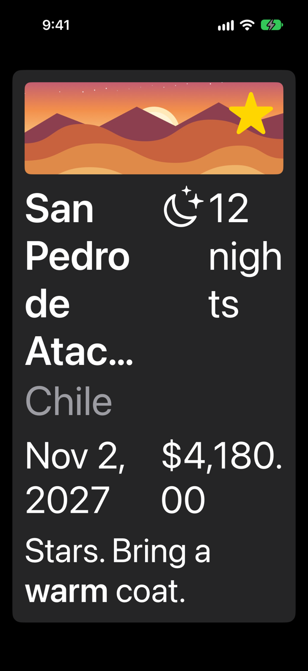
A row was the right arrangement when there was room for one. Now the city and the nights are fighting for the width, and both have lost: the name takes four lines and still ends in an ellipsis, "nights" is broken in two, and the price has its cents on a line of their own. In Auto Layout this was a second set of constraints, switched on by a trait. Here, describe both arrangements, and let SwiftUI use the first that fits:
struct TripCard: View { let trip: Trip var body: some View { VStack(alignment: .leading, spacing: 10) { Image(trip.imageName) .resizable() .scaledToFill() .frame(height: 120) .clipShape(RoundedRectangle(cornerRadius: 8)) .overlay(alignment: .topTrailing) { if trip.isFavorite { Image(systemName: "star.fill") .foregroundStyle(.yellow) .padding(8) } } HStack(alignment: .firstTextBaseline) { VStack(alignment: .leading, spacing: 2) { Text(trip.city) .font(.headline) Text(trip.country) .foregroundStyle(.secondary) ViewThatFits(in: .horizontal) { HStack(alignment: .firstTextBaseline) { title Spacer() nights } Spacer() Label("^[\(trip.nights) night](inflect: true)", systemImage: "moon.stars") VStack(alignment: .leading, spacing: 4) { title nights } } HStack { Text(trip.start, format: .dateTime.day().month().year()) Spacer() Text(trip.price, format: .currency(code: "USD")) ViewThatFits(in: .horizontal) { HStack { start Spacer() price } VStack(alignment: .leading, spacing: 4) { start price } } .font(.subheadline) Text(trip.formattedNotes) .font(.footnote) } .padding() .background(.quaternary, in: RoundedRectangle(cornerRadius: 12)) .padding(.horizontal) } private var title: some View { VStack(alignment: .leading, spacing: 2) { Text(trip.city) .font(.headline) Text(trip.country) .foregroundStyle(.secondary) } } private var nights: some View { Label("^[\(trip.nights) night](inflect: true)", systemImage: "moon.stars") } private var start: some View { Text(trip.start, format: .dateTime.day().month().year()) } private var price: some View { Text(trip.price, format: .currency(code: "USD")) }}struct TripCard: View {
let trip: Trip
var body: some View {
VStack(alignment: .leading, spacing: 10) {
Image(trip.imageName)
.resizable()
.scaledToFill()
.frame(height: 120)
.clipShape(RoundedRectangle(cornerRadius: 8))
.overlay(alignment: .topTrailing) {
if trip.isFavorite {
Image(systemName: "star.fill")
.foregroundStyle(.yellow)
.padding(8)
}
}
ViewThatFits(in: .horizontal) {
HStack(alignment: .firstTextBaseline) {
title
Spacer()
nights
}
VStack(alignment: .leading, spacing: 4) {
title
nights
}
}
ViewThatFits(in: .horizontal) {
HStack {
start
Spacer()
price
}
VStack(alignment: .leading, spacing: 4) {
start
price
}
}
.font(.subheadline)
Text(trip.formattedNotes)
.font(.footnote)
}
.padding()
.background(.quaternary, in: RoundedRectangle(cornerRadius: 12))
.padding(.horizontal)
}
private var title: some View {
VStack(alignment: .leading, spacing: 2) {
Text(trip.city)
.font(.headline)
Text(trip.country)
.foregroundStyle(.secondary)
}
}
private var nights: some View {
Label("^[\(trip.nights) night](inflect: true)", systemImage: "moon.stars")
}
private var start: some View {
Text(trip.start, format: .dateTime.day().month().year())
}
private var price: some View {
Text(trip.price, format: .currency(code: "USD"))
}
}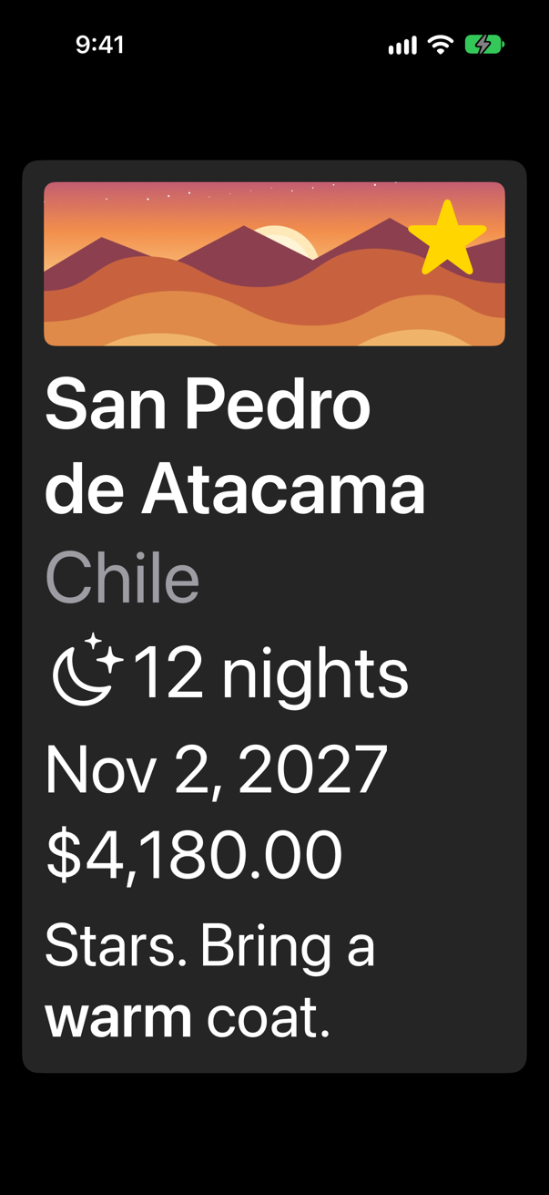
ViewThatFitsScreenshot · iPhone 17, iOS 27.0ViewThatFits(in: .horizontal) is given two views. It measures the first — the row — and if that is wider than the space on offer, it uses the second, the column. Apple: it "selects the first child whose ideal size on the constrained axes fits within the proposed size."
So that the row and the column are made of the same parts, the parts have moved into four small properties below body: title, nights, start, price. A computed property that returns some View is the lightest way to name a piece of a view. Lesson 7's edge cases explained what it is not: a separate view with its own updates.
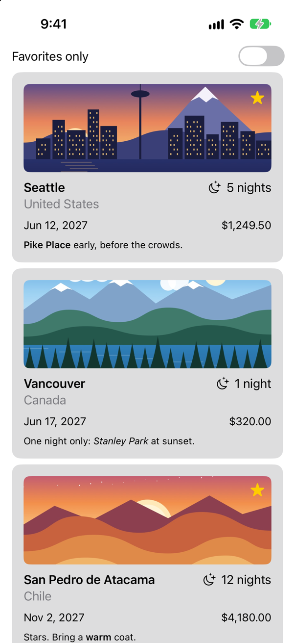
Run the app (⌘R), to see that the ordinary case is as it was:
A thousand cards
One container is left, and it is the one that matters when the data grows. The list of cards is a VStack in a ScrollView. A VStack builds every child at once, visible or not. With three trips that is nothing. Find out what it is with a thousand. This is a measurement, not a feature, so it goes in temporarily. Add a counter to ContentView.swift, outside the struct:
enum Counter {
    static var appeared = 0
}
And make the list show a thousand cards — the three trips over and over — counting each card as it appears, and reporting after three seconds:
struct ContentView: View { let store: TripStore @State private var favoritesOnly = false var body: some View { ScrollView { VStack { Toggle("Favorites only", isOn: $favoritesOnly) .padding(.horizontal) ForEach(store.trips.filter { !favoritesOnly || $0.isFavorite }) { trip in TripCard(trip: trip) ForEach(0..<1000, id: \.self) { n in TripCard(trip: store.trips[n % 3]) .onAppear { Counter.appeared += 1 } } } } .task { try? await Task.sleep(for: .seconds(3)) print("\(Counter.appeared) cards have appeared") } }}struct ContentView: View {
let store: TripStore
var body: some View {
ScrollView {
VStack {
ForEach(0..<1000, id: \.self) { n in
TripCard(trip: store.trips[n % 3])
.onAppear { Counter.appeared += 1 }
}
}
}
.task {
try? await Task.sleep(for: .seconds(3))
print("\(Counter.appeared) cards have appeared")
}
}
}Run the app, and wait for the console:
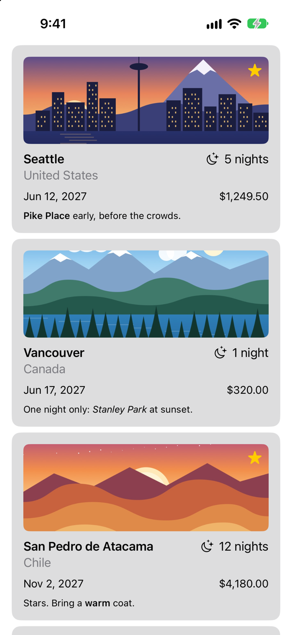
VStack: the first few are all you can seeScreenshot · iPhone 17, iOS 27.01000 cards have appearedAll thousand "appeared", though the screen shows three cards and the top edge of a fourth: every card was built and laid out, each with its picture, before you saw the first. Now change one word. VStack becomes LazyVStack:
struct ContentView: View { let store: TripStore var body: some View { ScrollView { VStack { LazyVStack { ForEach(0..<1000, id: \.self) { n in TripCard(trip: store.trips[n % 3]) .onAppear { Counter.appeared += 1 } } } } .task { try? await Task.sleep(for: .seconds(3)) print("\(Counter.appeared) cards have appeared") } }}struct ContentView: View {
let store: TripStore
var body: some View {
ScrollView {
LazyVStack {
ForEach(0..<1000, id: \.self) { n in
TripCard(trip: store.trips[n % 3])
.onAppear { Counter.appeared += 1 }
}
}
}
.task {
try? await Task.sleep(for: .seconds(3))
print("\(Counter.appeared) cards have appeared")
}
}
}Run it again:
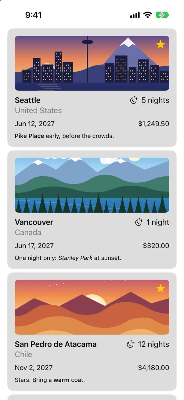
LazyVStack: the screen is the sameScreenshot · iPhone 17, iOS 27.04 cards have appearedFour: the cards in the picture. A lazy stack creates a child when it is about to come onto the screen, and not before. It is the nearest thing in a plain scroll view to a table view's cell reuse — and List, in Part 7, is lazy without being asked.
Laziness has a price. A lazy stack does not know how tall its content is until it has built it, so it estimates, and the scroll indicator can jump as you scroll. Apple's advice is to begin with the ordinary stack: "always start with a standard stack view and only switch to a lazy stack if profiling your code shows a worthwhile performance improvement." A list of trips that can grow without limit is the case for a lazy one. A card with five things in it is not.
Where this comes from: Creating performant scrollable stacks
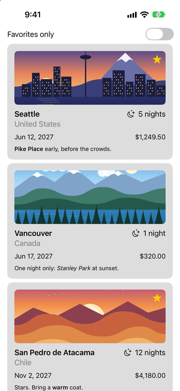
Put the real list back, keeping the lazy stack. Delete the Counter enum, and replace the struct:
enum Counter { static var appeared = 0}struct ContentView: View { let store: TripStore @State private var favoritesOnly = false var body: some View { ScrollView { LazyVStack { ForEach(0..<1000, id: \.self) { n in TripCard(trip: store.trips[n % 3]) .onAppear { Counter.appeared += 1 } Toggle("Favorites only", isOn: $favoritesOnly) .padding(.horizontal) ForEach(store.trips.filter { !favoritesOnly || $0.isFavorite }) { trip in TripCard(trip: trip) } } } .task { try? await Task.sleep(for: .seconds(3)) print("\(Counter.appeared) cards have appeared") } }}struct ContentView: View {
let store: TripStore
@State private var favoritesOnly = false
var body: some View {
ScrollView {
LazyVStack {
Toggle("Favorites only", isOn: $favoritesOnly)
.padding(.horizontal)
ForEach(store.trips.filter { !favoritesOnly || $0.isFavorite }) { trip in
TripCard(trip: trip)
}
}
}
}
}Run it (⌘R). The simulator shows
What you built
- A card whose every stack has an alignment and a spacing that you chose.
- A favorite star laid over the picture with
overlay. - Rows that turn into columns when the text is too large to fit: the preview from lesson 5 is mended.
- A list that builds only the cards it shows.
You have been telling stacks what to do. Next you find out how they decide: the three steps by which every SwiftUI view gets its size, why .frame() does not do what its name says, and what to do with the space you are offered.
The finished project
Stuck, or want to compare with your own? This is the project as it stands at the end of this lesson, built and run before it was put here.
- Trips-lesson-09.zip — unzip it, then open
Trips.xcodeprojin Xcode.
Flash cards
16 cards for this lesson, each labelled with its topic. 9 ask how you would write something; the other 7 are trick questions, written to catch a misunderstanding. Answer in your head first, then tap the card.
Syntax · StacksPut two views side by side, 12 points apart, standing on the same line of text.

HStack(alignment:spacing:). A row's alignment is vertical, and .firstTextBaseline is the one to use when the fonts differ. The spacing is the gap between each pair of neighbors.
Syntax · SpacersPush one view to each end of a row.

A Spacer() between them. It takes all the room that is left, and the row becomes as wide as it is allowed to be.
Syntax · AlignmentA column whose lines all start at the same edge.

VStack(alignment: .leading). A column's alignment is horizontal: .leading, .center (the default) or .trailing. It lines the children up with each other; it does not move the column.
Syntax · LayersLay a small view over the top trailing corner of a picture.

.overlay(alignment:) { … }. The picture decides the size; the overlay is drawn on top of it and lined up with the corner you name. .background(alignment:) { … } is the same, behind.
Syntax · LayersPile two views on top of one another, lined up at the bottom leading corner.

ZStack(alignment:). Later children are drawn on top of earlier ones. A ZStack's alignment has both directions, because it has no direction of its own.
Syntax · Lazy stacksA scrolling column of a thousand rows that builds each row only when it is needed.
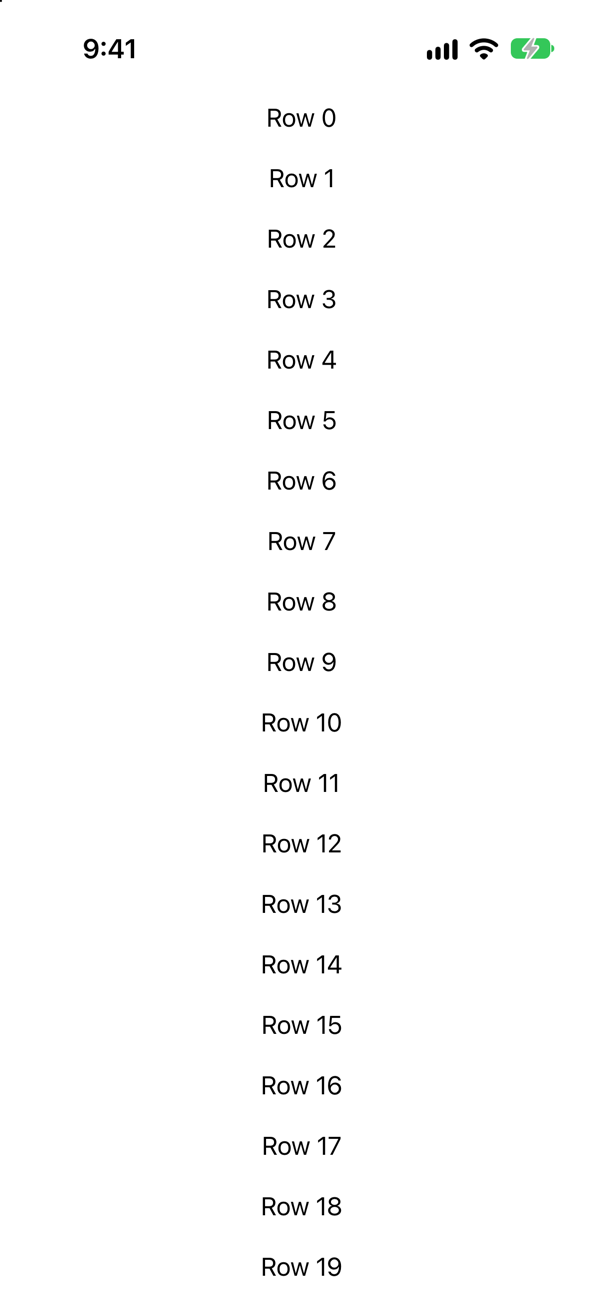
A LazyVStack inside a ScrollView. A plain VStack would build all thousand rows before showing the first.
Syntax · AdaptingShow a row when there is room for it, and a column when there is not.
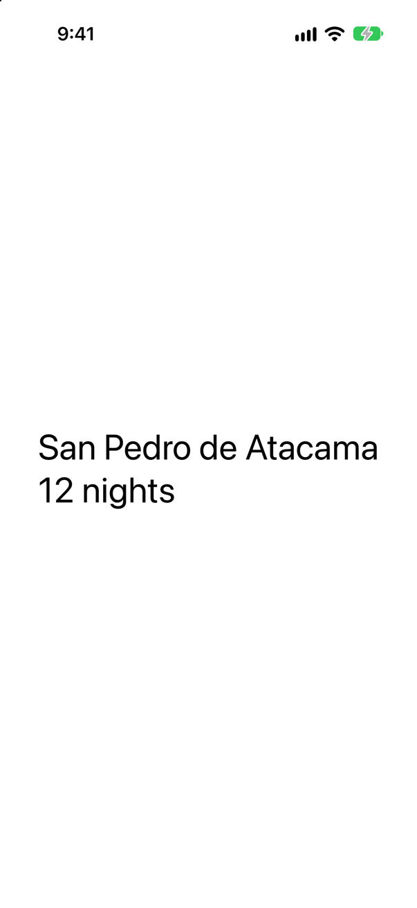
ViewThatFits. List the arrangements in order of preference; it uses the first one that fits. Here the text is large, the row does not fit, and the column is used.
Syntax · StacksDraw a hairline between two views in a column.

Divider(). In a column it is a horizontal line, in a row a vertical one. It stretches across the stack, so it also makes the stack as wide as it can be.
Syntax · SpacersPush two views apart, but never let them come closer than 24 points.

Spacer(minLength:). A spacer grows without limit, and it also has a smallest length. Set it when the gap matters; set it to 0 when the text matters more.
Trick question · AlignmentA VStack(alignment: .leading) with two lines of text is the only thing on the screen. Is it at the leading edge of the screen?

No: it is in the middle. The alignment lines the two texts up with each other, inside a stack that is only as wide as the wider one. Where the stack goes is decided by its parent. To put it at the edge: .frame(maxWidth: .infinity, alignment: .leading).
Trick question · SpacersText("Top"), a Spacer(), and Text("Bottom") in a VStack — inside a ScrollView. Where is "Bottom"?

Right under "Top". A spacer expands into the room its stack is given, and a scroll view gives no fixed height: its content may be as tall as it likes. With nothing to expand into, the spacer is as short as it can be.
Trick question · StacksTwo short texts in an HStack, with no spacer. How wide is the stack?

As wide as the two texts and the gap between them — no wider. A stack hugs its content. Only something flexible inside it, such as a Spacer, makes it reach for the edges.
Trick question · SpacingA VStack with no spacing:. Is the gap between its children zero?
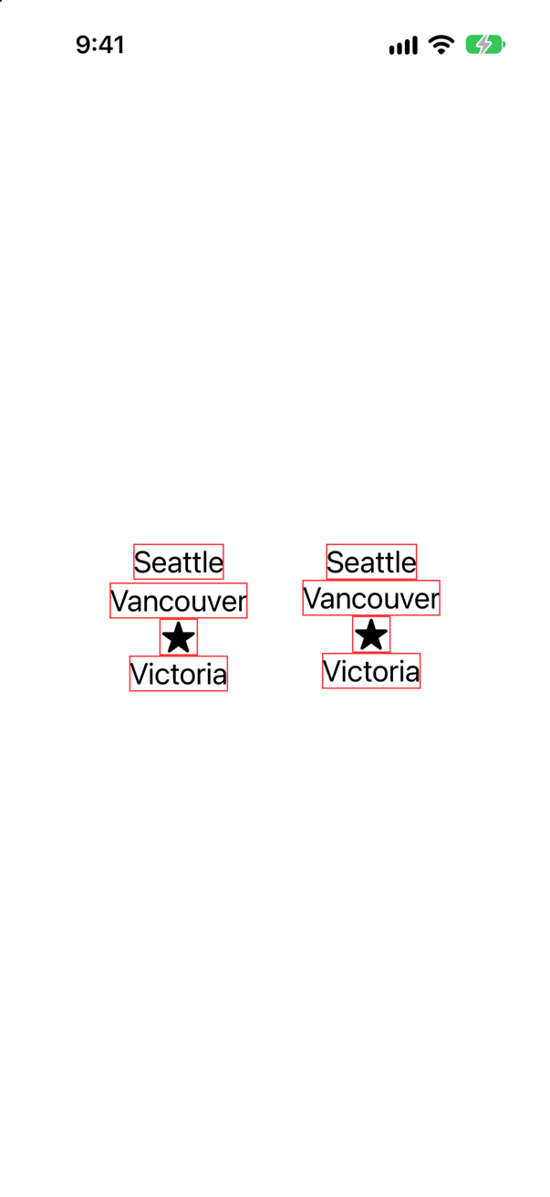
No. Left out, the spacing is "whatever is usual between these two views", and the stack decides. On the left, the default; on the right, the same stack with spacing: 0, where the borders touch. For a design, say the number.
Trick question · LayersA ZStack holds a short text and a 200 × 120 color. How large is the ZStack?

200 × 120: the size of its largest child. A ZStack is a stack: its size comes from all of its children. If one view should decide the size and the others should fit over it, use .overlay or .background on that view instead.
Trick question · StacksA column hugs two short texts. You add a Divider() between them. What happens to the column's width?
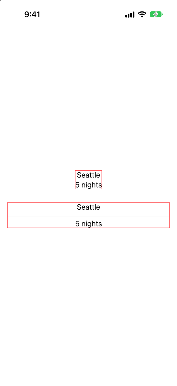
It becomes as wide as it can. A divider stretches across its stack, so it is flexible, and one flexible child is enough to make the whole stack grow. Above, the same column without the divider.
Trick question · SpacersA long name, a Spacer(), and "12 nights", in a row that has room for both texts and a few points to spare. Are both texts shown in full?

No (the upper row). A spacer has a smallest length of its own, and it keeps it even when the text beside it has to be cut short. Spacer(minLength: 0) gives every point back to the texts: the lower row is the same width, and both are whole.
Edge cases and tricky questions
11 questions of the kind an interviewer uses to find out whether you really know this — the corners, the traps, and the things that changed recently. Each has its source. Wherever the answer is what some code does, that code was compiled and run, and what you see under “Show the answer” is what it really did. Say your answer aloud before you open it.
The design wants this title at the leading edge of the screen. VStack(alignment: .leading) leaves it in the middle. Why — and what are the two ways to put it where it belongs?
Show the answer

The alignment did its job. Inside the stack, the two texts start at the same edge. But the stack itself is only as wide as its wider child, and its parent put it in the middle, as parents do. Apple says it in one sentence: "The alignment property doesn't position the VStack inside its container; instead, it positions the views inside the VStack."
So the cure is to change what the parent has to place. Either make the stack as wide as the space on offer, and say where its content goes inside that width:

Or put the stack in a row with a spacer, which pushes it to one side:

They look the same, and both are common. The frame is one view fewer, and says what you mean. The next lesson is about what that frame really is.
Where this comes from: Building layouts with stack views · Aligning views within a stack — Apple, “Building layouts with stack views”.
The same three lines — a text, a Spacer(), a text — in a VStack on the left, and in a VStack inside a ScrollView on the right. Where is each "bottom"?
Show the answer
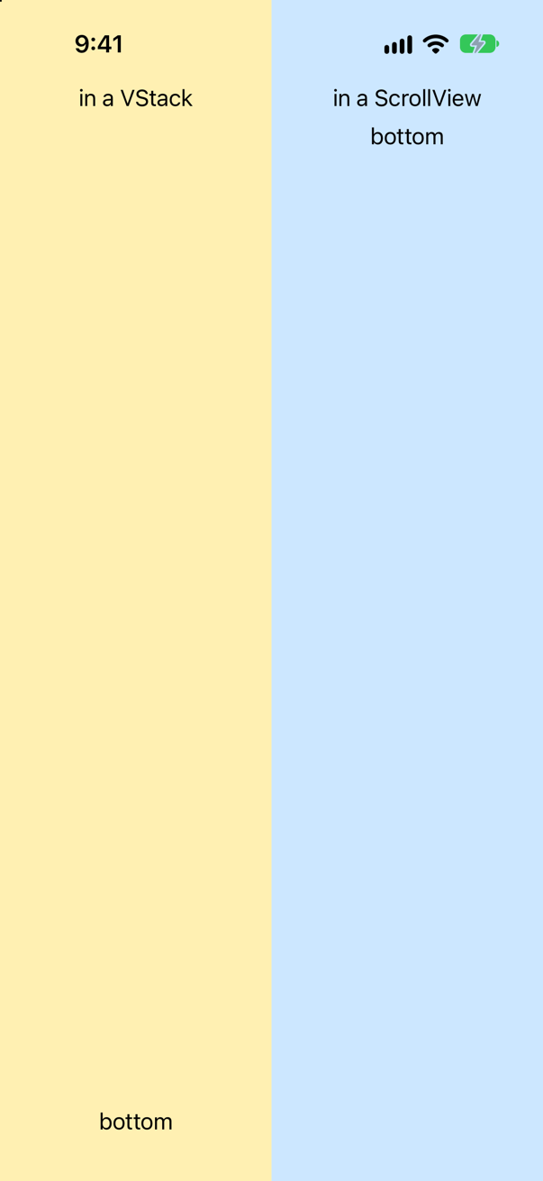
A spacer does not push. It takes — "as much as it can", in Apple's words, "within the limits of the stack's size". On the left, the stack is offered the height of the screen, and the spacer takes what the two texts leave.
On the right, the stack is inside a scroll view, and a scroll view makes no offer in the direction it scrolls: its content may be as tall as it likes. A stack that is offered nothing in particular is as tall as its content needs, and what a spacer needs is nothing. So the two texts sit together at the top.
This is the commonest reason for "my Spacer does nothing", and it is not a bug. If the content should fill the visible height when it is short — a sign-in screen that can still scroll on a small phone — say so. Make the content at least as tall as the scroll view. The scroll view will not tell its content how tall it is, so measure from outside:

GeometryReader round the scroll view: now the spacer has roomScreenshot · iPhone 17, iOS 27.0There is a shorter spelling that gives the same picture, .containerRelativeFrame(.vertical), and it hides a trap. It makes the content exactly as tall as the scroll view, not at least. Here are both, side by side, with content that needs more than a screen: Lines is sixty lines of text, a spacer, and "bottom"; measured prints a view's height.
The console showed
content, minHeight: 1366 points tall
content, containerRelativeFrame: 778 points tall
the scroll view: 778 points tall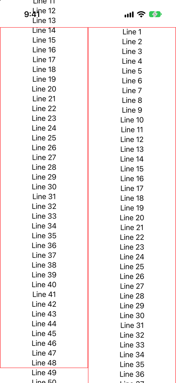
containerRelativeFrame(.vertical). Right: minHeightScreenshot · iPhone 17, iOS 27.0On the right, the content grew to the 1366 points it needs, and it scrolls. On the left it was held to the 778 points of the scroll view. Sixty lines do not fit in that, so they run off both ends of the red frame, and because the frame is no taller than the scroll view there is nothing to scroll: the first lines cannot be reached at all.
So: containerRelativeFrame for content that is known to fit, such as one page of a paged carousel. A minimum for content that can grow.
Where this comes from: Spacer · ScrollView · containerRelativeFrame(_:alignment:) · GeometryReader — Apple, Spacer: "A flexible space that expands along the major axis of its containing stack layout".
A VStack with no spacing:. Three texts, a symbol and two colored bars. Is the gap between each pair of neighbors the same? Is it 8 points?
Show the answer

No, and no. To get numbers, the same stack was run with each view numbered, so that the app could print the distance from the bottom of one to the top of the next:

The console showed
between 1 and 2: 2.0 points
between 2 and 3: 0.0 points
between 3 and 4: 0.0 points
between 4 and 5: 10.6 points
between 5 and 6: 8.0 points
Five gaps, and four different answers. Leaving out spacing: does not mean "the default number". Apple's description of the parameter: "The distance between adjacent subviews, or nil if you want the stack to choose a default distance for each pair of subviews." For each pair.
The stack chooses by asking the views. WWDC22: "In SwiftUI, all views have spacing preferences that indicate the amount of space the view prefers to have between itself and the next view", and a view "might prefer different values on different edges, and even different values for different kinds of adjacent views." When two neighbors disagree, "a built-in layout container uses the larger of the two preferences." So two texts sit as close as two lines of a paragraph, a symbol counts as text, two plain views get 8 points, and a text next to something that is not text asks for a little more.
What to do about it. For a first draft, leave it alone: the defaults follow the platform's conventions, which is the point of them. For a design with numbers in it, give the number. A stack with a spacing: uses that distance for every pair — in the same talk's words, giving a custom spacing is "essentially" ignoring the preferences. And never do arithmetic on the assumption that the default is 8. As the console shows, it is 8 only between views that have no opinion.
Where this comes from: VStack.init(alignment:spacing:content:) · ViewSpacing · WWDC22: Compose custom layouts with SwiftUI — Apple, VStack.init(alignment:spacing:content:), and WWDC22, “Compose custom layouts with SwiftUI”.
A thousand rows in a ScrollView: once in a VStack, once in a LazyVStack. After two seconds, without touching the screen, how many rows have appeared in each? And a third case: the LazyVStack with no ScrollView round it.
Show the answer
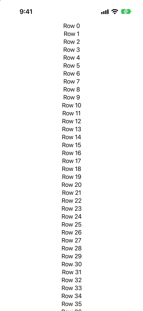
In the VStack, all of them: the console showed 1000 of 1000 rows have appeared. A VStack builds and lays out every child before it shows the first, however many there are. Apple: an HStack "renders the views all at once, regardless of whether they are on- or offscreen", and the same goes for its vertical sibling.
Change VStack to LazyVStack and nothing else, and the console showed 37 of 1000 rows have appeared — the rows on the screen, and no more. Scroll, and rows are made as they are needed.
Without the scroll view the lazy stack is still lazy: 40 of 1000 rows have appeared. It builds what is visible, and since nothing can scroll, the rest is never built at all. That is a bug, not a saving: the other rows simply cannot be reached.
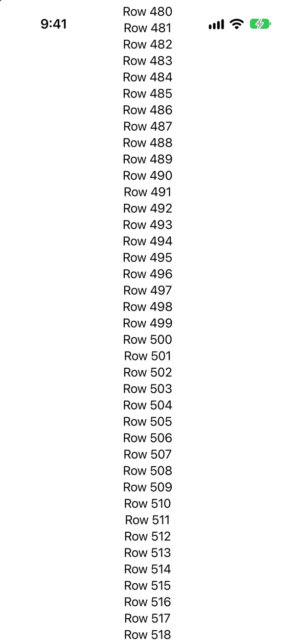
LazyVStack with no ScrollView: the middle of the list, and no way to the restScreenshot · iPhone 17, iOS 27.0The interview answer has two halves, and most candidates give one. Lazy stacks are for long, data-driven content in a scroll view; the interview-preparation repository's line is "VStack builds every child now; lazy containers build only what's near the screen". And they are not a free upgrade. Apple: "Lazy stacks trade some degree of layout correctness for performance, because the system only calculates the geometry for subviews as they become visible", so "always start with a standard stack view and only switch to a lazy stack if profiling your code shows a worthwhile performance improvement." Profile on a device, too: "Never profile your code using the iOS simulator." The counts above are counts, not timings.
Where this comes from: Creating performant scrollable stacks · Picking container views for your content · Senior iOS Interview Preparation (GitHub) — Apple, “Creating performant scrollable stacks”.
Each row counts its own taps in @State. The user taps row 0 twice, scrolls a long way down, and scrolls back. What does row 0 say now — in a LazyVStack, and in a VStack?
Show the answer
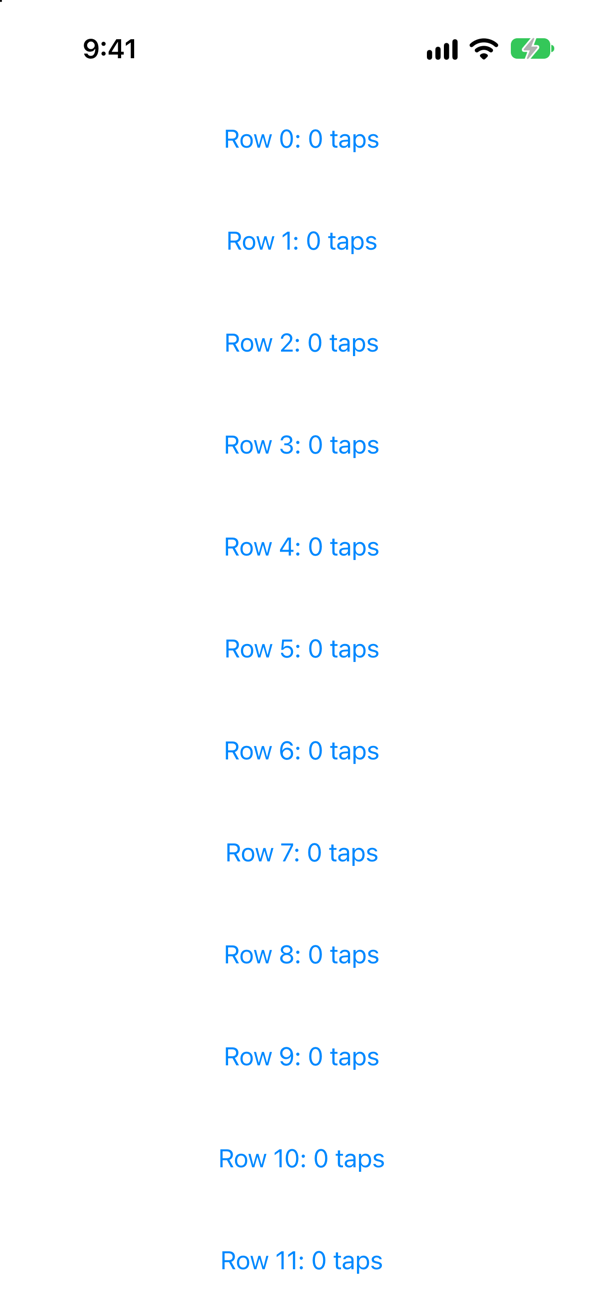
LazyVStack, after two taps on row 0, a long scroll away, and backScreenshot · iPhone 17, iOS 27.0In the LazyVStack: Row 0: 0 taps. The count is gone. The console shows why. While the user was away, the row was not merely off the screen:
row 0 disappearedand on the way back it was made again:
row 0 appearedA lazy stack builds rows as they are needed, and it lets go of rows that are far away. A row that has been let go takes its @State with it; the row that comes back is a new one. In the VStack, where every row exists for as long as the stack does, the same taps and the same scrolling printed nothing at all, and row 0 still said Row 0: 2 taps.
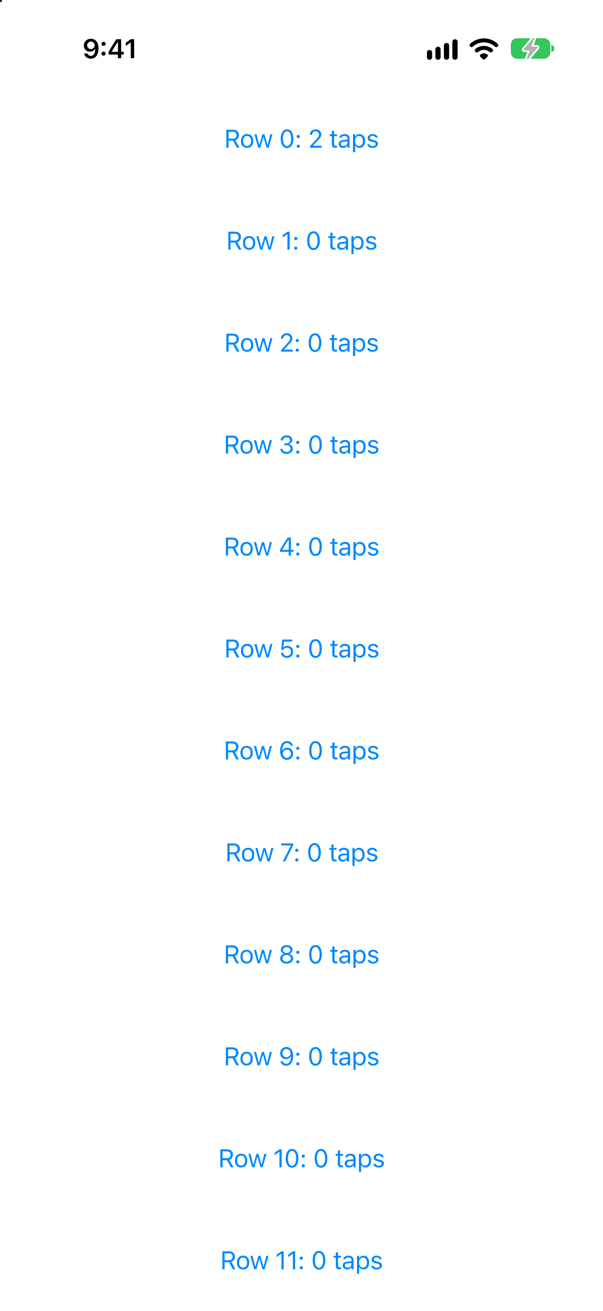
VStack, after the same taps and the same scrolling: the count is still thereScreenshot · iPhone 17, iOS 27.0So @State in a row of a lazy container — and List is one — is for things that may be forgotten: whether a disclosure is open, where an animation has got to. Anything the user would be sorry to lose belongs to the model, keyed by the row's id, where scrolling cannot reach it. That is the first lesson of Part 6.
Where this comes from: Creating performant scrollable stacks · LazyVStack · WWDC21: Demystify SwiftUI (2021 — still the reference on identity) — Apple, LazyVStack: "the stack view doesn’t create items until it needs to render them onscreen". WWDC21, “Demystify SwiftUI”: "the persistence of your state is tied to the lifetime of your views."
A title with a large red badge at its top trailing corner, built twice: with a ZStack, and with .overlay. The blue border shows the size each one reports to its parent. Which is larger, and which should you use?
Show the answer
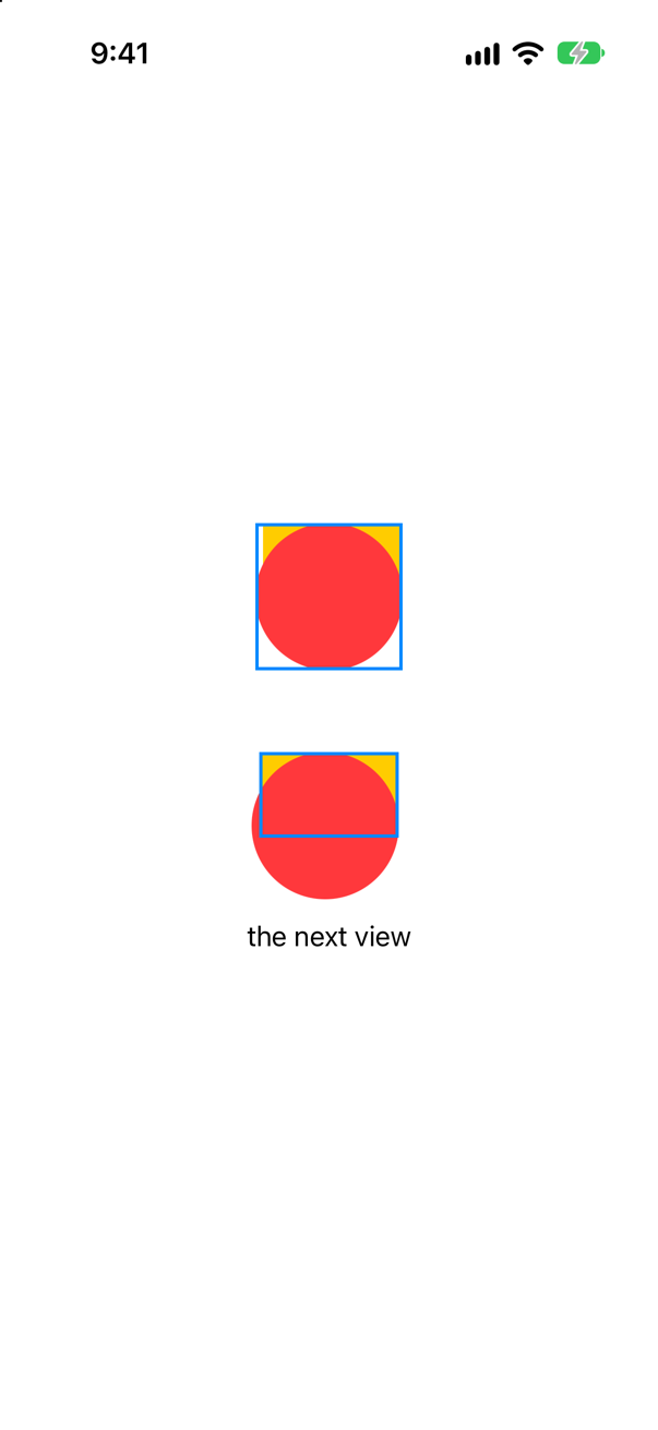
ZStack: as large as the badge. Below, the overlay: as large as the titleScreenshot · iPhone 17, iOS 27.0The ZStack is the larger. It is a stack, and a stack's size comes from all of its children: here, the 90-point circle. Everything round it is laid out as if it were that big.
The overlay version is the size of the title alone. The badge is drawn over it, and beyond it, without taking part in layout at all: look at how close "the next view" is, and at the badge running over the blue border.
Apple's rule for choosing: "If your layout has one dominant view that defines the size of the layout, use the overlay(_:alignment:) or background(_:alignment:) view modifier on that view. If you want the final view size to come from an aggregation of all the contained views, use a ZStack."
A badge, a selection ring, a loading spinner over a picture: one view is the thing, and the other decorates it. That is overlay. A card made of a picture, a gradient and a caption that should all fit: that is a ZStack.
Where this comes from: Building layouts with stack views · ZStack — Apple, “Building layouts with stack views”, section “Add depth in alternative ways”.
ViewThatFits is given a long sentence and a short one. The long one would fit if it wrapped onto two lines. Which does it show — and does in: .vertical change the answer?
Show the answer
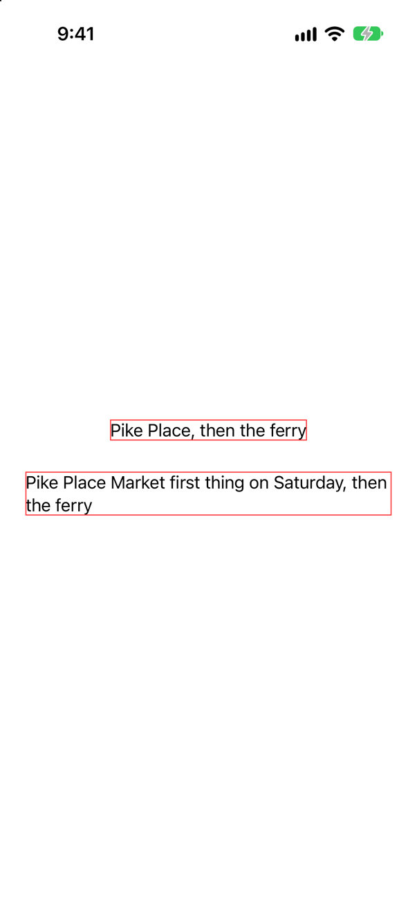
The first shows the short sentence, although the long one had room to wrap. ViewThatFits does not ask "could this be made to fit?" It asks each view for its ideal size, and compares that with the space. Apple: it "selects the first child whose ideal size on the constrained axes fits within the proposed size." The ideal size of a Text is its size on one line. That line is wider than the screen, so the long sentence is rejected before wrapping is ever considered.
The second checks one direction only. in: .vertical says: I do not care about the width, only whether it is too tall. Now the long sentence is offered the real width, wraps onto two lines, and two lines are not too tall.
So say which direction you mean. ViewThatFits(in: .horizontal) is the usual one, as in this lesson's card: "use the row if it is not too wide". The default checks both, and with text that is rarely what you want. And know what it replaces. In UIKit this was a size class or a trait collection and two sets of constraints; Hacking with Swift's interview answer on size classes gives the same example, a stack that "aligns its views horizontally in normal conditions, but vertically when constrained". ViewThatFits measures the content itself, so it is right at every text size, not only on every device.
Where this comes from: ViewThatFits · Hacking with Swift interview question: What is the purpose of size classes? — Apple, ViewThatFits.
A list of labels and values. Each row is an HStack; the rows are in a VStack(alignment: .leading). The values start wherever their labels happen to end. How do you make the values line up in a column — without fixed widths, and without a grid?
Show the answer
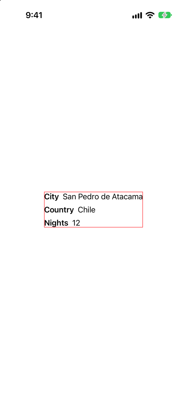
A stack's alignment is about its own children. The VStack lines up the three rows; it knows nothing about what is inside them. Apple: "By default, the alignment you specify for a stack applies only to that stack's child views. To align child views that reside in the nested stacks, define a custom alignment".
A custom alignment is a named line. You define it once, tell the outer stack to line its children up on it, and say in each row where that line is — here, at the leading edge of the value:
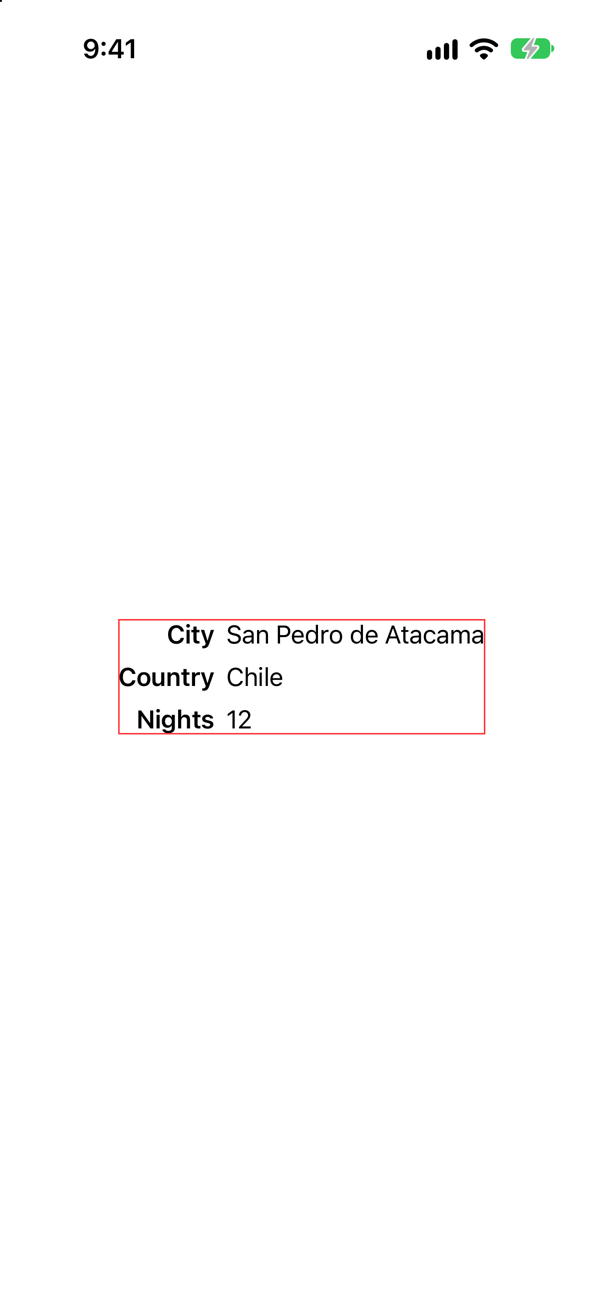
Each row reports "my valueEdge is where my second text begins", and the VStack slides the rows sideways until those points share an x. The labels end up right-aligned for free.
This is the SwiftUI answer to a constraint between two views in different containers, and it is the kind of thing a senior interview reaches for after the easy stack questions. Know that it exists, and know the newer alternative: for a table of rows and columns, Grid (lesson 11) does this with no alignment code at all.
Where this comes from: Aligning views across stacks · Aligning views within a stack — Apple, “Aligning views across stacks”.
A title that wraps onto three lines sits beside a small "12 nights". The row is aligned three ways: .firstTextBaseline, .lastTextBaseline, and the default. Where is "12 nights" in each?
Show the answer
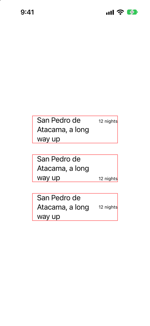
On the first line of the title; on its last line; and half-way down, level with the middle of the block. All three are in real apps, and only the first two are usually meant.
The default, .center, lines up the middles of the two views. When both are one line of the same font nobody can tell. With different fonts, or a title that wraps, the small text floats at a height that matches nothing. A baseline alignment ties it to a line of text: .firstTextBaseline for a label that belongs to the start of the title — the usual case — and .lastTextBaseline for something that should close the block, such as a price or a "more" link.
One detail that catches people who mix in pictures. Apple: "Custom images don't provide a text baseline guide, so the bottom of the image aligns to the text view's baseline." If the icon should sit lower or higher than that, alignmentGuide on the image says where its baseline is.
Where this comes from: Aligning views within a stack · VerticalAlignment — Apple, “Aligning views within a stack”.
Two texts in a stack that hugs them. Add a Divider() between them. What happens to the stack — in a VStack, and in an HStack?
Show the answer
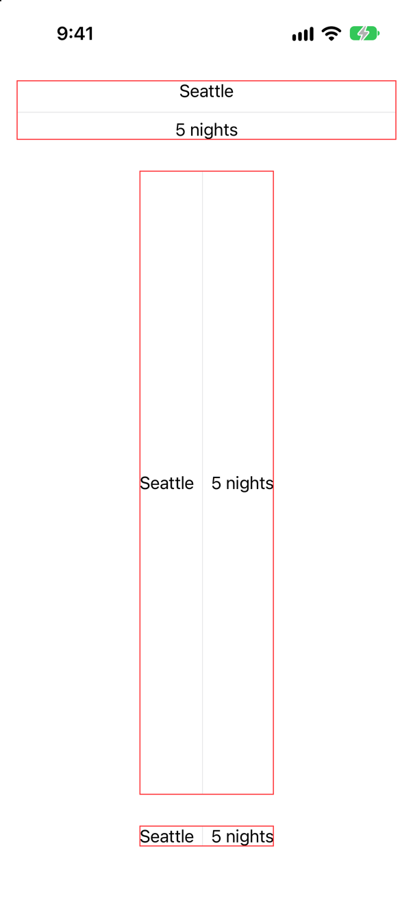
The column becomes as wide as it is allowed to be, and the row becomes as tall as it is allowed to be — which, in the middle of a screen, is most of the screen.
Apple describes the divider as a line that "extends across the minor axis of the stack". To extend, it has to be flexible in that direction, and a stack is as large as its most demanding child. Before the divider, nothing in the stack wanted more than its text. After it, one child wants everything.
In a column this is usually welcome: a full-width rule is what you wanted. In a row it is the classic surprise — a toolbar or a row of statistics that suddenly fills the screen. The cure is on the last line: .fixedSize() tells the stack to take its ideal size instead of the size it is offered, and the ideal height of this row is the height of its text. (.frame(height: 20) would also do it, and would be wrong at the next text size.)
Where this comes from: Divider · Building layouts with stack views — Apple, Divider.
Three letters in a row: A, a spacer, B, two spacers, C. Is B in the middle? And a second question about the same view: how short can a Spacer() become before it is the text beside it that gives way?
Show the answer

No: B is a third of the way along. The same row, with the letters numbered so that the app could print the distances between them:

The console showed
between A and B: 122.6 points
between B and C: 245.1 points
Twice as far from B to C as from A to B, to the nearest pixel. A spacer is a child like any other, and a stack shares out its room among its children. WWDC19's account of a stack with three children: "we divide the remaining space in three equal parts and then we propose one of those as the size for the least flexible child", then deduct what that child took, "and repeat." The letters are the least flexible, so they are settled first. The spacers are the most flexible, so they come last, and divide what is left equally: three spacers, three equal shares, and B stands after the first. Two spacers on one side and one on the other is a two-to-one split with no arithmetic.
Now the second question. A spacer stretches without limit, but it does not shrink to nothing. Apple, on its minLength: "The minimum length this spacer can be shrunk to, along the axis or axes of expansion. If nil, the system default spacing between views is used." The next picture has the two texts alone in its first row, and then the same texts with a spacer between them, in rows 250 and 249 points wide:
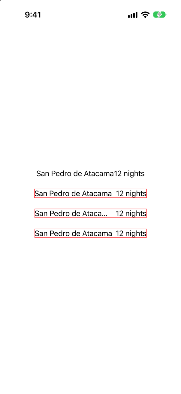
minLength: 0Screenshot · iPhone 17, iOS 27.0The console showed the two texts alone: 241.3 points. In 250 points that leaves 8.7 for the spacer, and everything fits. In 249 it leaves 7.7 — and the name is cut short, although nothing but an empty spacer stands between the two texts. The spacer's floor is 8 points here, the default spacing, and it defends them against the text. With minLength: 0 the same 249 points are enough.
So a Spacer() in a tight row costs 8 points of text. When the content matters more than the gap — a table row, a toolbar title — write Spacer(minLength: 0).
Where this comes from: Spacer · Spacer.minLength · WWDC19: Building Custom Views with SwiftUI (2019 — still the clearest account of how layout works) — Apple, Spacer, and WWDC19, “Building Custom Views with SwiftUI”.