How a view gets its size
How layout works: frames and sizing
You will buildA tool that prints the conversation between a parent and its child. Then, with what it shows you, three things for Trips: a strip of pictures that scrolls sideways, a row of three equal tiles, and a bar divided in proportion.
TimeAbout 100 minutes
WhyIn the last lesson you told stacks what to do. In this one you find out how they decide. In UIKit a view has a frame because somebody set it: you, or the constraint solver. In SwiftUI no view sets the size of another. A parent proposes a size, the child chooses its own, and the parent places it — three steps, the same at every level of every screen. Nearly everything that puzzles people about SwiftUI layout is one of those steps doing exactly what it should: a frame that does not resize its view, a button that will not grow, a text that is cut short when there is room. So in this lesson you watch the three steps happen.
Open your project
Open your
Tripsproject as lesson 9 left it: double-clickTrips.xcodeprojin Finder, or use File ▸ Open… (⌘O) in Xcode.If you did not finish lesson 9, or would rather start from a known state, download Trips-lesson-09.zip instead. It is the project exactly as it stood at the end of lesson 9. Unzip it and open
Trips.xcodeproj.Run it (⌘R) to check that it builds. You should see where lesson 9 ended:
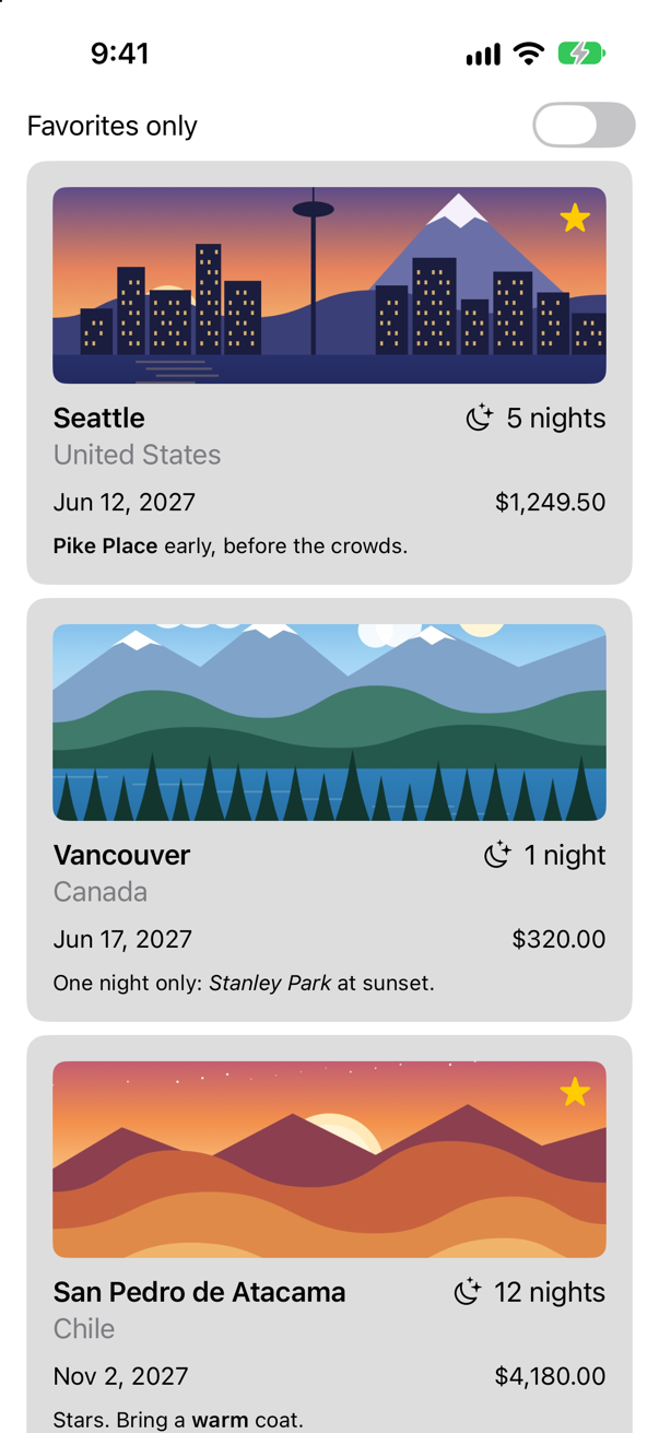
Trips, as it stood at the end of lesson 9Screenshot · iPhone 17, iOS 27.0
A window on the conversation
Layout happens before anything is drawn, and it leaves nothing to look at. So first, a tool. Make a new Swift File named Watch, and replace everything in it:
import SwiftUI

/// Prints what a view is offered, and what it takes. A tool for looking, not for shipping.
struct Watch: Layout {
    let name: String

    init(_ name: String) {
        self.name = name
    }

    func sizeThatFits(proposal: ProposedViewSize, subviews: Subviews, cache: inout ()) -> CGSize {
        let size = subviews[0].sizeThatFits(proposal)
        print("\(name): offered \(text(proposal.width)) x \(text(proposal.height)), takes \(text(size.width)) x \(text(size.height))")
        return size
    }

    func placeSubviews(in bounds: CGRect, proposal: ProposedViewSize, subviews: Subviews, cache: inout ()) {
        subviews[0].place(at: bounds.origin, proposal: proposal)
    }

    private func text(_ length: CGFloat?) -> String {
        guard let length else { return "nothing" }
        return length == .infinity ? "infinity" : "\(Int(length.rounded()))"
    }
}
You are not expected to follow every line: Layout is the next lesson's subject. Here only its shape matters. SwiftUI asks a container two things. How large are you? That is sizeThatFits, and it is handed the size that the container's own parent is offering. And where do your children go? That is placeSubviews. Watch is a container with one child and no opinions of its own. It passes the offer on to its child, prints the offer and the child's answer, and gives that answer as its own.
Now somewhere to use it. This lesson's experiments print to the console, so they have to run in the app and not in the canvas.
Make a new view for them. Choose File ▸ New ▸ File from Template… (⌘N). Under User Interface, select SwiftUI View, and click Next. Name it
Lab, and click Create.
struct Lab: View { var body: some View { Text("Hello, World!") Watch("text") { Text("Seattle") } .border(.red) }}struct Lab: View {
var body: some View {
Watch("text") {
Text("Seattle")
}
.border(.red)
}
}For the next four steps the app shows the lab instead of the list of trips. In TripsApp.swift, one line changes: ContentView(store: store) becomes Lab().
import SwiftUI@mainstruct TripsApp: App { @Environment(\.scenePhase) private var scenePhase @State private var store = TripStore() var body: some Scene { WindowGroup { ContentView(store: store) Lab() } .onChange(of: scenePhase) { _, new in if new == .background { store.save() } } }}import SwiftUI
@main
struct TripsApp: App {
@Environment(\.scenePhase) private var scenePhase
@State private var store = TripStore()
var body: some Scene {
WindowGroup {
Lab()
}
.onChange(of: scenePhase) { _, new in
if new == .background {
store.save()
}
}
}
}Run the app (⌘R). Look at the screen, and then at the console:

text: offered 402 x 778, takes 53 x 20One line, and it holds the whole of SwiftUI layout. Read it as a conversation.
| Step | Who | What happened |
|---|---|---|
| 1. Propose | The parent | "You may have 402 by 778." That is the screen, less the status bar at the top and the home indicator at the bottom. |
| 2. Choose | The text | "I will take 53 by 20." A text takes what its words need, and nothing more. |
| 3. Place | The parent | It has 402 by 778 and a child of 53 by 20, so it puts the child in the middle. |
A talk from WWDC 2019, Building Custom Views with SwiftUI, is still the clearest account of it: "the layout process has three steps. First, the root view offers the text a proposed size … Next, the text replies, well that's mighty generous of you but I'm really, I'm only this big. And in SwiftUI there's no way to force a size on your child, the parent has to respect that choice. And now the root view says alrighty, I need to put you somewhere so I'm putting you in the middle."
The second step is the one that differs from UIKit, where a parent set its child's frame and the child lived with it. Here the child decides. Not every child decides the same way. Try a color:
struct Lab: View { var body: some View { Watch("text") { Text("Seattle") Watch("color") { Color.yellow } .border(.red) .padding(40) }}struct Lab: View {
var body: some View {
Watch("color") {
Color.yellow
}
.border(.red)
.padding(40)
}
}Run it (⌘R). The simulator shows
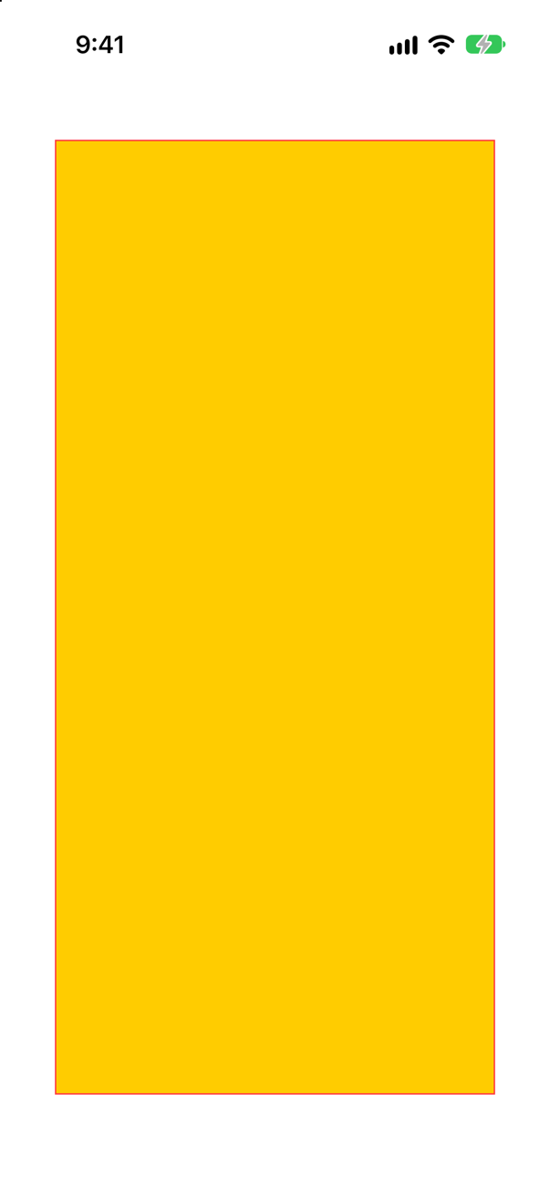
color: offered 322 x 698, takes 322 x 698The color took everything it was offered. Apple says so of colors — "a color used as a view expands to fill all the space it's given" — and it is true of shapes and spacers too. Every view sits somewhere between these two: it takes what it needs, like the text, or what it is given, like the color.
Look at the offer as well. It is not 402 by 778 this time. .padding(40) is a parent too: it was offered the screen, kept 40 points on each side for itself, and passed on what was left. Every modifier that affects layout is a view between the one above it and the one below, taking part in the same three steps.
A frame is a view
Now the modifier that everybody misreads. Put the text in a frame of 200 by 80, with a blue border to show where the frame is:
struct Lab: View { var body: some View { Watch("color") { Color.yellow Watch("text") { Text("Seattle") } .border(.red) .padding(40) .frame(width: 200, height: 80) .border(.blue) }}struct Lab: View {
var body: some View {
Watch("text") {
Text("Seattle")
}
.border(.red)
.frame(width: 200, height: 80)
.border(.blue)
}
}Run it (⌘R). The simulator shows
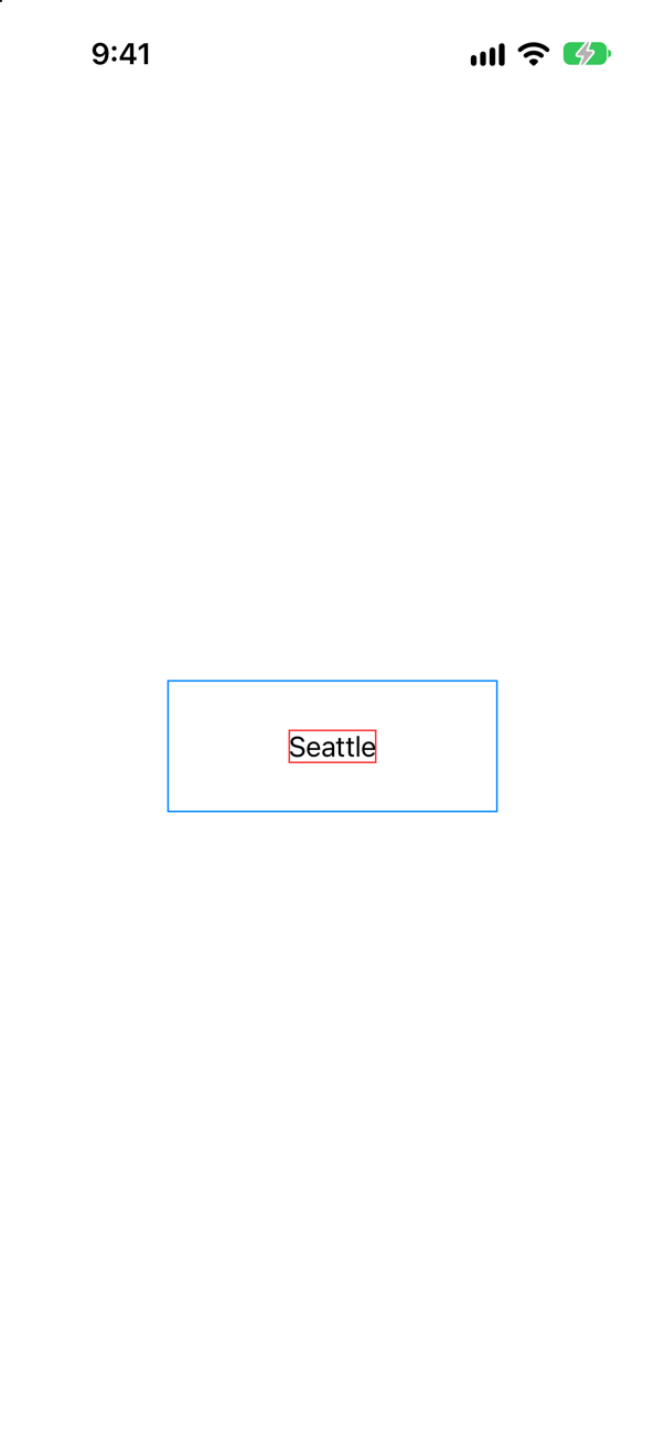
text: offered 200 x 80, takes 53 x 20.frame(width: 200, height: 80) did not make the text 200 by 80. It could not: step 2 belongs to the child. What it made is a new view of 200 by 80 that has the text as its child. That view offered the text 200 by 80. The text took 53 by 20, as it always does. And the frame placed it — in the middle, since nobody said otherwise.
The same talk: "the frame is not a constraint in SwiftUI, it's just a view which you can think of like a picture frame. It proposes fixed dimensions for its child, but like every other view, the child ultimately chooses its own size." Apple's reference for the modifier begins with the same idea: it "positions this view within an invisible frame".
Step 3 is the frame's to decide, and that is what its alignment is for:
struct Lab: View { var body: some View { Watch("text") { Text("Seattle") } .border(.red) .frame(width: 200, height: 80) .frame(width: 200, height: 80, alignment: .bottomTrailing) .border(.blue) }}struct Lab: View {
var body: some View {
Watch("text") {
Text("Seattle")
}
.border(.red)
.frame(width: 200, height: 80, alignment: .bottomTrailing)
.border(.blue)
}
}Run it (⌘R). The simulator shows
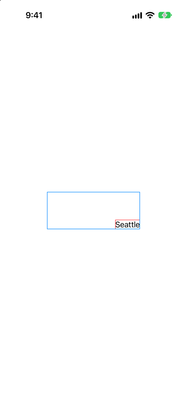
alignment: .bottomTrailing: the same frame, the same text, another placeScreenshot · iPhone 17, iOS 27.0A frame need not have a fixed size. Give it a maximum instead of a width:
struct Lab: View { var body: some View { Watch("text") { Text("Seattle") } .border(.red) .frame(width: 200, height: 80, alignment: .bottomTrailing) .frame(maxWidth: .infinity, alignment: .leading) .border(.blue) .padding() }}struct Lab: View {
var body: some View {
Watch("text") {
Text("Seattle")
}
.border(.red)
.frame(maxWidth: .infinity, alignment: .leading)
.border(.blue)
.padding()
}
}Run it (⌘R). The simulator shows

.frame(maxWidth: .infinity, alignment: .leading)Screenshot · iPhone 17, iOS 27.0text: offered 370 x 746, takes 53 x 20
text: offered 370 x 20, takes 53 x 20The blue frame is as wide as it is allowed to be — the screen, less the padding. The text inside it is still 53 points wide, and sits at the frame's leading edge because the alignment says so. This is the answer to "how do I make it full width?", and to the last lesson's edge case about a column that stayed in the middle. You do not stretch the view. You put it in a frame that stretches, and say where in that frame it belongs.
There are two lines in the console this time. A parent may ask its child more than once. Here the frame asked once to find out how tall it should be, and once again when it placed the text, with the size it had settled on.
A text under pressure
So what does a child do when it is offered less than it would like? A text has three answers. Here is one sentence three times, each in a frame 150 points wide:
struct Lab: View { let note = "Pike Place Market first thing on Saturday" var body: some View { Watch("text") { Text("Seattle") VStack(spacing: 30) { Text(note) .border(.red) .frame(width: 150) .border(.blue) Text(note) .lineLimit(1) .border(.red) .frame(width: 150) .border(.blue) Text(note) .fixedSize() .border(.red) .frame(width: 150) .border(.blue) } .border(.red) .frame(maxWidth: .infinity, alignment: .leading) .border(.blue) .padding() }}struct Lab: View {
let note = "Pike Place Market first thing on Saturday"
var body: some View {
VStack(spacing: 30) {
Text(note)
.border(.red)
.frame(width: 150)
.border(.blue)
Text(note)
.lineLimit(1)
.border(.red)
.frame(width: 150)
.border(.blue)
Text(note)
.fixedSize()
.border(.red)
.frame(width: 150)
.border(.blue)
}
}
}Run it (⌘R). The simulator shows
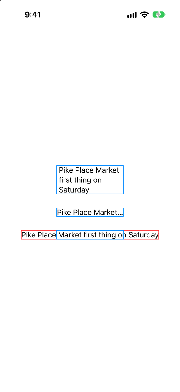
| The text | What it does with an offer of 150 points |
|---|---|
| As it comes | Wraps. It stays inside the width and takes as many lines as it needs — the frame gave no height, so it can. |
.lineLimit(1) | Keeps to one line, and shows "…" where the rest would have been. |
.fixedSize() | Ignores the offer. It takes its ideal size, the whole sentence on one line, and sticks out of its frame on both sides. |
Look at the blue borders: the frame is 150 points wide all three times. Only the child's choice differs. Apple describes fixedSize() as "the creation of a counter proposal to the view size proposed to a view by its parent" — the child answering "no: this much." It is the right tool when a text must never be cut short, and you have made sure that there is room.
Two views, one space
A frame has one child. A stack has several, and has to share its space among them. Watch it do that. Two texts that are too long to sit side by side, in a row 300 points wide:
struct Lab: View { let note = "Pike Place Market first thing on Saturday" VStack(spacing: 30) { Text(note) .border(.red) .frame(width: 150) .border(.blue) Text(note) .lineLimit(1) .border(.red) .frame(width: 150) .border(.blue) Text(note) .fixedSize() .border(.red) .frame(width: 150) .border(.blue) HStack { Watch("name") { Text("San Pedro de Atacama, Chile") .lineLimit(1) } .border(.red) Watch("nights") { Text("12 nights in November") .lineLimit(1) } .border(.red) } .frame(width: 300) .border(.blue) }}struct Lab: View {
var body: some View {
HStack {
Watch("name") {
Text("San Pedro de Atacama, Chile")
.lineLimit(1)
}
.border(.red)
Watch("nights") {
Text("12 nights in November")
.lineLimit(1)
}
.border(.red)
}
.frame(width: 300)
.border(.blue)
}
}Run it (⌘R). The simulator shows

name: offered infinity x 778, takes 220 x 20
name: offered 0 x 778, takes 0 x 20
nights: offered infinity x 778, takes 169 x 20
nights: offered 0 x 778, takes 0 x 20
nights: offered 146 x 778, takes 143 x 20
name: offered 149 x 778, takes 145 x 20
Six lines, and they are the whole of how a stack works. Take them in order.
| Lines | What the stack is doing |
|---|---|
| 1 to 4 | Finding out how flexible each child is, by making offers it does not mean: everything (infinity), then nothing (0). The name would take 220 points if it could, the nights 169, and each can shrink to nothing. |
| 5 | The real offer. The row is 300 points wide and keeps 8 for the gap, which leaves 292: half each, 146. The less flexible child is asked first. That is the nights. It takes 143, cutting itself short. |
| 6 | What is left goes to the other: 292 less 143 is 149. The name takes 145 of them. |
Apple's documentation says of every container that it measures its children "by proposing several sizes and looking at the responses", and the 2019 talk gives the rule you have just watched: "we divide the remaining space in … equal parts and then we propose one of those as the size for the least flexible child", deduct what it took, "and repeat."
The result is fair, and useless: two halves of two sentences. When one child matters more than the other, say so. Add .layoutPriority(1) to the nights:
struct Lab: View { var body: some View { HStack { Watch("name") { Text("San Pedro de Atacama, Chile") .lineLimit(1) } .border(.red) Watch("nights") { Text("12 nights in November") .lineLimit(1) } .border(.red) .layoutPriority(1) } .frame(width: 300) .border(.blue) }}struct Lab: View {
var body: some View {
HStack {
Watch("name") {
Text("San Pedro de Atacama, Chile")
.lineLimit(1)
}
.border(.red)
Watch("nights") {
Text("12 nights in November")
.lineLimit(1)
}
.border(.red)
.layoutPriority(1)
}
.frame(width: 300)
.border(.blue)
}
}Run it (⌘R). The simulator shows

.layoutPriority(1) on the nights: whole, at the name's expenseScreenshot · iPhone 17, iOS 27.0name: offered 0 x 778, takes 0 x 20
nights: offered 292 x 778, takes 169 x 20
name: offered 123 x 778, takes 115 x 20This time the stack asked the name only for its minimum. Then it offered the nights everything else — all 292 points — and the nights took the 169 they need. The name was left with 123. Apple: "A parent layout offers the child views with the highest layout priority all the space offered to the parent minus the minimum space required for all its lower-priority children."
A fraction of the container
The lab has done its work. Put the app back as it was: in TripsApp.swift, Lab() becomes ContentView(store: store) again:
import SwiftUI@mainstruct TripsApp: App { @Environment(\.scenePhase) private var scenePhase @State private var store = TripStore() var body: some Scene { WindowGroup { Lab() ContentView(store: store) } .onChange(of: scenePhase) { _, new in if new == .background { store.save() } } }}import SwiftUI
@main
struct TripsApp: App {
@Environment(\.scenePhase) private var scenePhase
@State private var store = TripStore()
var body: some Scene {
WindowGroup {
ContentView(store: store)
}
.onChange(of: scenePhase) { _, new in
if new == .background {
store.save()
}
}
}
}And delete Lab.swift: select it in the Project navigator, press the Delete key, and choose Move to Trash. Keep Watch.swift: you will open it up in the next lesson.
Now use what you saw. First, a strip of the trips' pictures across the top of the screen, to flick through sideways.
Choose File ▸ New ▸ File from Template… (⌘N), select SwiftUI View, and name it
PhotoStrip.
struct PhotoStrip: View { let trips: [Trip] var body: some View { Text("Hello, World!") ScrollView(.horizontal) { HStack(spacing: 12) { ForEach(trips) { trip in Image(trip.imageName) .resizable() .scaledToFill() .frame(width: 300, height: 180) .clipShape(RoundedRectangle(cornerRadius: 12)) } } } .safeAreaPadding(.horizontal) .scrollIndicators(.hidden) }}struct PhotoStrip: View {
let trips: [Trip]
var body: some View {
ScrollView(.horizontal) {
HStack(spacing: 12) {
ForEach(trips) { trip in
Image(trip.imageName)
.resizable()
.scaledToFill()
.frame(width: 300, height: 180)
.clipShape(RoundedRectangle(cornerRadius: 12))
}
}
}
.safeAreaPadding(.horizontal)
.scrollIndicators(.hidden)
}
}#Preview { PhotoStrip() PhotoStrip(trips: Trip.samples)}#Preview {
PhotoStrip(trips: Trip.samples)
}The picture is lesson 8's recipe for a photograph cropped to a box: .scaledToFill(), a frame, and a clip shape.
Open the canvas (⌥⌘↩):
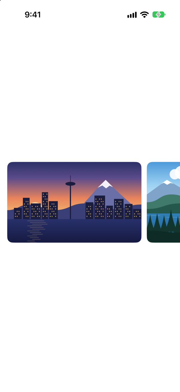
It looks right, and one number in it is a guess: 300. It was found by trying, on this phone, until the next picture just showed at the edge. The width you mean is not "300 points". It is "most of the width, whatever the width turns out to be" — on another phone, on an iPad, in half of a split screen.
The picture cannot learn that width by being offered it. Inside a scroll view that scrolls sideways, nothing is offered a width at all: the content may be as wide as it likes. So there is a frame that asks the container instead. Replace the fixed frame by two: one for the width, which asks the container, and one for the height, which stays at 180 points:
struct PhotoStrip: View { let trips: [Trip] var body: some View { ScrollView(.horizontal) { HStack(spacing: 12) { ForEach(trips) { trip in Image(trip.imageName) .resizable() .scaledToFill() .frame(width: 300, height: 180) .containerRelativeFrame(.horizontal, count: 5, span: 4, spacing: 12) .frame(height: 180) .clipShape(RoundedRectangle(cornerRadius: 12)) } } } .safeAreaPadding(.horizontal) .scrollIndicators(.hidden) }}struct PhotoStrip: View {
let trips: [Trip]
var body: some View {
ScrollView(.horizontal) {
HStack(spacing: 12) {
ForEach(trips) { trip in
Image(trip.imageName)
.resizable()
.scaledToFill()
.containerRelativeFrame(.horizontal, count: 5, span: 4, spacing: 12)
.frame(height: 180)
.clipShape(RoundedRectangle(cornerRadius: 12))
}
}
}
.safeAreaPadding(.horizontal)
.scrollIndicators(.hidden)
}
}The canvas now:
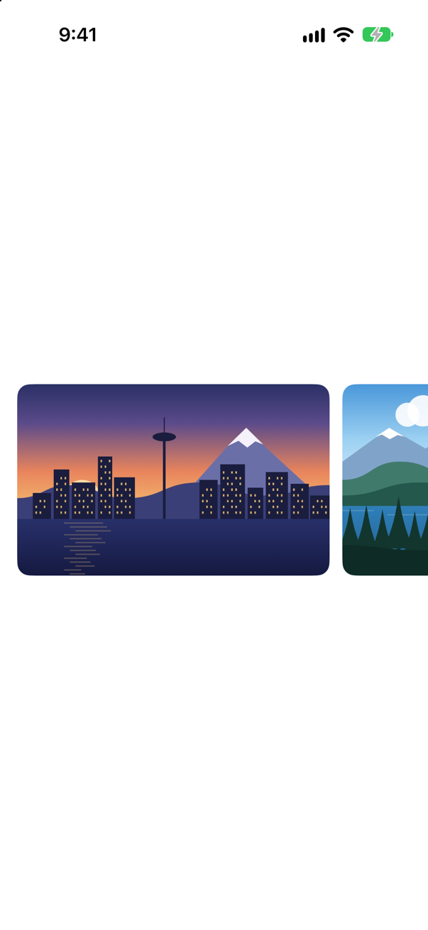
.containerRelativeFrame(.horizontal, count: 5, span: 4, spacing: 12) reads: divide the width of the nearest container into 5 columns with 12 points between them, and make this view 4 columns wide. Apple calls it a frame "with a size relative to the nearest container", and the nearest container here is the scroll view. .safeAreaPadding(.horizontal) on the scroll view is what keeps the first picture off the edge of the screen, and the container's width is counted inside that padding.
Two more lines make the strip stop on a picture and not between two:
struct PhotoStrip: View { let trips: [Trip] var body: some View { ScrollView(.horizontal) { HStack(spacing: 12) { ForEach(trips) { trip in Image(trip.imageName) .resizable() .scaledToFill() .containerRelativeFrame(.horizontal, count: 5, span: 4, spacing: 12) .frame(height: 180) .clipShape(RoundedRectangle(cornerRadius: 12)) } } .scrollTargetLayout() } .scrollTargetBehavior(.viewAligned) .safeAreaPadding(.horizontal) .scrollIndicators(.hidden) }}struct PhotoStrip: View {
let trips: [Trip]
var body: some View {
ScrollView(.horizontal) {
HStack(spacing: 12) {
ForEach(trips) { trip in
Image(trip.imageName)
.resizable()
.scaledToFill()
.containerRelativeFrame(.horizontal, count: 5, span: 4, spacing: 12)
.frame(height: 180)
.clipShape(RoundedRectangle(cornerRadius: 12))
}
}
.scrollTargetLayout()
}
.scrollTargetBehavior(.viewAligned)
.safeAreaPadding(.horizontal)
.scrollIndicators(.hidden)
}
}.scrollTargetLayout() marks the row as the thing whose children are places to stop, and .scrollTargetBehavior(.viewAligned) tells the scroll view to stop on one of them. Nothing in a still picture shows it, so you will try it in step 9, in the running app. You will meet both modifiers again in the interview problem at the end of this part.
Three equal tiles
Under the strip, a summary: how many trips, how many nights, and what they cost. Make another SwiftUI View, named TripSummary.
struct TripSummary: View { let trips: [Trip] var body: some View { Text("Hello, World!") HStack { Text("^[\(trips.count) trip](inflect: true)") .padding(10) .background(.quaternary, in: RoundedRectangle(cornerRadius: 12)) Text("^[\(nights) night](inflect: true)") .padding(10) .background(.quaternary, in: RoundedRectangle(cornerRadius: 12)) Text(total, format: .currency(code: "USD")) .padding(10) .background(.quaternary, in: RoundedRectangle(cornerRadius: 12)) } .font(.subheadline.weight(.semibold)) .padding(.horizontal) } private var nights: Int { trips.reduce(0) { $0 + $1.nights } } private var total: Decimal { trips.reduce(0) { $0 + $1.price } }}struct TripSummary: View {
let trips: [Trip]
var body: some View {
HStack {
Text("^[\(trips.count) trip](inflect: true)")
.padding(10)
.background(.quaternary, in: RoundedRectangle(cornerRadius: 12))
Text("^[\(nights) night](inflect: true)")
.padding(10)
.background(.quaternary, in: RoundedRectangle(cornerRadius: 12))
Text(total, format: .currency(code: "USD"))
.padding(10)
.background(.quaternary, in: RoundedRectangle(cornerRadius: 12))
}
.font(.subheadline.weight(.semibold))
.padding(.horizontal)
}
private var nights: Int {
trips.reduce(0) { $0 + $1.nights }
}
private var total: Decimal {
trips.reduce(0) { $0 + $1.price }
}
}#Preview { TripSummary() TripSummary(trips: Trip.samples)}#Preview {
TripSummary(trips: Trip.samples)
}The canvas:

Each text has padding and a gray background, and — as you now know — each is as wide as its words and no wider. The row hugs the three of them and sits in the middle. The design wants three equal tiles, filling the width.
You know the tool: .frame(maxWidth: .infinity). Add it to each of the three, as the last line:
struct TripSummary: View { let trips: [Trip] var body: some View { HStack { Text("^[\(trips.count) trip](inflect: true)") .padding(10) .background(.quaternary, in: RoundedRectangle(cornerRadius: 12)) .frame(maxWidth: .infinity) Text("^[\(nights) night](inflect: true)") .padding(10) .background(.quaternary, in: RoundedRectangle(cornerRadius: 12)) .frame(maxWidth: .infinity) Text(total, format: .currency(code: "USD")) .padding(10) .background(.quaternary, in: RoundedRectangle(cornerRadius: 12)) .frame(maxWidth: .infinity) } .font(.subheadline.weight(.semibold)) .padding(.horizontal) } private var nights: Int { trips.reduce(0) { $0 + $1.nights } } private var total: Decimal { trips.reduce(0) { $0 + $1.price } }}struct TripSummary: View {
let trips: [Trip]
var body: some View {
HStack {
Text("^[\(trips.count) trip](inflect: true)")
.padding(10)
.background(.quaternary, in: RoundedRectangle(cornerRadius: 12))
.frame(maxWidth: .infinity)
Text("^[\(nights) night](inflect: true)")
.padding(10)
.background(.quaternary, in: RoundedRectangle(cornerRadius: 12))
.frame(maxWidth: .infinity)
Text(total, format: .currency(code: "USD"))
.padding(10)
.background(.quaternary, in: RoundedRectangle(cornerRadius: 12))
.frame(maxWidth: .infinity)
}
.font(.subheadline.weight(.semibold))
.padding(.horizontal)
}
private var nights: Int {
trips.reduce(0) { $0 + $1.nights }
}
private var total: Decimal {
trips.reduce(0) { $0 + $1.price }
}
}The canvas:

Something happened: the tiles have moved apart. But the gray boxes are the size they were. Think of the frame as a view. The gray background was put on the padded text, which is small. Then that small gray box was put in a wide frame, which centered it. The three frames really are equal thirds of the row — a stack shares its space equally among children that are equally flexible, as you watched in step 5 — and each has a small gray box in its middle.
For the gray to be wide, the background has to be put on the wide thing. Move the frame up one line, above the background:
struct TripSummary: View { let trips: [Trip] var body: some View { HStack { Text("^[\(trips.count) trip](inflect: true)") .padding(10) .frame(maxWidth: .infinity) .background(.quaternary, in: RoundedRectangle(cornerRadius: 12)) .frame(maxWidth: .infinity) Text("^[\(nights) night](inflect: true)") .padding(10) .frame(maxWidth: .infinity) .background(.quaternary, in: RoundedRectangle(cornerRadius: 12)) .frame(maxWidth: .infinity) Text(total, format: .currency(code: "USD")) .padding(10) .frame(maxWidth: .infinity) .background(.quaternary, in: RoundedRectangle(cornerRadius: 12)) .frame(maxWidth: .infinity) } .font(.subheadline.weight(.semibold)) .padding(.horizontal) } private var nights: Int { trips.reduce(0) { $0 + $1.nights } } private var total: Decimal { trips.reduce(0) { $0 + $1.price } }}struct TripSummary: View {
let trips: [Trip]
var body: some View {
HStack {
Text("^[\(trips.count) trip](inflect: true)")
.padding(10)
.frame(maxWidth: .infinity)
.background(.quaternary, in: RoundedRectangle(cornerRadius: 12))
Text("^[\(nights) night](inflect: true)")
.padding(10)
.frame(maxWidth: .infinity)
.background(.quaternary, in: RoundedRectangle(cornerRadius: 12))
Text(total, format: .currency(code: "USD"))
.padding(10)
.frame(maxWidth: .infinity)
.background(.quaternary, in: RoundedRectangle(cornerRadius: 12))
}
.font(.subheadline.weight(.semibold))
.padding(.horizontal)
}
private var nights: Int {
trips.reduce(0) { $0 + $1.nights }
}
private var total: Decimal {
trips.reduce(0) { $0 + $1.price }
}
}The canvas:

The same three modifiers in another order, and another result. Each modifier wraps everything above it, so "which view is this background on?" has a definite answer, and you can always work it out by reading upward. It is also exactly why a button does not grow when you put .frame(maxWidth: .infinity) on it — one of this lesson's edge cases. The order of modifiers is the next lesson's subject. So is the fact that you have just typed the same three lines three times.
When you need the number
Last, a bar under the tiles that shows how the nights are shared among the trips: a segment for each trip, as wide as its share of the nights, yellow if the trip is a favorite.
Stacks cannot do this. A stack shares space equally, or by need. It does not share by a ratio that you have computed. For that you need a number: how wide am I? The view that answers is GeometryReader. It hands its content a proxy that knows the size the reader was given:
struct TripSummary: View { let trips: [Trip] var body: some View { HStack { Text("^[\(trips.count) trip](inflect: true)") .padding(10) .frame(maxWidth: .infinity) .background(.quaternary, in: RoundedRectangle(cornerRadius: 12)) Text("^[\(nights) night](inflect: true)") .padding(10) .frame(maxWidth: .infinity) .background(.quaternary, in: RoundedRectangle(cornerRadius: 12)) Text(total, format: .currency(code: "USD")) .padding(10) .frame(maxWidth: .infinity) .background(.quaternary, in: RoundedRectangle(cornerRadius: 12)) VStack(spacing: 10) { HStack { Text("^[\(trips.count) trip](inflect: true)") .padding(10) .frame(maxWidth: .infinity) .background(.quaternary, in: RoundedRectangle(cornerRadius: 12)) Text("^[\(nights) night](inflect: true)") .padding(10) .frame(maxWidth: .infinity) .background(.quaternary, in: RoundedRectangle(cornerRadius: 12)) Text(total, format: .currency(code: "USD")) .padding(10) .frame(maxWidth: .infinity) .background(.quaternary, in: RoundedRectangle(cornerRadius: 12)) } GeometryReader { proxy in HStack(spacing: 0) { ForEach(trips) { trip in Rectangle() .fill(trip.isFavorite ? Color.yellow : Color.gray) .padding(.horizontal, 1) .frame(width: proxy.size.width * Double(trip.nights) / Double(nights)) } } } } .font(.subheadline.weight(.semibold)) .padding(.horizontal) } private var nights: Int { trips.reduce(0) { $0 + $1.nights } } private var total: Decimal { trips.reduce(0) { $0 + $1.price } }}struct TripSummary: View {
let trips: [Trip]
var body: some View {
VStack(spacing: 10) {
HStack {
Text("^[\(trips.count) trip](inflect: true)")
.padding(10)
.frame(maxWidth: .infinity)
.background(.quaternary, in: RoundedRectangle(cornerRadius: 12))
Text("^[\(nights) night](inflect: true)")
.padding(10)
.frame(maxWidth: .infinity)
.background(.quaternary, in: RoundedRectangle(cornerRadius: 12))
Text(total, format: .currency(code: "USD"))
.padding(10)
.frame(maxWidth: .infinity)
.background(.quaternary, in: RoundedRectangle(cornerRadius: 12))
}
GeometryReader { proxy in
HStack(spacing: 0) {
ForEach(trips) { trip in
Rectangle()
.fill(trip.isFavorite ? Color.yellow : Color.gray)
.padding(.horizontal, 1)
.frame(width: proxy.size.width * Double(trip.nights) / Double(nights))
}
}
}
}
.font(.subheadline.weight(.semibold))
.padding(.horizontal)
}
private var nights: Int {
trips.reduce(0) { $0 + $1.nights }
}
private var total: Decimal {
trips.reduce(0) { $0 + $1.price }
}
}The canvas:
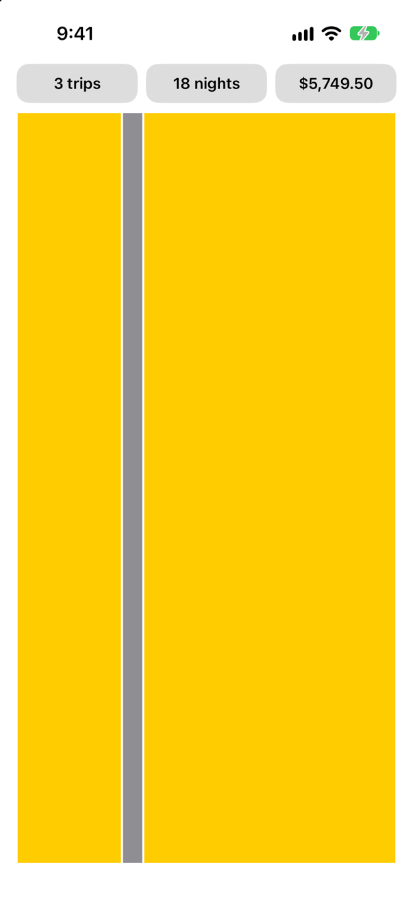
The widths are right: five eighteenths, one eighteenth, twelve eighteenths. And the bar has swallowed the screen. A GeometryReader is one of the views that takes everything it is offered. Apple's reference says it in one line: "This view returns a flexible preferred size to its parent layout." The rectangles inside it are shapes, which do the same. Nothing in that chain has a height of its own, so they all took the height on offer.
So give the reader a height — with a frame, which you now understand — and round off the ends:
struct TripSummary: View { let trips: [Trip] var body: some View { VStack(spacing: 10) { HStack { Text("^[\(trips.count) trip](inflect: true)") .padding(10) .frame(maxWidth: .infinity) .background(.quaternary, in: RoundedRectangle(cornerRadius: 12)) Text("^[\(nights) night](inflect: true)") .padding(10) .frame(maxWidth: .infinity) .background(.quaternary, in: RoundedRectangle(cornerRadius: 12)) Text(total, format: .currency(code: "USD")) .padding(10) .frame(maxWidth: .infinity) .background(.quaternary, in: RoundedRectangle(cornerRadius: 12)) } GeometryReader { proxy in HStack(spacing: 0) { ForEach(trips) { trip in Rectangle() .fill(trip.isFavorite ? Color.yellow : Color.gray) .padding(.horizontal, 1) .frame(width: proxy.size.width * Double(trip.nights) / Double(nights)) } } } .frame(height: 8) .clipShape(Capsule()) } .font(.subheadline.weight(.semibold)) .padding(.horizontal) } private var nights: Int { trips.reduce(0) { $0 + $1.nights } } private var total: Decimal { trips.reduce(0) { $0 + $1.price } }}struct TripSummary: View {
let trips: [Trip]
var body: some View {
VStack(spacing: 10) {
HStack {
Text("^[\(trips.count) trip](inflect: true)")
.padding(10)
.frame(maxWidth: .infinity)
.background(.quaternary, in: RoundedRectangle(cornerRadius: 12))
Text("^[\(nights) night](inflect: true)")
.padding(10)
.frame(maxWidth: .infinity)
.background(.quaternary, in: RoundedRectangle(cornerRadius: 12))
Text(total, format: .currency(code: "USD"))
.padding(10)
.frame(maxWidth: .infinity)
.background(.quaternary, in: RoundedRectangle(cornerRadius: 12))
}
GeometryReader { proxy in
HStack(spacing: 0) {
ForEach(trips) { trip in
Rectangle()
.fill(trip.isFavorite ? Color.yellow : Color.gray)
.padding(.horizontal, 1)
.frame(width: proxy.size.width * Double(trip.nights) / Double(nights))
}
}
}
.frame(height: 8)
.clipShape(Capsule())
}
.font(.subheadline.weight(.semibold))
.padding(.horizontal)
}
private var nights: Int {
trips.reduce(0) { $0 + $1.nights }
}
private var total: Decimal {
trips.reduce(0) { $0 + $1.price }
}
}The canvas:

| In the code | What it does |
|---|---|
GeometryReader { proxy in … } | Takes all the space it is offered, and tells its content how much that was: proxy.size. |
.frame(width: proxy.size.width * Double(trip.nights) / Double(nights)) | A segment's share of the width. This is the line that needs the number. |
.padding(.horizontal, 1), above the frame | The padding is inside the frame, so the segment is exactly its share and the color stops 1 point short at each side. That is the gap between segments. |
.frame(height: 8) on the reader | The reader takes what it is offered, so offer it 8 points. |
A GeometryReader changes the layout round it, as you have just seen, and it is the tool that people reach for too soon. Hacking with Swift's advice for the interview question "When would you use GeometryReader?" ends: "For bonus points you might want to add that GeometryReader is frequently over-used." A fraction of the screen is containerRelativeFrame. Equal shares are .frame(maxWidth: .infinity). Use the reader when a size has to be computed, as here.
Where this comes from: Hacking with Swift interview question: When would you use GeometryReader? · GeometryReader
On the screen
Put the two new views at the top of the list. In ContentView.swift:
struct ContentView: View { let store: TripStore @State private var favoritesOnly = false var body: some View { ScrollView { LazyVStack { LazyVStack(spacing: 12) { PhotoStrip(trips: store.trips) TripSummary(trips: store.trips) Toggle("Favorites only", isOn: $favoritesOnly) .padding(.horizontal) ForEach(store.trips.filter { !favoritesOnly || $0.isFavorite }) { trip in TripCard(trip: trip) } } } }}struct ContentView: View {
let store: TripStore
@State private var favoritesOnly = false
var body: some View {
ScrollView {
LazyVStack(spacing: 12) {
PhotoStrip(trips: store.trips)
TripSummary(trips: store.trips)
Toggle("Favorites only", isOn: $favoritesOnly)
.padding(.horizontal)
ForEach(store.trips.filter { !favoritesOnly || $0.isFavorite }) { trip in
TripCard(trip: trip)
}
}
}
}
}Run it (⌘R). The simulator shows
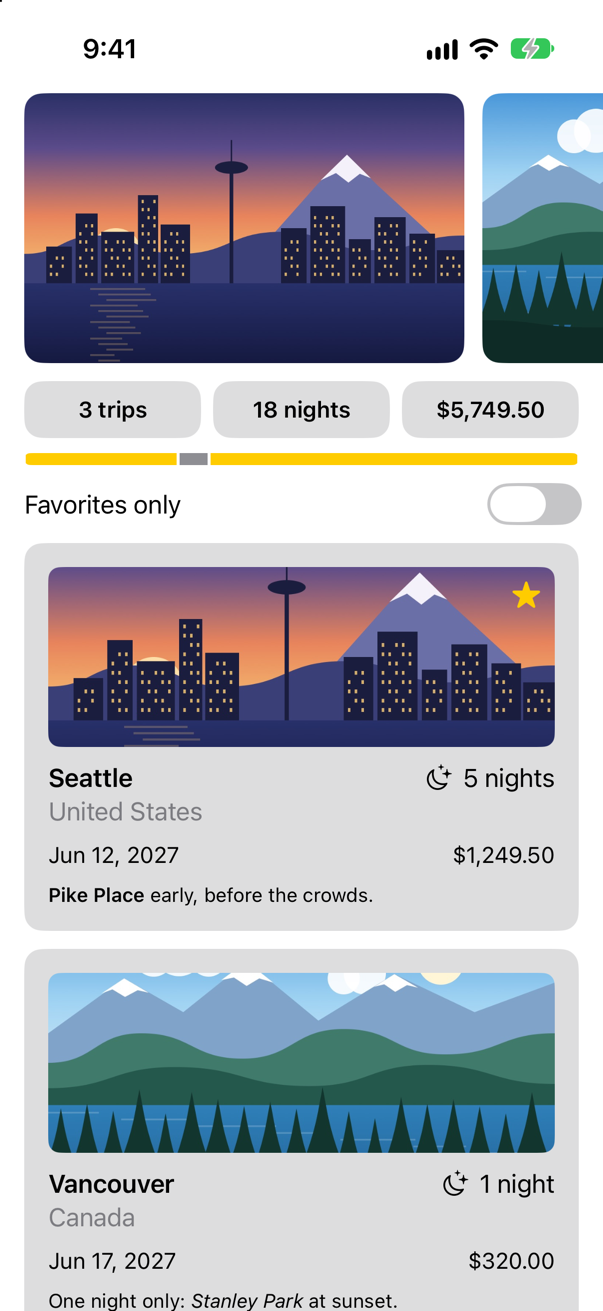
The stack has a spacing now, LazyVStack(spacing: 12), so that the strip, the summary, the switch and the cards are evenly apart. Now put a finger on the strip, drag it a little way to the left, and let go:
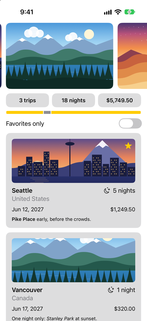
A short drag was enough, and the strip did not stop half-way: that is .viewAligned. Scroll the list up and down as well. The strip that scrolls sideways lives happily inside the list that scrolls up and down, and each picture is still four fifths of the width, because its nearest container is the strip and not the list.
What you built
Watch, a container that prints what a view is offered and what it takes.PhotoStrip: pictures four fifths of the screen wide on any device, withcontainerRelativeFrame.TripSummary: three equal tiles made with.frame(maxWidth: .infinity), and a bar that aGeometryReaderdivides in proportion.- A reason for each of them: propose, choose, place.
You moved one line in this lesson and the tiles changed. The next lesson is about why: what a modifier is, why their order matters everywhere, and how to give the three lines you typed three times a name of their own. Then grids — and the inside of Watch.
The finished project
Stuck, or want to compare with your own? This is the project as it stands at the end of this lesson, built and run before it was put here.
- Trips-lesson-10.zip — unzip it, then open
Trips.xcodeprojin Xcode.
Flash cards
20 cards for this lesson, each labelled with its topic. 11 ask how you would write something; the other 9 are trick questions, written to catch a misunderstanding. Answer in your head first, then tap the card.
Syntax · FramesMake a view as wide as its container, with its content at the leading edge.

.frame(maxWidth: .infinity, alignment: .leading). The frame takes all the width it is offered, and the alignment says where in the frame the view sits. The view itself is no wider than before.
Syntax · FramesPut a view in a box 200 points wide and 80 tall, in the box's bottom trailing corner.
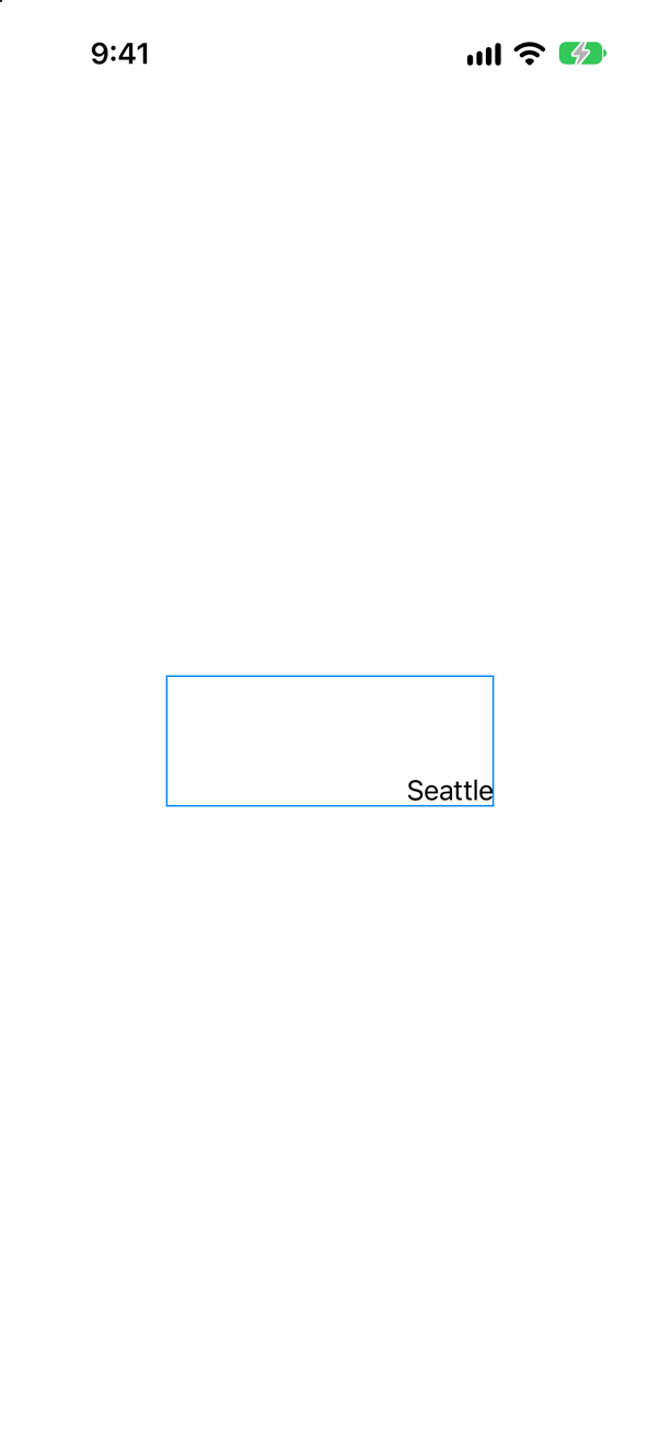
.frame(width:height:alignment:). A frame is a view with one child. It offers the child its own size and places it by the alignment — in the center, unless you say otherwise.
Syntax · TextA text that keeps its whole sentence on one line, whatever width it is offered.

.fixedSize(). The text takes its ideal size and ignores the offer. Here it is offered 150 points and sticks out of the blue frame on both sides, so use it only where you know there is room.
Syntax · TextA long text in a place that offers too little height. Let it wrap at the width it is given, and take every line it needs.
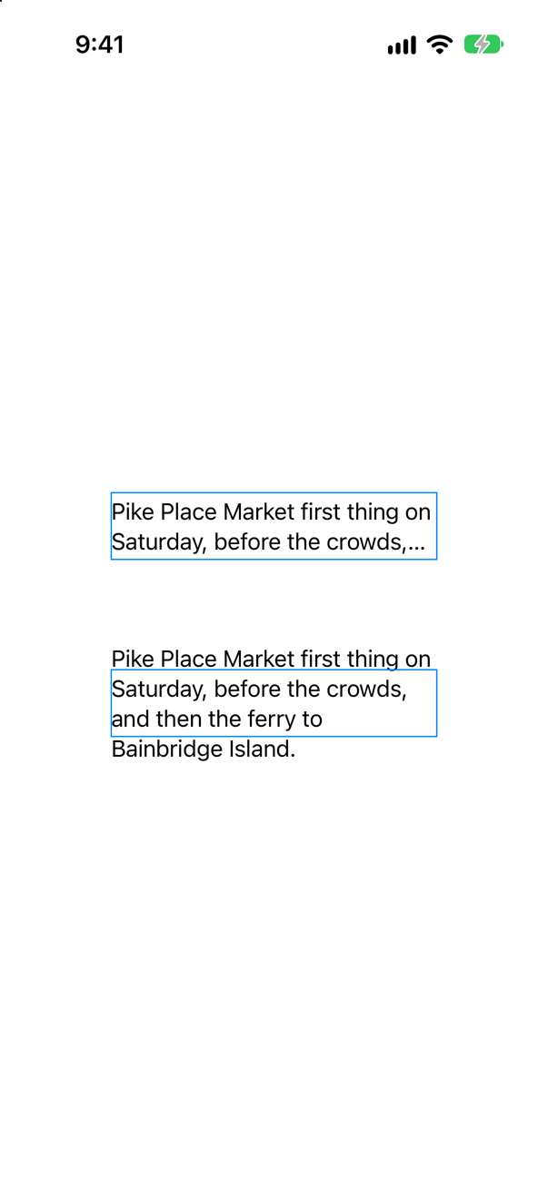
.fixedSize(horizontal: false, vertical: true): fixed at its ideal size up and down only. The width is still the one it is offered, so it wraps; the height is whatever its lines need, so nothing is cut off (the lower text; the upper is the same text without the modifier). It is the usual cure for a text that ends in "…" when it had room to grow.
Syntax · StacksTwo texts in a row that is too narrow for both. Make the second the one that stays whole.

.layoutPriority(1). Every view starts at priority 0. A stack offers its space to the children with the highest priority first, and the others share what is left.
Syntax · FramesThree views in a row, each exactly a third of the width.

.frame(maxWidth: .infinity) on each. Three children that are equally willing to stretch are given equal shares. Without the frames, each would be as wide as its own words.
Syntax · ContainersIn a scroll view that scrolls sideways, make each card four fifths of the scroll view's width.
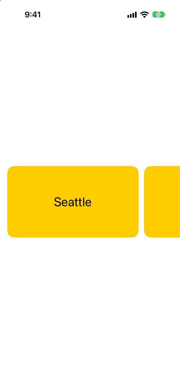
.containerRelativeFrame(.horizontal, count: 5, span: 4, spacing: 12): divide the container's width into 5 columns with 12 points between them, and take 4. The container is the nearest scroll view — not the stack the view happens to be in.
Syntax · GeometryReaderDraw a bar that is 40% as wide as the space it is in, whatever that turns out to be.

A GeometryReader: proxy.size is the size the reader was given. The reader takes everything it is offered, which is why it needs .frame(height: 8). Below it in the picture is the same value in the system's own ProgressView(value: 0.4) — for a plain progress bar, use that.
Syntax · ButtonsA button whose colored background is as wide as the screen.

The frame goes on the label, inside the button. The style draws its background round the label, so a wide label makes a wide button.
Syntax · ShapesA rectangle as wide as it is allowed to be, and always 16 to 9.
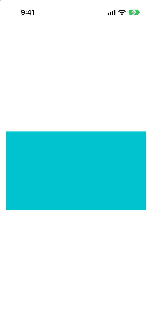
.aspectRatio(16 / 9, contentMode: .fit). A shape takes all the space it is offered. This modifier makes it take the largest piece of that space that has the right proportions.
Syntax · FramesA view that is never smaller than 44 by 44 points, but may be larger.

.frame(minWidth: 44, minHeight: 44). A minimum, not a size: content that needs more still gets it. On the left, the same star without the frame. Apple's guidelines: "a button needs a hit region of at least 44x44 pt".
Trick question · FramesText("Seattle").frame(width: 200, height: 80). How large is the text now?
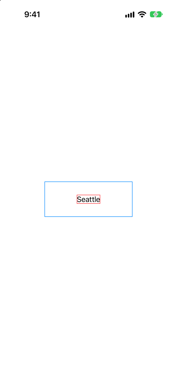
The size it always was (the red border). The frame is a separate view of 200 by 80 (the blue border), with the text placed in its middle. No parent can make a child a size that the child does not choose.
Trick question · FramesThe same three modifiers in two orders: padding, a yellow background, a frame 200 points wide — or padding, the frame, the background. Which yellow box is 200 points wide?
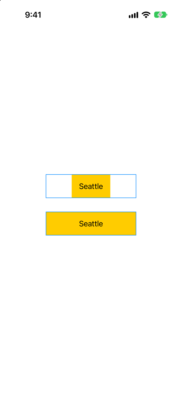
The second. A background is as large as the view it is put on. In the first, that view is the padded text; the frame comes afterward and only surrounds the yellow box. In the second, the frame is already there when the background arrives. (The blue border is the frame, both times.)
Trick question · Safe areaColor.red is the whole of body. How much of the screen is red?

All of it except a band at the top and one at the bottom. A color takes everything it is offered, and a view is offered the safe area: the screen less the status bar and the home indicator. Color.red.ignoresSafeArea() reaches the edges.
Trick question · ButtonsA .borderedProminent button, and after the style, .frame(maxWidth: .infinity). Is the blue part as wide as the screen?

No (the upper one). The frame is as wide as the screen — the red border — and the finished button sits in the middle of it, as small as it was. To widen the button, put the frame on its label (the lower one).
Trick question · GeometryReaderA GeometryReader with one small text in it, between two other texts in a VStack. How tall is the reader, and where in it is the small text?
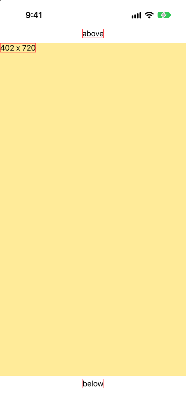
As tall as everything that was left — the text in it reports the size the reader was given, 402 by 720 — and the text is in the top leading corner. A reader takes all the space it is offered, and it does not center its content as other containers do.
Trick question · Position.offset(y: 30) on the second of five texts in a column. Does the third text move down to make room?
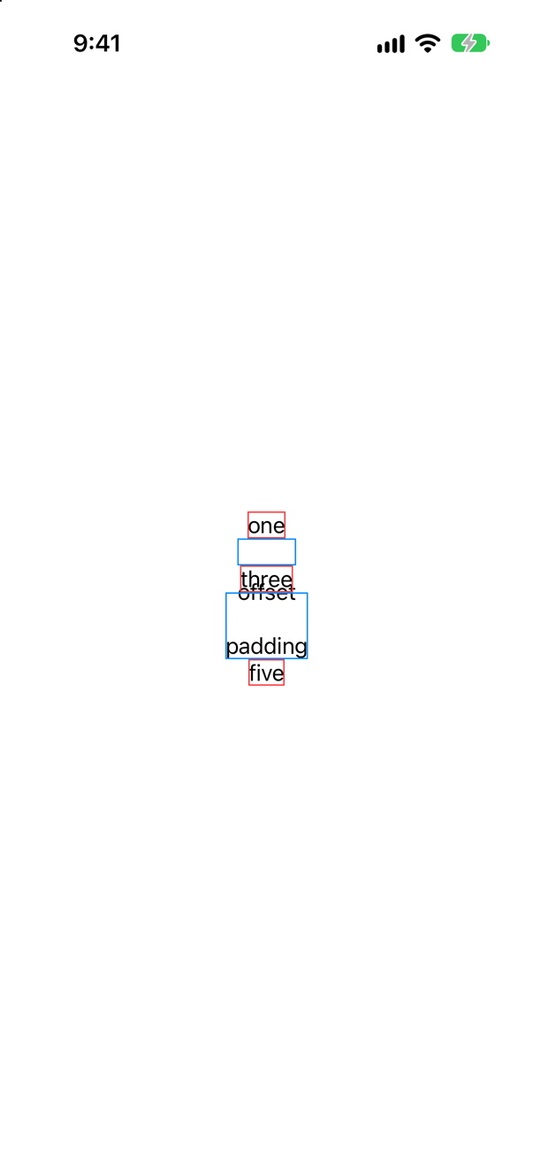
No. offset moves where a view is drawn, after layout is over: the word "offset" lands on top of "three". Its blue border was added after the offset, and shows the place that layout kept for it. padding(.top, 30) on the fourth is layout: everything below it moved.
Trick question · FramesA text in a frame of 300 by 60 (red), and round that a frame of 100 by 30 (blue). Which size do the neighbors see?
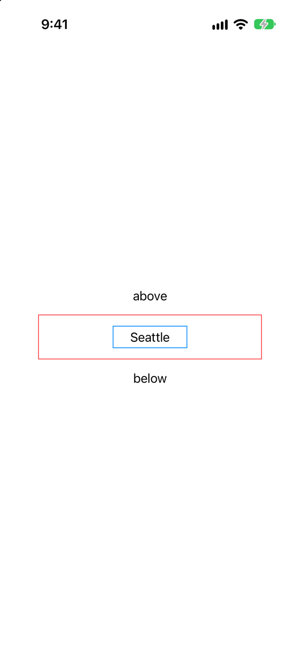
100 by 30: the outer frame. The inner frame is still 300 by 60 and sticks out of the outer one on every side. The texts above and below are placed against the blue box, 30 points from it, and never hear about the red one.
Trick question · Scroll viewsA text with .frame(maxWidth: .infinity) and a yellow background, inside a ScrollView(.horizontal). How wide is the yellow?

As wide as the word. maxWidth: .infinity means "all the width I am offered", and sideways a horizontal scroll view offers none: its content may be as wide as it likes. With no offer to take, the frame is the size of its child. Here the tool is containerRelativeFrame(.horizontal).
Trick question · FramesA short text with .frame(maxWidth: 100). Is the frame as wide as the text, or 100 points?
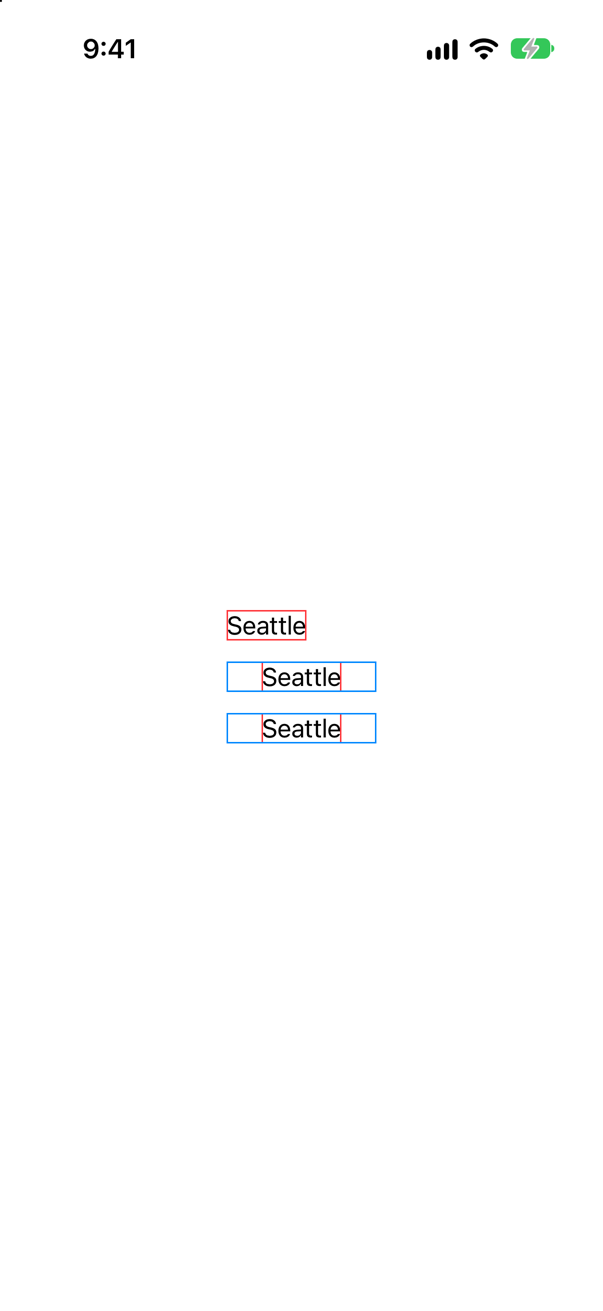
100 points (the second line). A maximum is not only a limit. A frame with a maximum takes the width it is offered, up to that maximum — and it is offered the whole screen. .frame(minWidth: 100), the third line, also comes to 100, for the other reason: the text is smaller than the minimum.
Edge cases and tricky questions
10 questions of the kind an interviewer uses to find out whether you really know this — the corners, the traps, and the things that changed recently. Each has its source. Wherever the answer is what some code does, that code was compiled and run, and what you see under “Show the answer” is what it really did. Say your answer aloud before you open it.
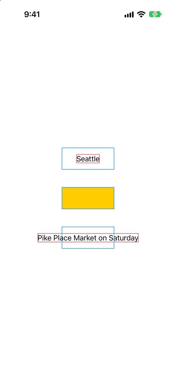
Three children, each in a frame of 120 by 50: a short text, a color, and a long text with .fixedSize(). Watch, from this lesson's tutorial, prints what each is offered and what it takes. Predict the three lines.
Show the answer
The console showed
a text: offered 120 x 50, takes 53 x 20
a color: offered 120 x 50, takes 120 x 50
a fixed text: offered 120 x 50, takes 231 x 20
The same offer three times, and three answers: less, exactly, and more. That is the second of the three steps, and it is the one to be exact about in an interview. The interview-preparation repository's whole answer to "How does SwiftUI layout work?" is one line — "Parent proposes a size, child chooses its size, parent positions it" — and the word that carries the weight is chooses. WWDC19: "in SwiftUI there's no way to force a size on your child, the parent has to respect that choice."
Then say what a frame is for, since it cannot force. It does two things. It makes an offer, which most views accept: a color, a shape, a wrapping text, a resizable image. And it is itself a fixed size for its parent. The three blue boxes are 120 by 50 whatever is inside them, which is why the long text can stick out of the third without moving anything else on the screen.
The third child is not misbehaving. fixedSize() is a view's way of declining, and Apple describes it in exactly those terms: "the creation of a counter proposal to the view size proposed to a view by its parent."
Where this comes from: WWDC19: Building Custom Views with SwiftUI (2019 — still the clearest account of how layout works) · ProposedViewSize · frame(width:height:alignment:) · fixedSize() · Senior iOS Interview Preparation (GitHub) — WWDC19, “Building Custom Views with SwiftUI”. Apple, ProposedViewSize: "views choose their own size, but they do that in response to a size proposal from their parent view."
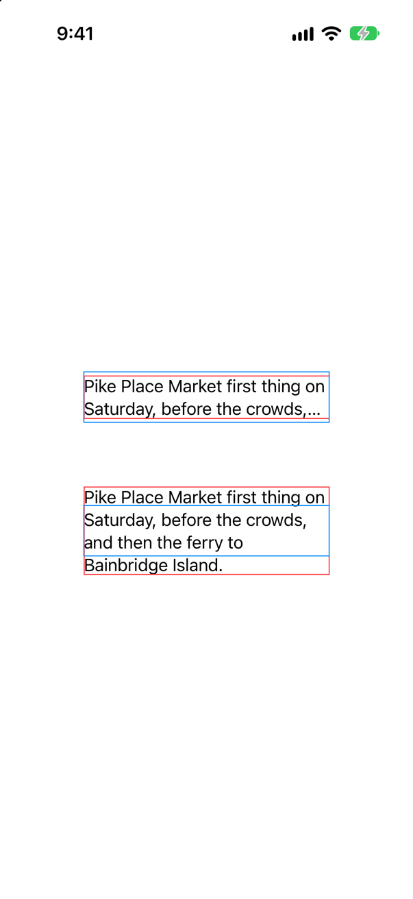
A note in a box 240 points wide and 50 tall ends in "…", though the design lets the text run on below the box. One modifier makes the text take all the lines it needs. Which — and what was the text offered, before and after?
Show the answer
The console showed
as it comes: offered 240 x 50, takes 240 x 42
fixed vertically: offered 240 x 50, takes 240 x 86
.fixedSize(horizontal: false, vertical: true). Both were offered 240 by 50. The first did what a text does with too little room: two lines fit in 50 points, so it kept two and marked the cut with an ellipsis. Nothing limited its lines; the height did.
The second was offered the same, as the console shows, because Watch is outside the modifier. What the modifier does is to pass the offer on with its height taken out: "be as tall as you like." The text wrapped at 240 points as before and took the four lines it needed, 86 points, out through the bottom of the blue frame. Apple: it "fixes this view at its ideal size in the specified dimensions", and "this can result in the view exceeding the parent's bounds, which may or may not be the effect you want."
In real code the box is seldom a frame you wrote. It is a row, a cell or a card whose height comes from somewhere else. The symptom is the same — a text ending in "…" that had room to grow — and so is the cure. .lineLimit(nil) does not help: there was no line limit to remove.
Where this comes from: fixedSize(horizontal:vertical:) · fixedSize() — Apple, fixedSize(horizontal:vertical:).
The design wants "Book this trip" as wide as the screen. A colleague adds .frame(maxWidth: .infinity) to the button, and the blue stays small. Why — and if the user taps the empty part of that wide frame, does the button fire?
Show the answer

Read the first one from the top, as SwiftUI does: a button; a style that draws a blue capsule round its label; and then a frame. The frame really is as wide as the screen — that is the red border. Inside it is a finished button, exactly as large as its label needs, placed in the middle. A frame is a view. It makes an offer to its child, and a button that is offered more than it needs takes what it needs.
In the second the frame is on the label. Now the label itself is a view that takes all the width it is offered, and the style draws its capsule round that. The same modifier with the same value: the only difference is which view it wraps.
And the tap. The first arrangement, alone on the screen, was tapped twice: once in the empty part of the frame, well to the left of the blue, and once on the blue.

The console showed, after both taps
bookedOne line, from the second tap. The frame is empty space round the button, not part of it: making a view's frame larger does not make the view larger, on the screen or under a finger. The next lesson has the tool for the other case, where a view should answer to taps over an area larger than what it draws.
Where this comes from: frame(minWidth:idealWidth:maxWidth:minHeight:idealHeight:maxHeight:alignment:) · WWDC19: Building Custom Views with SwiftUI (2019 — still the clearest account of how layout works) — WWDC19: "the frame is not a constraint in SwiftUI, it's just a view which you can think of like a picture frame."
Two ways to keep "12 nights in November" whole in a row that is too narrow for both texts: .layoutPriority(1) and .fixedSize(). In a row 300 points wide they look alike. What is the difference — and what does each do in a row of 150?
Show the answer
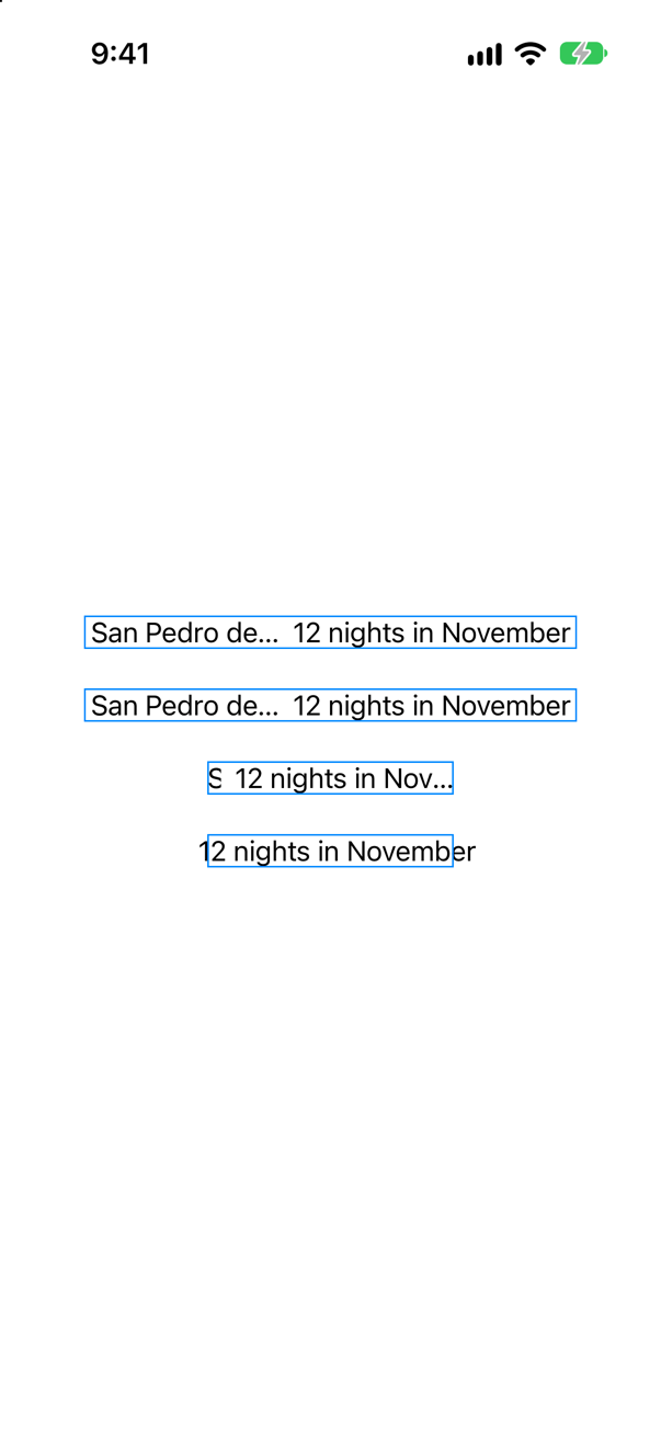
At 300 points both do the job: the nights are whole, and the name gives way. They get there by different roads.
A priority changes the order of the offers. Apple: "A parent layout offers the child views with the highest layout priority all the space offered to the parent minus the minimum space required for all its lower-priority children." The text is still an ordinary text, which takes what it needs if that much is on offer and truncates if it is not.
A fixed size changes the answer. The text takes its ideal width whatever it is offered.
At 150 points, where the nights do not fit even alone, the roads part. With the priority (third row) the nights are offered nearly all of the row and truncate inside it, and the name is down to its first letter. With the fixed size (fourth row) the nights take their full width anyway and stick out of the blue border on both sides, and there is nothing left of the name at all.
So: layoutPriority when a view should win the argument and still behave, which is nearly always what you want. fixedSize when it must never be cut, and you would rather break the layout than the text. And for a one-line label that may shrink a little first, Apple offers a third tool: "Use the minimumScaleFactor(_:) modifier if the text you place in a view doesn't fit and it's okay if the text shrinks to accommodate."
Where this comes from: layoutPriority(_:) · fixedSize() · minimumScaleFactor(_:) · WWDC19: Building Custom Views with SwiftUI (2019 — still the clearest account of how layout works) — Apple, layoutPriority(_:).
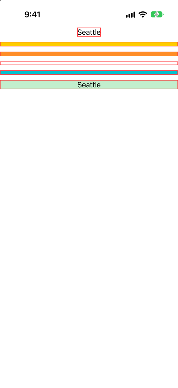
Inside a ScrollView, six views are each offered a width and no height at all. How tall is each: a text, a color, a GeometryReader, a Spacer, a capsule — and a text in .frame(maxWidth: .infinity, maxHeight: .infinity)?
Show the answer
The console showed
1 text: offered 402 x nothing, takes 53 x 20
2 color: offered 402 x nothing, takes 402 x 10
3 reader: offered 402 x nothing, takes 402 x 10
4 spacer: offered 402 x nothing, takes 402 x 8
5 capsule: offered 402 x nothing, takes 402 x 10
6 wide frame: offered 402 x nothing, takes 402 x 20
A scroll view cannot offer a height: its content is allowed to be as tall as it likes. So in that direction it offers nothing — in the API, nil, the unspecified proposal. Apple lists what a view does with each of the special offers: "The zero proposal; the view responds with its minimum size. The infinity proposal; the view responds with its maximum size. The unspecified proposal; the view responds with its ideal size."
Every view has an ideal size, and for the views that normally take everything it is small and arbitrary: 10 points for a color, a shape and a GeometryReader, and 8 for a spacer. For a text it is the size of its words. And the frame with maxHeight: .infinity has no offer to take all of, so it is as tall as its text: 20 points.
This one fact explains a family of bug reports. "My background color is a thin line in a scroll view." "My GeometryReader has no height." "My Spacer does nothing." "maxHeight: .infinity does not work." Each relies on an offer that a scroll view does not make. The cure is to say a height in some other way: .frame(height:), .aspectRatio(…), or .containerRelativeFrame(.vertical), which asks the scroll view itself how tall it is.
Where this comes from: ProposedViewSize · ScrollView · GeometryReader — Apple, ProposedViewSize.
"When would you use GeometryReader?" is a standard question. Start with what it does to a layout. A reader with one text in it, between two other texts: what is on the screen?
Show the answer
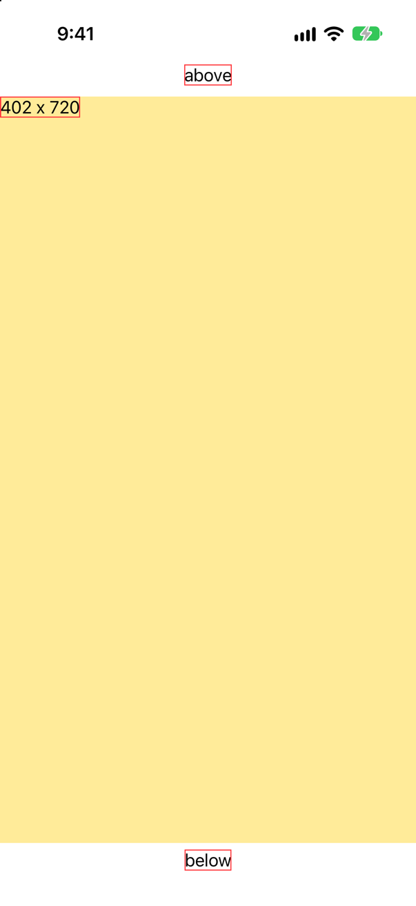
The reader took everything that was left, 402 by 720, and pushed "below" to the bottom of the screen. And its text is not in the middle of that space but in the top leading corner. Those are the two surprises. Apple's reference: "This view returns a flexible preferred size to its parent layout" — in practice, all of it — and, unlike a stack or a frame, a reader does not center what is in it.
A third surprise, when the same thing is put in a scroll view:
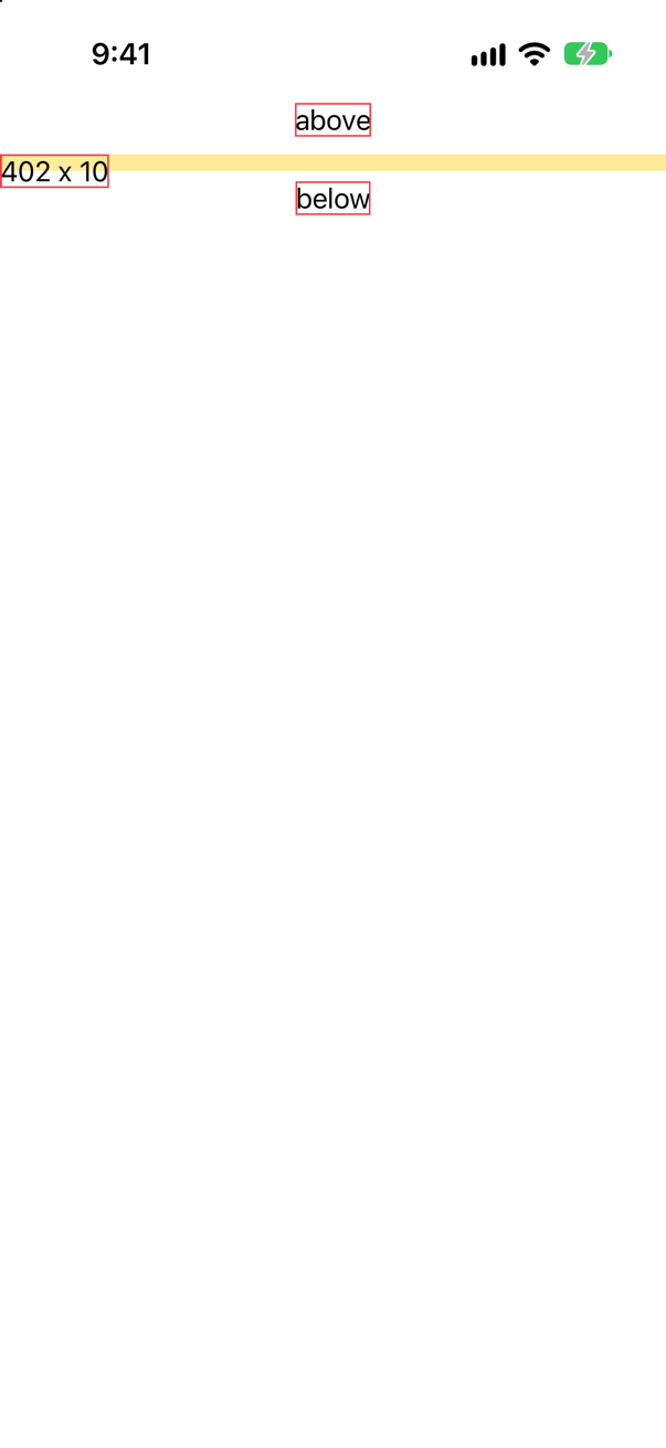
ScrollView: the reader is 10 points tall, and its text hangs out of itScreenshot · iPhone 17, iOS 27.0Offered no height, the reader falls back on its ideal size, which is 10 points. A reader's size depends entirely on what it is offered, which is why it so often "works in one place and breaks in another".
Now the question. Hacking with Swift's suggested answer: "GeometryReader allows us to read the size and location of a view, which means we can create proportional layouts or create adaptive modifiers that change their values as a view moves around the screen. For bonus points you might want to add that GeometryReader is frequently over-used."
The bonus points are the part to prepare, because most of its old jobs have better tools now.
| You want | Use |
|---|---|
| A fraction of the screen, or of a scroll view | containerRelativeFrame |
| Equal shares of a row | .frame(maxWidth: .infinity) on each |
| One arrangement if it fits, another if not | ViewThatFits |
| To know when a view's size or position changes | onGeometryChange(for:of:action:), which does not change the layout |
| An effect that depends on where a view is | visualEffect, which hands you a proxy without a reader |
| A container with rules of its own | the Layout protocol (the next lesson) |
What is left is what this lesson's tutorial used it for: drawing something whose shape is computed from the space, like the bar. Give it an explicit size when you do. The interview-preparation repository lists "deep GeometryReader / nested layouts" among the things that make scrolling slow.
Where this comes from: Hacking with Swift interview question: When would you use GeometryReader? · GeometryReader · onGeometryChange(for:of:action:) · visualEffect(_:) · Senior iOS Interview Preparation (GitHub) — Hacking with Swift: “When would you use GeometryReader?”
Three ways to give a screen a pale blue background: .background(.blue.opacity(0.3)); .background { Color.blue.opacity(0.3) }; and the second again, with .ignoresSafeArea() on the color. The view is the same each time: a text in a frame that fills the screen. Which of the three reach under the status bar and the home indicator?
Show the answer

.background(.blue.opacity(0.3)), a style: the whole screenScreenshot · iPhone 17, iOS 27.0The first reaches the edges. It is the form of background that takes a style, and Apple says of it: "By default, the background ignores safe area insets on all edges, but you can provide a specific set of edges to ignore, or an empty set to respect safe area insets on all edges."

.background { Color.blue.opacity(0.3) }, a view: the safe area onlyScreenshot · iPhone 17, iOS 27.0The second does not. With braces, the background is a view, and a view is laid out like any other: inside the safe area. "By default, the SwiftUI layout system sizes and positions views to avoid certain safe areas." The only difference between the first call and the second is a pair of braces.

.ignoresSafeArea(): the whole screen againScreenshot · iPhone 17, iOS 27.0The third puts it right by saying so, on the color and on nothing else.
That is the rule to take away: ignore the safe area for backgrounds, never for content. ignoresSafeArea() on the stack that holds a screen's text is the quick fix that puts a title under the clock.
Where this comes from: background(_:ignoresSafeAreaEdges:) · ignoresSafeArea(_:edges:) — Apple, background(_:ignoresSafeAreaEdges:) and ignoresSafeArea(_:edges:).
Five texts in a column with no spacing. The second has .offset(y: 30) and the fourth .padding(.top, 30); each of the two has a blue border, added after the modifier. Where does everything end up?
Show the answer
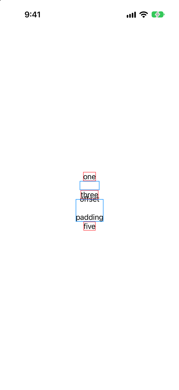
The word "offset" is drawn 30 points lower, on top of "three". Its blue border is still between "one" and "three", round an empty space, and "three" has not moved. Apple: "The original dimensions of the view aren't changed by offsetting the contents". Layout runs first, with the view where it was. The offset is applied afterward, when the view is drawn. The border came after the offset in the code, so it wraps the view as layout sees it: unmoved.
padding is layout. The fourth view really is 30 points taller, its border shows that, and "five" has moved down to make room.
So an offset is for moving how something looks without disturbing its neighbors — a nudge, a badge that overhangs a corner, the travel of an animation. It is also a way to make two views overlap by accident, because nothing makes room for where the view now appears. If the neighbors should make room, it was padding, a spacer or an alignment that you wanted.
Where this comes from: offset(x:y:) · Making fine adjustments to a view’s position — Apple, offset(x:y:).
A panel with 40 points of padding holds three bars. The first should be half as wide as the panel, and uses containerRelativeFrame(.horizontal) { width, _ in width / 2 }. The second uses containerRelativeFrame(.horizontal) alone. The third uses .frame(maxWidth: .infinity). How wide is each, on a screen 402 points wide?
Show the answer
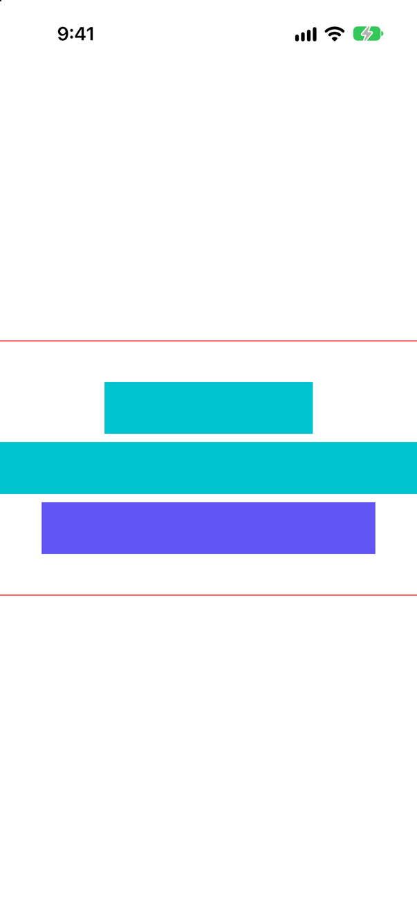
The widths, printed by the app (measured records a view's size, and they are printed a second later)
1 half of the container: 201 points wide
2 the whole container: 402 points wide
3 maxWidth: .infinity: 322 points wide
Half of the screen, not half of the panel. "The nearest container" does not mean the parent. Apple lists what counts as one: "The window presenting a view on iPadOS or macOS, or the screen of a device on iOS", a column of a NavigationSplitView, a NavigationStack, a tab of a TabView, and "a scrollable view like ScrollView or List". A stack with padding is not on the list.
So the second bar, which asks for the whole container, is 402 points wide and runs straight through the panel's padding, from one edge of the screen to the other. The third is an ordinary flexible frame. It takes what it is offered, which is the 322 points inside the padding.
The modifier is for the cases where the offer is no use, and a scroll view is the first of them. There the arithmetic matters, and the padding does too:
The console showed
1 with safeAreaPadding on the scroll view: 293.6 points wide
2 with padding on the content: 319.2 points wide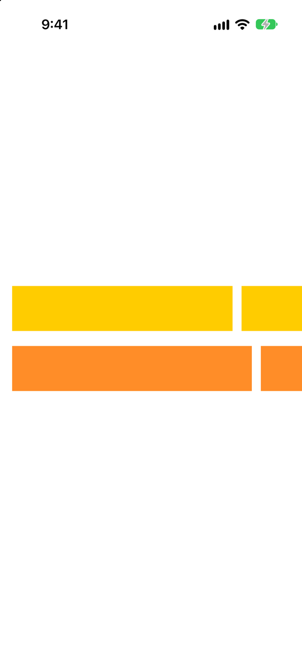
count: 5, span: 4, spacing: 12 twice: 293.6 points with safeAreaPadding, 319.2 withoutScreenshot · iPhone 17, iOS 27.0Apple gives the formula: the container's width, less the gaps between columns, divided by count, times span, plus the gaps that the span covers. With nothing subtracted that is (402 − 48) ÷ 5 × 4 + 36 = 319.2. And "the size provided to this modifier is the size of a container … subtracting any safe area insets". safeAreaPadding adds 16 points a side to the scroll view's safe area, so the container counts as 370: (370 − 48) ÷ 5 × 4 + 36 = 293.6. Ordinary padding on the content is not a safe area, and changes nothing.
For a fraction of a parent this is the wrong tool: use a GeometryReader, or a layout of your own.
Where this comes from: containerRelativeFrame(_:alignment:) · containerRelativeFrame(_:count:span:spacing:alignment:) — Apple, containerRelativeFrame(_:alignment:).
One short text, a little over 53 points wide, on a screen 402 points wide, in six different frames. How wide is each frame?
Show the answer
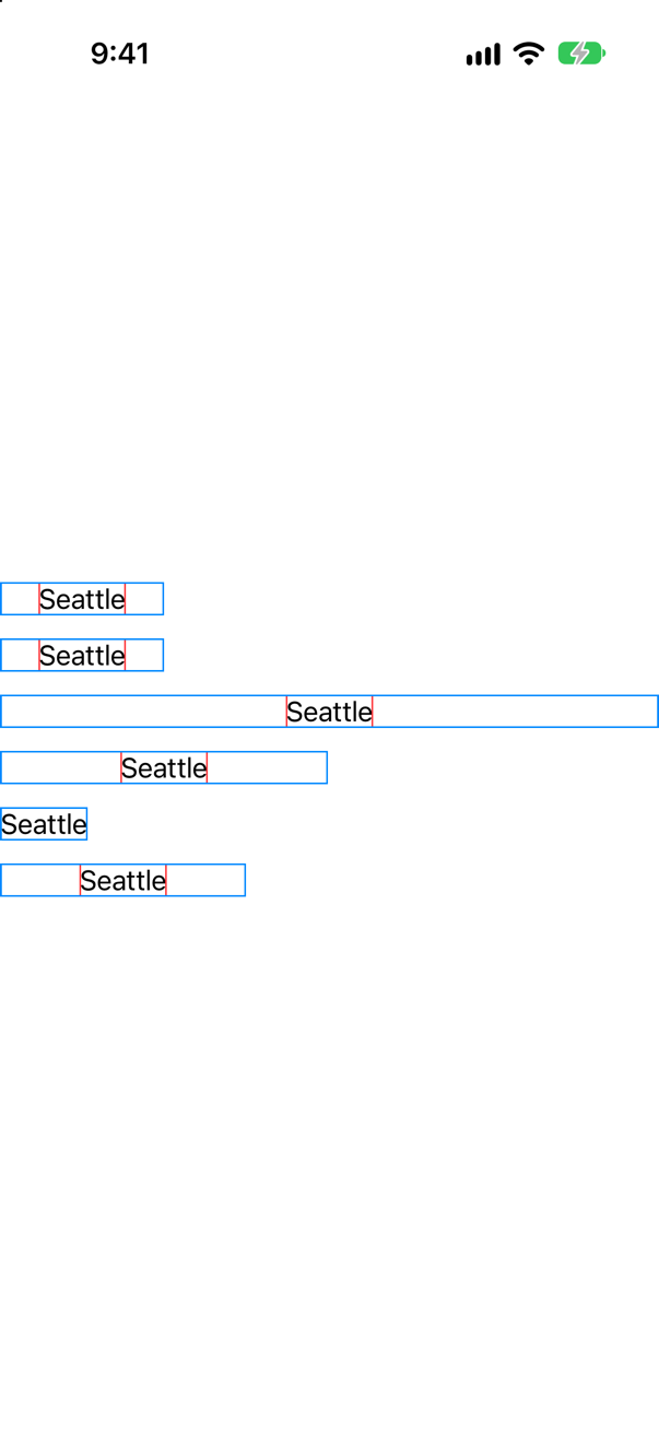
The widths, printed by the app
1 minWidth: 100: 100 points wide
2 maxWidth: 100: 100 points wide
3 maxWidth: .infinity: 402 points wide
4 minWidth: 100, maxWidth: 200: 200 points wide
5 idealWidth: 150: 53.3 points wide
6 idealWidth: 150, then fixedSize(): 150 points wide
The second line is the one that people get wrong. A maximum is not only a limit on the child. A frame with a maximum is a view that takes what it is offered, up to the maximum: it was offered 402, so it is 100. That is also all there is to maxWidth: .infinity in the third line: the same rule with no upper end, so the frame is as wide as the offer. Nothing about infinity is special.
Apple's reference states the rule for one constraint at a time. With a maximum, when "the size proposed for the frame by the parent is greater than the size of this view", the frame is "the proposed size, clamped to that maximum." With a minimum, a frame that is offered less than its child wants takes the offer, but never less than the minimum. And with both, as in the fourth line, the frame "unconditionally adopts the size proposed for it, clamped to the constraints": offered 402, it is 200.
The first line shows the plain use of a minimum: a frame is never smaller than it, whatever is inside. That is the 44-point tap target.
The ideal width, in the fifth line, did nothing at all. An ideal size is what a view takes when it is offered nothing — and here it was offered the screen. Take the offer away, with .fixedSize() or by putting the view in a scroll view, and the ideal size is what you get: 150, in the last line. This is how a view of your own can say what size it would like to be when nobody tells it.
Where this comes from: frame(minWidth:idealWidth:maxWidth:minHeight:idealHeight:maxHeight:alignment:) · fixedSize() — Apple, frame(minWidth:idealWidth:maxWidth:minHeight:idealHeight:maxHeight:alignment:).