Modifiers, grids, and a layout of your own
View modifiers, and why their order matters · Grids and custom layouts
You will buildNames for the styling you keep repeating, a row of filter chips in place of the switch, a table whose columns line up, a list that becomes two columns when there is room — and, when the chips no longer fit in one row, a container that you write yourself.
TimeAbout 110 minutes
WhyTwo subjects in this lesson, and one idea under both. In the last lesson you saw that a frame is a view which holds another view. That is true of every modifier: each one wraps what is above it, which is why their order matters, and why a group of them can be given a name and used again. The same question — who holds whom, and who decides the size — is all there is to a grid, and to a layout of your own. In UIKit these were separate crafts: appearance proxies and subclasses for styling, UICollectionView and its layouts for grids. Here they are the same few rules.
Open your project
Open your
Tripsproject as lesson 10 left it: double-clickTrips.xcodeprojin Finder, or use File ▸ Open… (⌘O) in Xcode.If you did not finish lesson 10, or would rather start from a known state, download Trips-lesson-10.zip instead. It is the project exactly as it stood at the end of lesson 10. Unzip it and open
Trips.xcodeproj.Run it (⌘R) to check that it builds. You should see where lesson 10 ended:
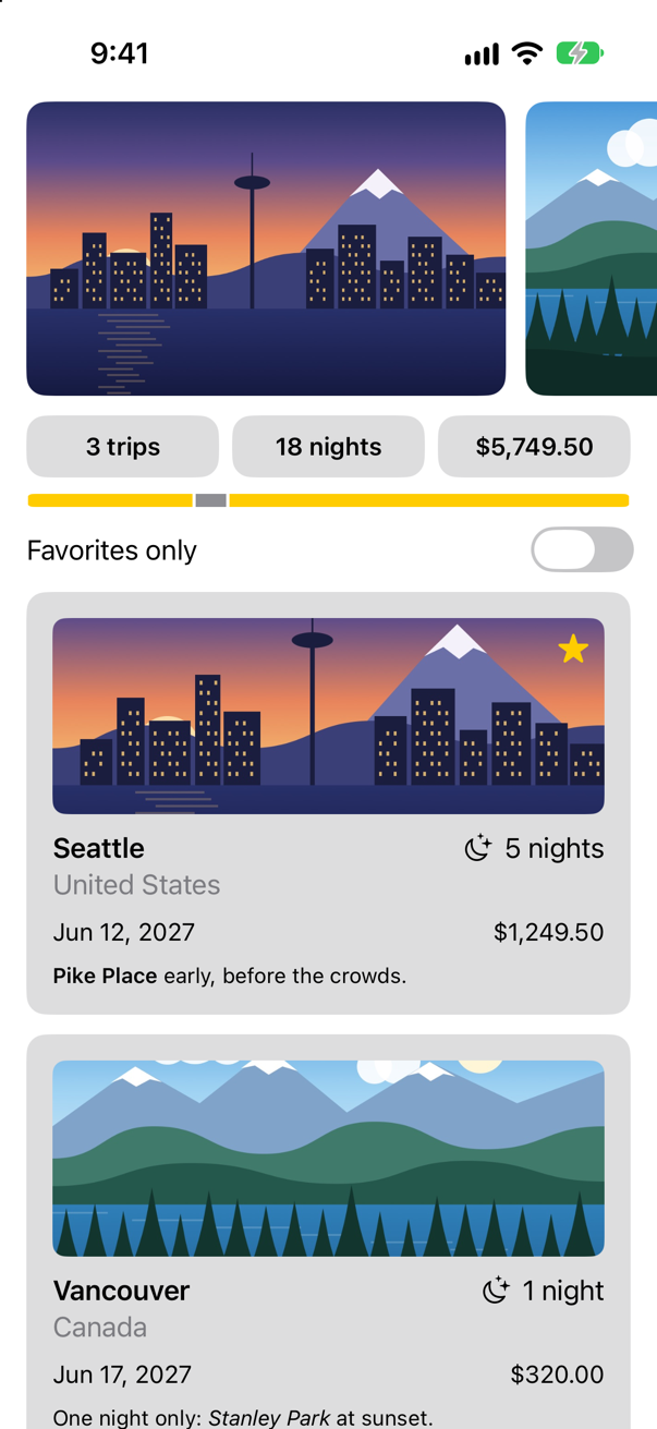
Trips, as it stood at the end of lesson 10Screenshot · iPhone 17, iOS 27.0
A name for three lines
Open TripSummary.swift. Each of the three texts is followed by the same three lines: padding, a frame, a background. In the last lesson you found out that their order matters. Now look at what the lines are.
A modifier is a method, and what it returns is a new view with the old one inside it. Apple: "Modifiers return a view that wraps the original view and replaces it in the view hierarchy." Text("…").padding(10) is not a text whose padding has been set to 10. It is a padding view that holds a text. Add .frame(maxWidth: .infinity) and you have a frame that holds a padding view that holds a text; add the background, and that is wrapped in turn. "You commonly chain modifiers, each wrapping the result of the previous one."
ModifiedContent becomes nodes of its own in SwiftUI's graph: the type after every modifier, and the sixteen nodes one chain of four makes, with what each reads.Open the guide →
A chain that you write more than once deserves a name. Make a new Swift File named Styles, and replace everything in it:
import SwiftUI

/// The gray tile round a figure in the summary.
struct Tile: ViewModifier {
    func body(content: Content) -> some View {
        content
            .padding(10)
            .frame(maxWidth: .infinity)
            .background(.quaternary, in: RoundedRectangle(cornerRadius: 12))
    }
}

extension View {
    func tile() -> some View {
        modifier(Tile())
    }
}| In the code | What it is |
|---|---|
struct Tile: ViewModifier | A modifier of your own. Apple: "Adopt the ViewModifier protocol when you want to create a reusable modifier that you can apply to any view." |
func body(content: Content) -> some View | Its one requirement. content stands for whatever view the modifier is put on, and what you return is what replaces it. |
extension View { func tile() … } | Not required, and always done. It lets you write .tile(), as you write .padding(), in place of .modifier(Tile()). |
Now use it. In TripSummary.swift:
struct TripSummary: View { let trips: [Trip] var body: some View { VStack(spacing: 10) { HStack { Text("^[\(trips.count) trip](inflect: true)") .padding(10) .frame(maxWidth: .infinity) .background(.quaternary, in: RoundedRectangle(cornerRadius: 12)) .tile() Text("^[\(nights) night](inflect: true)") .padding(10) .frame(maxWidth: .infinity) .background(.quaternary, in: RoundedRectangle(cornerRadius: 12)) .tile() Text(total, format: .currency(code: "USD")) .padding(10) .frame(maxWidth: .infinity) .background(.quaternary, in: RoundedRectangle(cornerRadius: 12)) .tile() } GeometryReader { proxy in HStack(spacing: 0) { ForEach(trips) { trip in Rectangle() .fill(trip.isFavorite ? Color.yellow : Color.gray) .padding(.horizontal, 1) .frame(width: proxy.size.width * Double(trip.nights) / Double(nights)) } } } .frame(height: 8) .clipShape(Capsule()) } .font(.subheadline.weight(.semibold)) .padding(.horizontal) } private var nights: Int { trips.reduce(0) { $0 + $1.nights } } private var total: Decimal { trips.reduce(0) { $0 + $1.price } }}struct TripSummary: View {
let trips: [Trip]
var body: some View {
VStack(spacing: 10) {
HStack {
Text("^[\(trips.count) trip](inflect: true)")
.tile()
Text("^[\(nights) night](inflect: true)")
.tile()
Text(total, format: .currency(code: "USD"))
.tile()
}
GeometryReader { proxy in
HStack(spacing: 0) {
ForEach(trips) { trip in
Rectangle()
.fill(trip.isFavorite ? Color.yellow : Color.gray)
.padding(.horizontal, 1)
.frame(width: proxy.size.width * Double(trip.nights) / Double(nights))
}
}
}
.frame(height: 8)
.clipShape(Capsule())
}
.font(.subheadline.weight(.semibold))
.padding(.horizontal)
}
private var nights: Int {
trips.reduce(0) { $0 + $1.nights }
}
private var total: Decimal {
trips.reduce(0) { $0 + $1.price }
}
}Open the canvas (⌥⌘↩):

.tile(): nothing has changed on the screenScreenshot · iPhone 17, iOS 27.0Nine lines have become three, the picture is the same, and the look of a tile now lives in one place. Change the corner radius in Tile and all three change.
Chips, and a tap that goes missing
The switch that says "Favorites only" can ask one question. A row of chips — small capsules, one of them selected — can ask several, and you will want more before the lesson is out. First, say what a filter is. Make a new Swift File named TripFilter, and add:
/// Which trips the list shows.
enum TripFilter: Hashable {
    case all
    case favorites
    case country(String)

    var title: String {
        switch self {
        case .all: "All"
        case .favorites: "Favorites"
        case .country(let name): name
        }
    }

    func includes(_ trip: Trip) -> Bool {
        switch self {
        case .all: true
        case .favorites: trip.isFavorite
        case .country(let name): trip.country == name
        }
    }
}
An enum with a title to show, and a rule for which trips belong. Now the chips.
Choose File ▸ New ▸ File from Template… (⌘N), select SwiftUI View, and name it
FilterBar.
struct FilterBar: View { let filters: [TripFilter] @Binding var selection: TripFilter var body: some View { Text("Hello, World!") HStack { ForEach(filters, id: \.self) { filter in Button { selection = filter } label: { Text(filter.title) .padding(.horizontal, 14) .padding(.vertical, 8) .background(filter == selection ? Color.yellow : Color.clear, in: Capsule()) } .buttonStyle(.plain) } } .font(.subheadline.weight(.medium)) }}struct FilterBar: View {
let filters: [TripFilter]
@Binding var selection: TripFilter
var body: some View {
HStack {
ForEach(filters, id: \.self) { filter in
Button {
selection = filter
} label: {
Text(filter.title)
.padding(.horizontal, 14)
.padding(.vertical, 8)
.background(filter == selection ? Color.yellow : Color.clear, in: Capsule())
}
.buttonStyle(.plain)
}
}
.font(.subheadline.weight(.medium))
}
}#Preview { FilterBar() @Previewable @State var selection = TripFilter.all FilterBar(filters: [.all, .favorites], selection: $selection)}#Preview {
@Previewable @State var selection = TripFilter.all
FilterBar(filters: [.all, .favorites], selection: $selection)
}Each chip is a Button, because a thing you tap to make something happen is a button, whatever it looks like. .buttonStyle(.plain) takes away the tint that a button gives its label, and leaves the looks to you: padding, and a yellow capsule behind the selected one. The selection comes in as a @Binding, as the star's did on lesson 5, because the bar changes a value that it does not own. Put the bar where the switch was. In ContentView.swift:
struct ContentView: View { let store: TripStore @State private var favoritesOnly = false @State private var filter = TripFilter.all var body: some View { ScrollView { LazyVStack(spacing: 12) { PhotoStrip(trips: store.trips) TripSummary(trips: store.trips) Toggle("Favorites only", isOn: $favoritesOnly) FilterBar(filters: [.all, .favorites], selection: $filter) .frame(maxWidth: .infinity, alignment: .leading) .padding(.horizontal) ForEach(store.trips.filter { !favoritesOnly || $0.isFavorite }) { trip in ForEach(store.trips.filter { filter.includes($0) }) { trip in TripCard(trip: trip) } } } }}struct ContentView: View {
let store: TripStore
@State private var filter = TripFilter.all
var body: some View {
ScrollView {
LazyVStack(spacing: 12) {
PhotoStrip(trips: store.trips)
TripSummary(trips: store.trips)
FilterBar(filters: [.all, .favorites], selection: $filter)
.frame(maxWidth: .infinity, alignment: .leading)
.padding(.horizontal)
ForEach(store.trips.filter { filter.includes($0) }) { trip in
TripCard(trip: trip)
}
}
}
}
}Run the app (⌘R), and tap the word Favorites:
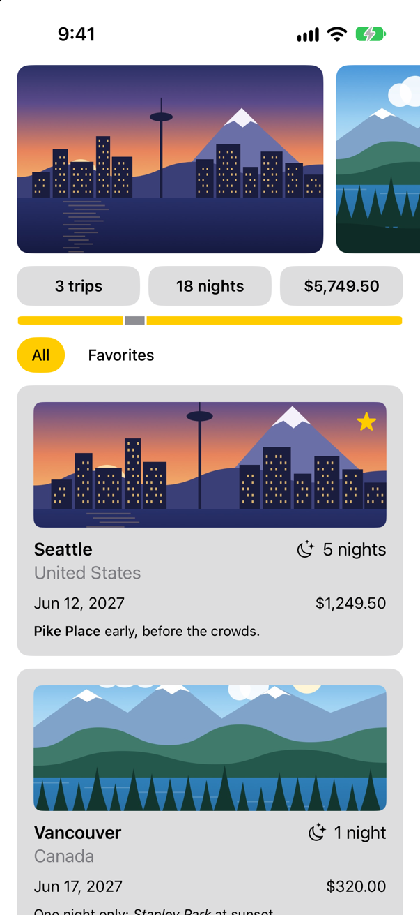
Nothing. The yellow has not moved, and there are still three trips. Before you look for the mistake in FilterBar, find out whether it is there. The canvas is live, and it shows the bar on its own. Open FilterBar.swift, and click Favorites in the canvas:

So the bar is right, and something in the app is in its way. You have seen what, on lesson 8. This picture is from that lesson, a moment before you added the clip shape:
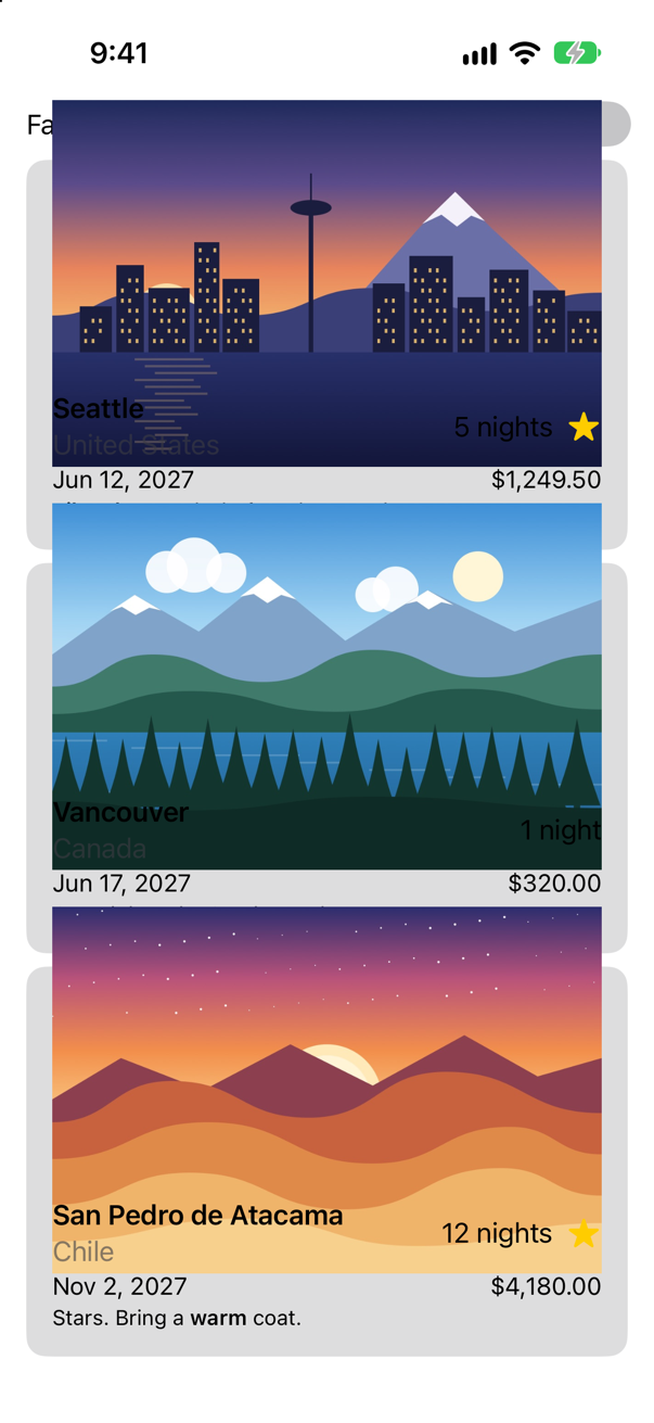
The picture has to be as wide as the card, which makes it 225 points tall, and its frame is 120 points tall. It runs above and below that frame. clipShape stopped the extra part from being drawn. It did not make it go away. The invisible top of the first card's picture still lies across the chips, a touch there is a touch on the picture, and the picture does nothing with it. (The switch that used to sit here went on working all the same: a Toggle is a UIKit control underneath, and was not caught by this.)
A view has two shapes: the one it draws and the one that takes touches. clipShape sets the first. The second is contentShape. In TripCard.swift, add one line under the clip shape:
struct TripCard: View { let trip: Trip var body: some View { VStack(alignment: .leading, spacing: 10) { Image(trip.imageName) .resizable() .scaledToFill() .frame(height: 120) .clipShape(RoundedRectangle(cornerRadius: 8)) .contentShape(Rectangle()) .overlay(alignment: .topTrailing) { if trip.isFavorite { Image(systemName: "star.fill") .foregroundStyle(.yellow) .padding(8) } } ViewThatFits(in: .horizontal) { HStack(alignment: .firstTextBaseline) { title Spacer() nights } VStack(alignment: .leading, spacing: 4) { title nights } } ViewThatFits(in: .horizontal) { HStack { start Spacer() price } VStack(alignment: .leading, spacing: 4) { start price } } .font(.subheadline) Text(trip.formattedNotes) .font(.footnote) } .padding() .background(.quaternary, in: RoundedRectangle(cornerRadius: 12)) .padding(.horizontal) } private var title: some View { VStack(alignment: .leading, spacing: 2) { Text(trip.city) .font(.headline) Text(trip.country) .foregroundStyle(.secondary) } } private var nights: some View { Label("^[\(trip.nights) night](inflect: true)", systemImage: "moon.stars") } private var start: some View { Text(trip.start, format: .dateTime.day().month().year()) } private var price: some View { Text(trip.price, format: .currency(code: "USD")) }}struct TripCard: View {
let trip: Trip
var body: some View {
VStack(alignment: .leading, spacing: 10) {
Image(trip.imageName)
.resizable()
.scaledToFill()
.frame(height: 120)
.clipShape(RoundedRectangle(cornerRadius: 8))
.contentShape(Rectangle())
.overlay(alignment: .topTrailing) {
if trip.isFavorite {
Image(systemName: "star.fill")
.foregroundStyle(.yellow)
.padding(8)
}
}
ViewThatFits(in: .horizontal) {
HStack(alignment: .firstTextBaseline) {
title
Spacer()
nights
}
VStack(alignment: .leading, spacing: 4) {
title
nights
}
}
ViewThatFits(in: .horizontal) {
HStack {
start
Spacer()
price
}
VStack(alignment: .leading, spacing: 4) {
start
price
}
}
.font(.subheadline)
Text(trip.formattedNotes)
.font(.footnote)
}
.padding()
.background(.quaternary, in: RoundedRectangle(cornerRadius: 12))
.padding(.horizontal)
}
private var title: some View {
VStack(alignment: .leading, spacing: 2) {
Text(trip.city)
.font(.headline)
Text(trip.country)
.foregroundStyle(.secondary)
}
}
private var nights: some View {
Label("^[\(trip.nights) night](inflect: true)", systemImage: "moon.stars")
}
private var start: some View {
Text(trip.start, format: .dateTime.day().month().year())
}
private var price: some View {
Text(trip.price, format: .currency(code: "USD"))
}
}The strip of pictures at the top is cut the same way, and overhangs by a few points. It is in nobody's way yet. Give it the same line in PhotoStrip.swift anyway — a picture that is filled and clipped should always have it:
struct PhotoStrip: View { let trips: [Trip] var body: some View { ScrollView(.horizontal) { HStack(spacing: 12) { ForEach(trips) { trip in Image(trip.imageName) .resizable() .scaledToFill() .containerRelativeFrame(.horizontal, count: 5, span: 4, spacing: 12) .frame(height: 180) .clipShape(RoundedRectangle(cornerRadius: 12)) .contentShape(Rectangle()) } } .scrollTargetLayout() } .scrollTargetBehavior(.viewAligned) .safeAreaPadding(.horizontal) .scrollIndicators(.hidden) }}struct PhotoStrip: View {
let trips: [Trip]
var body: some View {
ScrollView(.horizontal) {
HStack(spacing: 12) {
ForEach(trips) { trip in
Image(trip.imageName)
.resizable()
.scaledToFill()
.containerRelativeFrame(.horizontal, count: 5, span: 4, spacing: 12)
.frame(height: 180)
.clipShape(RoundedRectangle(cornerRadius: 12))
.contentShape(Rectangle())
}
}
.scrollTargetLayout()
}
.scrollTargetBehavior(.viewAligned)
.safeAreaPadding(.horizontal)
.scrollIndicators(.hidden)
}
}Run the app again, and tap Favorites:
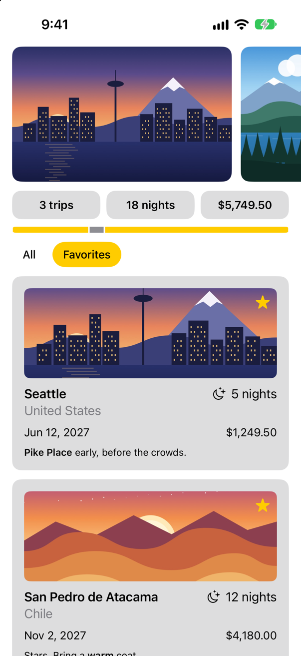
Two trips, and the yellow has moved. Apple's description of contentShape is one line: it "defines the content shape for hit testing." Hit testing is how SwiftUI decides which view a touch belongs to, and you have just seen that it does not go by what is on the screen.
That is one use of contentShape: to make the shape that takes touches smaller than the view. The other use is the opposite — a row, or a label with wide padding, that should answer over more than it draws. This lesson's edge cases put both to the test, with real taps.
A name with a parameter
The chip's looks are three lines inside FilterBar, and they will be wanted elsewhere. Give them a name too. This modifier needs to be told something — whether the chip is selected — so it has a property. Add to Styles.swift:
/// A filter chip: a yellow capsule when it is selected, plain text when it is not.
struct Chip: ViewModifier {
    let isSelected: Bool

    func body(content: Content) -> some View {
        content
            .padding(.horizontal, 14)
            .padding(.vertical, 8)
            .foregroundStyle(isSelected ? Color.black : Color.primary)
            .background(isSelected ? Color.yellow : Color.clear, in: Capsule())
    }
}

extension View {
    func chip(isSelected: Bool) -> some View {
        modifier(Chip(isSelected: isSelected))
    }
}
One line is new: the selected chip's text is black, whatever the color scheme, because white on yellow cannot be read. And the bar becomes:
struct FilterBar: View { let filters: [TripFilter] @Binding var selection: TripFilter var body: some View { HStack { ForEach(filters, id: \.self) { filter in Button { selection = filter } label: { Text(filter.title) .padding(.horizontal, 14) .padding(.vertical, 8) .background(filter == selection ? Color.yellow : Color.clear, in: Capsule()) .chip(isSelected: filter == selection) } .buttonStyle(.plain) } } .font(.subheadline.weight(.medium)) }}struct FilterBar: View {
let filters: [TripFilter]
@Binding var selection: TripFilter
var body: some View {
HStack {
ForEach(filters, id: \.self) { filter in
Button {
selection = filter
} label: {
Text(filter.title)
.chip(isSelected: filter == selection)
}
.buttonStyle(.plain)
}
}
.font(.subheadline.weight(.medium))
}
}The canvas:

FilterBar, with the chip's looks in a modifierScreenshot · iPhone 17, iOS 27.0There are two kinds of modifier in that file now, and it is worth being able to tell them apart.
| Kind | Examples | How it behaves |
|---|---|---|
| Wraps the view | .padding, .frame, .background, .border, .clipShape, .contentShape, .chip | Acts on the one view it is put on. Order matters. It has to be written on every view that wants it. |
| Sets something for everything inside | .font, .foregroundStyle, .lineLimit, .tint, .disabled | Travels down to every view inside. Put it on a container, once. A view deeper in can set its own, and the nearest one wins. |
That is why .font(.subheadline.weight(.medium)) is written once, on the HStack, and reaches both chips, while .chip(…) is written on each text. Apple: "The effects of a modifier propagate to child views that don't explicitly override the modifier." The second kind works through the environment, which is lesson 19.
A table whose columns line up
Now the other lesson: containers with more than one direction. A trip has facts — its country, when it starts, how long, how much — and facts want a table: labels in one column, values in another. Part 7 will give each trip a screen of its own, and this view is for that screen. For now it lives in its preview. Make a SwiftUI View named TripFacts, and try it first with the stacks you know:
struct TripFacts: View { let trip: Trip var body: some View { Text("Hello, World!") VStack(alignment: .leading, spacing: 8) { HStack { Text("Country") .foregroundStyle(.secondary) Text(trip.country) } HStack { Text("Starts") .foregroundStyle(.secondary) Text(trip.start, format: .dateTime.weekday(.wide).day().month(.wide).year()) } HStack { Text("Stay") .foregroundStyle(.secondary) Text("^[\(trip.nights) night](inflect: true)") } HStack { Text("Price") .foregroundStyle(.secondary) Text(trip.price, format: .currency(code: "USD")) } } }}struct TripFacts: View {
let trip: Trip
var body: some View {
VStack(alignment: .leading, spacing: 8) {
HStack {
Text("Country")
.foregroundStyle(.secondary)
Text(trip.country)
}
HStack {
Text("Starts")
.foregroundStyle(.secondary)
Text(trip.start, format: .dateTime.weekday(.wide).day().month(.wide).year())
}
HStack {
Text("Stay")
.foregroundStyle(.secondary)
Text("^[\(trip.nights) night](inflect: true)")
}
HStack {
Text("Price")
.foregroundStyle(.secondary)
Text(trip.price, format: .currency(code: "USD"))
}
}
}
}#Preview { TripFacts() TripFacts(trip: .atacama)}#Preview {
TripFacts(trip: .atacama)
}The canvas:

HStack: every value starts where its own label endsScreenshot · iPhone 17, iOS 27.0The rows are right and the table is not. Each HStack lays out its own two texts and knows nothing of the row above, so the values start in four different places. On lesson 9 one of the edge cases solved this with a custom alignment guide. There is a container made for it:
struct TripFacts: View { let trip: Trip var body: some View { VStack(alignment: .leading, spacing: 8) { HStack { Grid(alignment: .leading, horizontalSpacing: 12, verticalSpacing: 8) { GridRow { Text("Country") .foregroundStyle(.secondary) .gridColumnAlignment(.trailing) Text(trip.country) } HStack { GridRow { Text("Starts") .foregroundStyle(.secondary) Text(trip.start, format: .dateTime.weekday(.wide).day().month(.wide).year()) } HStack { GridRow { Text("Stay") .foregroundStyle(.secondary) Text("^[\(trip.nights) night](inflect: true)") } HStack { GridRow { Text("Price") .foregroundStyle(.secondary) Text(trip.price, format: .currency(code: "USD")) } } }}struct TripFacts: View {
let trip: Trip
var body: some View {
Grid(alignment: .leading, horizontalSpacing: 12, verticalSpacing: 8) {
GridRow {
Text("Country")
.foregroundStyle(.secondary)
.gridColumnAlignment(.trailing)
Text(trip.country)
}
GridRow {
Text("Starts")
.foregroundStyle(.secondary)
Text(trip.start, format: .dateTime.weekday(.wide).day().month(.wide).year())
}
GridRow {
Text("Stay")
.foregroundStyle(.secondary)
Text("^[\(trip.nights) night](inflect: true)")
}
GridRow {
Text("Price")
.foregroundStyle(.secondary)
Text(trip.price, format: .currency(code: "USD"))
}
}
}
}The canvas:
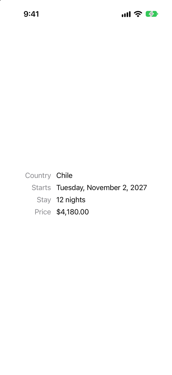
Grid: two columnsScreenshot · iPhone 17, iOS 27.0VStack became Grid, and each HStack became a GridRow. Apple describes the difference exactly: "A grid and its rows behave something like a collection of HStack instances wrapped in a VStack. However, the grid handles row and column creation as a single operation, which applies alignment and spacing to cells, rather than first to rows and then to a column of unrelated rows." A column is as wide as its widest cell, and every row uses that width.
| In the code | What it does |
|---|---|
Grid(alignment: .leading, horizontalSpacing: 12, verticalSpacing: 8) | The alignment of every cell unless a cell says otherwise, and the gaps between columns and between rows. |
GridRow { … } | One row. Its first view goes in the first column, its second in the second. |
.gridColumnAlignment(.trailing) | Written on one cell, it sets the alignment of that cell's whole column: the labels now end at the same edge. |
A list that becomes a grid
A Grid builds every cell at once, as a VStack does, which is what a small table wants. For a long scrolling collection there is a lazy one, as there was for stacks, and it has a second talent: it can decide for itself how many columns there is room for. In ContentView.swift, put the cards in a LazyVGrid:
struct ContentView: View { let store: TripStore @State private var filter = TripFilter.all var body: some View { ScrollView { LazyVStack(spacing: 12) { PhotoStrip(trips: store.trips) TripSummary(trips: store.trips) FilterBar(filters: [.all, .favorites], selection: $filter) .frame(maxWidth: .infinity, alignment: .leading) .padding(.horizontal) ForEach(store.trips.filter { filter.includes($0) }) { trip in TripCard(trip: trip) LazyVGrid(columns: [GridItem(.adaptive(minimum: 300))], spacing: 12) { ForEach(store.trips.filter { filter.includes($0) }) { trip in TripCard(trip: trip) } } } } }}struct ContentView: View {
let store: TripStore
@State private var filter = TripFilter.all
var body: some View {
ScrollView {
LazyVStack(spacing: 12) {
PhotoStrip(trips: store.trips)
TripSummary(trips: store.trips)
FilterBar(filters: [.all, .favorites], selection: $filter)
.frame(maxWidth: .infinity, alignment: .leading)
.padding(.horizontal)
LazyVGrid(columns: [GridItem(.adaptive(minimum: 300))], spacing: 12) {
ForEach(store.trips.filter { filter.includes($0) }) { trip in
TripCard(trip: trip)
}
}
}
}
}
}A lazy grid is told about its columns with an array of GridItem. There are three kinds.
GridItem(…) | A column that is |
|---|---|
.fixed(120) | exactly 120 points wide. |
.flexible() | a share of the width: three flexible items make three equal columns. |
.adaptive(minimum: 300) | not one column but as many as fit, each at least 300 points wide. Apple: it "prefers to insert as many items of the minimum size as possible but lets them increase to the maximum size." |
On an iPhone held upright there is room for one column of 300 points, so the app looks as it did. To see the grid, give the canvas a wider screen. Add a second preview at the bottom of ContentView.swift:
#Preview("Landscape", traits: .landscapeLeft) {
    ContentView(store: TripStore())
}
In the canvas, choose the Landscape tab, and drag the list up a little:
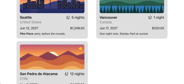
One line of layout, and the same screen is a list on a narrow device and a grid on a wide one — an iPad, or this phone on its side. In UIKit this was a collection view with a flow layout and a calculation in sizeForItemAt.
A layout of your own
More filters. A trip has a country, and TripFilter already has a case for it. Let the bar offer one chip for every country that has a trip. In ContentView.swift:
struct ContentView: View { let store: TripStore @State private var filter = TripFilter.all var body: some View { ScrollView { LazyVStack(spacing: 12) { PhotoStrip(trips: store.trips) TripSummary(trips: store.trips) FilterBar(filters: [.all, .favorites], selection: $filter) FilterBar(filters: filters, selection: $filter) .frame(maxWidth: .infinity, alignment: .leading) .padding(.horizontal) LazyVGrid(columns: [GridItem(.adaptive(minimum: 300))], spacing: 12) { ForEach(store.trips.filter { filter.includes($0) }) { trip in TripCard(trip: trip) } } } } } /// All, Favorites, and then a filter for each country that has a trip. private var filters: [TripFilter] { var countries: [String] = [] for trip in store.trips where !countries.contains(trip.country) { countries.append(trip.country) } return [.all, .favorites] + countries.map { TripFilter.country($0) } }}struct ContentView: View {
let store: TripStore
@State private var filter = TripFilter.all
var body: some View {
ScrollView {
LazyVStack(spacing: 12) {
PhotoStrip(trips: store.trips)
TripSummary(trips: store.trips)
FilterBar(filters: filters, selection: $filter)
.frame(maxWidth: .infinity, alignment: .leading)
.padding(.horizontal)
LazyVGrid(columns: [GridItem(.adaptive(minimum: 300))], spacing: 12) {
ForEach(store.trips.filter { filter.includes($0) }) { trip in
TripCard(trip: trip)
}
}
}
}
}
/// All, Favorites, and then a filter for each country that has a trip.
private var filters: [TripFilter] {
var countries: [String] = []
for trip in store.trips where !countries.contains(trip.country) {
countries.append(trip.country)
}
return [.all, .favorites] + countries.map { TripFilter.country($0) }
}
}Run the app (⌘R):
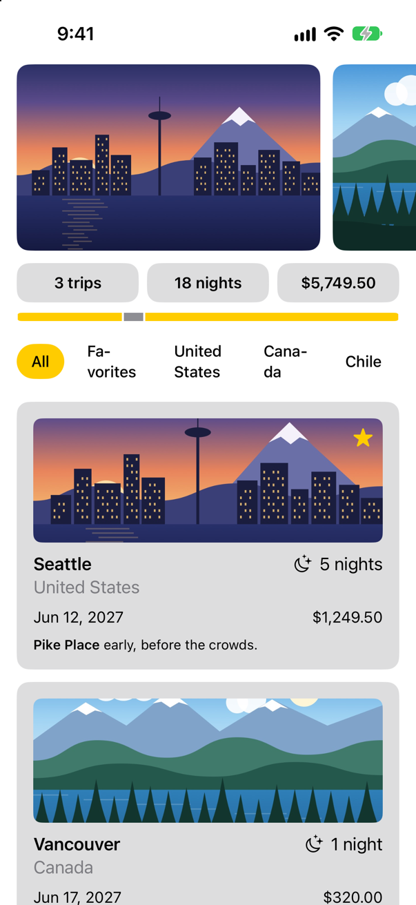
HStack that has no room for fiveScreenshot · iPhone 17, iOS 27.0Five chips do not fit across the screen, and the row has done what a stack does: it has shared out the width, and each text has wrapped inside its share. You watched this happen on lesson 10. No stack will help, because what the design wants is not a row. It wants the chips to flow: side by side until the line is full, then on to the next line, as words do in a paragraph. None of the containers you have met does that. So write one.
You have already used a container of your own. Open Watch.swift and read it again. A type that conforms to Layout answers the two questions from the last lesson: sizeThatFits — how large are you, given this offer? — and placeSubviews — where does each child go? Watch passed both on to its one child. A flow layout has real answers. Make a new Swift File named FlowLayout, and replace everything in it:
import SwiftUI

/// Lays its children out as words are laid out in a paragraph: side by side until the line is full,
/// then on a new line.
struct FlowLayout: Layout {
    var spacing: CGFloat = 8

    func sizeThatFits(proposal: ProposedViewSize, subviews: Subviews, cache: inout ()) -> CGSize {
        arrange(subviews, in: proposal.width ?? .infinity).size
    }

    func placeSubviews(in bounds: CGRect, proposal: ProposedViewSize, subviews: Subviews, cache: inout ()) {
        let points = arrange(subviews, in: bounds.width).points
        for (subview, point) in zip(subviews, points) {
            subview.place(at: CGPoint(x: bounds.minX + point.x, y: bounds.minY + point.y), proposal: .unspecified)
        }
    }

    /// Where each child goes, and how much room they take up together.
    private func arrange(_ subviews: Subviews, in width: CGFloat) -> (points: [CGPoint], size: CGSize) {
        var points: [CGPoint] = []
        var x: CGFloat = 0, y: CGFloat = 0, lineHeight: CGFloat = 0, widest: CGFloat = 0
        for subview in subviews {
            let size = subview.sizeThatFits(.unspecified)
            // no room left on this line: start the next
            if x > 0 && x + size.width > width {
                x = 0
                y += lineHeight + spacing
                lineHeight = 0
            }
            points.append(CGPoint(x: x, y: y))
            x += size.width + spacing
            lineHeight = max(lineHeight, size.height)
            widest = max(widest, x - spacing)
        }
        return (points, CGSize(width: widest, height: y + lineHeight))
    }
}| In the code | What it does |
|---|---|
arrange(_:in:) | The whole idea, in one loop. Ask each child for its ideal size. If it does not fit on the current line, move down to a new one. Remember where it went. |
subview.sizeThatFits(.unspecified) | A parent proposing a size to a child — the first of the three steps, written by you. .unspecified is the offer of "nothing in particular", which a view answers with its ideal size. |
sizeThatFits | The second step, for the container itself: the width of its widest line and the height of all its lines. |
placeSubviews | The third step. bounds is the rectangle the container was given; each child is placed inside it with place(at:proposal:). |
A Layout is used like a stack: its name, and braces. In FilterBar.swift, change one word: HStack becomes FlowLayout.
struct FilterBar: View { let filters: [TripFilter] @Binding var selection: TripFilter var body: some View { HStack { FlowLayout { ForEach(filters, id: \.self) { filter in Button { selection = filter } label: { Text(filter.title) .chip(isSelected: filter == selection) } .buttonStyle(.plain) } } .font(.subheadline.weight(.medium)) }}struct FilterBar: View {
let filters: [TripFilter]
@Binding var selection: TripFilter
var body: some View {
FlowLayout {
ForEach(filters, id: \.self) { filter in
Button {
selection = filter
} label: {
Text(filter.title)
.chip(isSelected: filter == selection)
}
.buttonStyle(.plain)
}
}
.font(.subheadline.weight(.medium))
}
}Run the app:
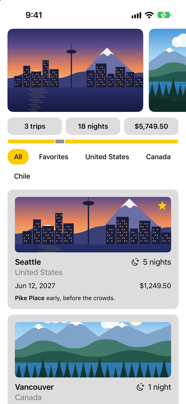
FlowLayoutScreenshot · iPhone 17, iOS 27.0The chips that fit are on the first line, the rest have moved down to a second, and none of them is squeezed. Tap Chile:
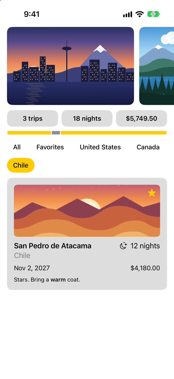
Reach for Layout when the rule is yours: flow, a radial arrangement, columns of equal width decided by the widest child. Do not reach for it to nudge one view, which is what alignment guides, padding and offset are for. And remember what it replaced: this file is the SwiftUI version of a subclass of UICollectionViewLayout, in under forty lines, with no index paths and no invalidation.
Where this comes from: Layout protocol · WWDC22: Compose custom layouts with SwiftUI
The same app, in the dark
That is the end of Part 4, and the main screen has its look. Before you close the project, see it the way a great many people will: in dark mode. Apple's instructions for a simulator: "In Device Hub, select a simulated device in the sidebar, and if necessary, click Start in the canvas. In the Settings inspector, change the environment settings, such as Appearance, Liquid Glass, and Text Size. Then run your app on the simulator and observe whether your app adjusts accordingly." Change the appearance to dark, and run the app:
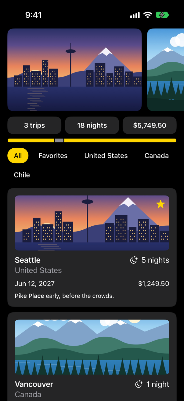
Nothing in the code mentions dark mode, and nothing had to. The screen behind everything is the system's own background; a text is drawn in .primary unless you say otherwise; and the grays of the tiles and the cards are .quaternary. Each of those is a color named for what it is for, with a light value and a dark value, and SwiftUI picks one as it draws. The one color that was fixed on purpose — the black of the selected chip's text — was fixed because it sits on yellow in both. Lesson 49 is about the rest: colors of your own, and when to choose them. Change the appearance back to light when you have looked.
What you built
TileandChip: two modifiers of your own, one of them with a parameter.FilterBar: chips that filter the list — and a picture that no longer takes the touches meant for them.TripFacts: a table in aGrid, with its columns lined up.- A list of cards that becomes a grid of cards when the screen is wide enough.
FlowLayout: a container written with the two methods of theLayoutprotocol.
Guide: Inside the Attribute Graph — SwiftUI's graph read out of a running app: a view's nodes, how a write reaches body, modifiers as nodes, and a debugger stopped at every step.
That is the end of Part 4: everything about how a screen is arranged. Part 6 is about what a screen knows — @State, @Binding, and who owns a piece of data. Before it comes the rest of the language under them, Part 5. It begins in the next lesson, where Part 2 left off: TinyUI again, a file of 2016 Swift to bring up to date, and a macro to read.
The finished project
Stuck, or want to compare with your own? This is the project as it stands at the end of this lesson, built and run before it was put here.
- Trips-lesson-11.zip — unzip it, then open
Trips.xcodeprojin Xcode.
Flash cards
23 cards for this lesson, each labelled with its topic. 12 ask how you would write something; the other 11 are trick questions, written to catch a misunderstanding. Answer in your head first, then tap the card.
Syntax · ModifiersGive three modifiers one name, so that any view can say .tile().

A type that conforms to ViewModifier, whose body(content:) returns the view to put in place of content, and an extension on View that applies it with modifier(_:).
Syntax · ModifiersA modifier of your own that takes a value: a chip that is yellow only when it is selected.

Give the modifier a property, and pass it on from the method in the extension: .chip(isSelected: true). A modifier is a struct, so it can hold whatever it needs to be told.
Syntax · TouchesA row with a gap in the middle. Make a tap count anywhere in the row, the gap included.

.contentShape(Rectangle()), before the gesture. A view takes touches where it draws, and a spacer draws nothing; the content shape says which shape takes them instead. The row was tapped in the middle of the gap, and the console showed: the row was tapped
Syntax · TouchesA picture cropped to a strip with scaledToFill. Stop the part that was cut off from taking the touches meant for the button above it.
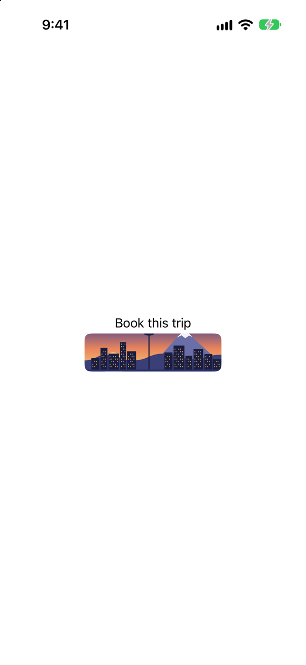
.contentShape(Rectangle()) after the clip. The picture is taller than its frame; clipping hides the extra, and the content shape stops it from taking touches. With the line in place, a tap on the button printed: booked
Syntax · ModifiersSet a font for every text in a column, and a different one for just the first.
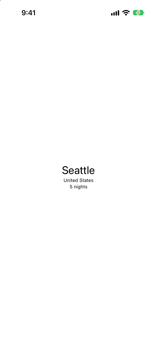
.font on the container reaches every text inside it. A text with a .font of its own keeps that one: the nearest wins.
Syntax · GridsA table of two rows and two columns, whose columns line up.

Grid and GridRow. A column is as wide as its widest cell, in every row. The alignment is for the content of all the cells.
Syntax · GridsIn a Grid, make the numbers in the second column end at the same edge.
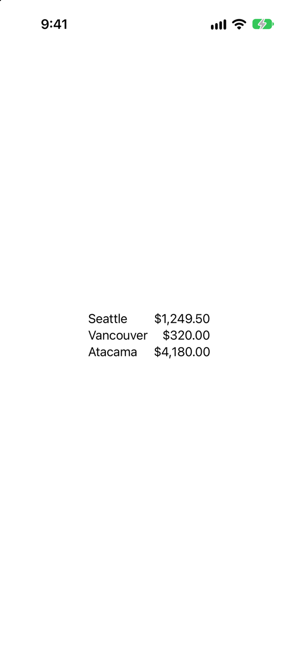
.gridColumnAlignment(.trailing) on one cell of the column. It sets the alignment of the whole column, so it is written once.
Syntax · GridsIn a Grid of three columns, a note that runs across the first two.
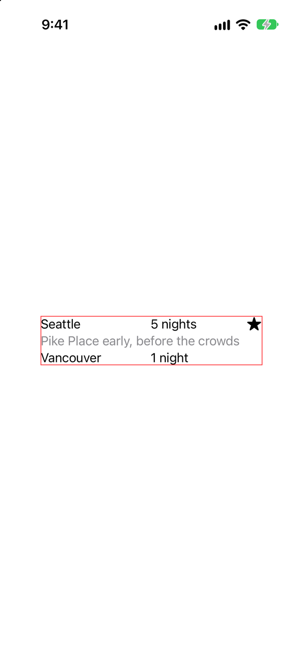
.gridCellColumns(2). The cell has the room of two columns, and the grid makes those columns wide enough for it: in the picture the first column has grown to hold the note, and the star's column is untouched. A view put in the grid without a GridRow spans all the columns.
Syntax · GridsA scrolling grid with as many columns as there is room for, each at least 100 points wide.
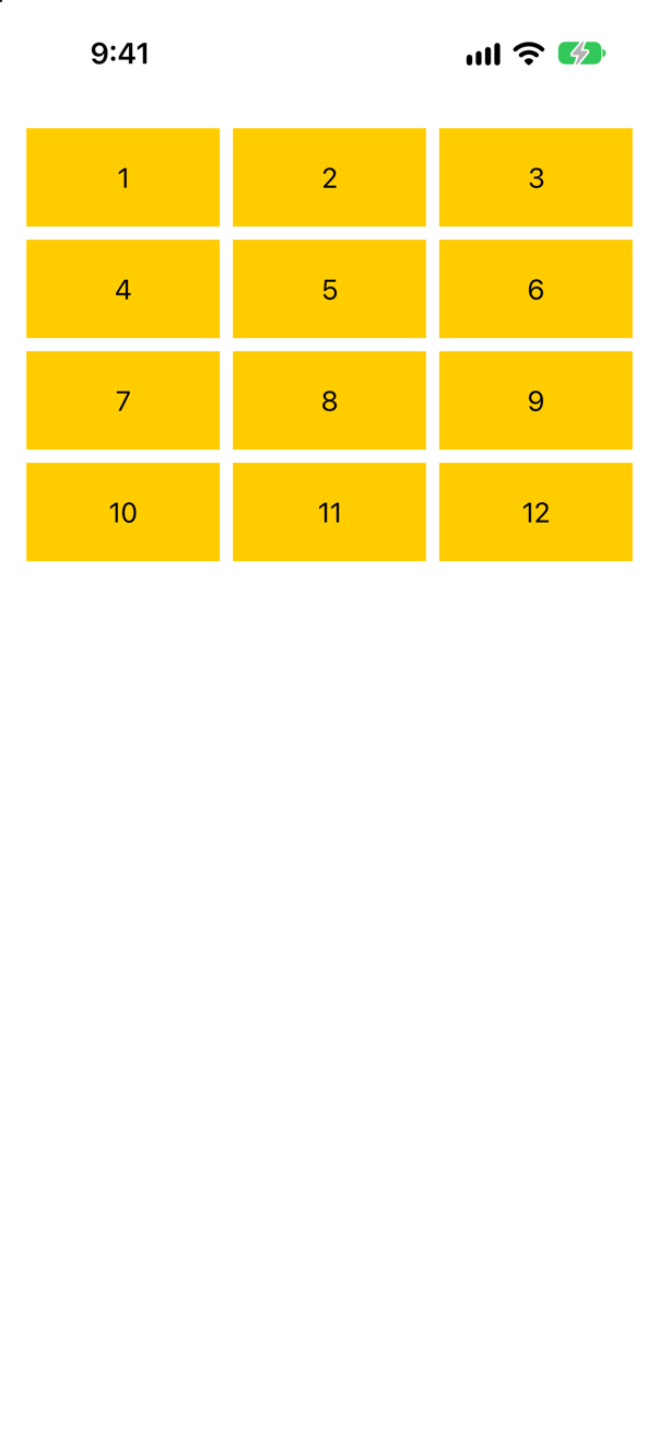
One GridItem(.adaptive(minimum: 100)). A single adaptive item stands for as many columns as fit: three on this phone, more on a wider screen.
Syntax · GridsA scrolling grid of exactly three equal columns.
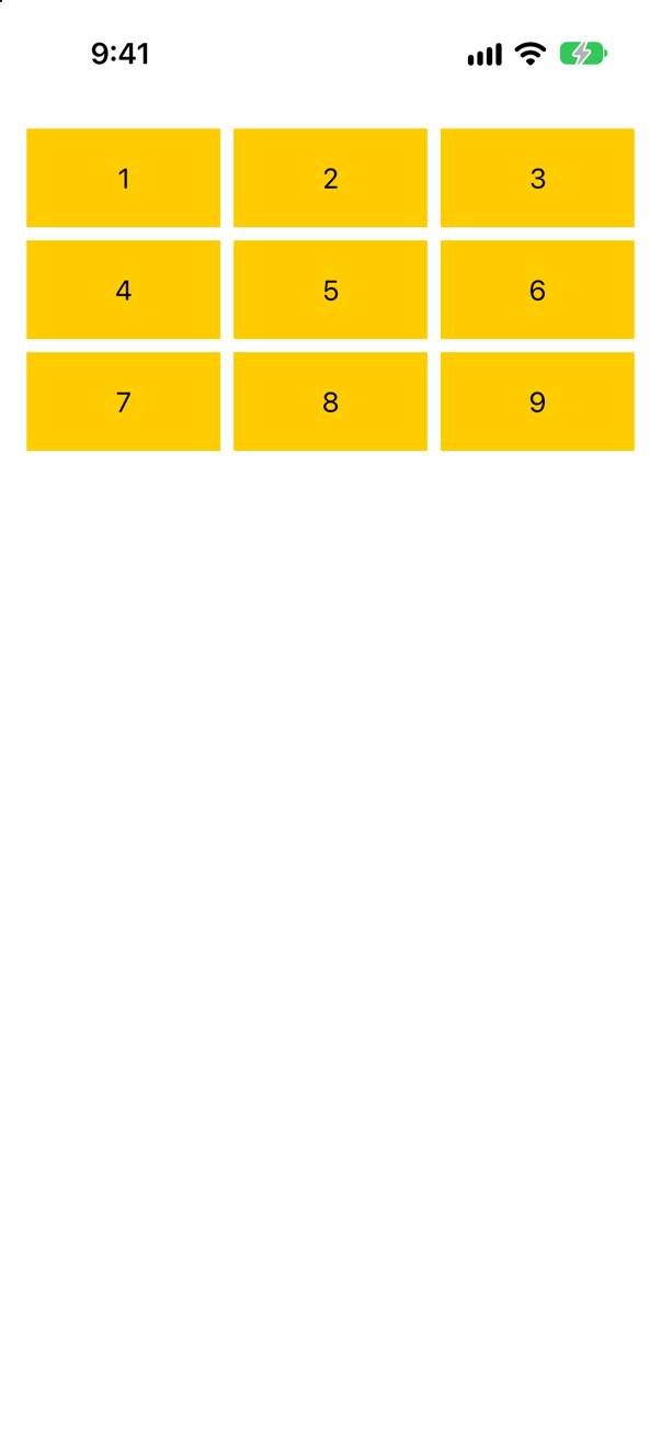
Three GridItem(.flexible()): one item for each column. Flexible items share the width equally. (Array(repeating: GridItem(.flexible()), count: 3) says the same in fewer words.)
Syntax · LayoutsThe two methods of a Layout: a container that is as large as its largest child, and puts every child in its top leading corner.
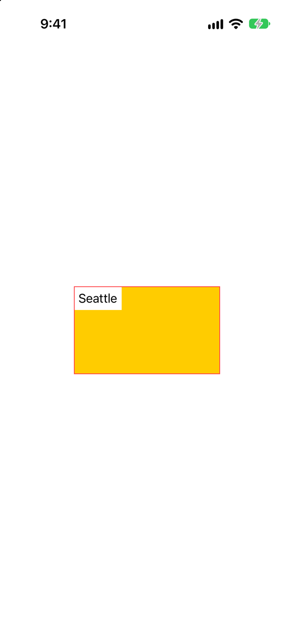
sizeThatFits answers "how large are you?" and placeSubviews puts each child somewhere inside bounds. Then the type is used like a stack: Corner { … }.
Syntax · LayoutsChange a group of views from a row to a column, without the views in it losing their state.
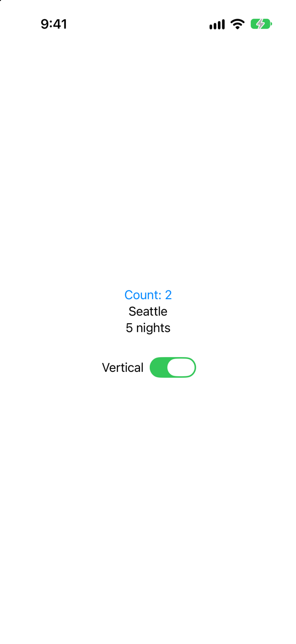
AnyLayout, holding an HStackLayout or a VStackLayout. The container changes and the views in it stay the same views: in the picture the counter was tapped twice as a row, and still says 2 as a column.
Trick question · Order.padding().background(.yellow), or .background(.yellow).padding(). Which yellow box is the larger?
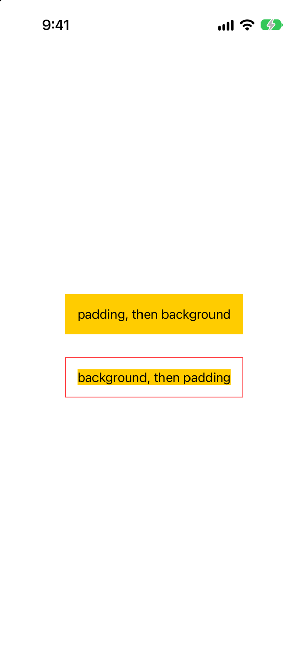
The first. Each modifier wraps what is above it. In the first, the background is put on the padded text, so the yellow includes the padding. In the second, it is put on the bare text, and the padding goes round the yellow (the red border shows it).
Trick question · Order.font(.largeTitle).font(.caption) on one text. Which font does it use — the last one written?
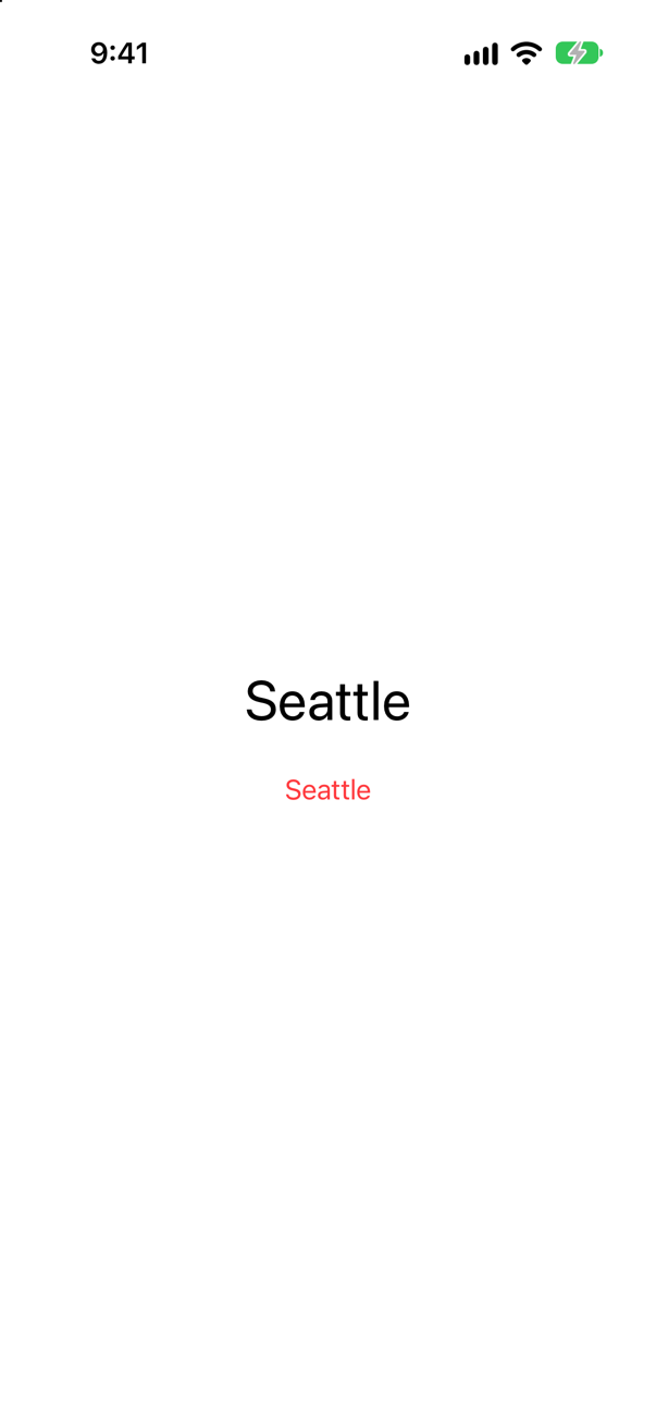
The first: large, and red. .font does not change a text. It sets a default for everything inside the view it wraps, and a view uses the nearest one. The second .font is further out, so it loses — for the same reason that a text with its own font ignores its container's.
Trick question · TouchesA text with 60 points of padding, and then .onTapGesture. The gesture is on the padded view. Does a tap in the padding count?
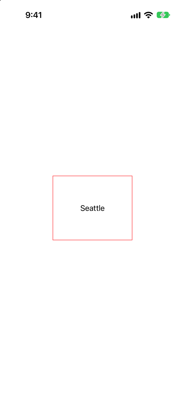
No. A view takes touches where it draws something, and padding draws nothing. A tap 40 points above the word printed nothing; a tap on the word printed "tapped". Give the padded view a background, or .contentShape(Rectangle()), and the whole box answers.
Trick question · TouchesFour buttons: .hidden(), .opacity(0), .opacity(0.5) and .disabled(true). Each is tapped where it is, or would be. Which of them fire?
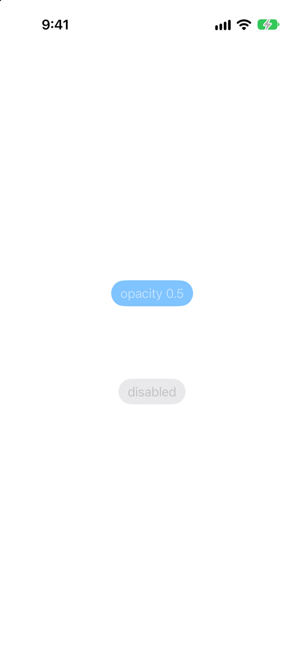
Only the one at half opacity. All four were tapped, and the console showed: opacity 0.5 was tapped. A hidden view and a fully transparent one take no touches; a disabled one is drawn, dimmed, and ignores them. The first two still take up their space.
Trick question · VisibilityThree columns of three views. The middle one has .hidden(), or .opacity(0), or is left out with if. In which columns do the other two close the gap?
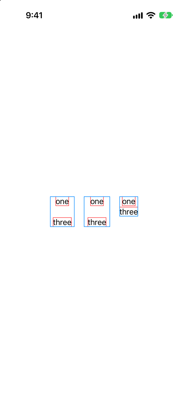
Only in the third. .hidden() and .opacity(0) change how a view is drawn, and it keeps its place in the layout: the first two columns are as tall and as wide as if the word were there. if leaves the view out altogether.
Trick question · Effects.shadow(…) on a VStack of two texts that has padding and no background. What gets a shadow?
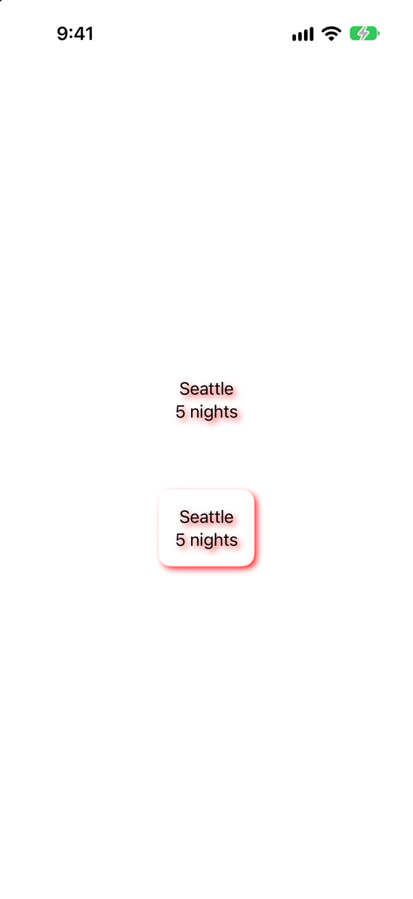
Every letter (the upper one). A shadow is cast by whatever is drawn, and a stack with padding draws nothing of its own: only its texts. Give it a background first (the lower one) and there is a box to cast the shadow, and the letters on it cast none.
Trick question · EffectsA yellow box. .shadow(…) and then .clipShape(…). Where is the shadow?
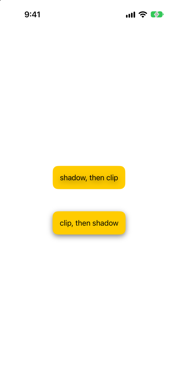
Gone (the upper one). A shadow is drawn outside the view, and a clip shape that is added afterward cuts off everything outside the shape. Clip first, then cast the shadow (the lower one).
Trick question · GridsA Grid that hugs its two short rows. You put a Divider() between them. How wide is the grid now?
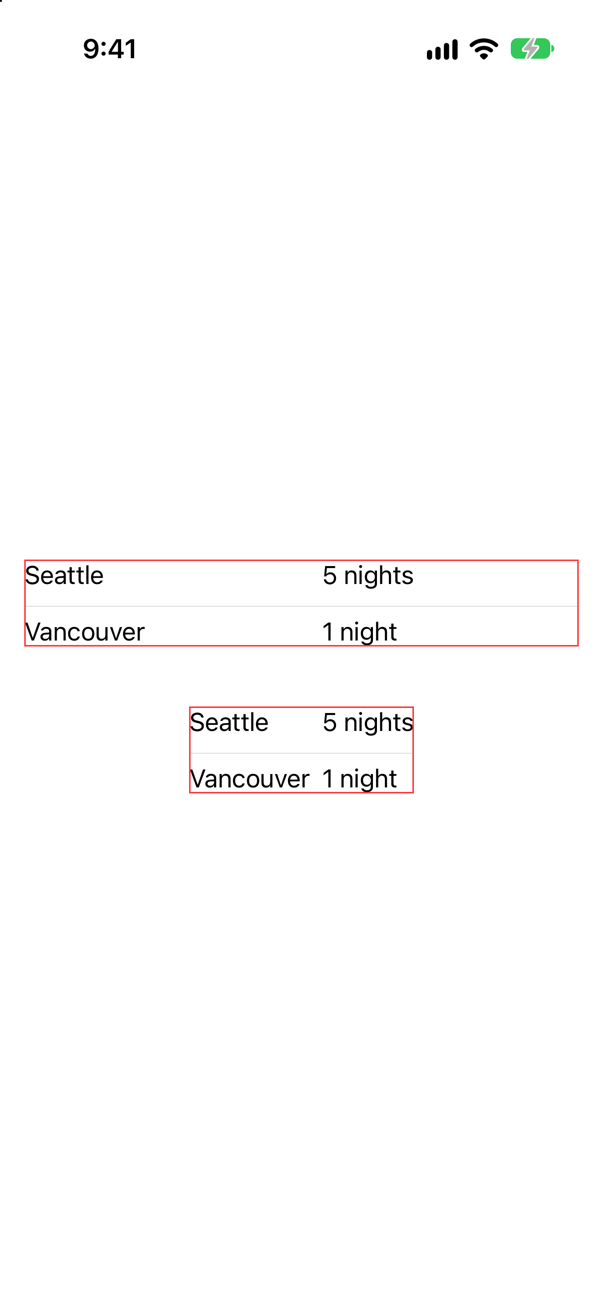
As wide as it is allowed to be (the upper one), with its columns spread out to match. A divider takes all the width it is offered, and a view in a grid without a GridRow spans every column. .gridCellUnsizedAxes(.horizontal) on the divider tells the grid not to offer it more than the other cells need (the lower one).
Trick question · GridsA LazyVGrid with two flexible columns. A cell of one line sits beside a cell of three lines. Where is the short one: at the top of its row?
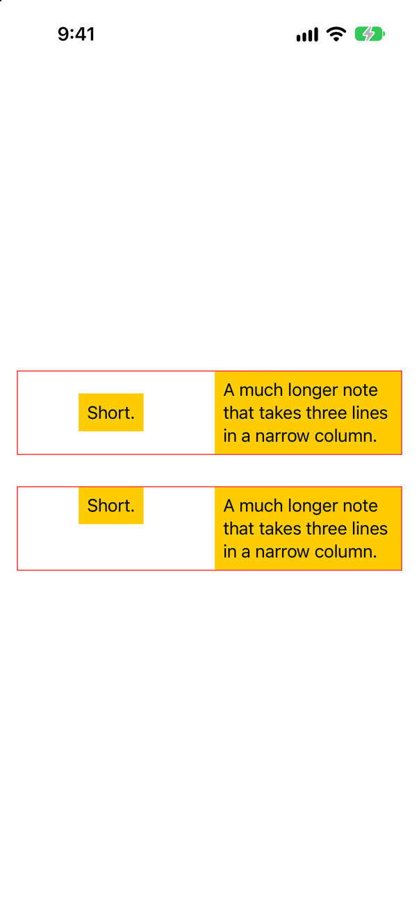
In the middle (the upper grid). A row is as tall as its tallest cell, and each cell is centered in the space it is given. The alignment belongs to the column: GridItem(.flexible(), alignment: .top) (the lower grid).
Trick question · GridsFive hundred rows of two cells in a Grid, inside a ScrollView. How many of the thousand cells are built before you see the first?
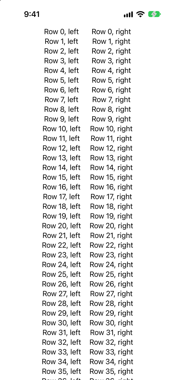
All thousand. The console showed: 1000 of 1000 cells have appeared. A Grid has to see every cell to make its columns line up, so it builds them all, as a VStack does. For a long scrolling collection use LazyVGrid, and tell it the columns.
Trick question · Layoutsif vertical { VStack { … } } else { HStack { … } }, with the same counter inside both. The counter says 2. The switch is flipped. What does it say now?
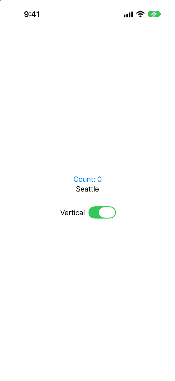
0. The two branches of an if are two different views. Flipping the switch throws one away, with the counter in it, and makes the other from scratch. AnyLayout changes the container and keeps the views.
Edge cases and tricky questions
18 questions of the kind an interviewer uses to find out whether you really know this — the corners, the traps, and the things that changed recently. Each has its source. Wherever the answer is what some code does, that code was compiled and run, and what you see under “Show the answer” is what it really did. Say your answer aloud before you open it.
View modifiers, and why their order matters
"Why does the order of modifiers matter?" is on every list of SwiftUI interview questions. Answer it — and then prove your answer without looking at the screen. What does type(of:) print for each of these three views?
Show the answer
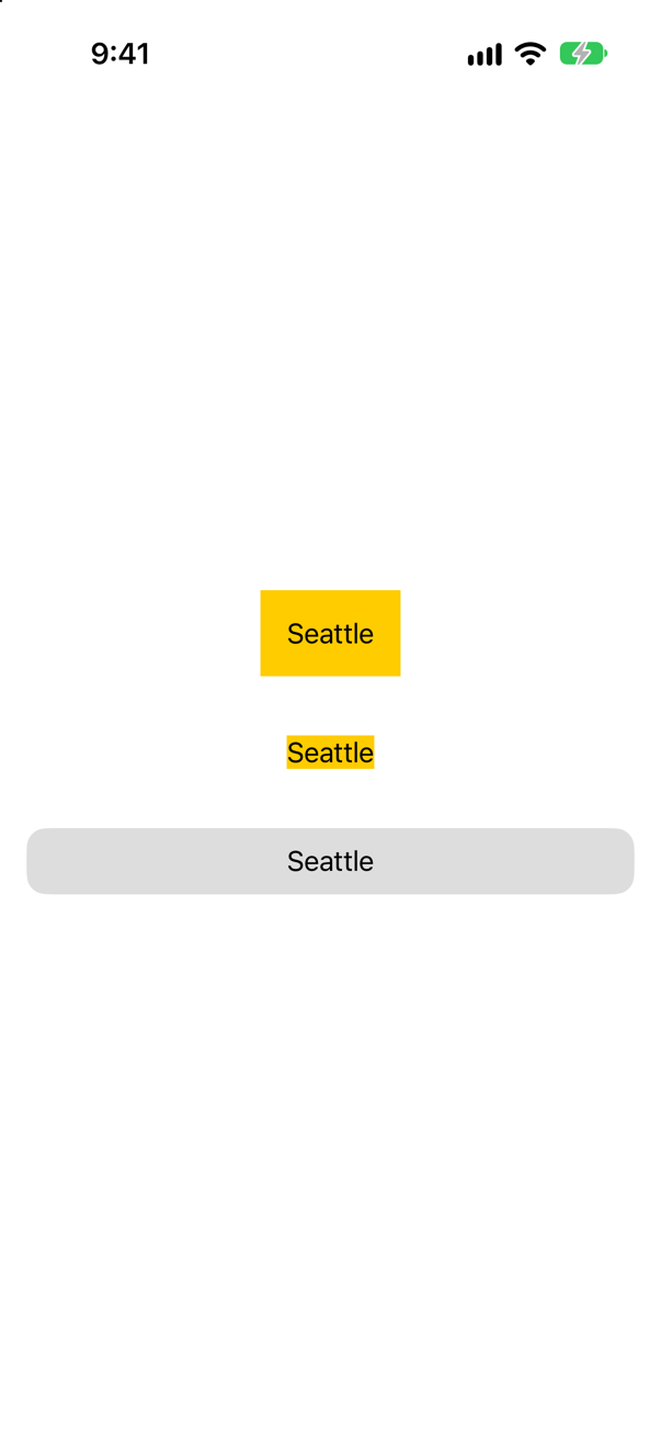
TileScreenshot · iPhone 17, iOS 27.0The console showed
ModifiedContent<ModifiedContent<Text, _PaddingLayout>, _BackgroundStyleModifier<Color>>
ModifiedContent<ModifiedContent<Text, _BackgroundStyleModifier<Color>>, _PaddingLayout>
ModifiedContent<Text, Tile>
The answer is in the types. A modifier does not change a view. It returns a new one, ModifiedContent, that holds the old view and the modifier. Apple: "Modifiers return a view that wraps the original view and replaces it in the view hierarchy." Chain two and you get one ModifiedContent inside another, and the order you wrote them in is the order of the nesting. Every layer then becomes nodes of its own in SwiftUI's graph: Inside the Attribute Graph shows the sixteen that one chain of four makes.
Read the first line from the inside out: a Text; that text in a padding; that padded text in a background. The second line has the same three parts nested the other way: the text in a background, and that in a padding. They are different types, so they are different views, and nobody should be surprised that they look different. The interview-preparation repository's whole answer is this: "Each modifier wraps the previous view in a new one."
The third line shows what your own modifier is: exactly the same thing. Text("Seattle").modifier(Tile()) is a ModifiedContent<Text, Tile>. The three modifiers inside Tile are its business; from outside it is one wrapper, like padding.
Two practical rules follow. Read a chain from the top down, saying "…and that is put in…" at each dot. And when a modifier seems to do nothing, ask which view it is on: it is usually on a wrapper that was not the one you meant.
Where this comes from: Configuring views · ViewModifier · Senior iOS Interview Preparation (GitHub) — Apple, “Configuring views”: "The order in which you apply modifiers matters."
Three things written twice. A text with .font(.largeTitle).font(.caption). A text with .foregroundStyle(.red).foregroundStyle(.blue). And a text with padding, a yellow background, padding again, and an orange background. What does each look like — and why do the first two follow one rule and the third another?
Show the answer
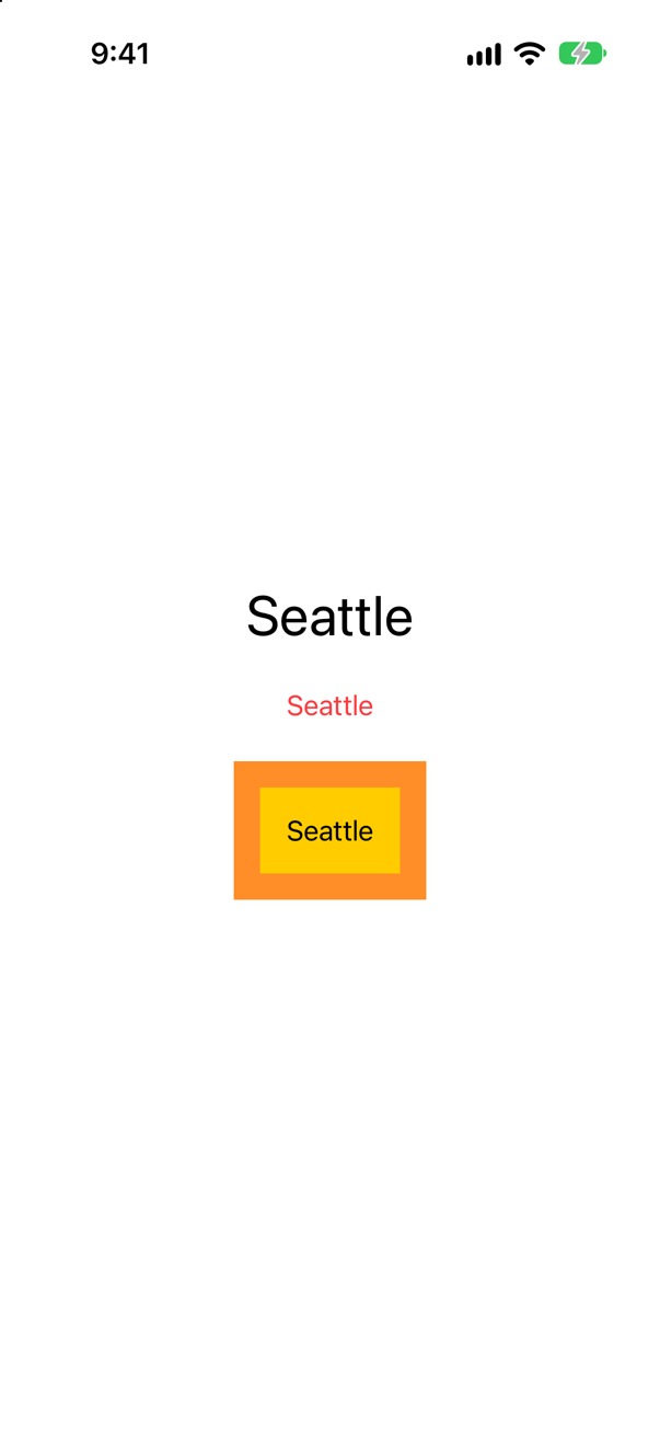
The first text is large and the second is red: in both, the modifier written first wins. The third has both paddings and both backgrounds.
The third is the plain case. Padding and background wrap the view, and wrapping twice gives two wrappers: a yellow box with an orange frame round it. Nothing is overridden, because there is nothing to override.
.font and .foregroundStyle do not wrap the text in anything visible. They set a value for everything inside the view they are put on, and a view that needs a font uses the nearest one. Apple: "The effects of a modifier propagate to child views that don't explicitly override the modifier." In .font(.largeTitle).font(.caption) the large title is nearer to the text, so the caption — one wrapper further out — never reaches it.
The rule is the one you already use without thinking about it: a font on a VStack is a default for its texts, and a text with its own font keeps it. Writing the two on one view is the same thing, with nothing in between. It matters in real code when a modifier of your own sets a font or a color: a caller who adds .font(…) after your modifier is setting a default that your modifier's font has already overridden.
Where this comes from: Configuring views — Apple, “Configuring views”, section “Configure child views”.
Ten rows. Each prints its number when it is tapped. Rows 1 to 8 are tapped in their padding, well to the side of the digit; rows 9 and 10 are tapped in the gap in the middle. Which rows print?
Show the answer
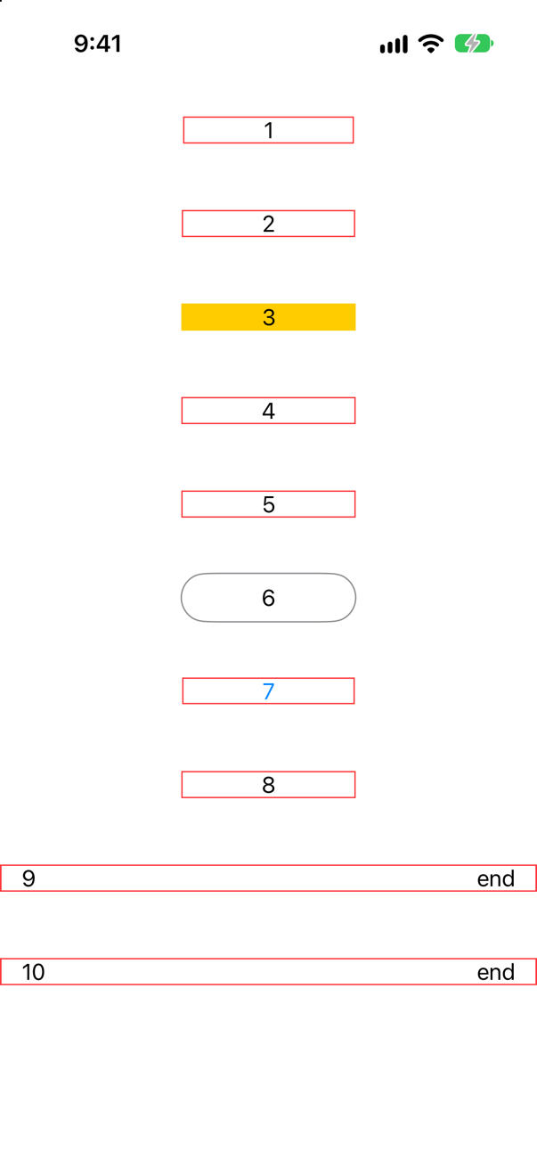
Tapped beside the digit, or in the gap, five of the ten printed:
3
5
6
7
10
Tapped on the digit itself — or, for the last two, on the word at the leading end — all ten did:
1
2
3
4
5
6
7
8
9
10
So every one of them works when you hit the text, and half of them have a tap area smaller than the box you can see. The rule: a gesture answers where its view draws something.
| Row | What it is | In the padding |
|---|---|---|
| 1 | The gesture, then the padding | No. The gesture is on the bare text; the padding is outside it. |
| 2 | Padding, then the gesture | No. The gesture is on the padded view, but padding draws nothing. |
| 3 | A yellow background | Yes. The background is drawn, so it takes touches. |
| 4 | A clear background | No. Color.clear draws nothing. |
| 5 | .contentShape(Rectangle()) | Yes. The shape for touches has been stated. |
| 6 | An outline: Capsule().stroke(…) as an overlay | Yes. A shape answers over its whole interior, even when only its outline is drawn. |
| 7 | A Button, with the usual style | Yes. The system's button styles take touches over the whole label. |
| 8 | A Button with .buttonStyle(.plain) | No. A plain button behaves like row 2. |
| 9 | A row with a Spacer | No. A spacer draws nothing. |
| 10 | The same, with .contentShape(Rectangle()) | Yes. |
How near is near enough? A finger is not a point, and SwiftUI allows for that. In a further run, nine copies of a word with a tap gesture were each tapped once, a little further beyond the end of the word each time:
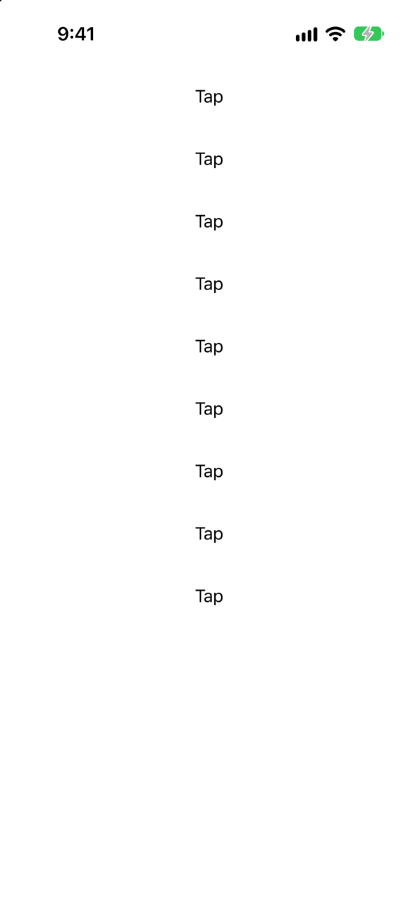
The console showed
hit, 4 points beyond the word
hit, 8 points beyond the word
hit, 12 points beyond the word
hit, 16 points beyond the word
hit, 20 points beyond the word
Up to 20 points beyond the word the tap still counted, and from 24 points it did not. So a label with a little padding seems to work without any help, which is how this bug hides: it appears when the empty part is wide.
Rows 2, 8 and 9 are the ones that reach production: a padded label, a custom-looking button, a list row with a gap in it, each of which "only works if you tap the text". The cure is the same one line every time, placed after the padding and before the gesture: .contentShape(Rectangle()). Apple's description of it is a single sentence: it "defines the content shape for hit testing."
And prefer row 7 to all of them. A Button tells VoiceOver that it is a button, shows that it is being pressed, and can be disabled; a text with a tap gesture does none of that.
Where this comes from: contentShape(_:eoFill:) · Human Interface Guidelines: Buttons — Apple, contentShape(_:eoFill:). The Human Interface Guidelines ask for "a hit region of at least 44x44 pt".
Five buttons, each with a picture directly under it. Every picture is cropped to a strip 50 points tall with scaledToFill, in five slightly different ways. Each button is tapped once, in its middle. Which taps arrive?
Show the answer
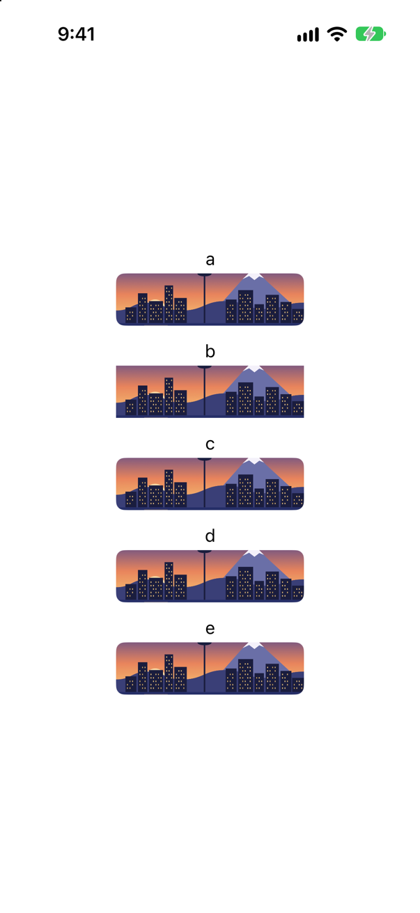
All five were tapped. The console showed
d was tapped
e was tapped
Only the last two. In the first three the tap never reached the button, and nothing on the screen says why.
The picture is three wide to two tall, so to fill a strip 180 points wide it is 120 points tall — not 50. It overflows its frame by 35 points above and below. clipShape and clipped() stop that overflow from being drawn. They do not stop it from being there: the invisible top of each picture lies over the button above it, and takes the touch. The proof asked the running app for the frame of each picture, as the accessibility system sees it: about 120 points tall for every one except d, which is 50.
Row c is the layout-safe recipe from lesson 8's edge cases, a clear color with the picture as its overlay. It fixes the layout and has the same blind spot: the overlay overflows too.
The fix is to say which shape takes touches. Row d adds .contentShape(Rectangle()), which makes that shape the frame. Row e uses .allowsHitTesting(false), which takes the picture out of hit testing altogether — the right choice when the picture has no gesture of its own.
This one is worth remembering in the words of the bug report it produces: "the button above the image only works if you tap its top half." Whenever a picture is filled and clipped, give it a content shape.
Where this comes from: contentShape(_:eoFill:) · clipped(antialiased:) · Fitting images into available space — Apple, contentShape(_:eoFill:): "Defines the content shape for hit testing." And clipped(antialiased:), which speaks only of what is visible: "content that extends beyond the edges of the frame is still visible" by default.
A popular extension gives every view .if(condition) { … }, so that a modifier can be applied "only if". Here two counters have each been tapped twice. One is highlighted with .if, the other with a ternary inside an ordinary modifier. The highlight is switched on. What do the two counters say?
Show the answer
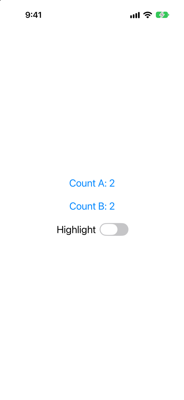
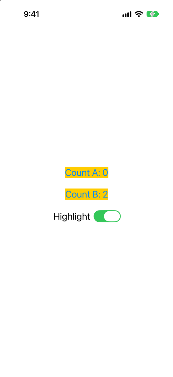
Count A: 0 and Count B: 2. The counter that used .if has lost its state.
Look at what .if returns: transform(self) in one branch and self in the other. Those are two different types, and an if between two types in a view builder is not one view that changes. It is two views, of which one exists at a time. When highlight flips, SwiftUI removes the plain counter, with its @State, and inserts a new, highlighted one that starts from 0.
The second counter is one view the whole time. Its background modifier is always there; only the color it is given changes. WWDC21's "Demystify SwiftUI" has a name for this: "We call modifiers like this 'inert modifiers,' because they don't affect the rendered result." And the advice: "Branches are great, and they exist in SwiftUI for a reason. But when used unnecessarily, they can cause poor performance, surprising animations, and, as Luca showed, even loss of state. When you introduce a branch, pause for a second and consider whether you're representing multiple views or two states of the same view."
So do not add .if to a codebase, and when you find it in one, know what it costs: state is lost, animations jump, and text fields lose their focus every time the condition changes. Nearly every modifier takes a value that can be made to do nothing: .clear, 0, 1, nil, false.
Where this comes from: WWDC21: Demystify SwiftUI (2021 — still the reference on identity) · Configuring views — WWDC21, “Demystify SwiftUI”.
Four ways to take a button away from the user: .hidden(), .opacity(0), leaving it out with if, and .disabled(true). For each: does it still take up its space? Can it still be tapped?
Show the answer
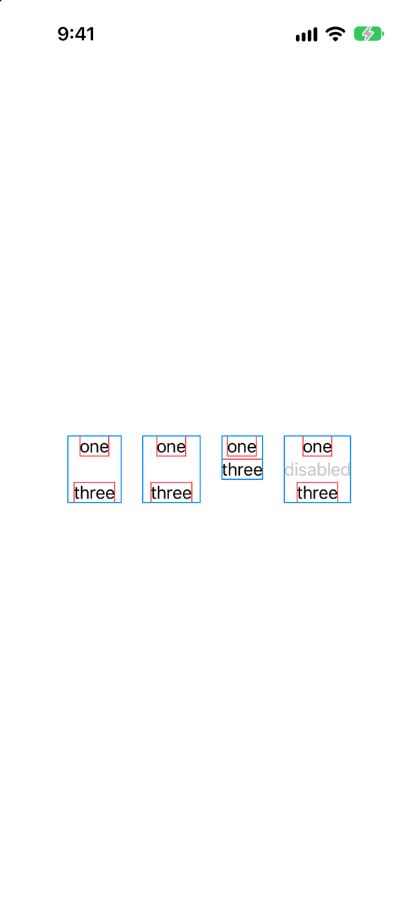
Space first. The first two columns are as tall and as wide as if the middle view were there. Apple says it of hidden(): "Hidden views are invisible and can't receive or respond to interactions. However, they do remain in the view hierarchy and affect layout." Opacity is only a way of drawing, so the same goes for it. The third column has closed up, because with if the view is not there at all. The disabled button is there and is drawn, dimmed.
Now touches. Four buttons, each tapped in its middle:
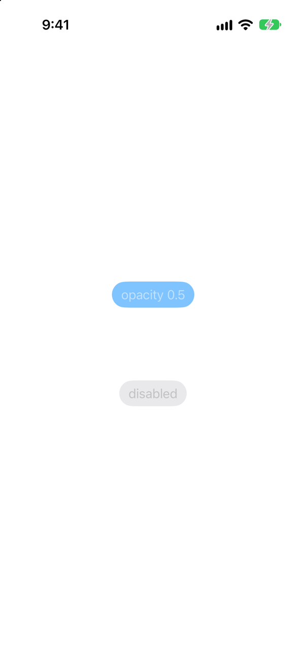
The console showed
opacity 0.5 was tappedOne line. A hidden button cannot be tapped, as the documentation says. Neither can one with an opacity of 0 — but at 0.5 it can, so do not use a small opacity as a way of switching something off. And a disabled button swallows its tap and does nothing.
| Keeps its space | Can be tapped | Use it for | |
|---|---|---|---|
.hidden() | Yes | No | Reserving room: a placeholder that keeps a row from jumping. |
.opacity(0) | Yes | No | The same, when the value changes and should animate: an inert modifier. |
if | No | It is not there | Content that really comes and goes — at the price of its state. |
.disabled(true) | Yes | No | A control the user should see and cannot use yet. |
The interview version is "what is the difference between hiding a view and removing it?", and the answer that shows experience ends with state: of the four, only if destroys the view's @State, as the last edge case showed.
Where this comes from: hidden() · WWDC21: Demystify SwiftUI (2021 — still the reference on identity) — Apple, hidden().
"How would you round the corners of one of your views?" The answer in most interview guides is .cornerRadius(12). What does Apple's documentation say about that modifier today — and what are the three ways to do it now?
Show the answer
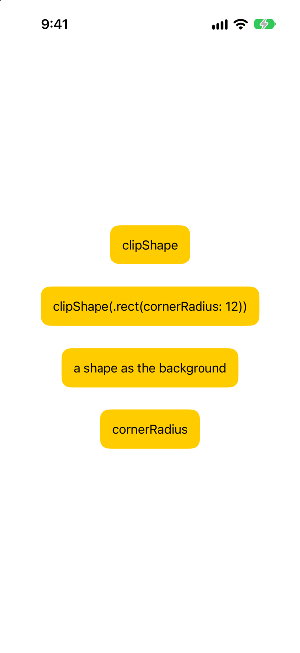
Hacking with Swift's suggested answer is still the one most people give: "If you're using SwiftUI, then the cornerRadius() modifier is your friend." Apple's reference for cornerRadius(_:antialiased:) now lists it as deprecated, with the note: "Use clipShape or fill instead." The same has happened to foregroundColor(_:), whose page says to use foregroundStyle(_:).
It still compiles. The code above was built with Xcode 27 and produced no warning, which is why this one catches people: nothing tells you. The documentation dates the deprecation to iOS 27.2, and this course was built against iOS 27.0, which is why there is no warning yet.
The three ways to say it now. Clip the view to a shape: .clipShape(RoundedRectangle(cornerRadius: 12)), or the shorter .clipShape(.rect(cornerRadius: 12)). Or, when the roundness belongs to a background, do not clip at all: .background(.yellow, in: RoundedRectangle(cornerRadius: 12)) draws a rounded shape behind the view and leaves the view alone. That is what Tile and Chip do in this lesson's tutorial, and it is the one to prefer: nothing is cut off, so a shadow or a badge that overhangs the edge survives.
Clipping has consequences that a background does not. It cuts off anything drawn outside the shape, including a shadow added before it. And, as an earlier edge case showed, it does not cut the area that takes touches.
Where this comes from: Hacking with Swift interview question: How would you round the corners of one of your views? · cornerRadius(_:antialiased:) · clipShape(_:style:) — Hacking with Swift: “How would you round the corners of one of your views?” Apple, cornerRadius(_:antialiased:).
"How would you add a shadow to one of your views?" — .shadow(…). Now the follow-up. The same shadow is put on a column of two texts three ways: on the bare column; on the column with a white rounded background; and on the column after .compositingGroup(). What casts a shadow in each?
Show the answer
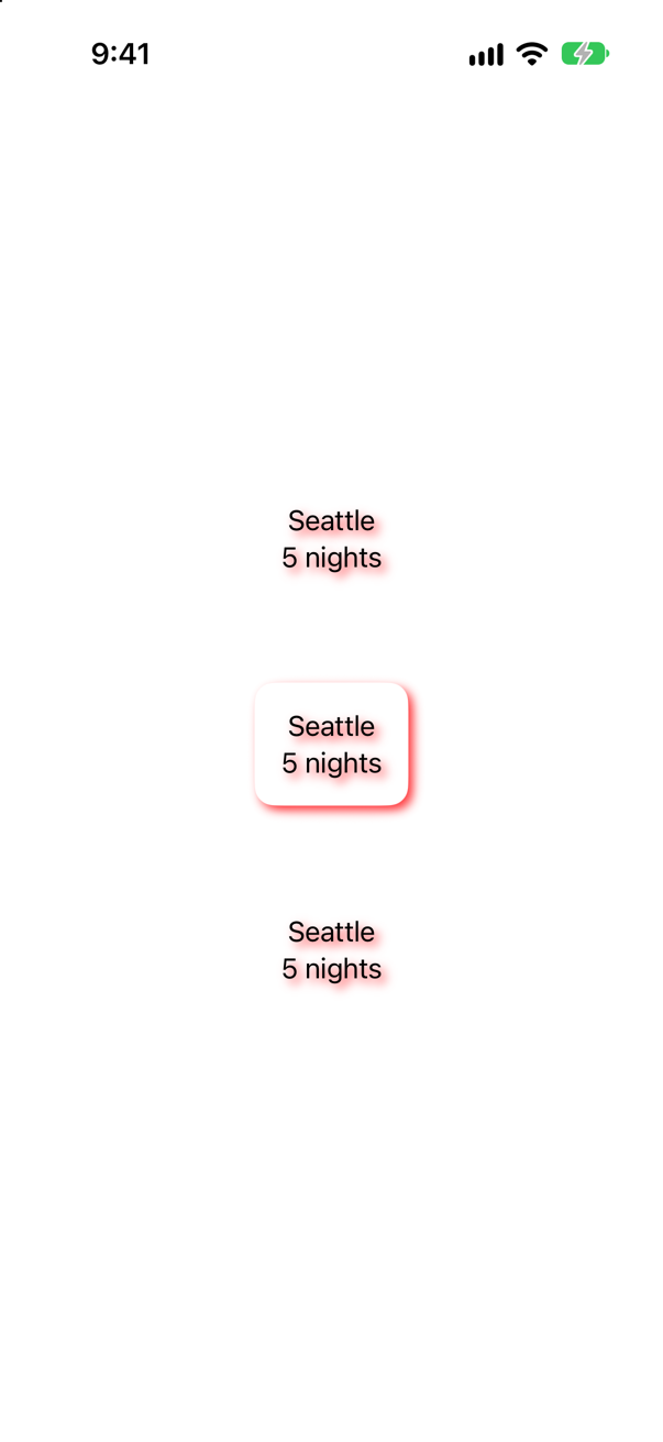
In the first, every letter. A shadow is cast by what is drawn, and a column with padding draws nothing of its own. It is the SwiftUI version of setting a shadow on a UIView with a clear background and finding that the labels inside have grown shadows.
In the second, the box. The background is drawn, it is behind the texts, and the shadow of the whole — box and letters together — is the shadow of the box.
The third is the first again, and that is the instructive one. .compositingGroup() draws the column and its contents into one image before the shadow is applied. Apple: "A compositing group makes compositing effects in this view's ancestor views, such as opacity and the blend mode, take effect before this view is rendered." One image, one shadow — but the image is still only letters on nothing, so the shadow is still the shape of the letters. Where a compositing group changes the picture is with overlapping things: a card made of several views that should fade as one, or cast one shadow and not one each.
Hacking with Swift's answer to the interview question adds the part that shows experience: "This would be a good time to mention to relative cost of dynamic shadows". A shadow has to be computed from whatever is drawn, every time that changes. A shadow on a simple filled shape is cheap. A shadow on a complicated, changing view, in every row of a scrolling list, is one of the classic causes of dropped frames.
Where this comes from: Hacking with Swift interview question: How would you add a shadow to one of your views? · compositingGroup() — Hacking with Swift: “How would you add a shadow to one of your views?” Apple, compositingGroup().
A Text can be put inside another Text literal, styled: Text("\(Text("5").bold()) nights"). A colleague adds a little padding round the number. It compiles. What is on the screen?
Show the answer
It compiles, with a warning
'appendInterpolation' is deprecated: Localized string interpolation produces an unlocalized, debug description for this type of value. Use a type supported by LocalizedStringKey.StringInterpolation or initialize a LocalizedStringResource instead with an interpolated value that conforms to CustomLocalizedStringResourceConvertible.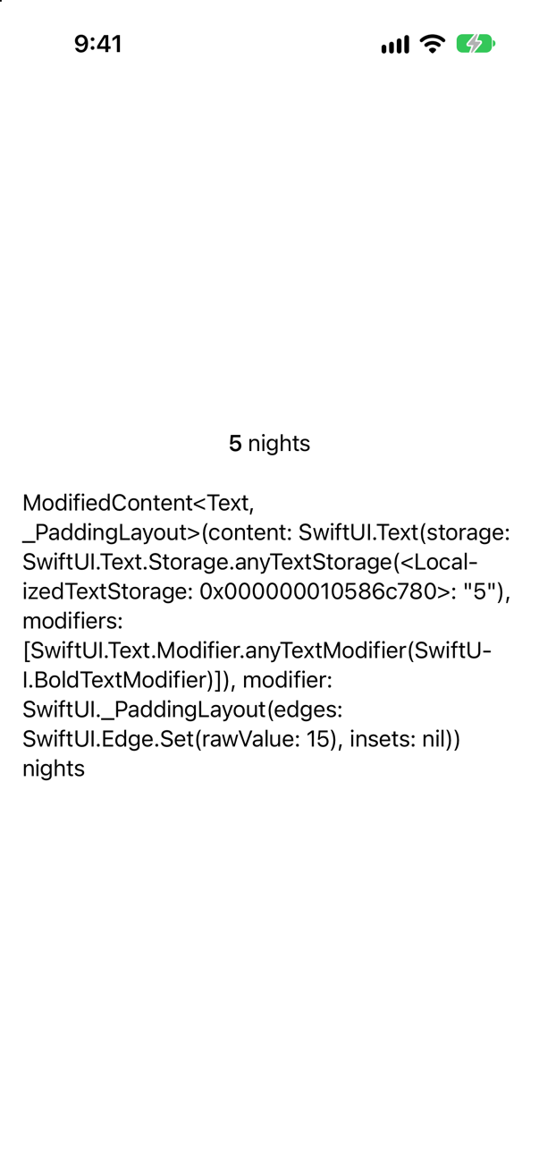
A dump of the view's type, where the 5 should be. It compiled — with the warning above, on the second line.
Text("5").bold() is a Text: bold() here is one of the modifiers that Text defines for itself, which take a text and return a text. So it can be interpolated into another Text, which knows how to include a text with its styling.
.padding() is a modifier for any view, and what it returns is not a Text. Apple: "general modifiers return an opaque type. For example, the return value from the padding modifier isn't Text, but rather an opaque result type". Order matters here for the type: after the first general modifier, you no longer have a text, and everything that needs one stops working. An interpolation that is handed some other value falls back on describing it, which is the dump on the screen, and the warning is the compiler telling you so.
So: text modifiers first, general modifiers after. And treat this warning as an error. It is the same one that lesson 8's Decimal produced, and for the same reason: the interpolation was given something it has no proper way to show.
Where this comes from: Configuring views · Text — Apple, “Configuring views”, section “Use view-specific modifiers”.
"When should you create a custom ViewModifier?" An extension method that chains a few modifiers needs no type at all. Here is something an extension method cannot do. What happens when "Seattle" is tapped — and to "Vancouver"?
Show the answer

"Seattle" turns yellow, and "Vancouver" does not. The modifier has @State, and each place it is used gets a copy of that state for itself. ContentView has no state at all, and knows nothing about which one is marked.
That is the answer to the question. For a fixed chain of modifiers, an extension method is enough: roomy(), in the same extension, is two modifiers and no type.
You need a type that conforms to ViewModifier when the modifier needs something that only a type can hold: @State of its own, as here; a value from the environment, with @Environment; or properties that you want to name and document. Apple: "Adopt the ViewModifier protocol when you want to create a reusable modifier that you can apply to any view."
And know the next step up. When what you are styling is a control, there is a protocol made for it — ButtonStyle, LabelStyle, ToggleStyle — which is given the control's parts and its state (is it pressed? is it on?) and which a whole screen can adopt with one line. A chip that should dim while it is pressed is a ButtonStyle, not a ViewModifier.
Where this comes from: ViewModifier · Configuring views — Apple, ViewModifier.
Grids and custom layouts
"When would you choose Grid instead of LazyVGrid?" Start with a measurement. A thousand cards in a ScrollView, once in a Grid and once in a LazyVGrid. After a second and a half, without a touch, how many have appeared in each?
Show the answer
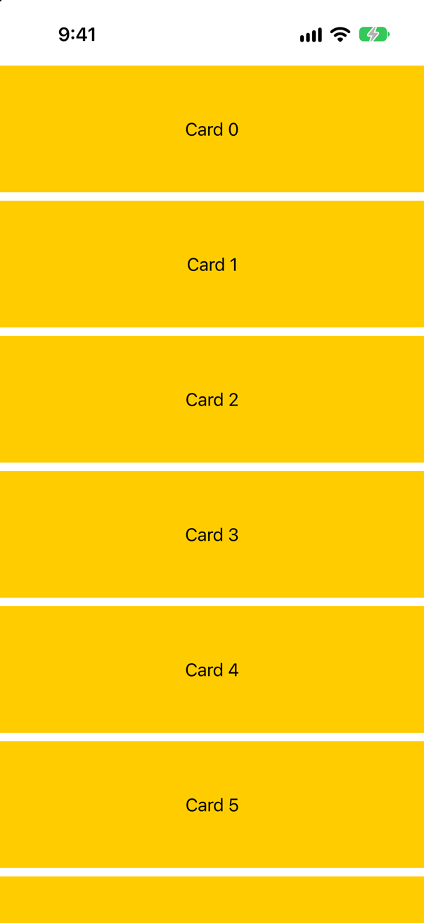
GridScreenshot · iPhone 17, iOS 27.0In the Grid, every one: the console showed 1000 of 1000 cards have appeared. In the LazyVGrid, 7 of 1000 cards have appeared — the ones on the screen.
That is the first half of the answer, and Apple states it in both directions. A Grid "can size its rows and columns correctly because it renders all of its child views immediately." Lazy grids "render their cells when SwiftUI needs to display them, rather than all at once. This reduces the initial cost of displaying a large scrollable grid that's never fully visible, but also reduces the grid's ability to optimally lay out cells."
The second half is that last clause: what a lazy grid gives up. The same small table, in each:
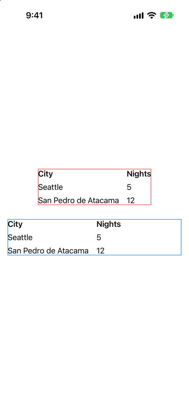
Grid, whose columns fit their contents. Blue: a LazyVGrid, whose columns are what you said they wereScreenshot · iPhone 17, iOS 27.0The Grid looked at every cell and made the first column as wide as "San Pedro de Atacama". The LazyVGrid cannot look: most of its cells do not exist yet. Apple: it "doesn't generally have access to all the views in a row, because it generates new cells as people scroll", and "instead, it relies on a grid item for information". So its columns are whatever the GridItems say — here, two equal halves, whatever is in them.
The answer, then. Grid for a small, fixed table whose columns should fit what is in them: a form, a set of statistics, a price list. LazyVGrid for a scrolling collection of similar cells that may be long: photographs, cards, search results. The interview-preparation repository's line for an image-heavy grid is a list of four things, of which the first is the container: "LazyVGrid, stable IDs, right-sized images from the server, downsample off main, cache them." And Apple's caution applies here as it did to lazy stacks: "Switch to a lazy grid only if profiling your code shows a worthwhile performance improvement."
Where this comes from: Grid · GridItem · Senior iOS Interview Preparation (GitHub) — Apple, Grid, section “Performance considerations”, and GridItem.
"What does GridItem(.adaptive(minimum: 100)) do?" Four lazy grids, with these columns: three .fixed(60); three .flexible(); one .adaptive(minimum: 80); and a .fixed(60) followed by an .adaptive(minimum: 50). How many columns does each have, on a screen 402 points wide?
Show the answer
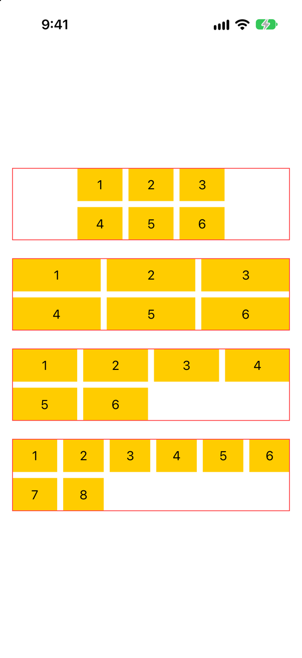
Three, three, four and six.
The first two are what they say. Three fixed items are three columns of 60 points, with the grid's own width left over on each side. Three flexible items are three columns that share the width: Apple's definition is "the size of the grid with spacing and inflexible items removed, divided by the number of flexible items, clamped to the provided bounds."
The third is the one that the question is about. An adaptive item is not a column. It is "multiple items in the space of a single flexible item": the grid fits in as many columns of at least 80 points as it can, here four, and then lets them grow to use up the width. It "prefers to insert as many items of the minimum size as possible but lets them increase to the maximum size." Rotate the phone, or run on an iPad, and the count changes with no code. One line of layout does the work of a collection view's flow layout.
The fourth shows that the kinds can be mixed, and how. The fixed item takes its 60 points. The adaptive item is then one flexible item with the rest of the width, and fills it with columns of at least 50 points: five of them. Six columns in all, and the cells flow through them in order.
Where this comes from: GridItem · LazyVGrid — Apple, GridItem.Size.adaptive(minimum:maximum:) and GridItem.Size.flexible(minimum:maximum:).
A small Grid hugs its two rows. A Divider() is added between them, and the grid changes shape. How — and what are the two modifiers that give you a divider, or a cell, of the width you meant?
Show the answer
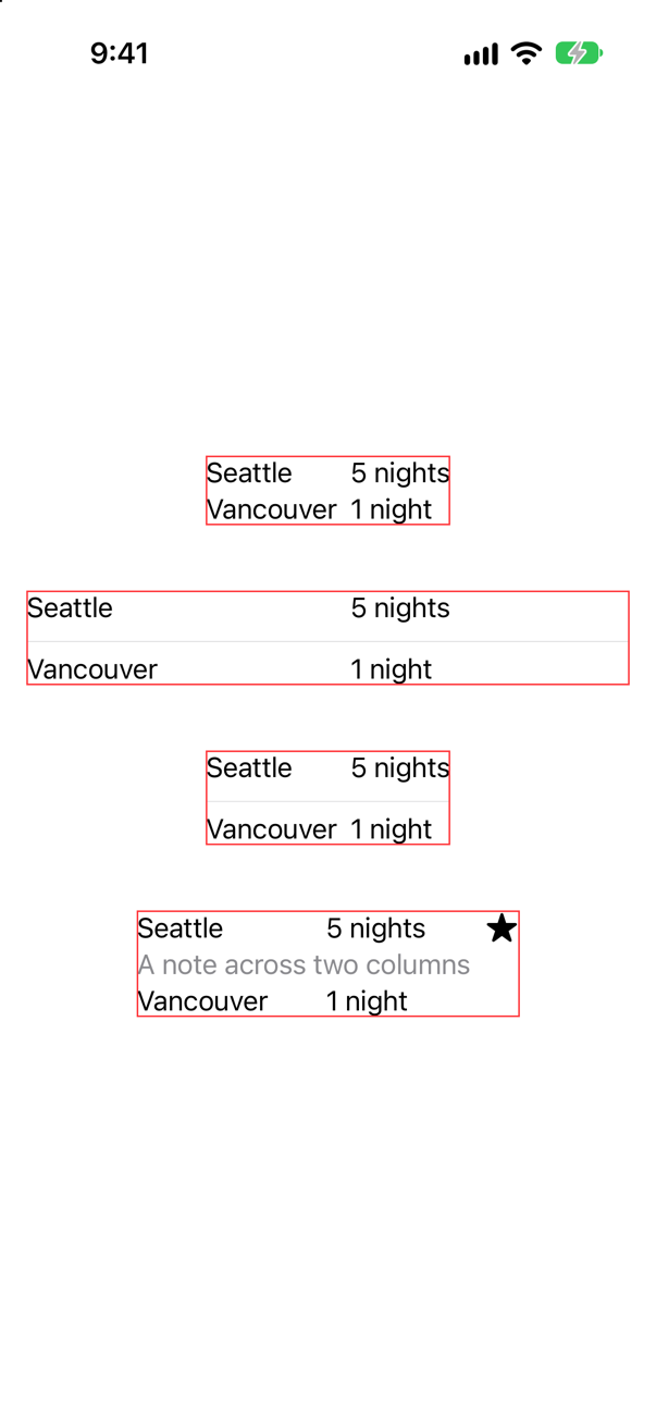
gridCellUnsizedAxes; and a cell that spans two columnsScreenshot · iPhone 17, iOS 27.0With the divider, the grid is as wide as the screen allows and its columns have moved apart. Two rules meet. A view that is put in a grid without a GridRow becomes a row of its own that spans every column. And a divider takes all the width it is offered. Apple: "Because a divider takes as much horizontal space as its parent offers, the entire grid widens to fill the width offered by its parent view." It is lesson 9's divider in a stack, in two dimensions.
The first modifier is for exactly this. .gridCellUnsizedAxes(.horizontal) "asks grid layouts not to offer the view extra size in the specified axes": the divider is then as wide as the other cells make the grid, and no wider. That is the third grid.
The second is for a cell that should cover some columns and not all. .gridCellColumns(2), on a view inside a GridRow, makes it span two. In the fourth grid the note runs under the first two columns, and the star's column is left alone.
A related trap, while you are here: an empty cell. A row that has nothing to put in a column needs something there to keep the later cells in place. Color.clear will do it, and will then stretch the row and the column, because a color takes everything it is offered. Color.clear.gridCellUnsizedAxes([.horizontal, .vertical]) is the empty cell that takes no room.
Where this comes from: Grid · gridCellUnsizedAxes(_:) — Apple, Grid, section “Multicolumn cells”, and gridCellUnsizedAxes(_:).
A two-column LazyVGrid of notes. The notes are of different lengths, so the cells are of different heights. Where does a short cell sit in its row — and how do you get a grid of equal cards?
Show the answer
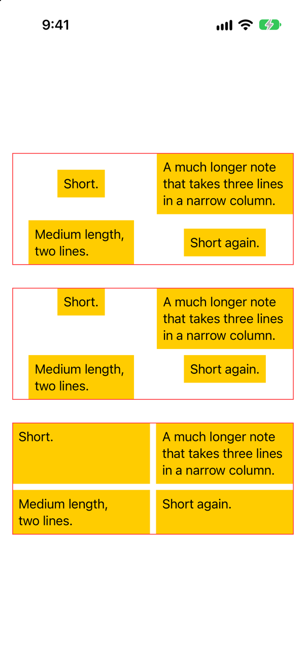
In the middle of its row, and in the middle of its column. A lazy grid gives every cell in a row the height of the tallest, and every cell the width of its column, and then places each view in that space. Step 3 of layout again: the view chose its size, and the container chooses where it goes. The default is the center.
Where it goes is a property of the column: GridItem(.flexible(), alignment: .top). That is the second grid. The notes now start at the top of their rows — and are still centered sideways, and still of four different sizes, which is seldom what a design means by a grid of cards.
For equal cards, the cell has to take the space, and not merely be placed in it. That is the last lesson's subject: .frame(maxWidth: .infinity, maxHeight: .infinity, alignment: .topLeading), and then the background, in that order, so that the yellow is on the frame. Third grid: each card fills its cell, and every row is as tall as its longest note.
This lesson's tutorial did not need this, because every TripCard in a row happens to be the same height. The day a note runs to two lines, it will.
Where this comes from: GridItem · frame(minWidth:idealWidth:maxWidth:minHeight:idealHeight:maxHeight:alignment:) — Apple, GridItem.
A row of views should become a column when the user turns on large text. Two ways to write it: if vertical { VStack { … } } else { HStack { … } }, and AnyLayout. A counter in each has been tapped twice. The switch is flipped. What do the counters say?
Show the answer
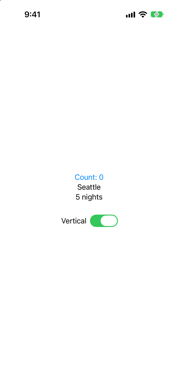
if and else: after two taps and the switch, the counter is back at 0Screenshot · iPhone 17, iOS 27.0With if and else: Count: 0. The VStack in one branch and the HStack in the other are two different views, and so is everything in them. Flipping the switch removed one counter, with its @State, and created another.
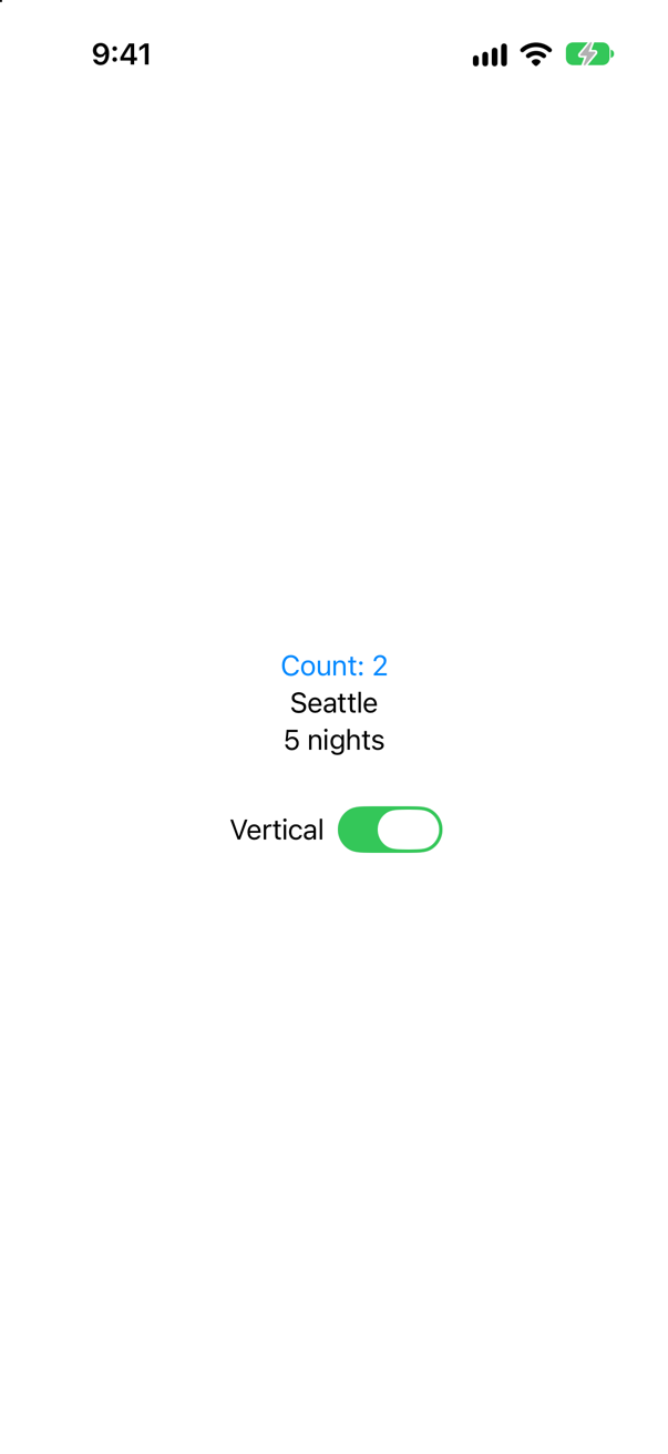
AnyLayout: the same taps, the same switch, and the counter still says 2Screenshot · iPhone 17, iOS 27.0With AnyLayout: Count: 2. There is one container the whole time, and one set of children. Only the rule for arranging them changed. Apple: "Use an AnyLayout instance to enable dynamically changing the type of a layout container without destroying the state of the subviews."
HStackLayout and VStackLayout are the stacks you know, in the form that conforms to Layout; a layout of your own, like this lesson's FlowLayout, can go in an AnyLayout too. Because the views are the same views before and after, the change can also be animated: each one slides from its old place to its new one. With if and else there is nothing to slide, only one set of views fading out and another fading in.
The usual condition is not a switch but the environment — the Dynamic Type size, or the horizontal size class — and for the simple case, "a row if it fits, otherwise a column", lesson 9's ViewThatFits is less code. AnyLayout is for when you decide, and the state inside must survive the decision.
Where this comes from: AnyLayout · WWDC22: Compose custom layouts with SwiftUI · WWDC21: Demystify SwiftUI (2021 — still the reference on identity) — Apple, AnyLayout.
"Which two methods must a custom Layout implement?" sizeThatFits and placeSubviews. Now the follow-up. This lesson's FlowLayout is given the five chips four times: on a screen; inside a ScrollView(.horizontal); with .fixedSize(); and in a frame 150 points wide. How many lines of chips are there each time — and which line of FlowLayout decides?
Show the answer
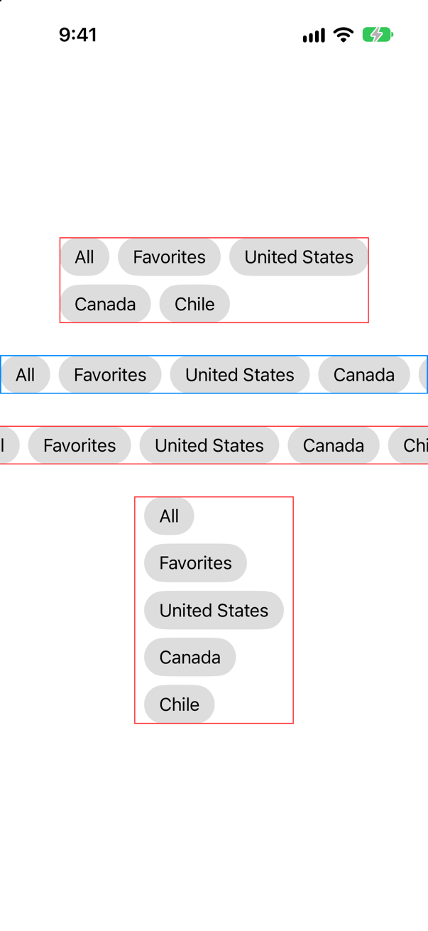
Two, one, one and five. The line that decides is the first line of sizeThatFits:
arrange(subviews, in: proposal.width ?? .infinity).size
A layout does not get to assume a width. It is offered one, as every view is, and the offer can be any of the three special ones that Apple lists for this method: "The zero proposal; respond with the layout's minimum size. The infinity proposal; respond with the layout's maximum size. The unspecified proposal; respond with the layout's ideal size."
On the screen the offer is 370 points, and the chips wrap onto a second line. In a scroll view that scrolls sideways, and under .fixedSize(), the offer has no width: proposal.width is nil. The ?? .infinity turns that into "as wide as you like", so everything goes on one line — which is the right ideal size for a flow of chips, and is why the third one runs off both edges of the screen. In 150 points, no two chips fit side by side.
To see the conversation, print was added to both methods, and the first of the four was run alone:
The console showed
sizeThatFits: offered 370 x 778, answers 291 x 80
placeSubviews: in 291 x 80
placeSubviews: in 291 x 80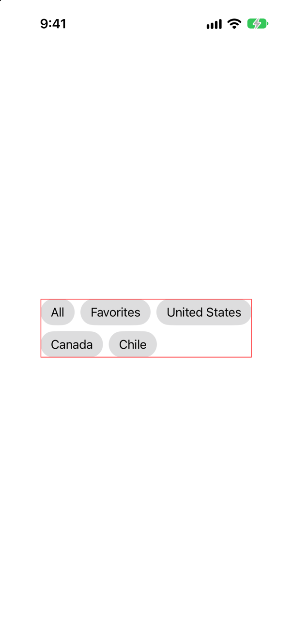
One question about size, answered with the size of the two lines of chips; then the placing, in exactly the rectangle that was claimed. Apple: "SwiftUI views choose their own size, so the layout engine always uses a value that you return from this method as the actual size of the composite view." The placing was asked for twice, and a parent may ask for the size more than once too, so both methods must be cheap, and must agree with each other: "Be sure that you use computations during placement that are consistent with those in your implementation of other protocol methods." FlowLayout guarantees that the simple way. Both methods call the same arrange.
Where this comes from: Layout protocol · Layout.sizeThatFits(proposal:subviews:cache:) · Layout.placeSubviews(in:proposal:subviews:cache:) · WWDC22: Compose custom layouts with SwiftUI — Apple, Layout: sizeThatFits(proposal:subviews:cache:) and placeSubviews(in:proposal:subviews:cache:).
FlowLayout puts 8 points between its children, whatever they are. An HStack with no spacing: does not use one number, as lesson 9 showed. How does a layout of your own find out what the views would like — and does it then match the HStack?
Show the answer
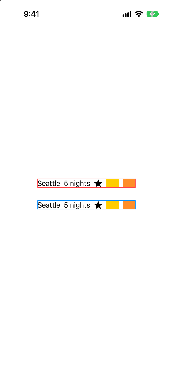
HStack. Blue: a row that asks its childrenScreenshot · iPhone 17, iOS 27.0The console showed
side by side, the neighbors ask for: 8.0, 8.0, 8.0, 8.0
one above the other, they would ask for: 2.0, 0.0, 3.3, 8.0
the row that asks is 229 points wide
the HStack is 229 points wide
Every child that a layout is handed carries its spacing preferences, and a layout asks one neighbor about the next: subviews[index].spacing.distance(to: subviews[index + 1].spacing, along: .horizontal). Apple: the method "considers the preferences of adjacent views on the edge where they meet. It returns the smallest distance that satisfies both views' preferences for the given edge."
Side by side, these five views all ask for the same 8 points. One above the other they would not — 2 between the two texts, nothing between a text and a symbol, 3.3 between the symbol and a color, 8 between the two colors — which is lesson 9's edge case seen from the inside. And the row that was laid out with the answers comes to exactly the width of the HStack above it, 229 points. This is what the built-in stacks do. WWDC22: "respecting these preferences in your own layouts is a good way to get results that automatically follow Apple's interface guidelines, and as a result, match the look of the rest of the system."
So a layout of your own has the same two choices as a stack: a number that you were given, or the views' own wishes. FlowLayout takes a number, which is right for chips. Whichever you choose, use it in both methods. Apple: "if you add spacing during placement, make sure your implementation of sizeThatFits(proposal:subviews:cache:) accounts for the extra space." The classic bug in a first custom layout is a container that is too small for its children by exactly the gaps.
Where this comes from: Layout.placeSubviews(in:proposal:subviews:cache:) · ViewSpacing · WWDC22: Compose custom layouts with SwiftUI — Apple, Layout.placeSubviews(in:proposal:subviews:cache:), and WWDC22, “Compose custom layouts with SwiftUI”.
A thousand cards in a LazyVGrid. The grid is not the scroll view's direct child: it sits in a plain VStack, under a header. Is it still lazy? And what if there is no ScrollView at all?
Show the answer
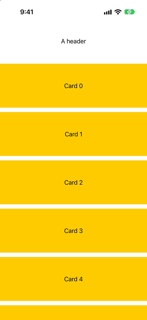
Still lazy: the console showed 6 of 1000 cards have appeared. A lazy grid does not need to be the scroll view's own child. It finds the scroll view that it is in, however many ordinary containers are in between, and builds the cells that fall inside the part that can be seen. This lesson's ContentView relies on this: its grid of cards is one child of a stack that also holds the strip, the summary and the chips.
Take the scroll view away and the grid is still lazy, in the worst way: 8 of 1000 cards have appeared.
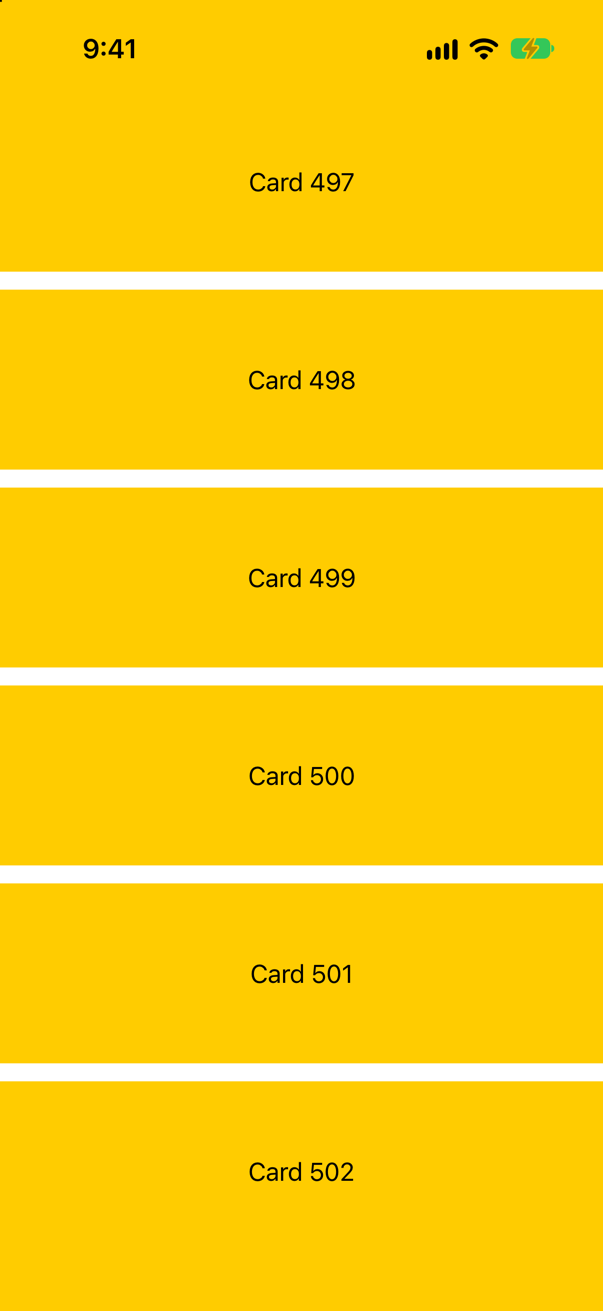
It built the cards that fit on the screen, and nobody can reach the others. A lazy container trades completeness for speed on the understanding that scrolling will ask for the rest. Without scrolling, the rest never comes.
The opposite mistake is the commoner one: a Grid, or a plain VStack, holding a thousand of anything inside a ScrollView — every one of them built before the first is seen, as this lesson's first edge case counted. The rule that covers both: long and scrolling means lazy; short and fixed means not.
Where this comes from: LazyVGrid · Creating performant scrollable stacks · Grid — Apple, LazyVGrid, and “Creating performant scrollable stacks”.
Further reading
- ViewModifier
- Configuring views
- View fundamentals
- Grid
- Layout protocol
- WWDC22: Compose custom layouts with SwiftUI
An infinite photo carousel
“Build a horizontally paging photo carousel that feels infinite in both directions, from five photos. Thirty minutes. Talk while you type.” Given: a Photo type that is Identifiable, and a finished PhotoCard view.
Where this comes from: DoorDash iOS interview, as reported by candidates (Prepfully) — recently reported by DoorDash candidates: “design a photo browser app with an infinite scroll carousel”
Show the answer
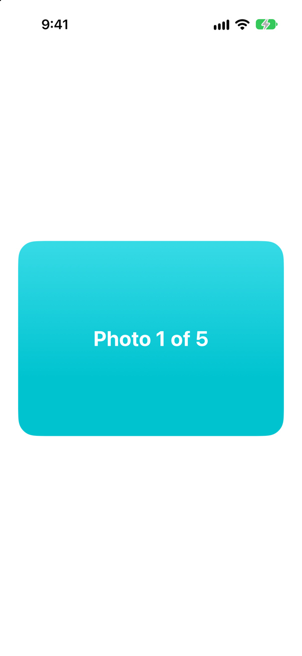
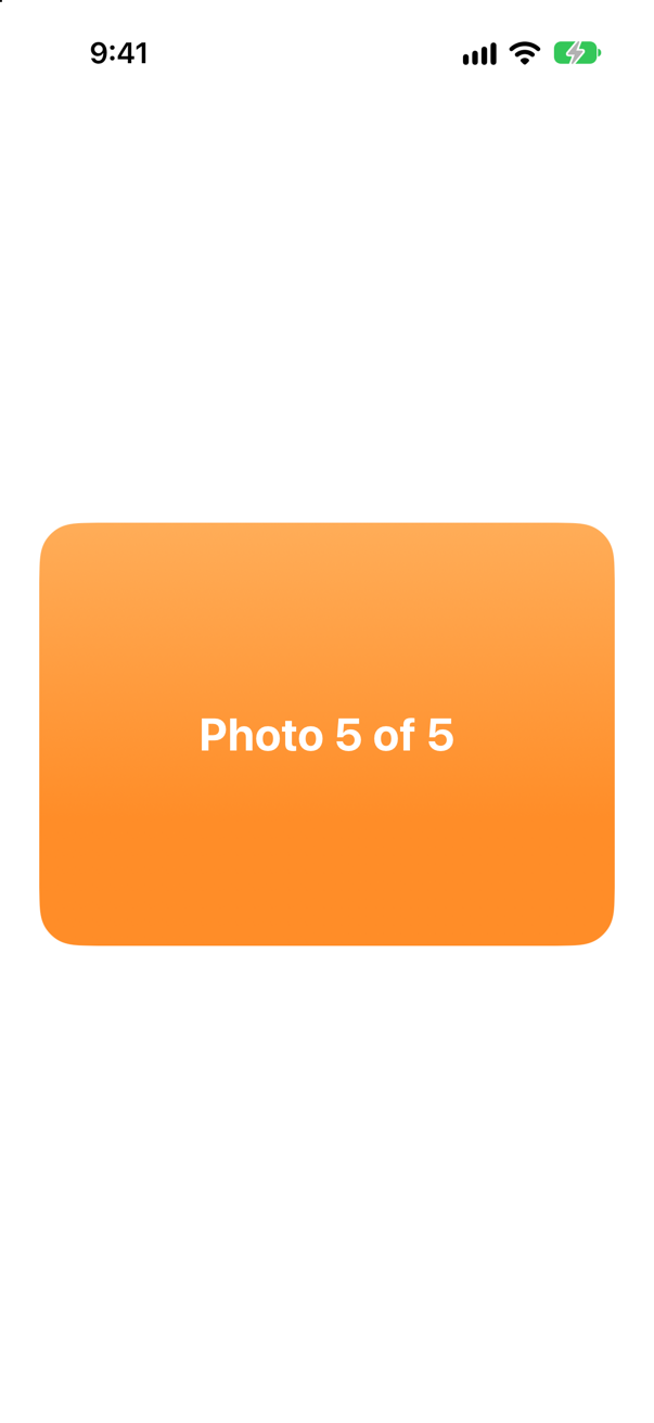
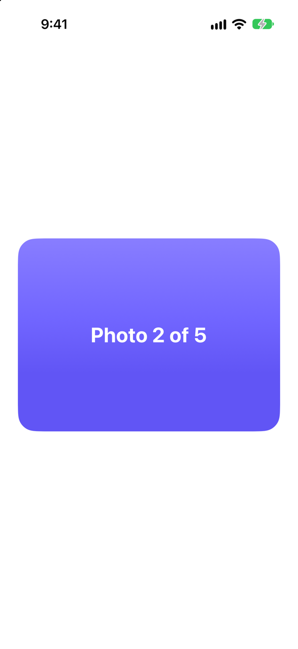
Three decisions worth saying out loud. A lazy stack, so that a thousand copies cost nothing until they are scrolled to. Modulo arithmetic to map a huge index onto five real photos. And starting in the middle, so that both directions exist from the first frame. scrollTargetLayout with .paging gives the snapping; containerRelativeFrame sizes each card to the scroll view without a GeometryReader.
Then name the trade-off before the interviewer does: this only appears infinite. It is honest for any human thumb, but a stricter solution re-centres the position when it nears either end. Say what you would add with ten more minutes: an accessibility value ("photo 3 of 5") and image prefetching.
What interviewers listen for: Laziness, a defensible choice of identity (here the index really is the identity), and trade-offs that you offer rather than have dragged out of you.