A boarding pass, drawn in code
Shapes and paths
You will buildA boarding pass at the top of each trip's screen: first on a built-in rounded rectangle, then on a ticket shape of your own with a notch in each side, and with a ring that shows how much of all your nights away this trip takes.
TimeAbout 60 minutes
WhyPart 8 is drawing and animation. It starts with the thing everything else is drawn with: a shape is a type that turns a rectangle into a path, and SwiftUI does the rest — filling it, stroking it, using it as a background or a clip, at whatever size the layout hands it. In UIKit this was UIBezierPath and CAShapeLayer; here it is one small struct. Interviewers ask candidates to draw something custom live — a ticket, a speech bubble, a progress ring — and then ask why the arc went the wrong way.
Open your project
Open your
Tripsproject as lesson 24 left it: double-clickTrips.xcodeprojin Finder, or use File ▸ Open… (⌘O) in Xcode.If you did not finish lesson 24, or would rather start from a known state, download Trips-lesson-24.zip instead. It is the project exactly as it stood at the end of lesson 24. Unzip it and open
Trips.xcodeproj.Run it (⌘R) to check that it builds. You should see where lesson 24 ended:
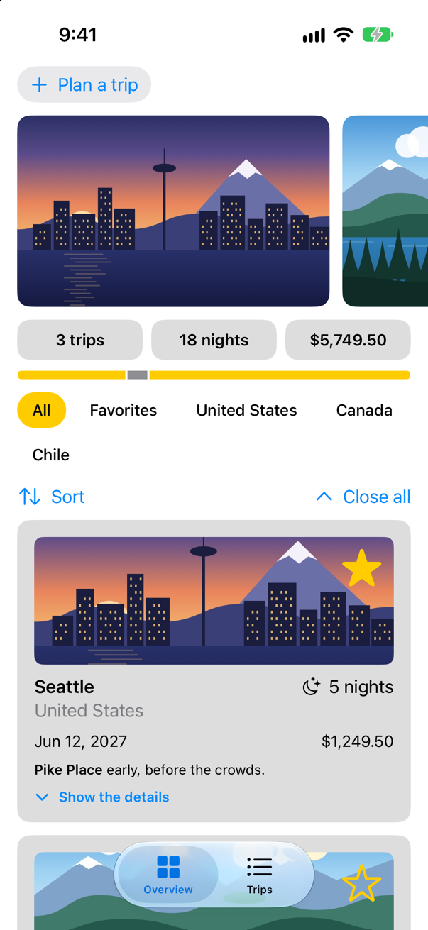
Trips, as it stood at the end of lesson 24Screenshot · iPhone 17, iOS 27.0
A boarding pass on a built-in shape
SwiftUI has shapes ready to use — Rectangle, RoundedRectangle, Circle, Capsule, Ellipse — and every one of them is a view that you can fill or stroke, and also a shape that a modifier can draw in. .background(_:in:) fills a shape behind a view, sized to fit it. The boarding pass starts that way. Make a SwiftUI View named BoardingPass:
struct BoardingPass: View { let trip: Trip @Environment(\.highlight) private var highlight var body: some View { Text("Hello, World!") VStack(alignment: .leading, spacing: 4) { Text("Boarding pass") .font(.caption.weight(.semibold)) .textCase(.uppercase) .foregroundStyle(.secondary) Text(trip.city) .font(.title2.weight(.bold)) Text(trip.start, format: .dateTime.day().month(.wide).year()) .foregroundStyle(.secondary) } .frame(maxWidth: .infinity, alignment: .leading) .padding(.vertical, 20) .padding(.horizontal, 28) .background(highlight.opacity(0.3), in: RoundedRectangle(cornerRadius: 16)) .padding(.horizontal) }}struct BoardingPass: View {
let trip: Trip
@Environment(\.highlight) private var highlight
var body: some View {
VStack(alignment: .leading, spacing: 4) {
Text("Boarding pass")
.font(.caption.weight(.semibold))
.textCase(.uppercase)
.foregroundStyle(.secondary)
Text(trip.city)
.font(.title2.weight(.bold))
Text(trip.start, format: .dateTime.day().month(.wide).year())
.foregroundStyle(.secondary)
}
.frame(maxWidth: .infinity, alignment: .leading)
.padding(.vertical, 20)
.padding(.horizontal, 28)
.background(highlight.opacity(0.3), in: RoundedRectangle(cornerRadius: 16))
.padding(.horizontal)
}
}#Preview { BoardingPass() BoardingPass(trip: .seattle)}#Preview {
BoardingPass(trip: .seattle)
}And show it at the top of a trip's screen. In TripDetail.swift:
struct TripDetail: View { let id: Trip.ID @Binding var selection: Trip.ID? @Environment(TripStore.self) private var store @State private var editing: Trip? @State private var isConfirmingDelete = false var body: some View { @Bindable var store = store if let index = store.trips.firstIndex(where: { $0.id == id }) { ScrollView { VStack(spacing: 16) { BoardingPass(trip: store.trips[index]) TripCard(trip: $store.trips[index]) if let next = next(after: store.trips[index]) { NavigationLink("Next: \(next.city)", value: next.id) } } } .navigationTitle(store.trips[index].city) .toolbar { ToolbarItem { Button("All trips", systemImage: "list.bullet") { selection = nil } } ToolbarItem { Button("Edit") { editing = store.trips[index] } } ToolbarOverflowMenu { Button("Delete trip", systemImage: "trash", role: .destructive) { isConfirmingDelete = true } } } .alert("Delete \(store.trips[index].city)?", isPresented: $isConfirmingDelete) { Button("Delete", role: .destructive) { store.delete([store.trips[index]]) } Button("Cancel", role: .cancel) { } } message: { Text("This cannot be undone.") } .sheet(item: $editing) { trip in TripEditor(trip: trip) { edited in store.update(edited) } .presentationDetents([.medium, .large]) } } else { ContentUnavailableView("This trip is gone", systemImage: "airplane.departure") } } /// The trip that starts soonest after this one, if there is one. private func next(after trip: Trip) -> Trip? { store.trips.filter { $0.start > trip.start }.min { $0.start < $1.start } }}struct TripDetail: View {
let id: Trip.ID
@Binding var selection: Trip.ID?
@Environment(TripStore.self) private var store
@State private var editing: Trip?
@State private var isConfirmingDelete = false
var body: some View {
@Bindable var store = store
if let index = store.trips.firstIndex(where: { $0.id == id }) {
ScrollView {
VStack(spacing: 16) {
BoardingPass(trip: store.trips[index])
TripCard(trip: $store.trips[index])
if let next = next(after: store.trips[index]) {
NavigationLink("Next: \(next.city)", value: next.id)
}
}
}
.navigationTitle(store.trips[index].city)
.toolbar {
ToolbarItem {
Button("All trips", systemImage: "list.bullet") {
selection = nil
}
}
ToolbarItem {
Button("Edit") {
editing = store.trips[index]
}
}
ToolbarOverflowMenu {
Button("Delete trip", systemImage: "trash", role: .destructive) {
isConfirmingDelete = true
}
}
}
.alert("Delete \(store.trips[index].city)?", isPresented: $isConfirmingDelete) {
Button("Delete", role: .destructive) {
store.delete([store.trips[index]])
}
Button("Cancel", role: .cancel) { }
} message: {
Text("This cannot be undone.")
}
.sheet(item: $editing) { trip in
TripEditor(trip: trip) { edited in
store.update(edited)
}
.presentationDetents([.medium, .large])
}
} else {
ContentUnavailableView("This trip is gone", systemImage: "airplane.departure")
}
}
/// The trip that starts soonest after this one, if there is one.
private func next(after trip: Trip) -> Trip? {
store.trips.filter { $0.start > trip.start }.min { $0.start < $1.start }
}
}Run the app, tap Trips, and open Seattle:
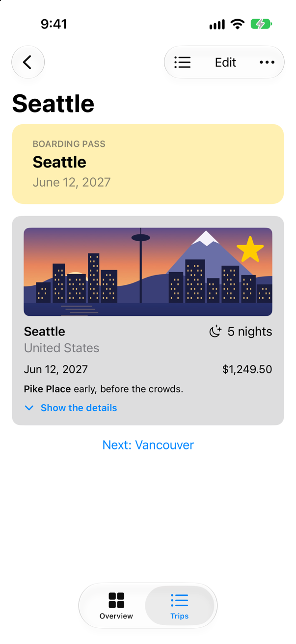
The rectangle took the size of the text and padding in front of it — background(_:in:) hands the shape the view's own frame. That is the first rule of shapes: a shape has no size of its own. It draws itself to fit whatever rectangle it is given.
A shape of your own
A ticket has a notch bitten out of each side, and no built-in shape does that. A shape of your own is a type that conforms to Shape, which asks for one method: path(in:), which is handed a rectangle and returns a Path — the outline to fill or stroke. A path is drawn like a pen on paper: move(to:) puts the pen down, addLine(to:) draws a straight line, addArc a piece of a circle, and closeSubpath() goes back to the start. Make a new Swift File named Ticket, and replace everything in it:
import SwiftUI

/// A ticket: a rectangle with a round notch bitten out of each side.
struct Ticket: Shape {
    var notch: CGFloat = 14

    func path(in rect: CGRect) -> Path {
        var path = Path()
        path.move(to: CGPoint(x: rect.minX, y: rect.minY))
        path.addLine(to: CGPoint(x: rect.maxX, y: rect.minY))
        path.addLine(to: CGPoint(x: rect.maxX, y: rect.midY - notch))
        path.addArc(center: CGPoint(x: rect.maxX, y: rect.midY), radius: notch,
                    startAngle: .degrees(270), endAngle: .degrees(90), clockwise: true)
        path.addLine(to: CGPoint(x: rect.maxX, y: rect.maxY))
        path.addLine(to: CGPoint(x: rect.minX, y: rect.maxY))
        path.addLine(to: CGPoint(x: rect.minX, y: rect.midY + notch))
        path.addArc(center: CGPoint(x: rect.minX, y: rect.midY), radius: notch,
                    startAngle: .degrees(90), endAngle: .degrees(270), clockwise: true)
        path.closeSubpath()
        return path
    }
}
Follow the pen: from the top left corner along the top, down the right side to just above the middle, around a half circle into the ticket, down to the bottom right, along the bottom, up the left side to just below the middle, around the other half circle, and back to the start.
Angles in a path are measured from the positive x-axis, as in school — but SwiftUI's y-axis points down, so 90° is straight down and 270° straight up. Apple warns that "because SwiftUI by default uses a vertically-flipped coordinate system … specifying a clockwise arc results in a counterclockwise arc after the transformation is applied." The right notch runs from 270° (above the middle) to 90° (below it) through 180° — the inside of the ticket — which on the screen looks counterclockwise, and is written clockwise: true. One of this lesson's edge cases draws it both ways.
Where this comes from: addArc(center:radius:startAngle:endAngle:clockwise:transform:)
Now use it. In BoardingPass.swift, the background becomes a Ticket():
struct BoardingPass: View { let trip: Trip @Environment(\.highlight) private var highlight var body: some View { VStack(alignment: .leading, spacing: 4) { Text("Boarding pass") .font(.caption.weight(.semibold)) .textCase(.uppercase) .foregroundStyle(.secondary) Text(trip.city) .font(.title2.weight(.bold)) Text(trip.start, format: .dateTime.day().month(.wide).year()) .foregroundStyle(.secondary) } .frame(maxWidth: .infinity, alignment: .leading) .padding(.vertical, 20) .padding(.horizontal, 28) .background(highlight.opacity(0.3), in: RoundedRectangle(cornerRadius: 16)) .background(highlight.opacity(0.3), in: Ticket()) .padding(.horizontal) }}struct BoardingPass: View {
let trip: Trip
@Environment(\.highlight) private var highlight
var body: some View {
VStack(alignment: .leading, spacing: 4) {
Text("Boarding pass")
.font(.caption.weight(.semibold))
.textCase(.uppercase)
.foregroundStyle(.secondary)
Text(trip.city)
.font(.title2.weight(.bold))
Text(trip.start, format: .dateTime.day().month(.wide).year())
.foregroundStyle(.secondary)
}
.frame(maxWidth: .infinity, alignment: .leading)
.padding(.vertical, 20)
.padding(.horizontal, 28)
.background(highlight.opacity(0.3), in: Ticket())
.padding(.horizontal)
}
}Run the app and open Seattle again:
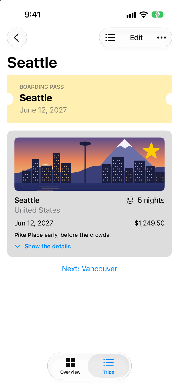
The same shape at any size
Because path(in:) works from the rectangle it is handed — rect.maxX, rect.midY, never a fixed number of points — the same ticket fits any frame. A preview can show three at once. In Ticket.swift, under the struct:
#Preview("Three sizes") {
    VStack(spacing: 24) {
        Ticket().fill(.orange).frame(width: 120, height: 60)
        Ticket().fill(.orange).frame(width: 240, height: 100)
        Ticket(notch: 24).fill(.orange).frame(width: 340, height: 160)
    }
}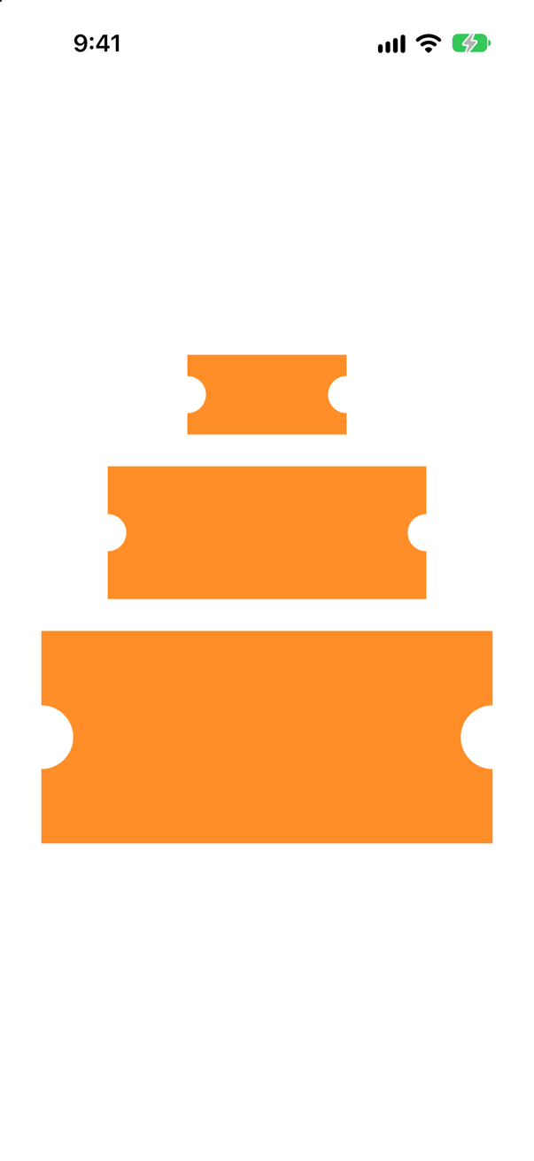
The notch is the one fixed size: 14 points, unless the ticket is given another, as the third is. That is a choice. A notch that grew with the ticket would be rect.height / 8 instead.
Part of a path: a ring
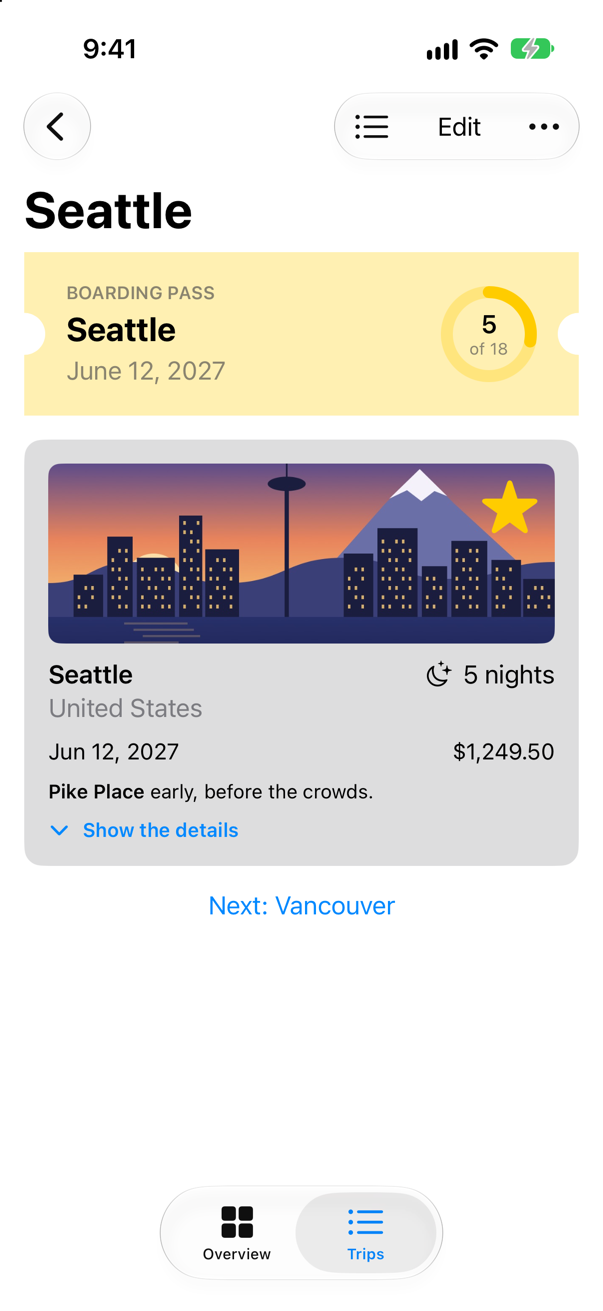
trim(from:to:) draws only part of a shape's path: from 0, the start, to 1, the end. Apple: it draws "a portion of a shape by ignoring portions of the beginning and ending of the shape's path." A circle trimmed to 0.28 is 28% of a ring — the share of all your nights away that Seattle's 5 of 18 take. Make a SwiftUI View named NightsRing:
struct NightsRing: View { let nights: Int let total: Int @Environment(\.highlight) private var highlight var body: some View { Text("Hello, World!") ZStack { Circle() .strokeBorder(highlight.opacity(0.3), lineWidth: 8) Circle() .inset(by: 4) .trim(from: 0, to: Double(nights) / Double(max(total, 1))) .stroke(highlight, style: StrokeStyle(lineWidth: 8, lineCap: .round)) .rotationEffect(.degrees(-90)) VStack(spacing: 0) { Text(nights, format: .number) .font(.headline) Text("of \(total)") .font(.caption2) .foregroundStyle(.secondary) } } .frame(width: 64, height: 64) }}struct NightsRing: View {
let nights: Int
let total: Int
@Environment(\.highlight) private var highlight
var body: some View {
ZStack {
Circle()
.strokeBorder(highlight.opacity(0.3), lineWidth: 8)
Circle()
.inset(by: 4)
.trim(from: 0, to: Double(nights) / Double(max(total, 1)))
.stroke(highlight, style: StrokeStyle(lineWidth: 8, lineCap: .round))
.rotationEffect(.degrees(-90))
VStack(spacing: 0) {
Text(nights, format: .number)
.font(.headline)
Text("of \(total)")
.font(.caption2)
.foregroundStyle(.secondary)
}
}
.frame(width: 64, height: 64)
}
}#Preview { NightsRing() HStack(spacing: 20) { NightsRing(nights: 1, total: 18) NightsRing(nights: 5, total: 18) NightsRing(nights: 12, total: 18) }}#Preview {
HStack(spacing: 20) {
NightsRing(nights: 1, total: 18)
NightsRing(nights: 5, total: 18)
NightsRing(nights: 12, total: 18)
}
}Three details in it are about how strokes work. The track uses strokeBorder, which draws the line inside the shape; a plain stroke straddles the outline, half inside and half out. The trimmed ring cannot use strokeBorder — a trimmed shape is not one that can be inset — so it insets the circle first, by half the line's width, and then strokes it. And a circle's path starts at three o'clock, so the ring is turned a quarter back to start at twelve. Each of those is an edge case in this lesson.
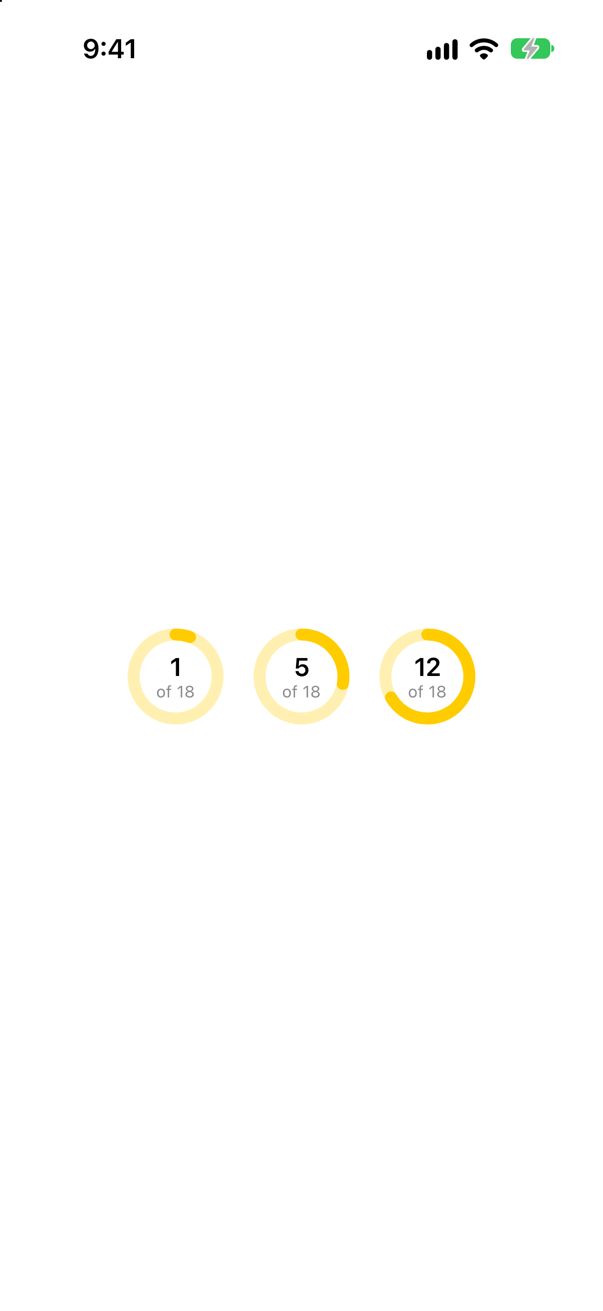
Last, the boarding pass shows the ring beside the city, and is told the total. In BoardingPass.swift:
struct BoardingPass: View { let trip: Trip let totalNights: Int @Environment(\.highlight) private var highlight var body: some View { VStack(alignment: .leading, spacing: 4) { Text("Boarding pass") .font(.caption.weight(.semibold)) .textCase(.uppercase) .foregroundStyle(.secondary) Text(trip.city) .font(.title2.weight(.bold)) Text(trip.start, format: .dateTime.day().month(.wide).year()) .foregroundStyle(.secondary) HStack(spacing: 16) { VStack(alignment: .leading, spacing: 4) { Text("Boarding pass") .font(.caption.weight(.semibold)) .textCase(.uppercase) .foregroundStyle(.secondary) Text(trip.city) .font(.title2.weight(.bold)) Text(trip.start, format: .dateTime.day().month(.wide).year()) .foregroundStyle(.secondary) } Spacer() NightsRing(nights: trip.nights, total: totalNights) } .frame(maxWidth: .infinity, alignment: .leading) .padding(.vertical, 20) .padding(.horizontal, 28) .background(highlight.opacity(0.3), in: Ticket()) .padding(.horizontal) }}struct BoardingPass: View {
let trip: Trip
let totalNights: Int
@Environment(\.highlight) private var highlight
var body: some View {
HStack(spacing: 16) {
VStack(alignment: .leading, spacing: 4) {
Text("Boarding pass")
.font(.caption.weight(.semibold))
.textCase(.uppercase)
.foregroundStyle(.secondary)
Text(trip.city)
.font(.title2.weight(.bold))
Text(trip.start, format: .dateTime.day().month(.wide).year())
.foregroundStyle(.secondary)
}
Spacer()
NightsRing(nights: trip.nights, total: totalNights)
}
.padding(.vertical, 20)
.padding(.horizontal, 28)
.background(highlight.opacity(0.3), in: Ticket())
.padding(.horizontal)
}
}#Preview { BoardingPass(trip: .seattle) BoardingPass(trip: .seattle, totalNights: 18)}#Preview {
BoardingPass(trip: .seattle, totalNights: 18)
}And in TripDetail.swift, hand it the total of every trip's nights:
struct TripDetail: View { let id: Trip.ID @Binding var selection: Trip.ID? @Environment(TripStore.self) private var store @State private var editing: Trip? @State private var isConfirmingDelete = false var body: some View { @Bindable var store = store if let index = store.trips.firstIndex(where: { $0.id == id }) { ScrollView { VStack(spacing: 16) { BoardingPass(trip: store.trips[index]) BoardingPass(trip: store.trips[index], totalNights: store.trips.reduce(0) { $0 + $1.nights }) TripCard(trip: $store.trips[index]) if let next = next(after: store.trips[index]) { NavigationLink("Next: \(next.city)", value: next.id) } } } .navigationTitle(store.trips[index].city) .toolbar { ToolbarItem { Button("All trips", systemImage: "list.bullet") { selection = nil } } ToolbarItem { Button("Edit") { editing = store.trips[index] } } ToolbarOverflowMenu { Button("Delete trip", systemImage: "trash", role: .destructive) { isConfirmingDelete = true } } } .alert("Delete \(store.trips[index].city)?", isPresented: $isConfirmingDelete) { Button("Delete", role: .destructive) { store.delete([store.trips[index]]) } Button("Cancel", role: .cancel) { } } message: { Text("This cannot be undone.") } .sheet(item: $editing) { trip in TripEditor(trip: trip) { edited in store.update(edited) } .presentationDetents([.medium, .large]) } } else { ContentUnavailableView("This trip is gone", systemImage: "airplane.departure") } } /// The trip that starts soonest after this one, if there is one. private func next(after trip: Trip) -> Trip? { store.trips.filter { $0.start > trip.start }.min { $0.start < $1.start } }}struct TripDetail: View {
let id: Trip.ID
@Binding var selection: Trip.ID?
@Environment(TripStore.self) private var store
@State private var editing: Trip?
@State private var isConfirmingDelete = false
var body: some View {
@Bindable var store = store
if let index = store.trips.firstIndex(where: { $0.id == id }) {
ScrollView {
VStack(spacing: 16) {
BoardingPass(trip: store.trips[index],
totalNights: store.trips.reduce(0) { $0 + $1.nights })
TripCard(trip: $store.trips[index])
if let next = next(after: store.trips[index]) {
NavigationLink("Next: \(next.city)", value: next.id)
}
}
}
.navigationTitle(store.trips[index].city)
.toolbar {
ToolbarItem {
Button("All trips", systemImage: "list.bullet") {
selection = nil
}
}
ToolbarItem {
Button("Edit") {
editing = store.trips[index]
}
}
ToolbarOverflowMenu {
Button("Delete trip", systemImage: "trash", role: .destructive) {
isConfirmingDelete = true
}
}
}
.alert("Delete \(store.trips[index].city)?", isPresented: $isConfirmingDelete) {
Button("Delete", role: .destructive) {
store.delete([store.trips[index]])
}
Button("Cancel", role: .cancel) { }
} message: {
Text("This cannot be undone.")
}
.sheet(item: $editing) { trip in
TripEditor(trip: trip) { edited in
store.update(edited)
}
.presentationDetents([.medium, .large])
}
} else {
ContentUnavailableView("This trip is gone", systemImage: "airplane.departure")
}
}
/// The trip that starts soonest after this one, if there is one.
private func next(after trip: Trip) -> Trip? {
store.trips.filter { $0.start > trip.start }.min { $0.start < $1.start }
}
}Run the app and open Seattle:
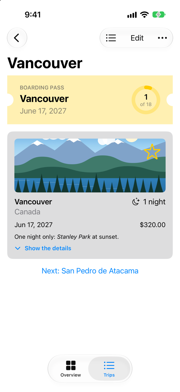
Tap Next: Vancouver — one night, a sliver of the ring:
What you built
- A
BoardingPassview, its background drawn in a shape withbackground(_:in:). - A
Ticketshape of your own: lines and arcs inpath(in:), worked out from the rectangle it is given. - A preview that shows one shape at three sizes.
- A
NightsRing: a circle trimmed withtrim(from:to:), stroked inside its frame, starting at twelve o'clock.
Next, color that changes across a view: gradients, materials and shadows — and the ticket gets all three.
The finished project
Stuck, or want to compare with your own? This is the project as it stands at the end of this lesson, built and run before it was put here.
- Trips-lesson-25.zip — unzip it, then open
Trips.xcodeprojin Xcode.
Flash cards
20 cards for this lesson, each labelled with its topic. 12 ask how you would write something; the other 8 are trick questions, written to catch a misunderstanding. Answer in your head first, then tap the card.
Syntax · ShapesDraw a filled circle, a capsule and a rounded rectangle.
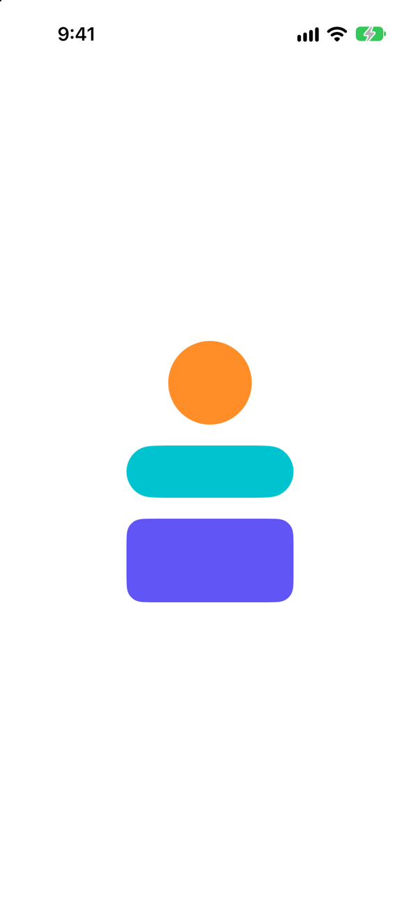
The built-in shapes, each filled with .fill(_:). A shape has no size of its own: each takes the frame it is given.
Syntax · ShapesDraw only the outline of a circle, 4 points wide.
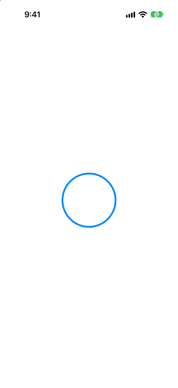
.stroke(_:lineWidth:). The line is centered on the outline: half of it lies outside the shape's frame.
Syntax · ShapesDraw an outline that stays entirely inside the shape's frame.
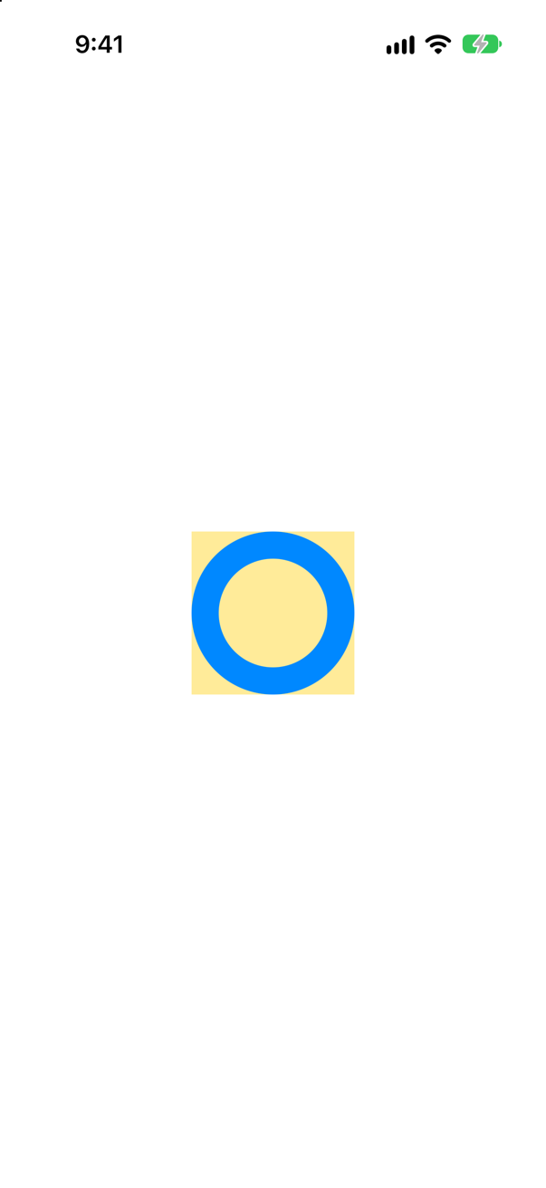
.strokeBorder(_:lineWidth:). Apple: it is "equivalent to insetting self by lineWidth / 2 and stroking the resulting shape". In the picture the yellow square is the frame, and the ring stays within it.
Syntax · ShapesPut a colored shape behind a view, sized to fit it.

.background(_:in:): a style, filling a shape that takes the view's own frame — here the text and its padding.
Syntax · ShapesCut a view to the outline of a shape.
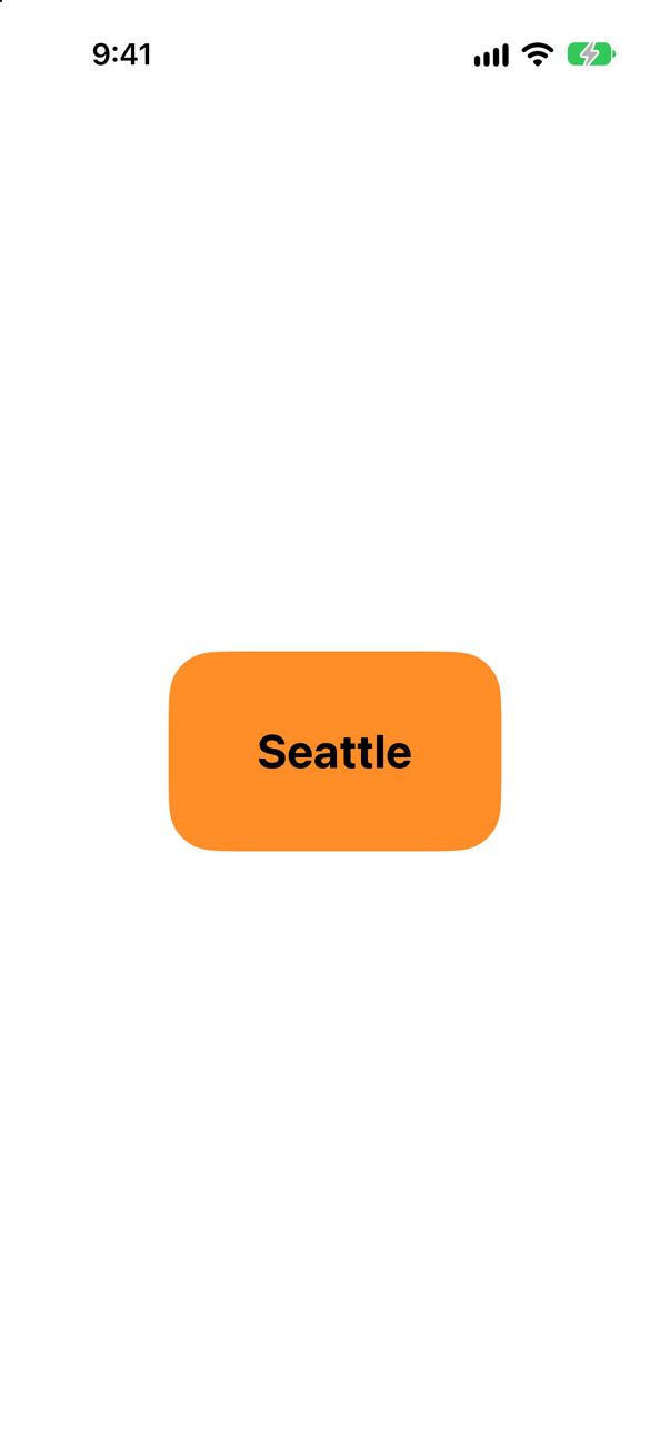
.clipShape(_:): whatever lies outside the shape is not drawn. .rect(cornerRadius:) is the short way to write RoundedRectangle(cornerRadius:) where a shape is expected.
Syntax · PathsA shape of your own: a triangle that fits any frame.
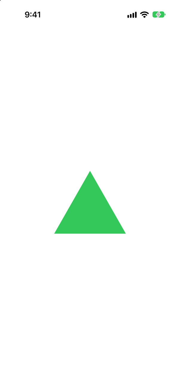
A type that conforms to Shape and implements path(in:): move the pen, add lines, close the path. Every point comes from rect, so the triangle fits whatever frame it is given.
Syntax · PathsStroke a line with dashes.
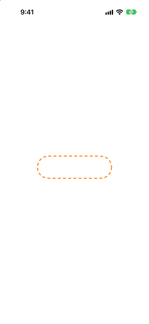
A StrokeStyle with a dash pattern: 8 points drawn, 6 left out, again and again. StrokeStyle also sets the ends of lines (lineCap) and their corners (lineJoin).
Syntax · PathsDraw three quarters of a ring.
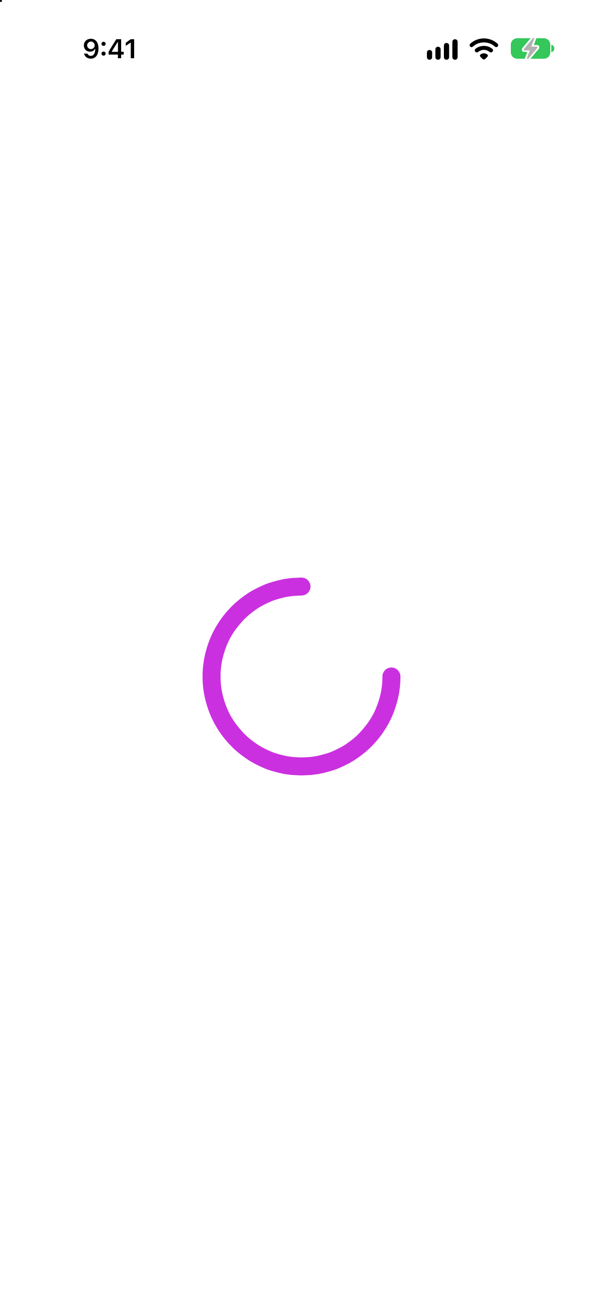
.trim(from:to:), then a stroke: fractions of the way along the shape's path. A circle's path starts at three o'clock, so the gap in the picture is the quarter from twelve to three.
Syntax · ShapesFill a shape and outline it, in one chain (iOS 17 and later).
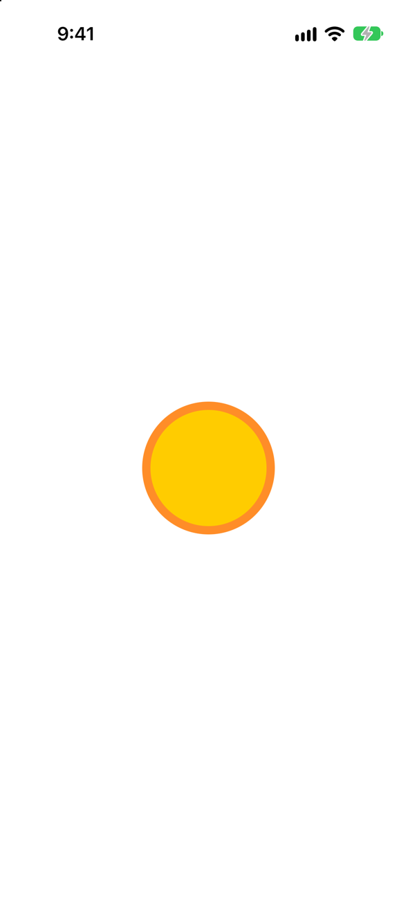
.fill(_:) followed by .stroke(_:lineWidth:). Since iOS 17 a filled shape can still be stroked; before, the outline had to be a second shape laid over the first.
Syntax · PathsCut one shape out of another (iOS 17 and later).
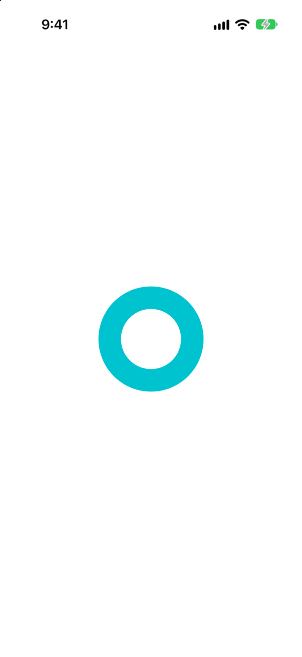
subtracting(_:) — with union, intersection and symmetricDifference, set operations on shapes. A circle minus a smaller circle is a ring that can be filled.
Syntax · ShapesMake the whole inside of a ring answer taps, not just its line.
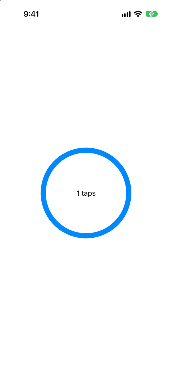
.contentShape(_:) decides which part of a view answers a finger. A stroked shape answers only on its line; with contentShape(Circle()) the tap in the middle counted.
Syntax · PathsDraw a line without making a type for it.
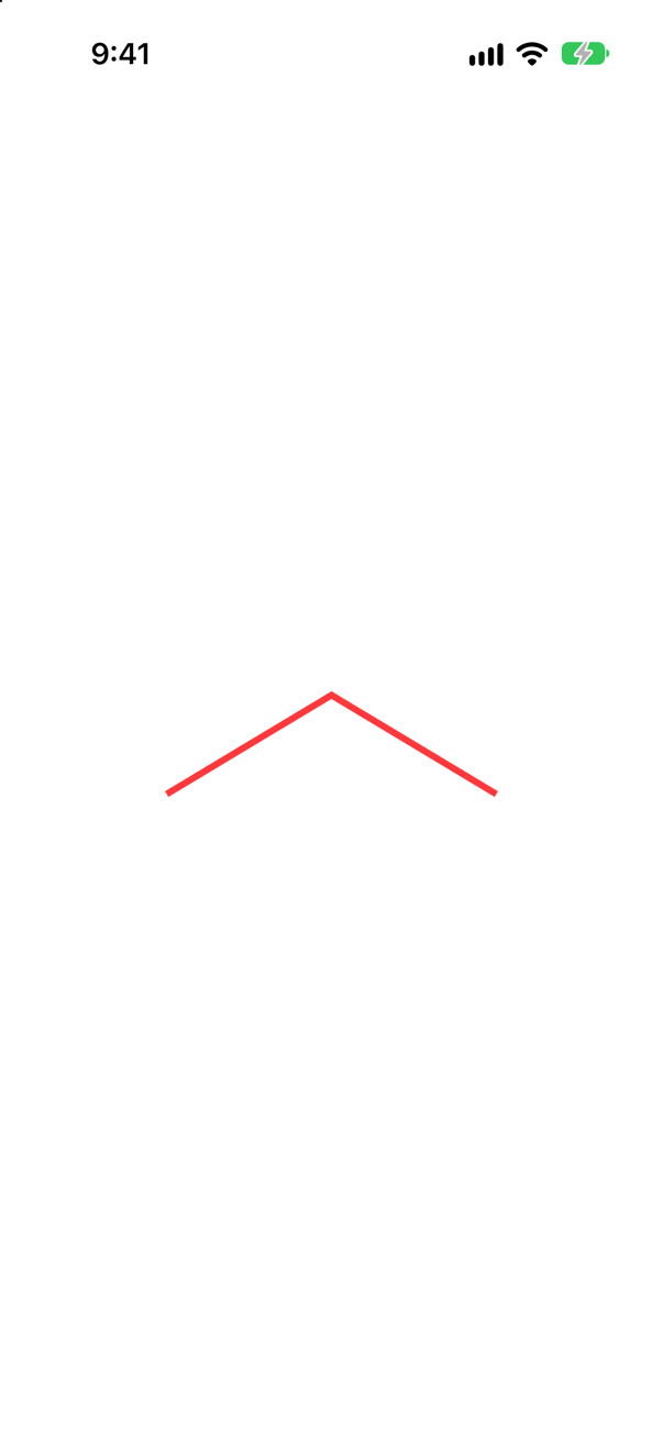
Path { path in … } is a view of its own. Its points are fixed numbers, so unlike a Shape it does not scale to its frame — fine for a one-off, wrong for anything that must fit.
Trick question · PathsA notch on the right edge of a ticket: an arc from 270° (just above the middle) to 90° (just below), around the inside. clockwise: true or false?
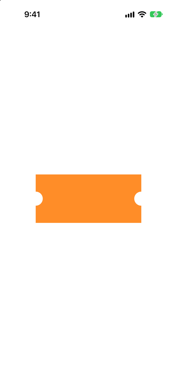
true — though on the screen the arc turns counterclockwise. SwiftUI's y-axis points down, and Apple warns that "specifying a clockwise arc results in a counterclockwise arc". With false the notches become bumps (an edge case shows both).
Trick question · ShapesCircle().stroke(.blue, lineWidth: 20).frame(width: 120, height: 120). How wide is what is drawn?
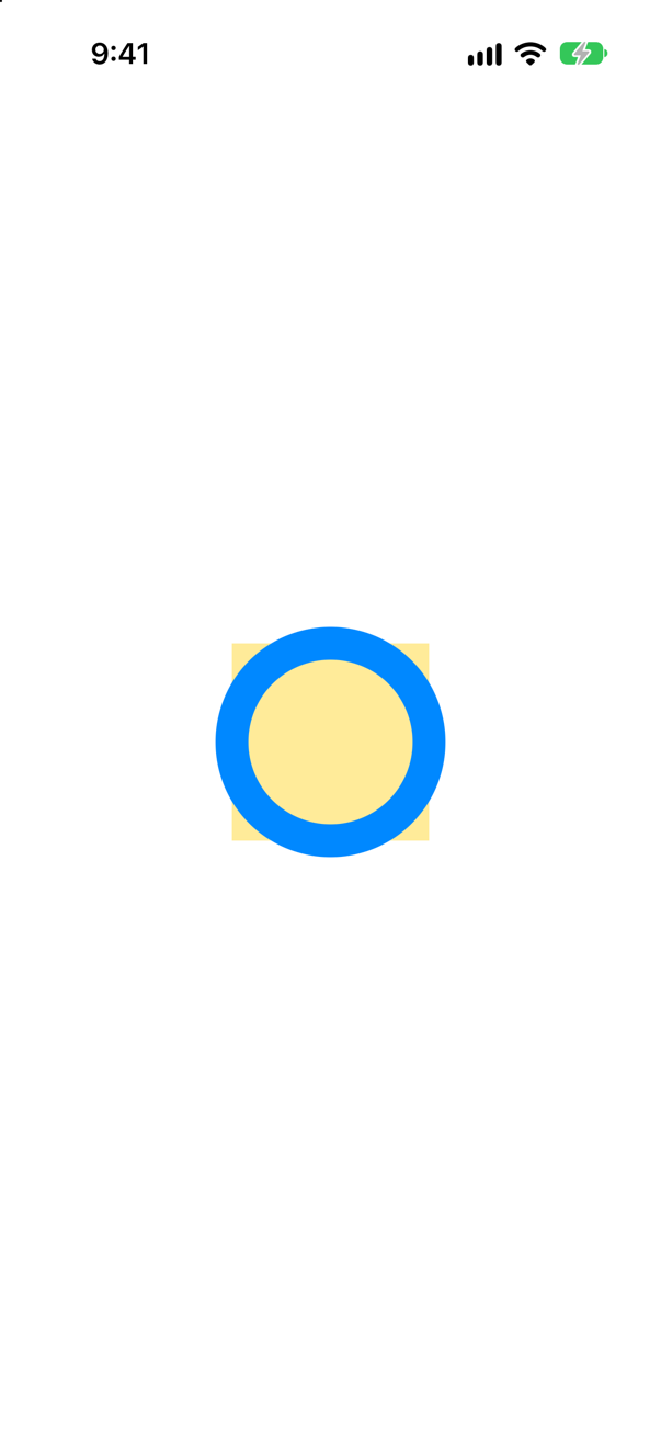
140 points. The line is centered on the outline, so 10 of its 20 points lie outside the 120-point frame — the yellow square in the picture — on every side. Use strokeBorder to keep it inside.
Trick question · PathsCircle().trim(from: 0, to: 0.25), stroked. Which quarter of the circle is drawn?
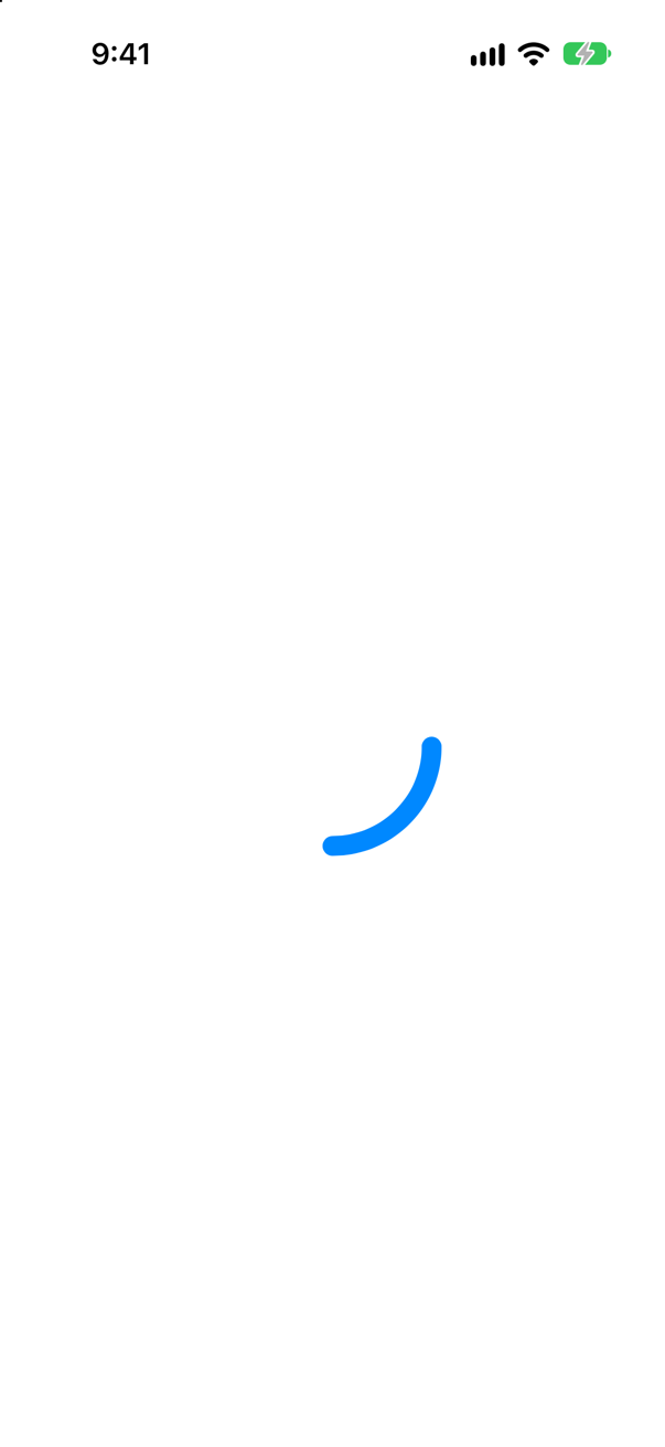
Three o'clock to six. A circle's path begins at its rightmost point and runs downward on the screen. For a progress ring that starts at twelve, turn it: .rotationEffect(.degrees(-90)).
Trick question · ShapesCircle().trim(from: 0, to: 0.25).strokeBorder(.blue, lineWidth: 12). Does it compile?
No: "value of type 'some Shape' has no member 'strokeBorder'". strokeBorder needs a shape that can inset itself (InsettableShape), and trim returns a plain some Shape. Inset first, then trim: Circle().inset(by: 6).trim(from: 0, to: 0.25).stroke(…).
Trick question · ShapesA stroked circle has .onTapGesture. The user taps the middle of it. Does the tap count?
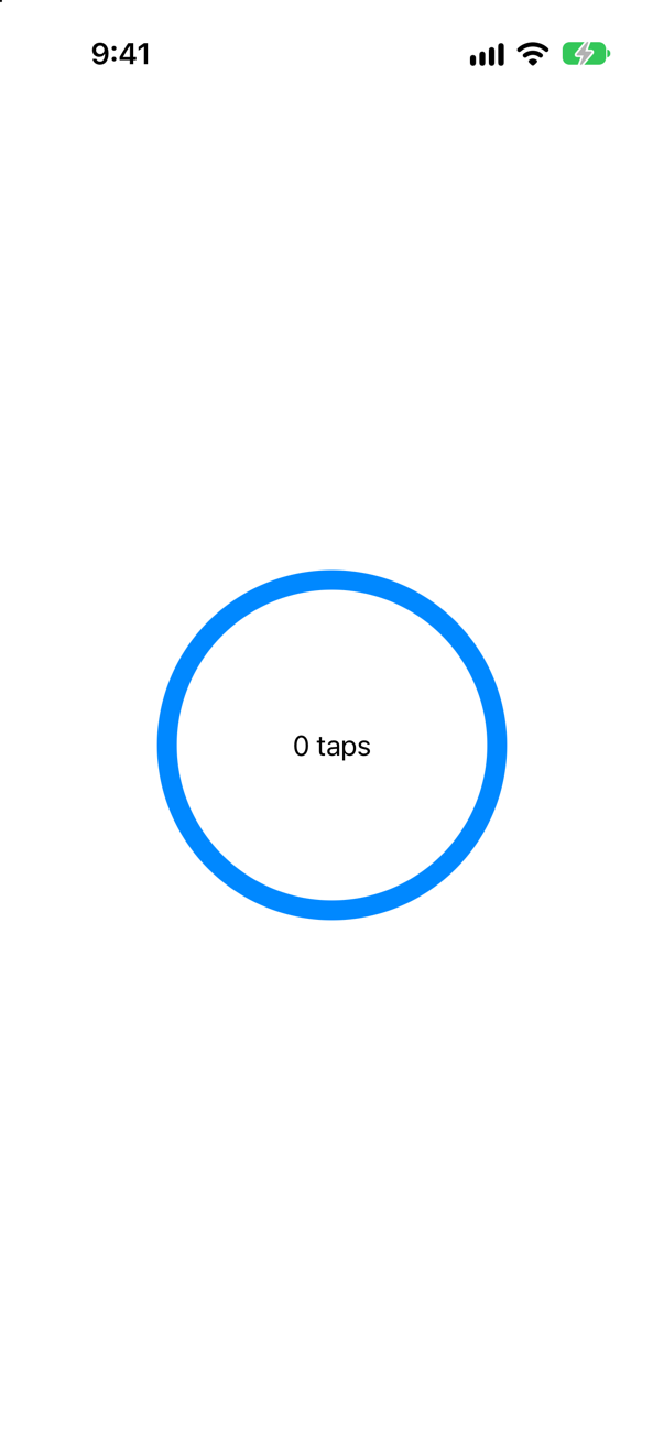
No. A stroked shape answers only where it is drawn — the line. The picture is after a tap in the middle: 0. .contentShape(Circle()) makes the whole circle answer.
Trick question · ShapesCircle().frame(width: 80, height: 80) — no fill, no stroke. What is drawn?
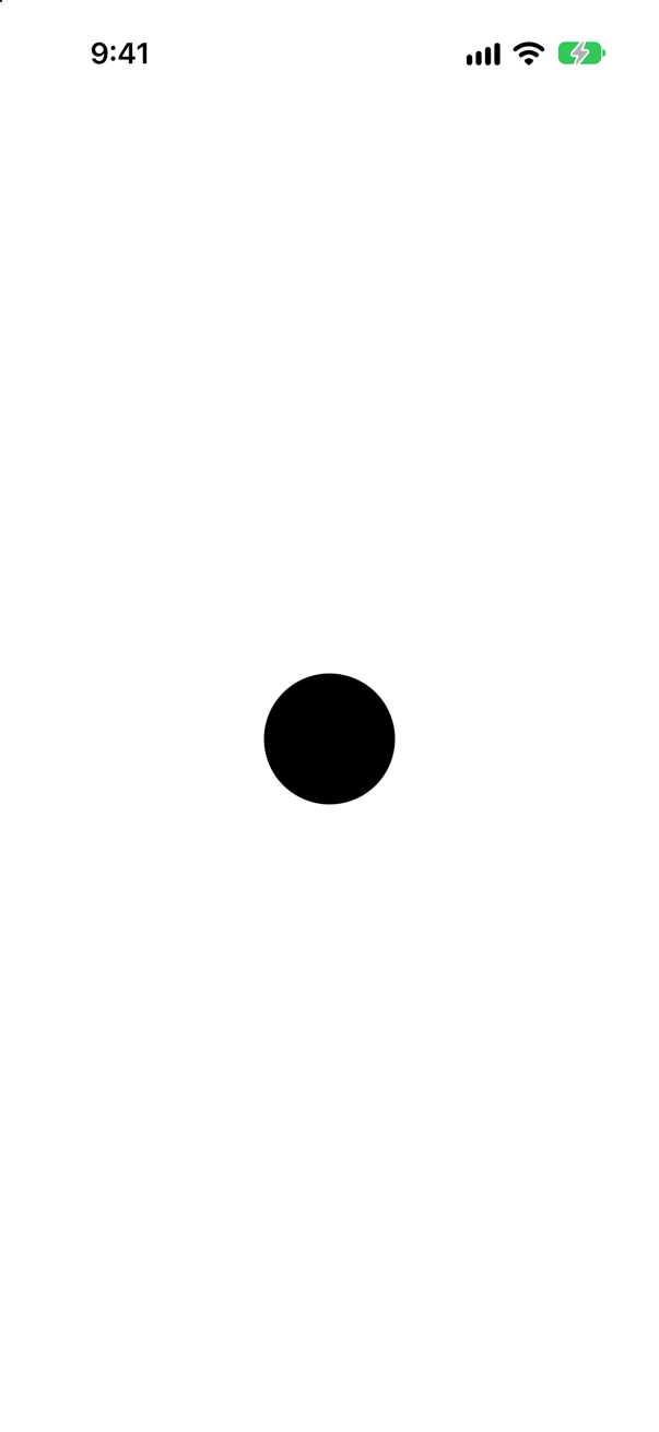
A filled circle, in the foreground color — black in light appearance, white in dark. Apple: "Shapes without an explicit fill or stroke get a default fill based on the foreground color." .foregroundStyle(.pink) would make it pink.
Trick question · ShapesVStack { Text("Above"); Circle().fill(.teal); Text("Below") } — no frame on the circle. How big is it?
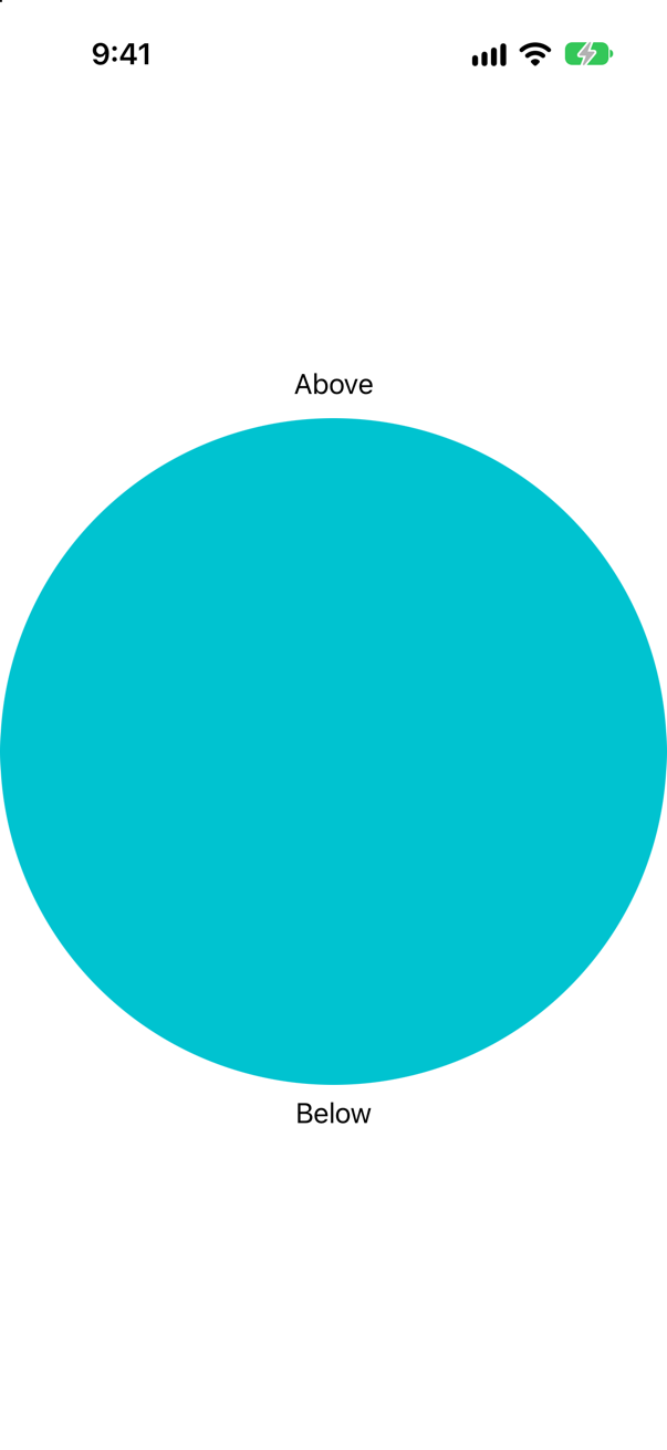
As big as it can be. A shape takes all the space it is offered: the circle grew to the width of the screen and pushed the texts apart. Give it a frame, or .aspectRatio(1, contentMode: .fit) inside a sized container.
Trick question · PathsA Shape whose path(in:) draws a triangle from fixed points — (50, 0), (100, 100), (0, 100) — is given a 240 × 200 frame. What is drawn?
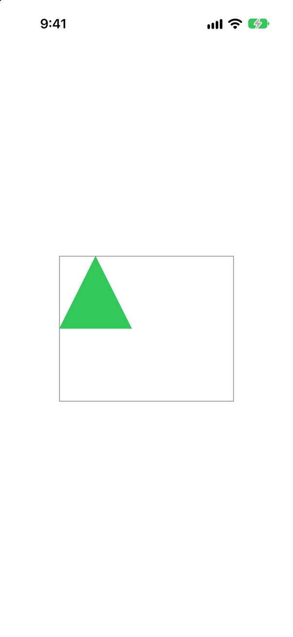
A small triangle in the top left corner, the same size whatever the frame (the gray border). path(in:) is handed the rectangle so that you draw from it: rect.midX, rect.maxY. Fixed numbers ignore it.
Edge cases and tricky questions
10 questions of the kind an interviewer uses to find out whether you really know this — the corners, the traps, and the things that changed recently. Each has its source. Wherever the answer is what some code does, that code was compiled and run, and what you see under “Show the answer” is what it really did. Say your answer aloud before you open it.
The ticket's notches, drawn twice: once with clockwise: true on both arcs, once with clockwise: false. Which one bites into the ticket — and why is it the one that looks wrong on paper?
Show the answer
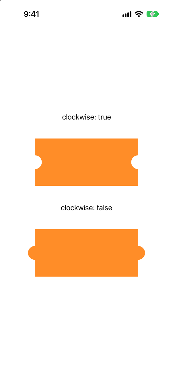
clockwise: true bites in; false bulges out. The right notch runs from 270° to 90°. Angles start from the positive x-axis — three o'clock — as in school, but SwiftUI's y-axis points down: 90° is straight down, 270° straight up. To go from up to down through 180°, the inside of the ticket, the angle must decrease, and decreasing is what the path calls clockwise. On the screen that turn looks counterclockwise.
Apple spells out the consequence: "because SwiftUI by default uses a vertically-flipped coordinate system (with the origin in the top-left of the view), specifying a clockwise arc results in a counterclockwise arc after the transformation is applied." The practical rule: work out the arc by which angles it must pass through, not by which way it looks — or draw it once and flip the flag.
Where this comes from: addArc(center:radius:startAngle:endAngle:clockwise:transform:) · Path — Measured on an iPhone 17 simulator: the picture is both shapes, drawn by the code above.
Two circles, each in a 120-point frame shown in yellow: one with .stroke(lineWidth: 20), one with .strokeBorder(lineWidth: 20). Which stays inside its frame?
Show the answer
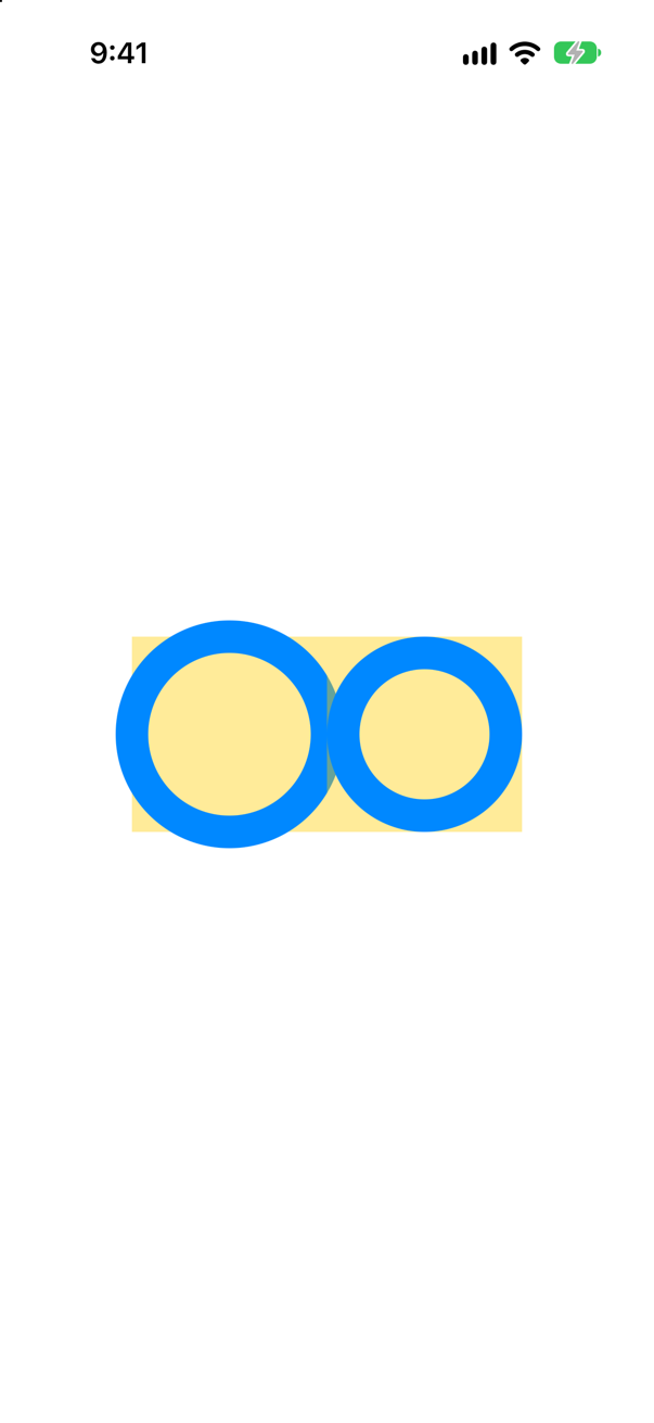
strokeBorder. A stroke is centered on the shape's outline: 10 of its 20 points fall inside the circle and 10 outside it, over the edge of the frame — on the left, the ring overlaps its neighbor. strokeBorder draws the whole width inside. Apple: it is "equivalent to insetting self by lineWidth / 2 and stroking the resulting shape with lineWidth as the line-width."
Layout never sees the overflow: the frame is 120 points either way, so a stroked shape can cover its neighbors or be cut off by a clip. Use strokeBorder when a ring must fit where it is put, as this lesson's track does.
Where this comes from: strokeBorder(_:lineWidth:antialiased:) · InsettableShape — Measured on an iPhone 17 simulator.
Circle().trim(from: 0, to: 0.25), stroked — and the same with .rotationEffect(.degrees(-90)). Which quarters are drawn?
Show the answer
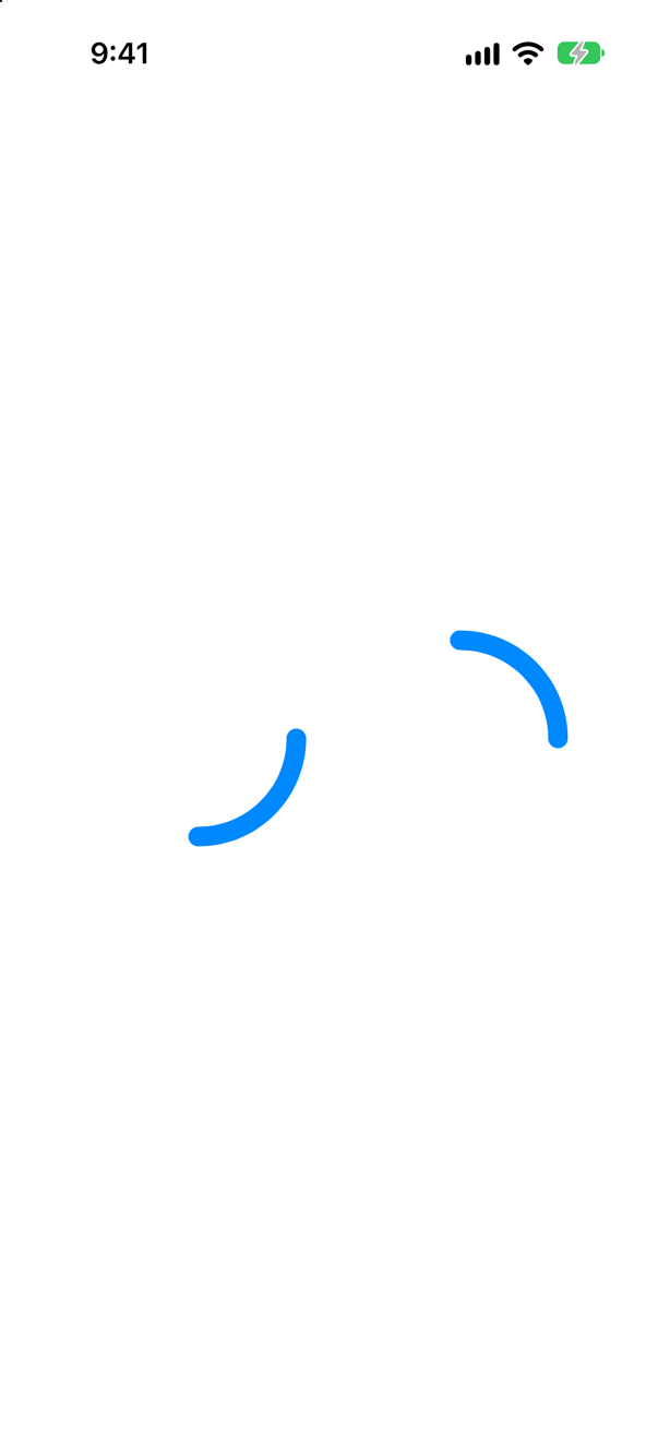
Three o'clock to six, and — turned — twelve to three. A circle's path begins at its rightmost point and runs downward on the screen, the way the flipped angles of the previous question run. trim counts fractions along that path from its own start, so 0 is three o'clock.
A progress ring is expected to start at twelve and run clockwise. Turning the shape a quarter back with .rotationEffect(.degrees(-90)) does it, as NightsRing does. (Rotating is a drawing effect: the frame does not change, which is why it suits a circle.)
Where this comes from: trim(from:to:) · Shape — Apple, trim(from:to:): it draws "a portion of a shape by ignoring portions of the beginning and ending of the shape's path."
A progress ring should stay inside its frame, so it uses strokeBorder: Circle().trim(from: 0, to: 0.75).strokeBorder(.purple, lineWidth: 12). Does it compile — and if not, what does?
Show the answer
It does not compile. Xcode reports
value of type 'some Shape' has no member 'strokeBorder'It does not compile. strokeBorder belongs to InsettableShape — a shape that knows how to draw a smaller copy of itself — and trim returns a plain some Shape, which does not. The order is the fix: inset the circle first, by half the line's width, then trim it, then stroke it:
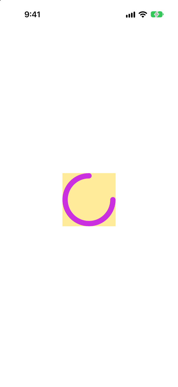
Inside its frame (the yellow square). NightsRing does exactly this. The general lesson is about modifier order on shapes: each returns a new shape type, and what you can do next depends on what the last one returned.
Where this comes from: InsettableShape · trim(from:to:) — Measured with Xcode 27.
A stroked circle has .onTapGesture. The user taps the middle of the circle. Does the tap count? What makes it count?
Show the answer
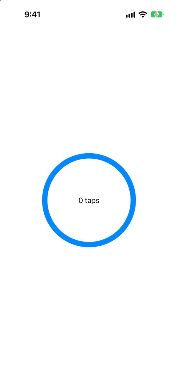
No. A shape answers a finger only where it is drawn, and a stroked circle is drawn only on its line — the middle is empty. Tell SwiftUI which shape to test instead:
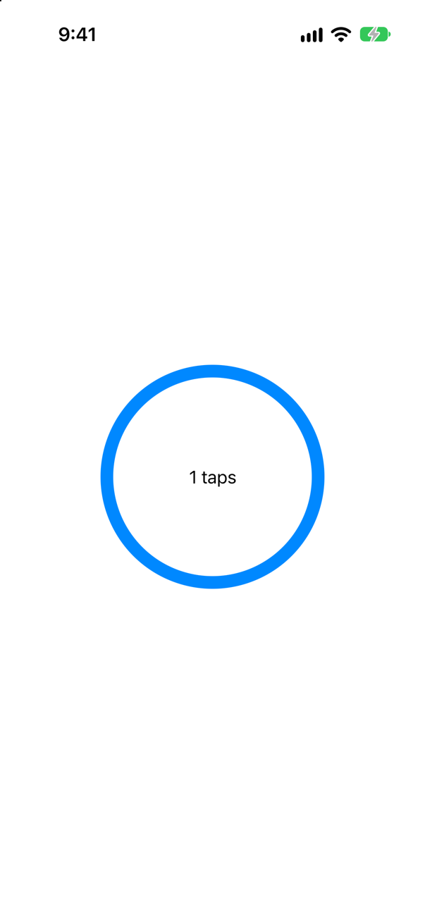
One tap. contentShape takes any shape — .contentShape(Rectangle()) makes a whole frame answer, transparent parts included. (The counter in both has .allowsHitTesting(false), so that it cannot take the tap itself.)
Where this comes from: contentShape(_:eoFill:) — Measured on iOS 27: a tap in the middle of the stroked circle counted 0 times, and 1 time with contentShape.
Circle() with a frame and nothing else — no fill, no stroke. What is drawn? And beside it, the same with .foregroundStyle(.pink)?
Show the answer
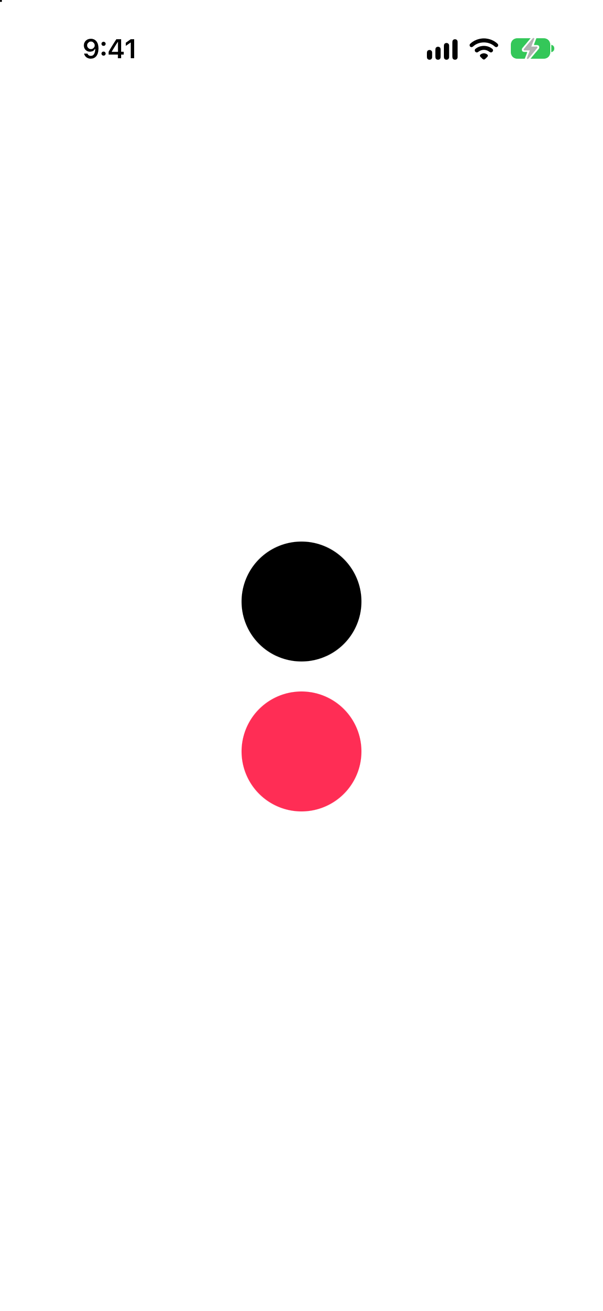
A filled circle in the foreground color: black, here, in light appearance; and pink. Apple: "Shapes without an explicit fill or stroke get a default fill based on the foreground color." The foreground style is inherited from the environment like any other, so a shape left unstyled turns white in dark appearance, and takes on whatever .foregroundStyle a parent sets.
That is convenient for icons that should match the text around them, and a surprise for a shape meant to be one fixed color. Fill it explicitly when the color matters.
Where this comes from: Shape — Measured on an iPhone 17 simulator in light appearance.
A Circle().fill(.teal) with no frame sits in a VStack between two texts. How big is it?
Show the answer
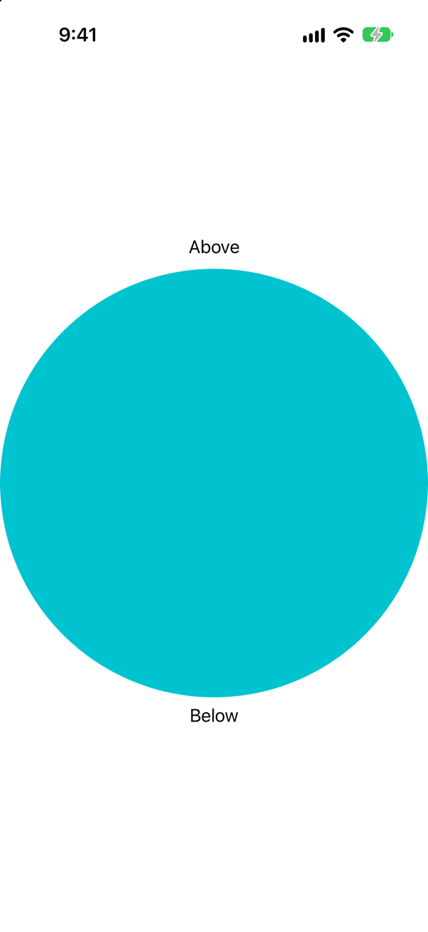
As big as it can be. A shape is flexible: offered the screen, it takes it, and lesson 10's layout rules do the rest — the texts keep the height they need, and the circle gets all the rest. Being a circle, it draws itself as large as fits inside that space, centered. The "Below" text was pushed most of the way down the screen.
So a shape almost always wants a frame, or .aspectRatio(1, contentMode: .fit) with a size from its container. Text and images have an ideal size of their own; shapes do not.
Where this comes from: Shape — Measured on an iPhone 17 simulator.
A Shape whose path(in:) uses fixed points — a triangle on (50, 0), (100, 100) and (0, 100) — is given a 240 × 200 frame. A second triangle uses rect.midX, rect.maxX and rect.maxY. What does each draw?
Show the answer
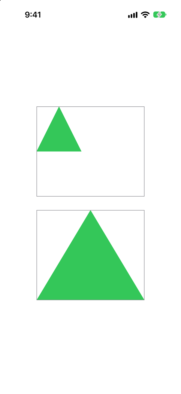
The fixed one is a small triangle in the corner of its frame; the other fills it. path(in:) is handed the rectangle the shape must fill, and a path built from that rectangle's minX, midX, maxX, minY, midY and maxY fits any size. One built from numbers ignores it.
This is the interview version of "make it work at any size": every coordinate in path(in:) should mention rect, and a fixed number should be a deliberate choice, like the ticket's 14-point notch.
Where this comes from: Shape · Path — Measured on an iPhone 17 simulator; the gray borders are the frames.
Since iOS 17, shapes and paths have set operations — union, intersection, subtracting. Can the ticket be drawn without a single arc?
Show the answer
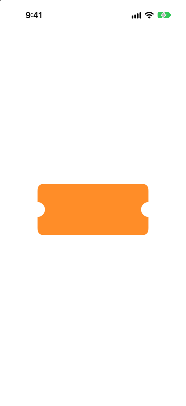
Yes. A rounded rectangle, minus a circle centered on each side: subtracting cuts one path out of another. It even gives the corners a radius, which the hand-drawn version would need four more arcs for.
Which to choose? Set operations say what the shape is; a hand-built path says how to draw it, and is the only way to get curves that are not pieces of simple shapes. Interviewers usually want the path first — it shows you understand the coordinate system — and are pleased to hear the shorter way after.
Where this comes from: Path · Shape — Measured on an iPhone 17 simulator with iOS 27.
A circle should be filled yellow with an orange outline. Before iOS 17 that took two shapes. What does it take now?
Show the answer
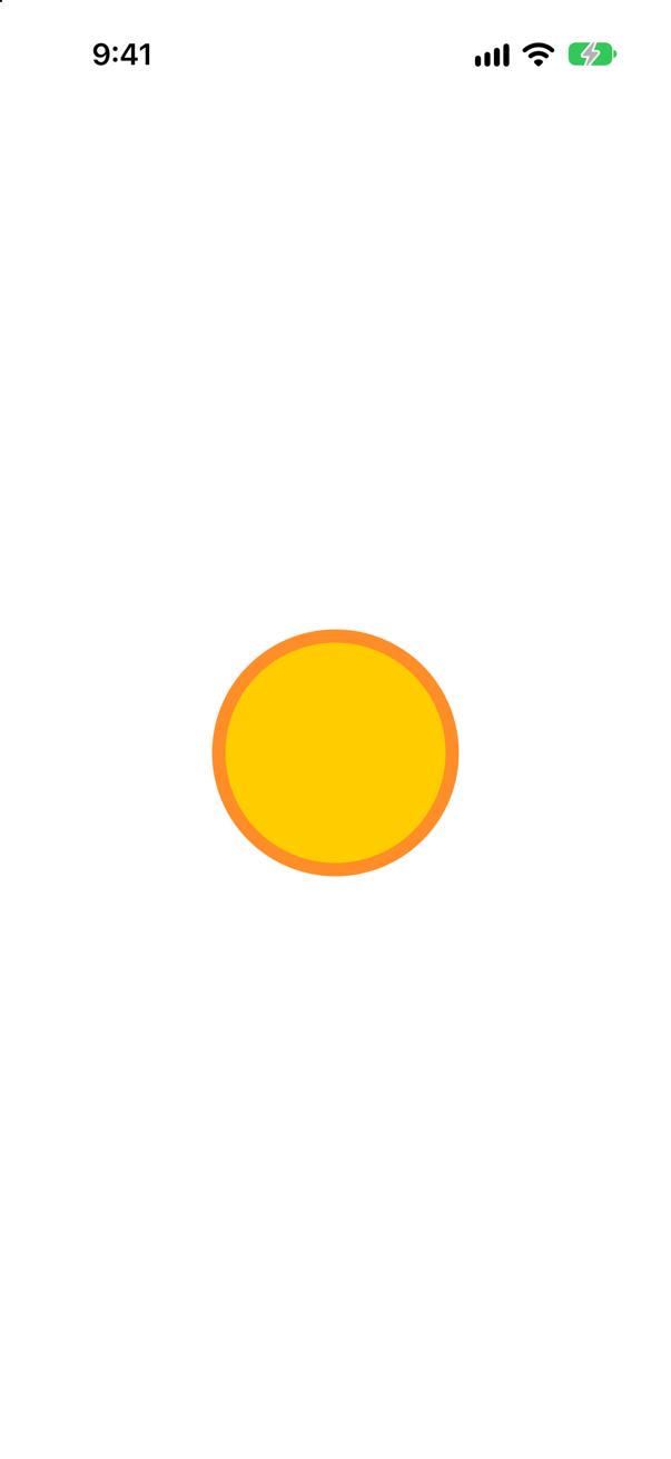
One chain: .fill(.yellow).stroke(.orange, lineWidth: 8). Since iOS 17, fill returns a shape view that can still be stroked. Before, fill returned a plain view, and the outline had to be a second circle laid over the first — code you will still meet:
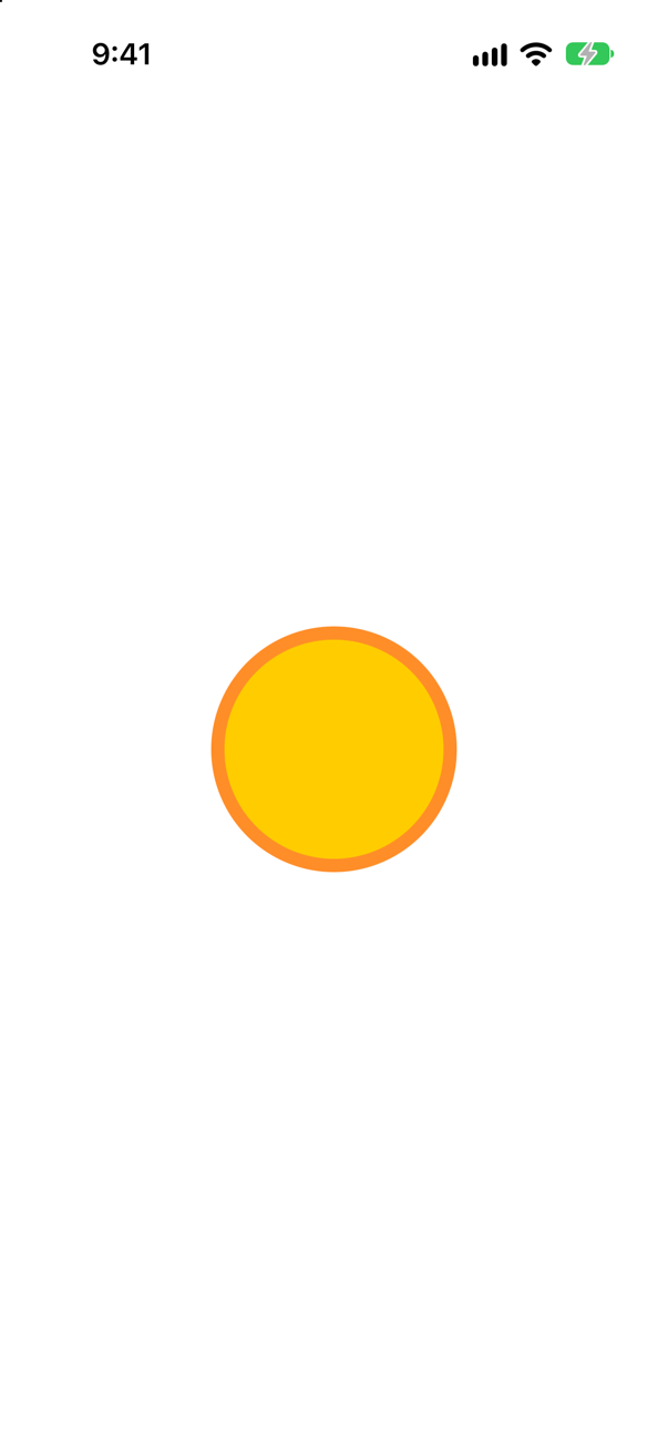
The same picture. The newer form is shorter and cannot drift — two shapes can be given different sizes by mistake; one cannot. The stroke is centered on the outline either way, so half of it covers the fill's edge and half lies outside.
Where this comes from: Shape · StrokeStyle — Measured on an iPhone 17 simulator with iOS 27.