Color, glass and depth
Gradients, materials, and shadows
You will buildThe boarding pass in a gradient of the highlight color, the favorite star on a frosted disc that reads over any photo, a soft shadow under the ticket — and the screen checked in dark appearance.
TimeAbout 50 minutes
WhyThe last lesson's shapes were filled with flat color. This lesson's three tools change how they look without changing what they are: a gradient is color that varies across a shape, a material is a translucent layer that blurs what is behind it, and a shadow adds depth. All three are styles and modifiers — one line each — and each has a trap that interviewers like: a gradient is not a Color, a material is not a white at half opacity, and a shadow goes on more than you meant.
Open your project
Open your
Tripsproject as lesson 25 left it: double-clickTrips.xcodeprojin Finder, or use File ▸ Open… (⌘O) in Xcode.If you did not finish lesson 25, or would rather start from a known state, download Trips-lesson-25.zip instead. It is the project exactly as it stood at the end of lesson 25. Unzip it and open
Trips.xcodeproj.Run it (⌘R) to check that it builds. You should see where lesson 25 ended:
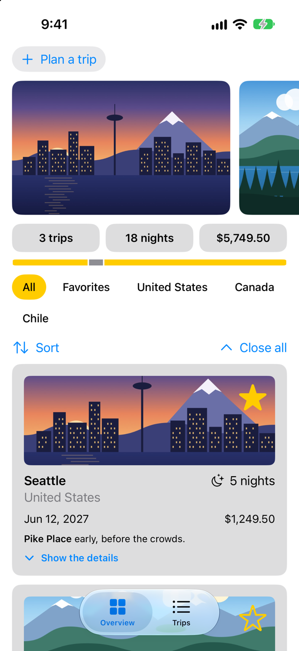
Trips, as it stood at the end of lesson 25Screenshot · iPhone 17, iOS 27.0
A gradient
A LinearGradient blends a list of colors along a line, from a start point to an end point. The points are given in unit space — .topLeading is the top left corner of whatever is filled, .bottomTrailing the bottom right — so the same gradient fits any shape. Apple: "The gradient maps the unit space points into the bounding rectangle of each shape filled with the gradient." Like a color, a gradient is a shape style, so it goes wherever a style is asked for: fill, foregroundStyle, background. In BoardingPass.swift, the ticket gets one, from the highlight color to a lighter version of it:
struct BoardingPass: View { let trip: Trip let totalNights: Int @Environment(\.highlight) private var highlight var body: some View { HStack(spacing: 16) { VStack(alignment: .leading, spacing: 4) { Text("Boarding pass") .font(.caption.weight(.semibold)) .textCase(.uppercase) .foregroundStyle(.secondary) Text(trip.city) .font(.title2.weight(.bold)) Text(trip.start, format: .dateTime.day().month(.wide).year()) .foregroundStyle(.secondary) } Spacer() NightsRing(nights: trip.nights, total: totalNights) } .padding(.vertical, 20) .padding(.horizontal, 28) .background(highlight.opacity(0.3), in: Ticket()) .background(LinearGradient(colors: [highlight, highlight.opacity(0.35)], startPoint: .topLeading, endPoint: .bottomTrailing), in: Ticket()) .padding(.horizontal) }}struct BoardingPass: View {
let trip: Trip
let totalNights: Int
@Environment(\.highlight) private var highlight
var body: some View {
HStack(spacing: 16) {
VStack(alignment: .leading, spacing: 4) {
Text("Boarding pass")
.font(.caption.weight(.semibold))
.textCase(.uppercase)
.foregroundStyle(.secondary)
Text(trip.city)
.font(.title2.weight(.bold))
Text(trip.start, format: .dateTime.day().month(.wide).year())
.foregroundStyle(.secondary)
}
Spacer()
NightsRing(nights: trip.nights, total: totalNights)
}
.padding(.vertical, 20)
.padding(.horizontal, 28)
.background(LinearGradient(colors: [highlight, highlight.opacity(0.35)],
startPoint: .topLeading, endPoint: .bottomTrailing),
in: Ticket())
.padding(.horizontal)
}
}Run the app, tap Trips, and open Seattle:
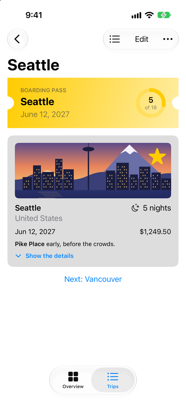
A style is not a color, though. A modifier that asks for a Color — foregroundColor(_:), for one — will not take a gradient; this lesson's edge cases show the error, and the modifier that does.
A material
The favorite star sits on the trip's picture, and over the yellow of the Seattle sunset it is hard to see. A material is the system's answer: a translucent layer that blurs whatever is behind it. Apple: "A material isn’t a view, but adding a material is like inserting a translucent layer between the modified view and its background" — and "The blurring effect provided by the material isn’t simple opacity." There are five thicknesses, from .ultraThinMaterial to .ultraThickMaterial. In TripCard.swift, put the star on a small disc of the thinnest:
struct TripCard: View { @Binding var trip: Trip @State private var showsFacts = false var body: some View { VStack(alignment: .leading, spacing: 10) { Image(trip.imageName) .resizable() .scaledToFill() .frame(height: 120) .clipShape(RoundedRectangle(cornerRadius: 8)) .contentShape(Rectangle()) .overlay(alignment: .topTrailing) { FavoriteButton(isFavorite: $trip.isFavorite) .accessibilityLabel("Favorite \(trip.city)") .padding(6) .background(.ultraThinMaterial, in: Circle()) .padding(8) } ViewThatFits(in: .horizontal) { HStack(alignment: .firstTextBaseline) { title Spacer() nights } VStack(alignment: .leading, spacing: 4) { title nights } } ViewThatFits(in: .horizontal) { HStack { start Spacer() price } VStack(alignment: .leading, spacing: 4) { start price } } .font(.subheadline) Text(trip.formattedNotes) .font(.footnote) Button(showsFacts ? "Hide the details" : "Show the details", systemImage: showsFacts ? "chevron.up" : "chevron.down") { showsFacts.toggle() } .font(.footnote.weight(.semibold)) .accessibilityLabel(showsFacts ? "Hide the details of \(trip.city)" : "Show the details of \(trip.city)") if showsFacts { TripFacts(trip: trip) .font(.subheadline) } } .padding() .background(.quaternary, in: RoundedRectangle(cornerRadius: 12)) .padding(.horizontal) } private var title: some View { VStack(alignment: .leading, spacing: 2) { Text(trip.city) .font(.headline) Text(trip.country) .foregroundStyle(.secondary) } } private var nights: some View { Label("^[\(trip.nights) night](inflect: true)", systemImage: "moon.stars") } private var start: some View { Text(trip.start, format: .dateTime.day().month().year()) } private var price: some View { Text(trip.price, format: .currency(code: "USD")) }}struct TripCard: View {
@Binding var trip: Trip
@State private var showsFacts = false
var body: some View {
VStack(alignment: .leading, spacing: 10) {
Image(trip.imageName)
.resizable()
.scaledToFill()
.frame(height: 120)
.clipShape(RoundedRectangle(cornerRadius: 8))
.contentShape(Rectangle())
.overlay(alignment: .topTrailing) {
FavoriteButton(isFavorite: $trip.isFavorite)
.accessibilityLabel("Favorite \(trip.city)")
.padding(6)
.background(.ultraThinMaterial, in: Circle())
.padding(8)
}
ViewThatFits(in: .horizontal) {
HStack(alignment: .firstTextBaseline) {
title
Spacer()
nights
}
VStack(alignment: .leading, spacing: 4) {
title
nights
}
}
ViewThatFits(in: .horizontal) {
HStack {
start
Spacer()
price
}
VStack(alignment: .leading, spacing: 4) {
start
price
}
}
.font(.subheadline)
Text(trip.formattedNotes)
.font(.footnote)
Button(showsFacts ? "Hide the details" : "Show the details", systemImage: showsFacts ? "chevron.up" : "chevron.down") {
showsFacts.toggle()
}
.font(.footnote.weight(.semibold))
.accessibilityLabel(showsFacts ? "Hide the details of \(trip.city)" : "Show the details of \(trip.city)")
if showsFacts {
TripFacts(trip: trip)
.font(.subheadline)
}
}
.padding()
.background(.quaternary, in: RoundedRectangle(cornerRadius: 12))
.padding(.horizontal)
}
private var title: some View {
VStack(alignment: .leading, spacing: 2) {
Text(trip.city)
.font(.headline)
Text(trip.country)
.foregroundStyle(.secondary)
}
}
private var nights: some View {
Label("^[\(trip.nights) night](inflect: true)", systemImage: "moon.stars")
}
private var start: some View {
Text(trip.start, format: .dateTime.day().month().year())
}
private var price: some View {
Text(trip.price, format: .currency(code: "USD"))
}
}Run the app and open Seattle again:
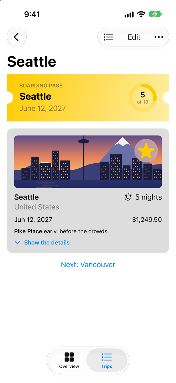
The disc lets the picture show through, blurred, so the star reads without hiding the photo behind a solid patch. Materials also change with the appearance — the last step checks that.
A shadow, in the right place
.shadow(color:radius:x:y:) draws a blurred copy of a view underneath it, offset by x and y. Apple: "If you don’t specify a color, the method uses a semi-transparent black." The obvious place for it would be the end of the boarding pass's modifiers — but a shadow on a view shadows everything drawn in it, and the words on the ticket would each cast one too (an edge case in this lesson shows it). The shadow belongs to the ticket's shape alone. So the background moves into the form of background that takes a view, where the ticket can be filled and shadowed. In BoardingPass.swift:
struct BoardingPass: View { let trip: Trip let totalNights: Int @Environment(\.highlight) private var highlight var body: some View { HStack(spacing: 16) { VStack(alignment: .leading, spacing: 4) { Text("Boarding pass") .font(.caption.weight(.semibold)) .textCase(.uppercase) .foregroundStyle(.secondary) Text(trip.city) .font(.title2.weight(.bold)) Text(trip.start, format: .dateTime.day().month(.wide).year()) .foregroundStyle(.secondary) } Spacer() NightsRing(nights: trip.nights, total: totalNights) } .padding(.vertical, 20) .padding(.horizontal, 28) .background(LinearGradient(colors: [highlight, highlight.opacity(0.35)], startPoint: .topLeading, endPoint: .bottomTrailing), in: Ticket()) .background { Ticket() .fill(LinearGradient(colors: [highlight, highlight.opacity(0.35)], startPoint: .topLeading, endPoint: .bottomTrailing)) .shadow(color: .black.opacity(0.2), radius: 8, y: 4) } .padding(.horizontal) }}struct BoardingPass: View {
let trip: Trip
let totalNights: Int
@Environment(\.highlight) private var highlight
var body: some View {
HStack(spacing: 16) {
VStack(alignment: .leading, spacing: 4) {
Text("Boarding pass")
.font(.caption.weight(.semibold))
.textCase(.uppercase)
.foregroundStyle(.secondary)
Text(trip.city)
.font(.title2.weight(.bold))
Text(trip.start, format: .dateTime.day().month(.wide).year())
.foregroundStyle(.secondary)
}
Spacer()
NightsRing(nights: trip.nights, total: totalNights)
}
.padding(.vertical, 20)
.padding(.horizontal, 28)
.background {
Ticket()
.fill(LinearGradient(colors: [highlight, highlight.opacity(0.35)],
startPoint: .topLeading, endPoint: .bottomTrailing))
.shadow(color: .black.opacity(0.2), radius: 8, y: 4)
}
.padding(.horizontal)
}
}Run the app and open Seattle:
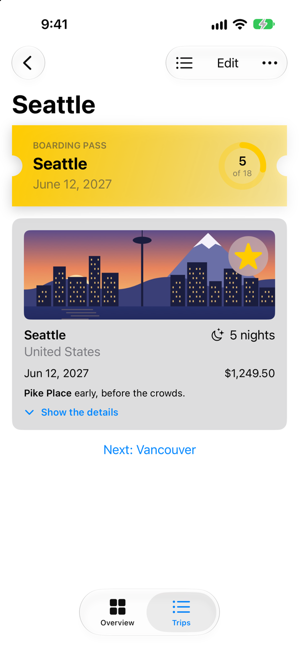
Check the dark
Gradients, materials and shadows each behave differently in dark appearance, so look at both. In the simulator, the appearance is a setting of the device; the app needs no change to follow it.
Switch the simulator to dark appearance, run the app, and open Seattle:
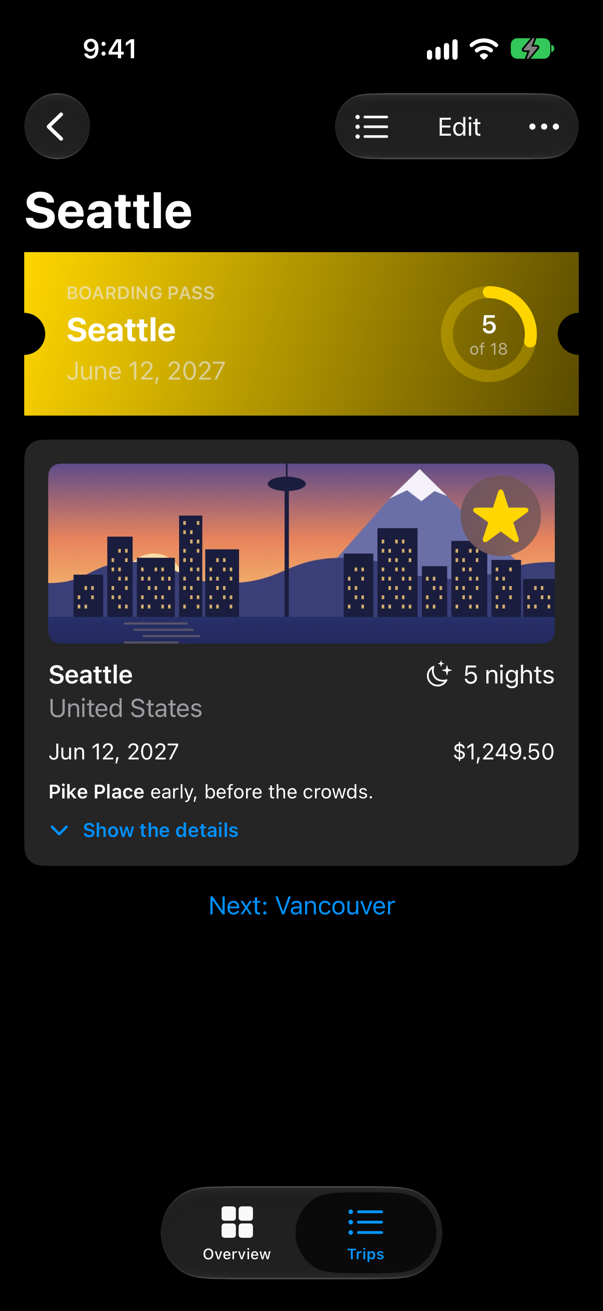
Three things changed by themselves. The material turned dark — the disc behind the star is now a smoky glass rather than a frosted one — and the text on the screen turned light. The gradient changed too, though nothing in it says dark: its far end is the highlight at 35% opacity, and see-through yellow over a black page is a dark olive. A gradient made with opacity is only as light as what lies behind it. And the shadow, black on a black page, all but disappeared — which is why dark designs show depth with lighter surfaces rather than shadows; one of this lesson's edge cases makes a card vanish entirely that way.
Look closely at the pass, too: its secondary text turned light along with everything else, and light gray on yellow is hard to read. Colors that work in both appearances are part of lesson 49; for now, notice that a fixed background color and a text color that adapts make a pair that can clash.
What you built
- A
LinearGradientas the ticket's fill, from the highlight color to a lighter one. - The favorite star on a disc of
.ultraThinMaterial. - A shadow on the ticket's shape only, through
background { }. - The screen checked in dark appearance.
Next, Canvas: drawing hundreds of things without a view for each — every day of 2027 in one picture, the days away in color.
The finished project
Stuck, or want to compare with your own? This is the project as it stands at the end of this lesson, built and run before it was put here.
- Trips-lesson-26.zip — unzip it, then open
Trips.xcodeprojin Xcode.
Flash cards
18 cards for this lesson, each labelled with its topic. 10 ask how you would write something; the other 8 are trick questions, written to catch a misunderstanding. Answer in your head first, then tap the card.
Syntax · GradientsFill a shape with a gradient running from its top left to its bottom right.
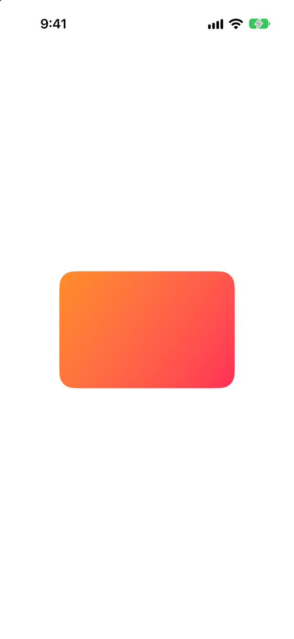
LinearGradient(colors:startPoint:endPoint:). The points are unit points — .topLeading is the corner of whatever is filled — so the gradient fits any size.
Syntax · GradientsThe quickest gradient there is: one made from a single color.
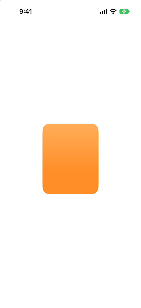
.gradient on any Color: Apple's "standard gradient for the color", a slight lightening from top to bottom. It is how the system draws its own colored tiles.
Syntax · GradientsA gradient that spreads out from a center point.
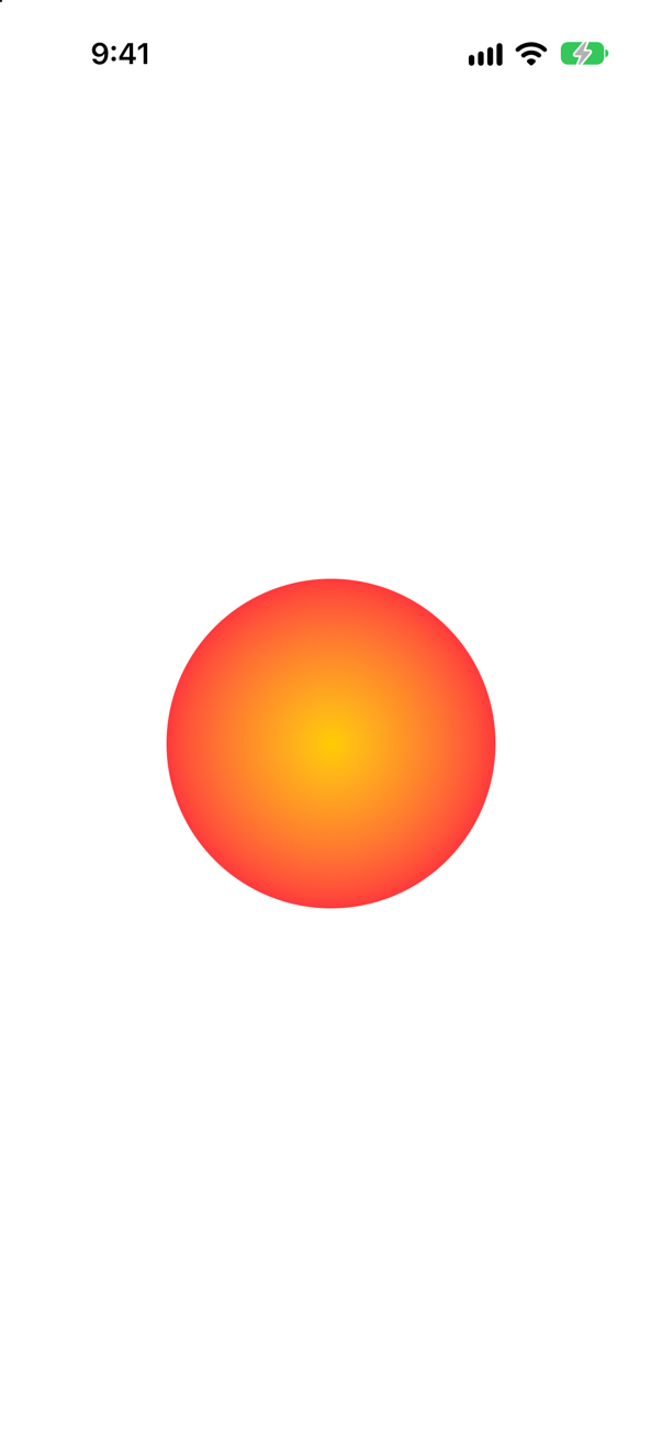
RadialGradient(colors:center:startRadius:endRadius:). Unlike the center, the radii are in points: here the last color is reached 100 points out, at the circle's edge.
Syntax · GradientsA gradient that sweeps around a center, like the hand of a clock.
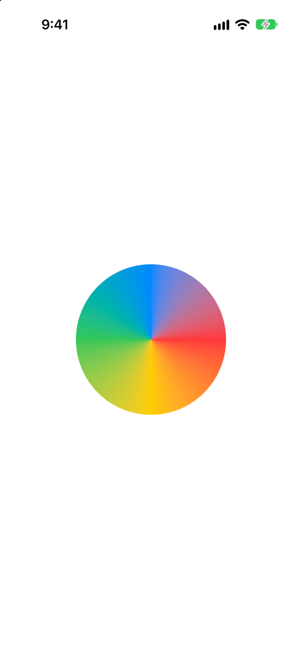
AngularGradient — a "conic" gradient. It starts at three o'clock, like a circle's path; ending on the color it starts with hides the seam.
Syntax · GradientsA gradient that blends colors across a grid of points (iOS 18 and later).
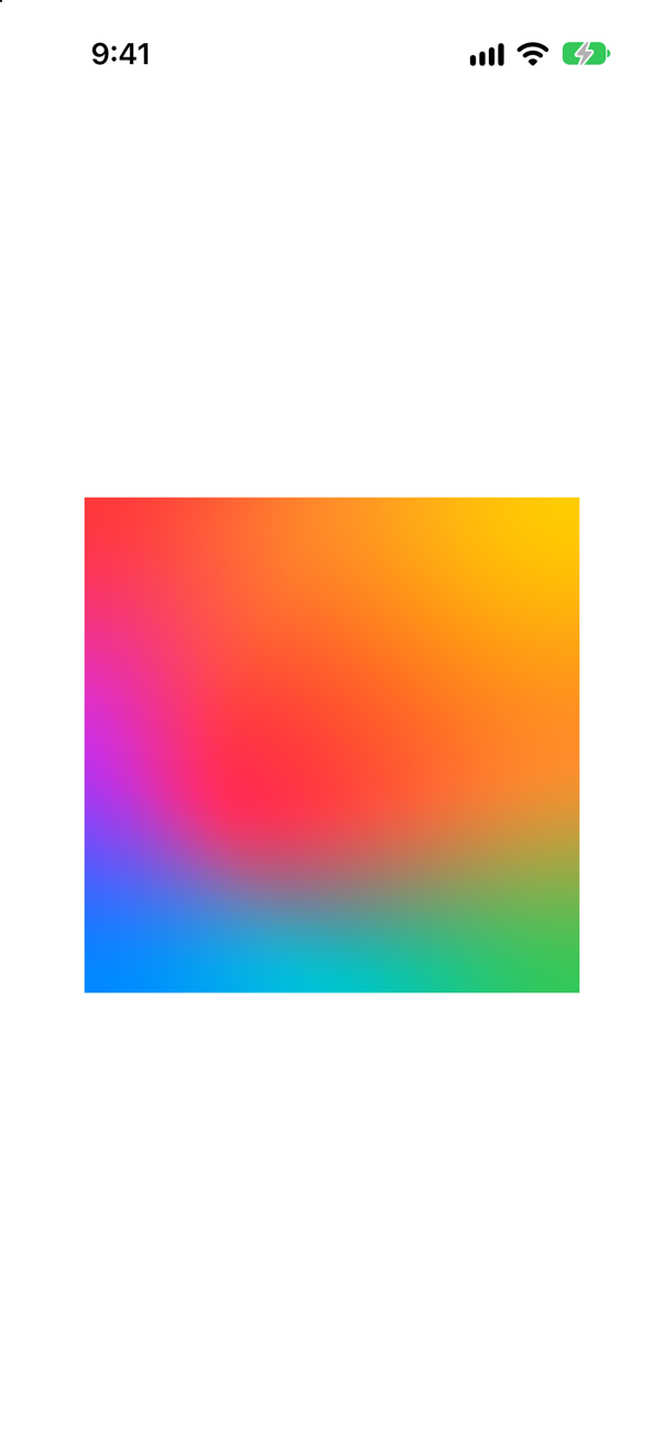
MeshGradient(width:height:points:colors:): a grid of width × height points, each with a color. Moving an inner point — here the middle one, to (0.3, 0.6) — bends the blend.
Syntax · MaterialsA translucent, blurred background behind a label, like the system's own controls.
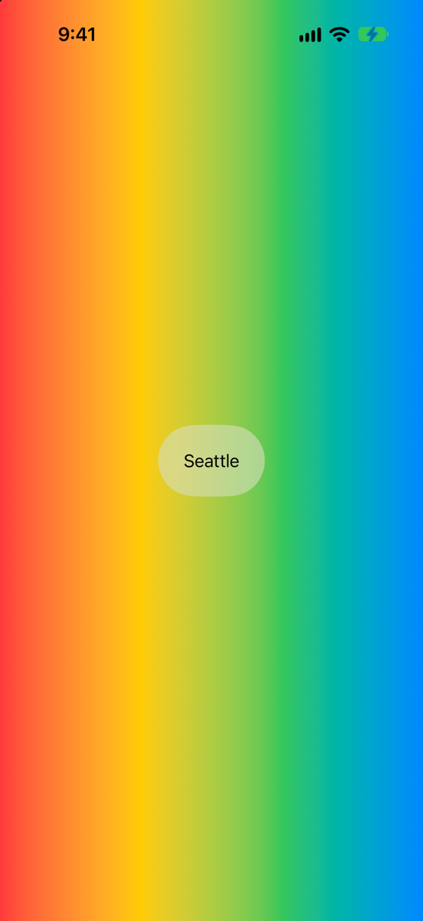
A material — .ultraThinMaterial, .thinMaterial, .regularMaterial, .thickMaterial, .ultraThickMaterial — as a background style. It blurs what lies behind it in your app and adapts to light and dark.
Syntax · MaterialsQuieter text on a material that still blends with it.
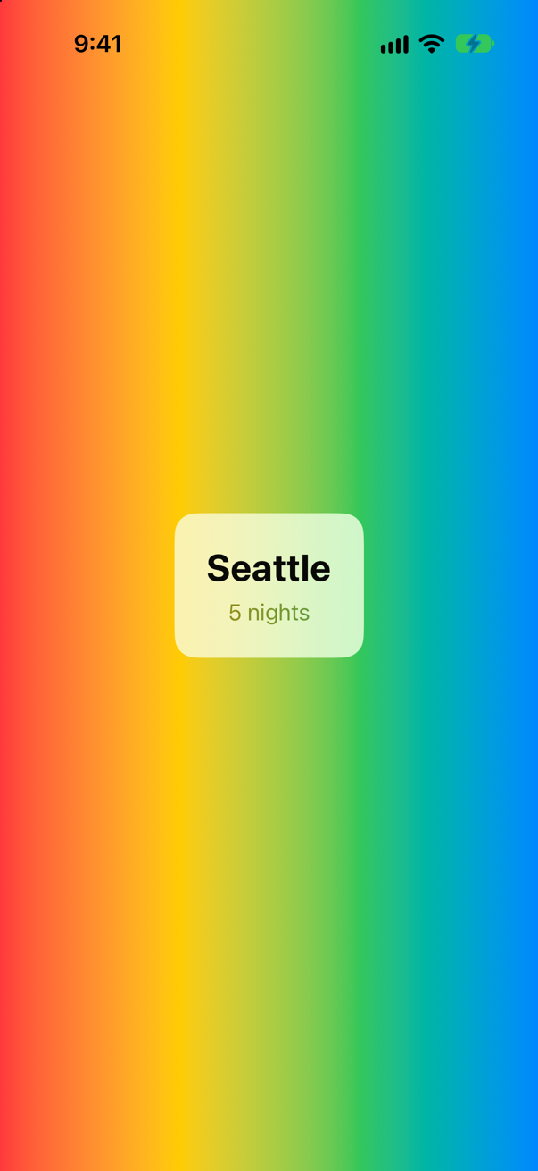
.foregroundStyle(.secondary). On a material, Apple says, text gets vibrancy — a blend that keeps it readable — and a hierarchical style like .secondary keeps it, while a fixed color "disables vibrancy".
Syntax · ShadowsA soft shadow, lifted a little below a card.
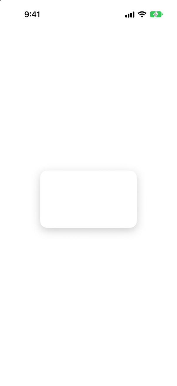
.shadow(color:radius:x:y:): radius blurs it, x and y move it. Without a color it is "a semi-transparent black".
Syntax · ShadowsShadow a whole card as one shape, not each thing drawn in it.
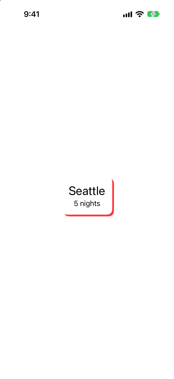
.compositingGroup() before the shadow: the card is flattened into one picture first, and only its outline casts the (deliberately loud) red shadow. Without it, the words cast their own.
Syntax · GradientsText drawn in a gradient.
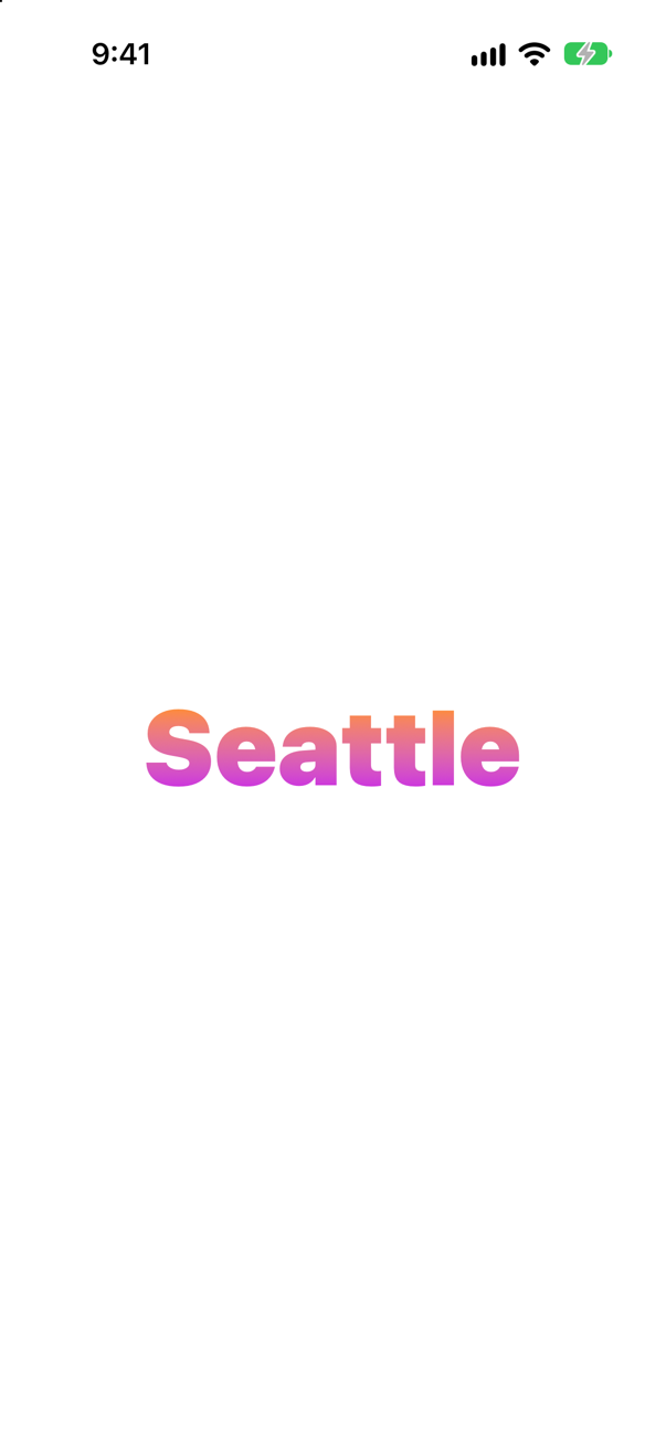
.foregroundStyle(_:) takes any shape style, a gradient included. (foregroundColor(_:) takes only a Color.)
Trick question · GradientsText("Seattle").foregroundColor(LinearGradient(colors: [.orange, .pink], startPoint: .leading, endPoint: .trailing)). Does it compile?
No: "cannot convert value of type 'LinearGradient' to expected argument type 'Color'". A gradient is a shape style, not a Color. foregroundStyle(_:) takes any style.
Trick question · Gradients.foregroundStyle(LinearGradient(colors: [.orange, .purple], startPoint: .top, endPoint: .bottom)) on a VStack of three lines of text. One gradient down the whole stack, or one per line?
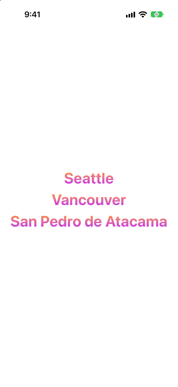
One per line. Apple: a gradient "maps the unit space points into the bounding rectangle of each shape filled with the gradient" — each text is filled on its own, orange at its top and purple at its bottom. An edge case shows how to make one gradient span all three.
Trick question · ShadowsA card — two texts on a white rounded rectangle — gets .shadow(color: .red, radius: 0, x: 4, y: 4). What casts the red shadow?
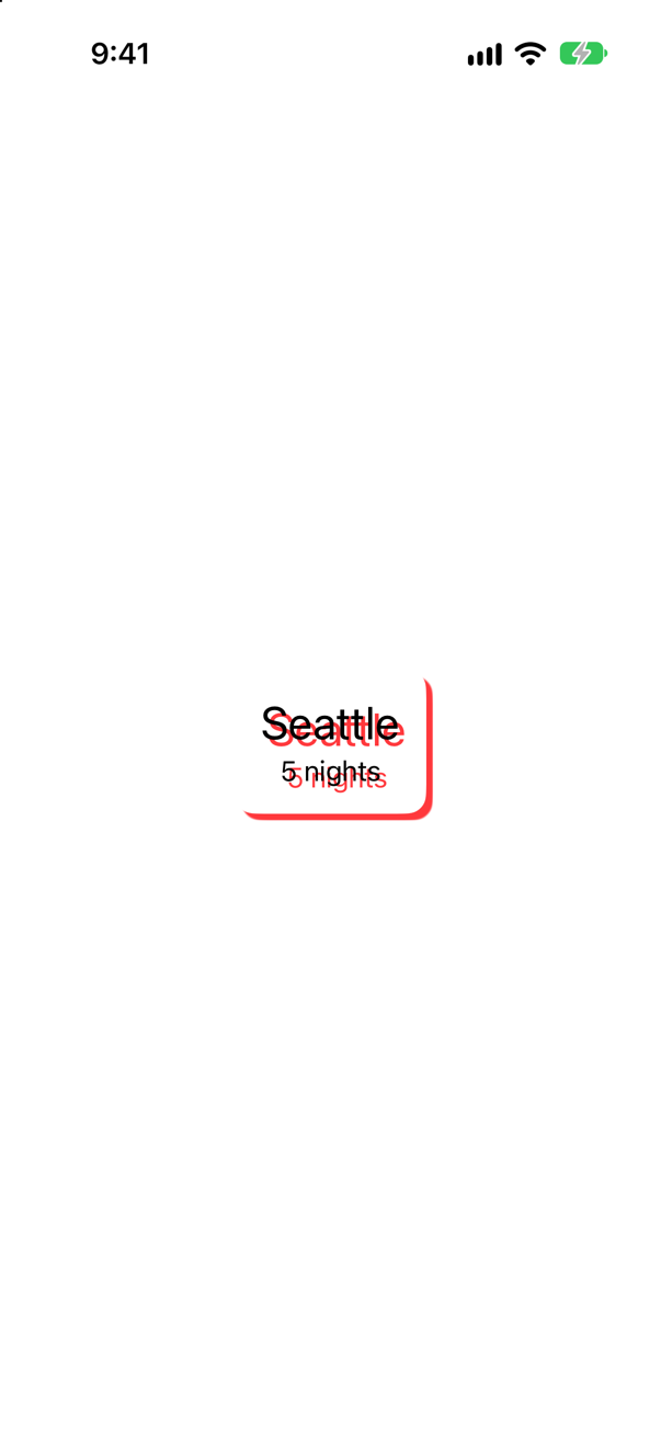
Everything in it — the card and each word. A shadow on a view is applied to every layer drawn in it, so the words cast theirs onto the white card. .compositingGroup() before .shadow flattens the card first, and only its outline casts one.
Trick question · ShadowsColor.teal.frame(width: 100, height: 100).shadow(radius: 10, y: 10).clipShape(RoundedRectangle(cornerRadius: 16)). Where is the shadow?
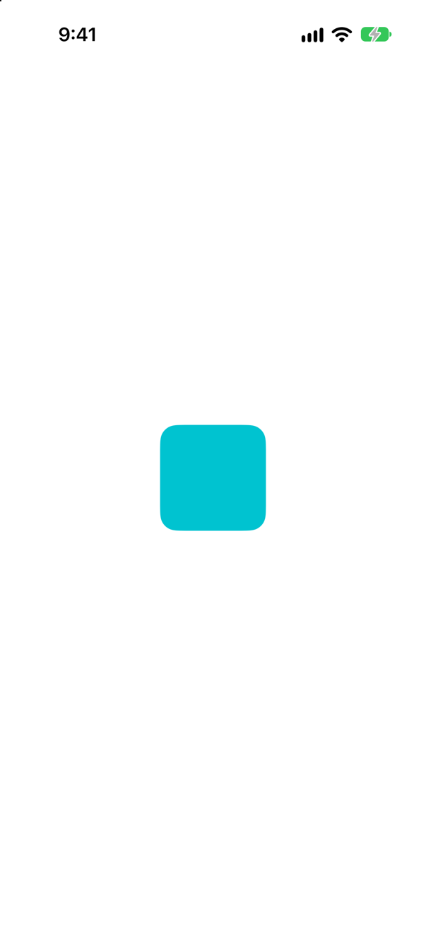
Gone. The shadow is drawn outside the square, and the clip, coming after it, cuts away everything outside the rounded square — the shadow with it. Clip first, then shadow.
Trick question · ShadowsA card filled with .background (the page color) and given .shadow(radius: 12, y: 8), in dark appearance. What do you see?
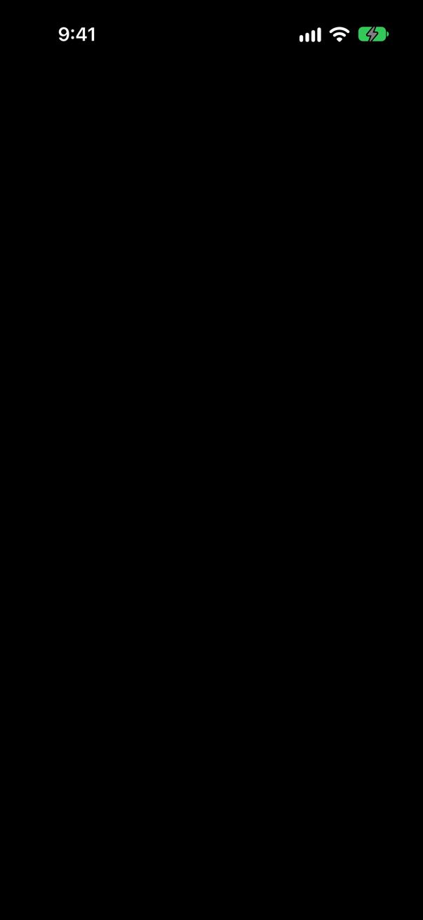
Nothing at all. In dark appearance .background is black, so the card matches the page, and the default shadow is "a semi-transparent black" — black on black. In light appearance the same code is a white card with a soft shadow. Dark designs need lighter surfaces, not shadows.
Trick question · GradientsA 300 × 200 rectangle filled with RadialGradient(colors: [.yellow, .red], center: .center, startRadius: 0, endRadius: 50). How much of it is yellow-to-red, and how much plain red?
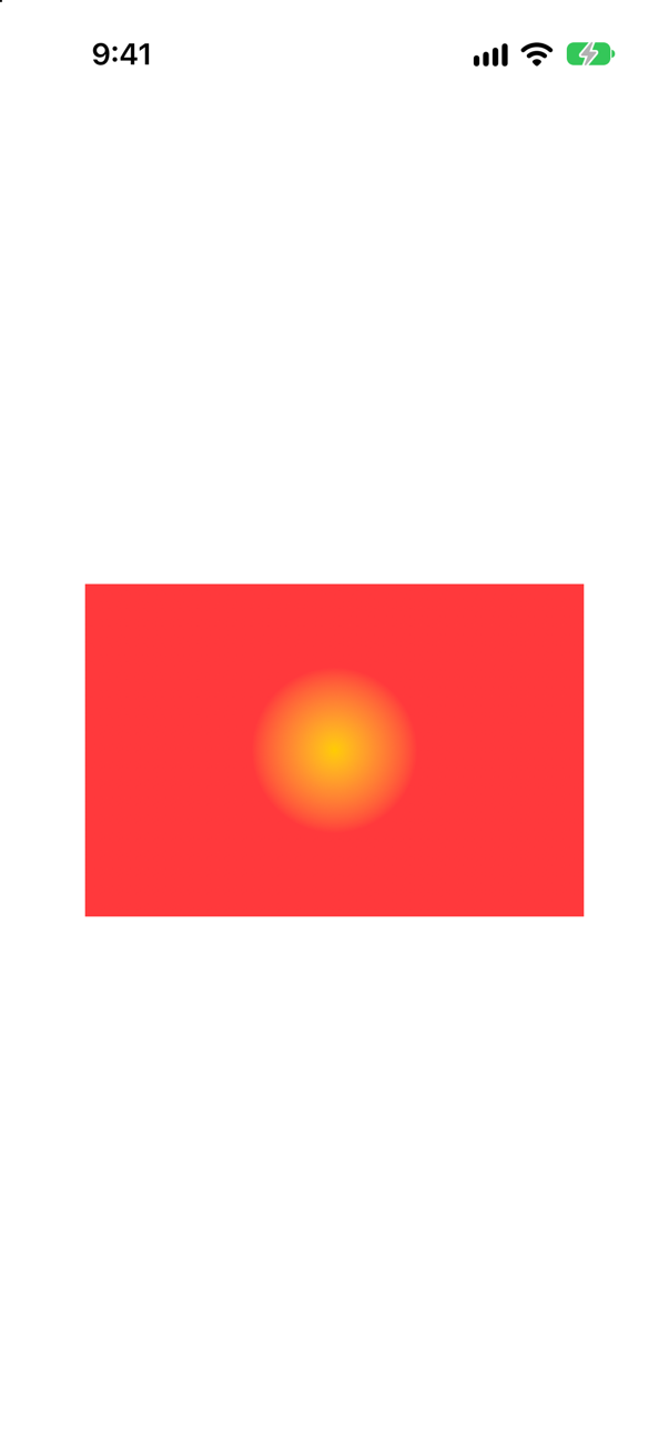
A small spot in the middle, and plain red everywhere else. The center is a unit point, but the radii are in points: the gradient is over 50 points from the center, and beyond that it is the last color.
Trick question · GradientsA MeshGradient of width 2 and height 2 — four points — is given only three colors. What happens?
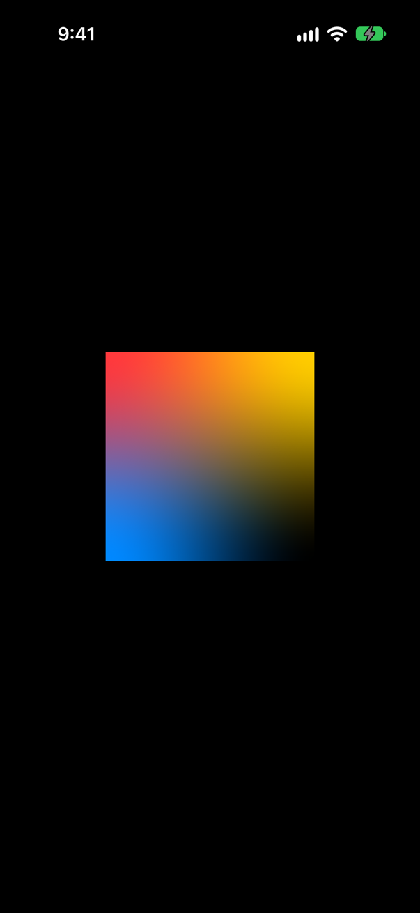
It draws, and the fourth corner is transparent — the black behind shows through there. No crash and no warning: count the colors yourself, width × height of them.
Trick question · MaterialsTwo panels over a rainbow: one on .regularMaterial, one on .white.opacity(0.5). Are they the same?
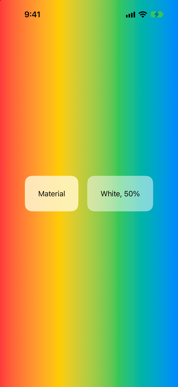
No. The white panel only lightens the stripes, which still show sharply through it. The material blurs them into a soft wash. Apple: "The blurring effect provided by the material isn’t simple opacity." It also changes with the appearance; the white does not.
Edge cases and tricky questions
10 questions of the kind an interviewer uses to find out whether you really know this — the corners, the traps, and the things that changed recently. Each has its source. Wherever the answer is what some code does, that code was compiled and run, and what you see under “Show the answer” is what it really did. Say your answer aloud before you open it.
A designer wants a city name drawn in a gradient: Text("Seattle").foregroundColor(LinearGradient(…)). Does it compile — and what is the difference between foregroundColor and foregroundStyle?
Show the answer
It does not compile. Xcode reports
cannot convert value of type 'LinearGradient' to expected argument type 'Color'It does not compile: foregroundColor(_:) takes a Color and nothing else. foregroundStyle(_:) takes any ShapeStyle — a color, a gradient, a material, an image, or a hierarchical style such as .secondary:
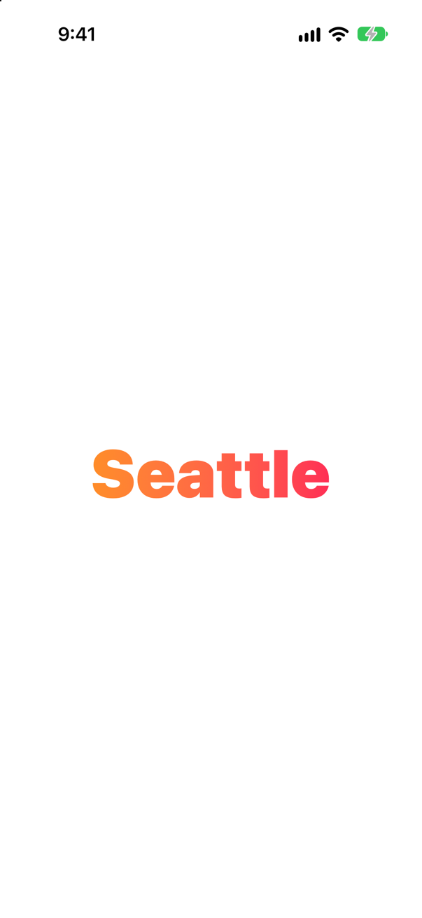
Apple's page for it lists exactly that range: "use Color or image(_:sourceRect:scale:), or one of the gradient types … To set a style that’s relative to the containing view’s style, use one of the semantic styles, like primary." Older code is full of foregroundColor; write new code with foregroundStyle, and expect a reviewer to ask why if you do not.
Where this comes from: ShapeStyle · foregroundStyle(_:) — Measured with Xcode 27.
.foregroundStyle(LinearGradient(colors: [.orange, .purple], startPoint: .top, endPoint: .bottom)) on a VStack of three lines. Does one gradient run down the whole stack? If not, how do you make it?
Show the answer
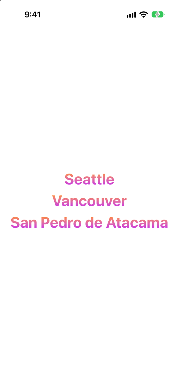
No — each line gets the whole gradient. Apple: "The gradient maps the unit space points into the bounding rectangle of each shape filled with the gradient." Every text is filled on its own, so .top and .bottom mean the top and bottom of that line.
To span the stack, draw the gradient once, the size of the stack, and cut it to the shape of the text with mask. The stack itself stays, invisible, to give the overlay its size:
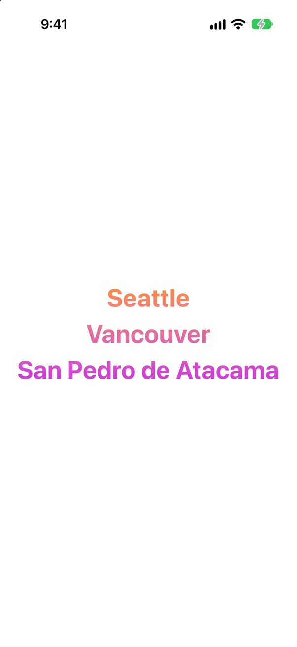
Orange at the top line, purple at the bottom. The same rule explains a gradient on a ForEach of shapes: each shape restarts it.
Where this comes from: LinearGradient · foregroundStyle(_:) — Measured on an iPhone 17 simulator.
A card — two texts on a white rounded rectangle — gets a shadow. A loud red one makes it easy to see: .shadow(color: .red, radius: 0, x: 4, y: 4). What casts it? And with .compositingGroup() just before?
Show the answer
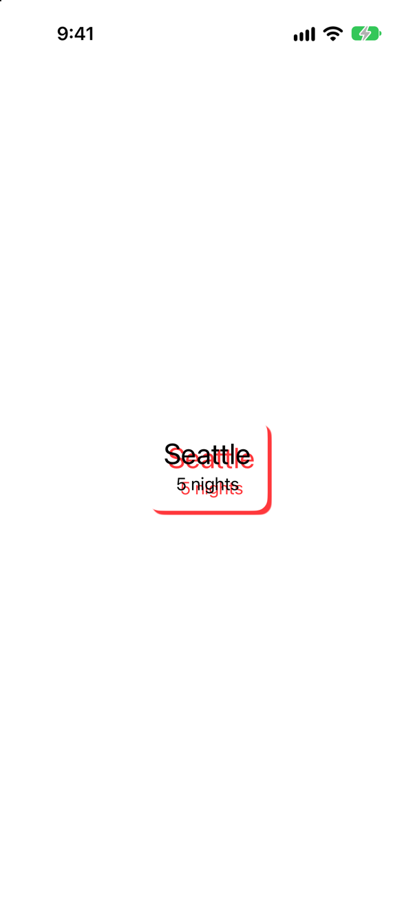
The card and each word. A shadow on a view is applied to each layer drawn in it, so the texts cast shadows of their own — onto the white card, where they show. With a compositing group first:
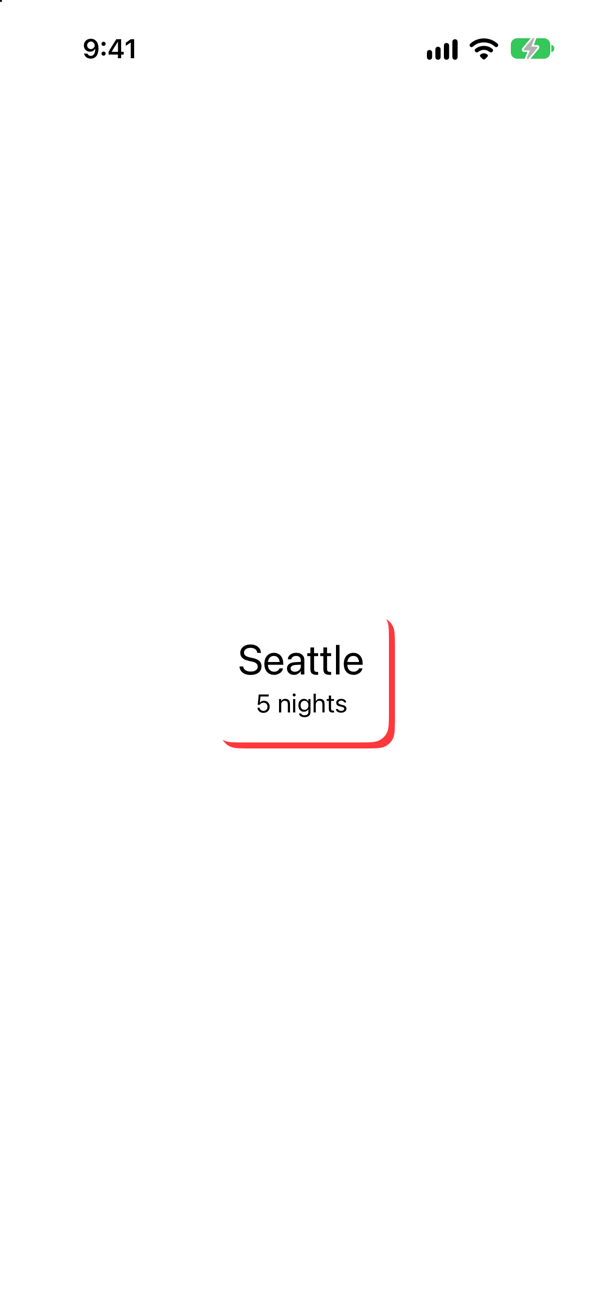
Only the card's outline. Apple: "A compositing group makes compositing effects in this view’s ancestor views, such as opacity and the blend mode, take effect before this view is rendered" — the card is flattened into one picture, and the shadow is that picture's.
Where this comes from: shadow(color:radius:x:y:) · compositingGroup() — Measured on an iPhone 17 simulator; a red, unblurred shadow makes the difference visible.
A square gets a shadow and a rounded clip. Shadow first, or clip first — does it matter?
Show the answer
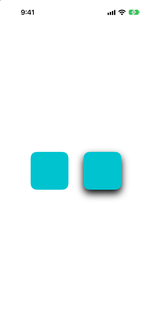
It matters: shadow first, and the shadow is gone. Each modifier wraps the view before it. On the left, the shadow is drawn around the square, and then the clip cuts away everything outside the rounded square — including the shadow. On the right, the square is clipped first and the shadow is drawn around the clipped shape.
Lesson 9's lesson about modifier order, in its most visible form: a clip removes whatever lies outside it, whatever drew it.
Where this comes from: shadow(color:radius:x:y:) — Measured on an iPhone 17 simulator.
Over a striped background, one panel uses .regularMaterial and one .white.opacity(0.5). What is different — and what happens to the material in dark appearance?
Show the answer
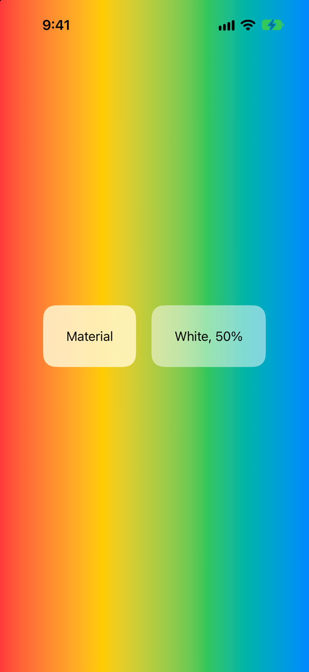
The white only lightens; the material blurs. Through the white panel the stripes stay sharp, just paler. Behind the material they melt into a soft wash, and the text stays easy to read whatever passes beneath it. Apple: "The blurring effect provided by the material isn’t simple opacity. Instead, it uses a platform-specific blending that produces an effect that resembles heavily frosted glass."
And it changes with the appearance, which a fixed white cannot:
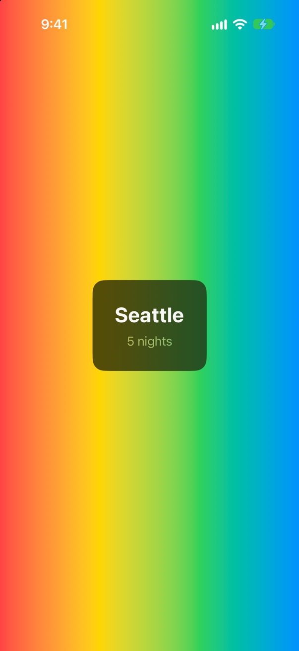
Dark glass, and the text on it turned light by itself. Apple adds that on a material, text gets vibrancy — "a context-specific blend of the foreground and background colors that improves contrast" — which a fixed foregroundStyle color switches off, but .secondary keeps, as the second line does.
Where this comes from: Material · foregroundStyle(_:) — Apple, Material: "A material blurs a background that’s part of your app, but not what appears behind your app on the screen."
Two 300 × 200 rectangles filled with a yellow-to-red RadialGradient centered in the middle: one with endRadius: 50, one with endRadius: 150. What does each look like?
Show the answer
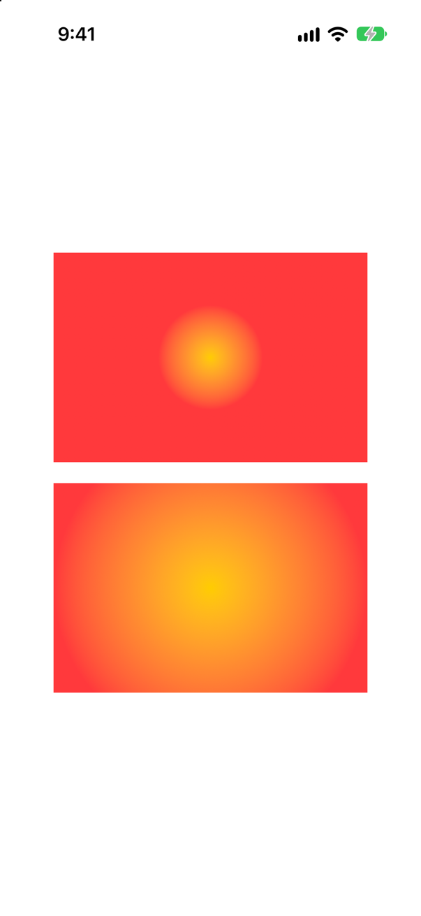
A small glow in a red rectangle, and a glow that fills most of it. A radial gradient's center is a unit point, like a linear gradient's ends, but its radii are in points: the colors change over the first 50 or 150 points from the center, and everything farther out is the last color.
So the same gradient looks different on a small badge and a full screen, unlike a linear one. Choose radii from the size of what is filled — half the shorter side reaches the nearest edge — or reach for a GeometryReader when the size is not known.
Where this comes from: RadialGradient — Apple, RadialGradient: "The gradient applies the color function as the distance from a center point, scaled to fit within the defined start and end radii."
AngularGradient(colors: [.white, .blue], center: .center) fills a circle. Where is the hard edge between the two colors?
Show the answer
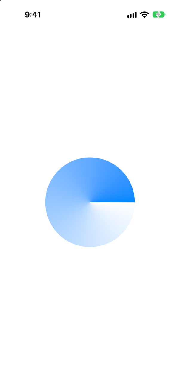
At three o'clock. An angular gradient starts at angle zero — the positive x-axis, the same place a circle's path and the last lesson's trim start — and runs around clockwise on the screen from white to blue, so blue meets white again at the start.
Two ways to hide the seam: end on the color you began with ([.red, .yellow, .green, .blue, .red]), or pass a startAngle and endAngle to turn it where it will not be noticed. Apple notes that when the angles cover less than a full turn, the gap "fills the missing area with the colors defined by gradient locations one and zero".
Where this comes from: AngularGradient — Measured on an iPhone 17 simulator.
RoundedRectangle(cornerRadius: 16).fill(.orange.gradient) beside the same filled with plain .orange. What does .gradient add?
Show the answer
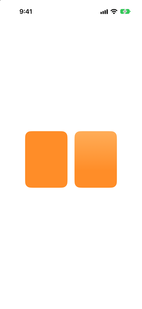
A gentle lightening toward the top. .gradient returns an AnyGradient, Apple's "standard gradient for the color", and "When used as a ShapeStyle, this type draws a linear gradient with start-point [0.5, 0] and end-point [0.5, 1]" — top center to bottom center.
It is the cheapest way to make a flat tile look less flat, and it follows the color: highlight.gradient would change with the highlight. This lesson's ticket uses an explicit LinearGradient instead because it wants a diagonal and a lighter end than the standard one.
Where this comes from: AnyGradient — Measured on an iPhone 17 simulator.
A 2 × 2 MeshGradient needs four points and four colors. Given four points but only three colors, over a black background, what happens?
Show the answer
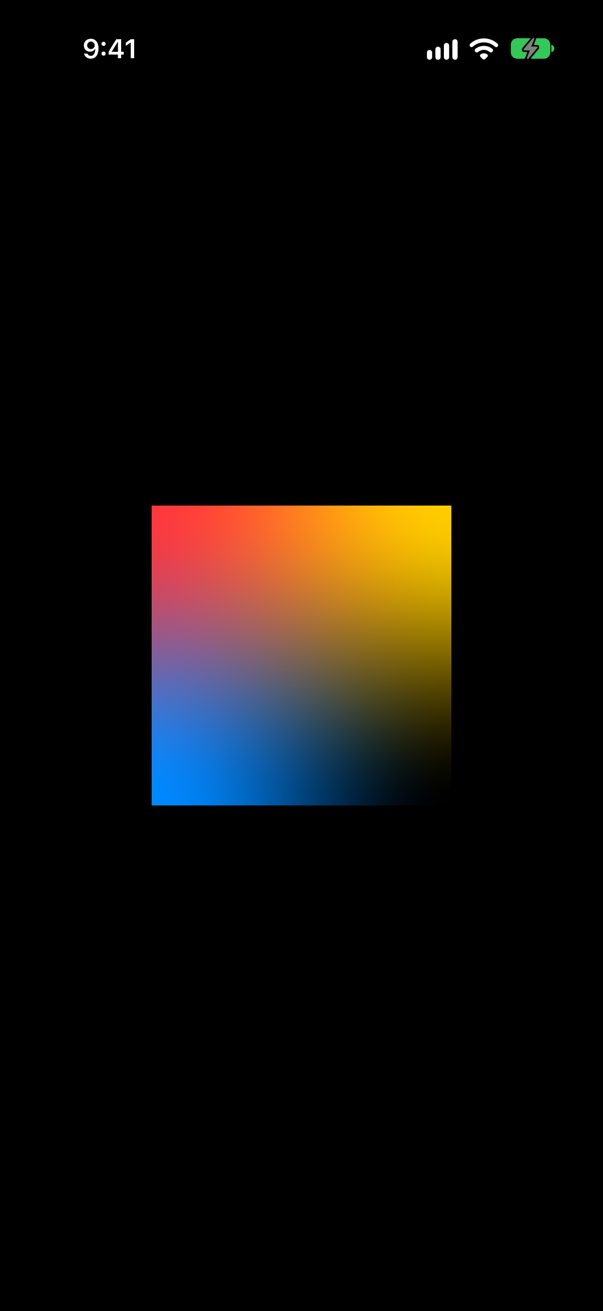
It draws, and the fourth corner is transparent — the black behind shows through the bottom right, and the colors fade toward it. There is no crash and no message: a mesh is simply as many colors as you gave it, and the rest are clear.
So count. A mesh of width × height needs exactly that many points and colors, in rows from the top left. Apple describes each vertex as having "a position, a color and four surrounding Bezier control points" — leave one out, and its corner of the picture goes missing.
Where this comes from: MeshGradient — Measured on iOS 27.
A card filled with .background — the color of the page — gets .shadow(radius: 12, y: 8), with no color given. It looks fine in light appearance. What about dark?
Show the answer
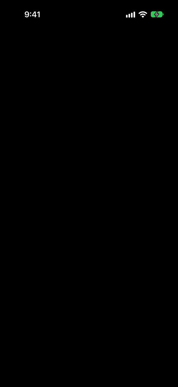
The card vanishes. In dark appearance .background is black, so the card is the color of the page, and the shadow is Apple's default — "If you don’t specify a color, the method uses a semi-transparent black" — black on black. In light appearance the same code is a white card floating on a soft shadow:
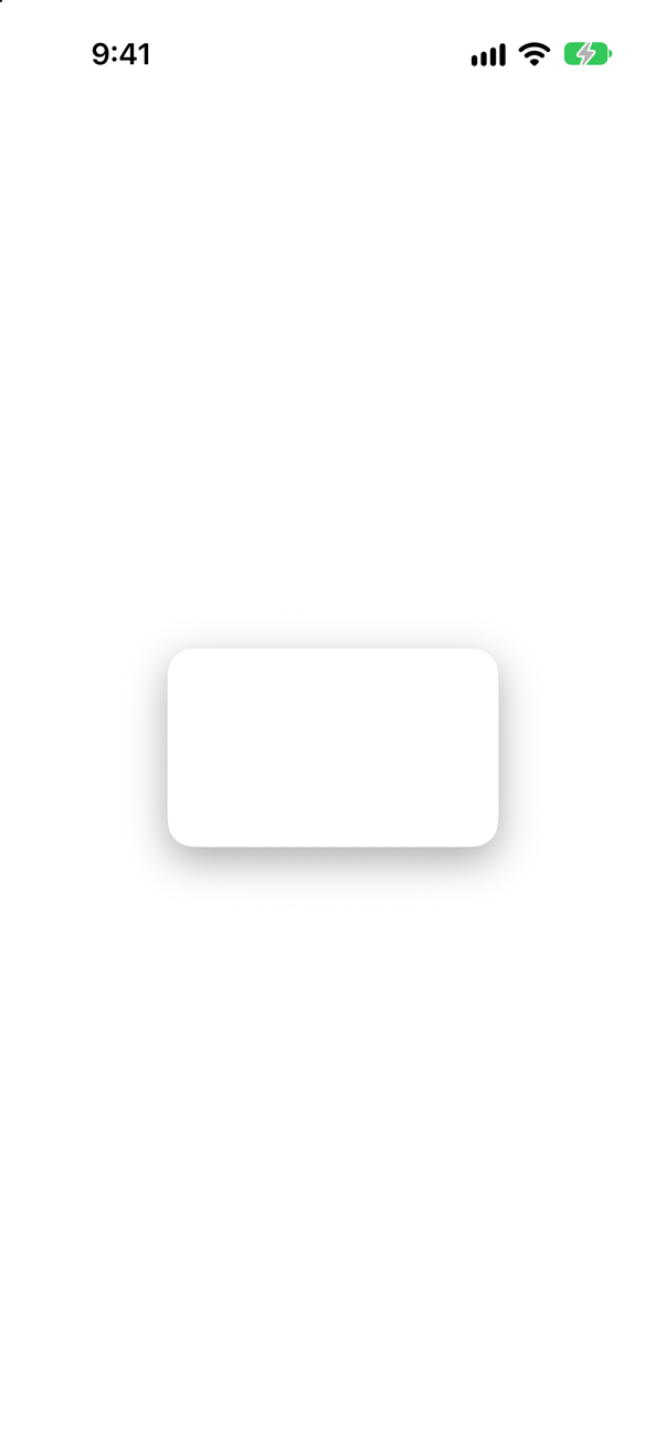
A shadow only reads on a lighter surface. The usual dark-appearance answer is a lighter fill for raised things — a material, for one — rather than a darker shadow. Check every shadowed design in both appearances.
Where this comes from: shadow(color:radius:x:y:) — Measured on an iPhone 17 simulator in dark and light appearance.