Settings, and the keyboard
Controls and forms · Text input and focus
You will buildA Settings tab built as a Form — a picker that recolors the whole app, a toggle for the year, and a name the boarding pass prints — a button style of your own for the pass, and a trip editor where the keyboard goes where it should: City first, Return to Country, a price on the number pad with a Done button.
TimeAbout 110 minutes
WhyPart 9 is input. In UIKit a control told you about a change through target–action or a delegate; in SwiftUI a control is handed a binding, and changes the value itself. That one idea covers every control in this lesson — a picker, a toggle, a text field — and a Form arranges them the way Settings does. Then text input, where most of the real work is the keyboard: which field has it, what the Return key says and does, and what happens on a keyboard that has no Return key at all.
Open your project
Open your
Tripsproject as lesson 29 left it: double-clickTrips.xcodeprojin Finder, or use File ▸ Open… (⌘O) in Xcode.If you did not finish lesson 29, or would rather start from a known state, download Trips-lesson-29.zip instead. It is the project exactly as it stood at the end of lesson 29. Unzip it and open
Trips.xcodeproj.Run it (⌘R) to check that it builds. You should see where lesson 29 ended:
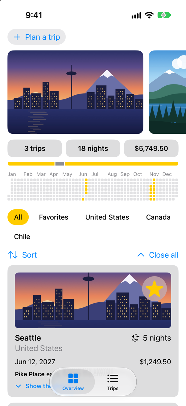
Trips, as it stood at the end of lesson 29Screenshot · iPhone 17, iOS 27.0
A settings form
Settings are data that many screens read, so they live in one @Observable class, put into the environment by the app — the same pattern as the store in lesson 19, and on the main actor for the same reason: the screens read it. Make a new Swift File named Settings, and replace everything in it:
import SwiftUI

/// The choices made on the Settings tab, shared by every screen that uses them. `@MainActor`: the
/// screens read them.
@MainActor
@Observable
final class Settings {
    var highlight = Highlight.yellow
    var showsYear = true

    /// The colors the app can be drawn in. `Sendable`: plain data — and a type nested in the class
    /// does not take the class's actor, so it says so itself.
    enum Highlight: String, CaseIterable, Identifiable, Sendable {
        case yellow, mint, orange

        var id: Self {
            self
        }

        var color: Color {
            switch self {
            case .yellow: .yellow
            case .mint: .mint
            case .orange: .orange
            }
        }
    }
}
The Settings screen is a Form: Apple calls it "A container for grouping controls used for data entry, such as in settings or inspectors", and it gives each control the grouped look of the Settings app. Each control is handed a binding to the value it changes — $settings.highlight, $settings.showsYear — and changes it directly: no target, no action, no delegate. The picker's options come from a ForEach over the enum's cases, and each option's id is the case itself, so it matches the type of the selection. Make a SwiftUI View named SettingsView:
struct SettingsView: View { @Environment(Settings.self) private var settings var body: some View { Text("Hello, World!") @Bindable var settings = settings NavigationStack { Form { Section("Look") { Picker("Highlight", selection: $settings.highlight) { ForEach(Settings.Highlight.allCases) { choice in Text(choice.rawValue.capitalized) } } .pickerStyle(.segmented) Toggle("Show the year on the Overview", isOn: $settings.showsYear) } } .navigationTitle("Settings") } }}struct SettingsView: View {
@Environment(Settings.self) private var settings
var body: some View {
@Bindable var settings = settings
NavigationStack {
Form {
Section("Look") {
Picker("Highlight", selection: $settings.highlight) {
ForEach(Settings.Highlight.allCases) { choice in
Text(choice.rawValue.capitalized)
}
}
.pickerStyle(.segmented)
Toggle("Show the year on the Overview", isOn: $settings.showsYear)
}
}
.navigationTitle("Settings")
}
}
}#Preview { SettingsView() .environment(Settings())}#Preview {
SettingsView()
.environment(Settings())
}In TripsApp.swift, the app owns the settings, adds the tab, and puts the settings — and the highlight they choose — into the environment of every tab:
import SwiftUI@mainstruct TripsApp: App { @Environment(\.scenePhase) private var scenePhase @State private var store = TripStore() @State private var settings = Settings() var body: some Scene { WindowGroup { TabView { Tab("Overview", systemImage: "square.grid.2x2") { ContentView() } Tab("Trips", systemImage: "list.bullet") { TripList() } Tab("Settings", systemImage: "gearshape") { SettingsView() } } .environment(store) .environment(settings) .environment(\.highlight, settings.highlight.color) .task { // On the main actor, as the store is: `.task` and the closure take // the actor of the code they are written in. Each value is a [Trip], // handed on because a trip is Sendable. for await _ in Observations({ store.trips }) { store.save() } } } .onChange(of: scenePhase) { _, new in if new == .background { store.save() } } }}import SwiftUI
@main
struct TripsApp: App {
@Environment(\.scenePhase) private var scenePhase
@State private var store = TripStore()
@State private var settings = Settings()
var body: some Scene {
WindowGroup {
TabView {
Tab("Overview", systemImage: "square.grid.2x2") {
ContentView()
}
Tab("Trips", systemImage: "list.bullet") {
TripList()
}
Tab("Settings", systemImage: "gearshape") {
SettingsView()
}
}
.environment(store)
.environment(settings)
.environment(\.highlight, settings.highlight.color)
.task {
// On the main actor, as the store is: `.task` and the closure take
// the actor of the code they are written in. Each value is a [Trip],
// handed on because a trip is Sendable.
for await _ in Observations({ store.trips }) {
store.save()
}
}
}
.onChange(of: scenePhase) { _, new in
if new == .background {
store.save()
}
}
}
}And the Overview shows the year only when the toggle says so. In ContentView.swift, the struct and its two previews — a preview of a view that reads the settings needs settings of its own, or it stops with lesson 19's "No Observable object" error:
struct ContentView: View { @Environment(TripStore.self) private var store @Environment(Settings.self) private var settings @State private var filter = TripFilter.all @State private var closings = 0 var body: some View { @Bindable var store = store ScrollView { LazyVStack(spacing: 12) { TripPlanner() .environment(\.highlight, .mint) PhotoStrip(trips: store.trips) TripSummary(trips: store.trips) YearGrid(trips: store.trips) if settings.showsYear { YearGrid(trips: store.trips) } FilterBar(filters: filters, selection: $filter) .frame(maxWidth: .infinity, alignment: .leading) .padding(.horizontal) HStack { Menu("Sort", systemImage: "arrow.up.arrow.down") { Button("By date") { store.trips.sort { $0.start < $1.start } } Button("By price") { store.trips.sort { $0.price < $1.price } } } Spacer() Button("Close all", systemImage: "chevron.up") { closings += 1 } } .padding(.horizontal) LazyVGrid(columns: [GridItem(.adaptive(minimum: 300))], spacing: 12) { ForEach($store.trips) { $trip in if filter.includes(trip) { TripCard(trip: $trip) } } } .id(closings) } } } /// All, Favorites, and then a filter for each country that has a trip. private var filters: [TripFilter] { var countries: [String] = [] for trip in store.trips where !countries.contains(trip.country) { countries.append(trip.country) } return [.all, .favorites] + countries.map { TripFilter.country($0) } }}struct ContentView: View {
@Environment(TripStore.self) private var store
@Environment(Settings.self) private var settings
@State private var filter = TripFilter.all
@State private var closings = 0
var body: some View {
@Bindable var store = store
ScrollView {
LazyVStack(spacing: 12) {
TripPlanner()
.environment(\.highlight, .mint)
PhotoStrip(trips: store.trips)
TripSummary(trips: store.trips)
if settings.showsYear {
YearGrid(trips: store.trips)
}
FilterBar(filters: filters, selection: $filter)
.frame(maxWidth: .infinity, alignment: .leading)
.padding(.horizontal)
HStack {
Menu("Sort", systemImage: "arrow.up.arrow.down") {
Button("By date") { store.trips.sort { $0.start < $1.start } }
Button("By price") { store.trips.sort { $0.price < $1.price } }
}
Spacer()
Button("Close all", systemImage: "chevron.up") { closings += 1 }
}
.padding(.horizontal)
LazyVGrid(columns: [GridItem(.adaptive(minimum: 300))], spacing: 12) {
ForEach($store.trips) { $trip in
if filter.includes(trip) {
TripCard(trip: $trip)
}
}
}
.id(closings)
}
}
}
/// All, Favorites, and then a filter for each country that has a trip.
private var filters: [TripFilter] {
var countries: [String] = []
for trip in store.trips where !countries.contains(trip.country) {
countries.append(trip.country)
}
return [.all, .favorites] + countries.map { TripFilter.country($0) }
}
}#Preview { ContentView() .environment(TripStore()) .environment(Settings())}#Preview {
ContentView()
.environment(TripStore())
.environment(Settings())
}#Preview("Landscape", traits: .landscapeLeft) { ContentView() .environment(TripStore()) .environment(Settings())}#Preview("Landscape", traits: .landscapeLeft) {
ContentView()
.environment(TripStore())
.environment(Settings())
}Run the app and tap Settings:
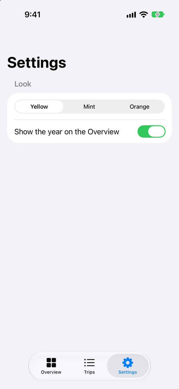
Choose Mint, turn the toggle off, and go back to the Overview:
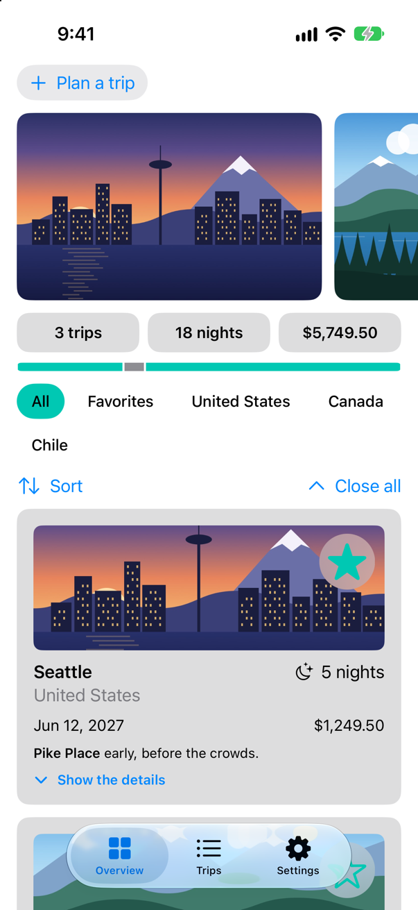
The chips, the stars and the summary bar turned mint, and the year is gone — each control changed its value, and every view that reads it followed. Notice where the toggle sits: the switch is at the trailing edge of the row, and only the switch turns it; a tap on the words does nothing (an edge case in this lesson taps there).
A button style of your own
The boarding pass is a button with the plain style, so it gives no sign of being pressed. A ButtonStyle decides how a button looks, and is told whether it is pressed right now. Apple's page for it: "To configure the current button style for a view hierarchy, use the buttonStyle(_:) modifier." Make a new Swift File named PressableStyle, and replace everything in it:
import SwiftUI

/// A button that sinks a little under the finger, for large tappable cards.
struct PressableStyle: ButtonStyle {
    func makeBody(configuration: Configuration) -> some View {
        configuration.label
            .scaleEffect(configuration.isPressed ? 0.96 : 1)
            .opacity(configuration.isPressed ? 0.85 : 1)
            .animation(.easeOut(duration: 0.15), value: configuration.isPressed)
    }
}
The style draws the button's own label (configuration.label) and shrinks it a little while configuration.isPressed is true. In BoardingPass.swift, use it in place of .plain:
struct BoardingPass: View { let trip: Trip let totalNights: Int @Environment(\.highlight) private var highlight @State private var isCheckedIn = false var body: some View { Button { withAnimation(.spring(duration: 0.5, bounce: 0.3)) { isCheckedIn.toggle() } completion: { print(isCheckedIn ? "Checked in to \(trip.city)" : "Check-in undone for \(trip.city)") } } label: { HStack(spacing: 16) { VStack(alignment: .leading, spacing: 4) { Text("Boarding pass") .font(.caption.weight(.semibold)) .textCase(.uppercase) .foregroundStyle(.secondary) Text(trip.city) .font(.title2.weight(.bold)) Text(trip.start, format: .dateTime.day().month(.wide).year()) .foregroundStyle(.secondary) Label("Checked in", systemImage: "checkmark.seal.fill") .font(.caption.weight(.semibold)) .opacity(isCheckedIn ? 1 : 0) } Spacer() NightsRing(nights: trip.nights, total: totalNights) } .padding(.vertical, 20) .padding(.horizontal, 28) .background { Ticket(notch: isCheckedIn ? 22 : 14) .fill(LinearGradient(colors: [highlight, highlight.opacity(0.35)], startPoint: .topLeading, endPoint: .bottomTrailing)) .shadow(color: .black.opacity(0.2), radius: 8, y: 4) } } .buttonStyle(.plain) .buttonStyle(PressableStyle()) .accessibilityLabel("Boarding pass for \(trip.city)") .accessibilityHint(isCheckedIn ? "Undoes the check-in" : "Checks in") .padding(.horizontal) }}struct BoardingPass: View {
let trip: Trip
let totalNights: Int
@Environment(\.highlight) private var highlight
@State private var isCheckedIn = false
var body: some View {
Button {
withAnimation(.spring(duration: 0.5, bounce: 0.3)) {
isCheckedIn.toggle()
} completion: {
print(isCheckedIn ? "Checked in to \(trip.city)" : "Check-in undone for \(trip.city)")
}
} label: {
HStack(spacing: 16) {
VStack(alignment: .leading, spacing: 4) {
Text("Boarding pass")
.font(.caption.weight(.semibold))
.textCase(.uppercase)
.foregroundStyle(.secondary)
Text(trip.city)
.font(.title2.weight(.bold))
Text(trip.start, format: .dateTime.day().month(.wide).year())
.foregroundStyle(.secondary)
Label("Checked in", systemImage: "checkmark.seal.fill")
.font(.caption.weight(.semibold))
.opacity(isCheckedIn ? 1 : 0)
}
Spacer()
NightsRing(nights: trip.nights, total: totalNights)
}
.padding(.vertical, 20)
.padding(.horizontal, 28)
.background {
Ticket(notch: isCheckedIn ? 22 : 14)
.fill(LinearGradient(colors: [highlight, highlight.opacity(0.35)],
startPoint: .topLeading, endPoint: .bottomTrailing))
.shadow(color: .black.opacity(0.2), radius: 8, y: 4)
}
}
.buttonStyle(PressableStyle())
.accessibilityLabel("Boarding pass for \(trip.city)")
.accessibilityHint(isCheckedIn ? "Undoes the check-in" : "Checks in")
.padding(.horizontal)
}
}Run the app and open Seattle:
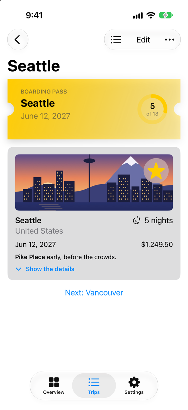
A still picture shows the pass at rest. Press and hold it in the simulator to see it sink; let go, and it checks in as before — the action runs when the finger lifts, however long it was held (an edge case holds it for two seconds).
A name to print
Lesson 30 begins with the simplest text input: a TextField bound to a string, which "updates this value continuously as the user types", in Apple's words. Two modifiers tell the keyboard about it: .textContentType(.name) says what the field is for, so that the system can offer the right suggestions, and .submitLabel(.done) changes the Return key's label. Add the name to the settings, in Settings.swift:
import SwiftUI/// The choices made on the Settings tab, shared by every screen that uses them. `@MainActor`: the/// screens read them.@MainActor@Observablefinal class Settings { var travelerName = "" var highlight = Highlight.yellow var showsYear = true /// The colors the app can be drawn in. `Sendable`: plain data — and a type nested in the class /// does not take the class's actor, so it says so itself. enum Highlight: String, CaseIterable, Identifiable, Sendable { case yellow, mint, orange var id: Self { self } var color: Color { switch self { case .yellow: .yellow case .mint: .mint case .orange: .orange } } }}import SwiftUI
/// The choices made on the Settings tab, shared by every screen that uses them. `@MainActor`: the
/// screens read them.
@MainActor
@Observable
final class Settings {
var travelerName = ""
var highlight = Highlight.yellow
var showsYear = true
/// The colors the app can be drawn in. `Sendable`: plain data — and a type nested in the class
/// does not take the class's actor, so it says so itself.
enum Highlight: String, CaseIterable, Identifiable, Sendable {
case yellow, mint, orange
var id: Self {
self
}
var color: Color {
switch self {
case .yellow: .yellow
case .mint: .mint
case .orange: .orange
}
}
}
}A field for it, in its own section at the top of the form. In SettingsView.swift:
struct SettingsView: View { @Environment(Settings.self) private var settings var body: some View { @Bindable var settings = settings NavigationStack { Form { Section("Traveler") { TextField("Name", text: $settings.travelerName) .textContentType(.name) .submitLabel(.done) } Section("Look") { Picker("Highlight", selection: $settings.highlight) { ForEach(Settings.Highlight.allCases) { choice in Text(choice.rawValue.capitalized) } } .pickerStyle(.segmented) Toggle("Show the year on the Overview", isOn: $settings.showsYear) } } .navigationTitle("Settings") } }}struct SettingsView: View {
@Environment(Settings.self) private var settings
var body: some View {
@Bindable var settings = settings
NavigationStack {
Form {
Section("Traveler") {
TextField("Name", text: $settings.travelerName)
.textContentType(.name)
.submitLabel(.done)
}
Section("Look") {
Picker("Highlight", selection: $settings.highlight) {
ForEach(Settings.Highlight.allCases) { choice in
Text(choice.rawValue.capitalized)
}
}
.pickerStyle(.segmented)
Toggle("Show the year on the Overview", isOn: $settings.showsYear)
}
}
.navigationTitle("Settings")
}
}
}And the boarding pass prints it when there is one. In BoardingPass.swift:
struct BoardingPass: View { let trip: Trip let totalNights: Int @Environment(\.highlight) private var highlight @Environment(Settings.self) private var settings @State private var isCheckedIn = false var body: some View { Button { withAnimation(.spring(duration: 0.5, bounce: 0.3)) { isCheckedIn.toggle() } completion: { print(isCheckedIn ? "Checked in to \(trip.city)" : "Check-in undone for \(trip.city)") } } label: { HStack(spacing: 16) { VStack(alignment: .leading, spacing: 4) { Text("Boarding pass") .font(.caption.weight(.semibold)) .textCase(.uppercase) .foregroundStyle(.secondary) Text(trip.city) .font(.title2.weight(.bold)) Text(trip.start, format: .dateTime.day().month(.wide).year()) .foregroundStyle(.secondary) if !settings.travelerName.isEmpty { Text("Passenger: \(settings.travelerName)") .font(.caption) } Label("Checked in", systemImage: "checkmark.seal.fill") .font(.caption.weight(.semibold)) .opacity(isCheckedIn ? 1 : 0) } Spacer() NightsRing(nights: trip.nights, total: totalNights) } .padding(.vertical, 20) .padding(.horizontal, 28) .background { Ticket(notch: isCheckedIn ? 22 : 14) .fill(LinearGradient(colors: [highlight, highlight.opacity(0.35)], startPoint: .topLeading, endPoint: .bottomTrailing)) .shadow(color: .black.opacity(0.2), radius: 8, y: 4) } } .buttonStyle(PressableStyle()) .accessibilityLabel("Boarding pass for \(trip.city)") .accessibilityHint(isCheckedIn ? "Undoes the check-in" : "Checks in") .padding(.horizontal) }}struct BoardingPass: View {
let trip: Trip
let totalNights: Int
@Environment(\.highlight) private var highlight
@Environment(Settings.self) private var settings
@State private var isCheckedIn = false
var body: some View {
Button {
withAnimation(.spring(duration: 0.5, bounce: 0.3)) {
isCheckedIn.toggle()
} completion: {
print(isCheckedIn ? "Checked in to \(trip.city)" : "Check-in undone for \(trip.city)")
}
} label: {
HStack(spacing: 16) {
VStack(alignment: .leading, spacing: 4) {
Text("Boarding pass")
.font(.caption.weight(.semibold))
.textCase(.uppercase)
.foregroundStyle(.secondary)
Text(trip.city)
.font(.title2.weight(.bold))
Text(trip.start, format: .dateTime.day().month(.wide).year())
.foregroundStyle(.secondary)
if !settings.travelerName.isEmpty {
Text("Passenger: \(settings.travelerName)")
.font(.caption)
}
Label("Checked in", systemImage: "checkmark.seal.fill")
.font(.caption.weight(.semibold))
.opacity(isCheckedIn ? 1 : 0)
}
Spacer()
NightsRing(nights: trip.nights, total: totalNights)
}
.padding(.vertical, 20)
.padding(.horizontal, 28)
.background {
Ticket(notch: isCheckedIn ? 22 : 14)
.fill(LinearGradient(colors: [highlight, highlight.opacity(0.35)],
startPoint: .topLeading, endPoint: .bottomTrailing))
.shadow(color: .black.opacity(0.2), radius: 8, y: 4)
}
}
.buttonStyle(PressableStyle())
.accessibilityLabel("Boarding pass for \(trip.city)")
.accessibilityHint(isCheckedIn ? "Undoes the check-in" : "Checks in")
.padding(.horizontal)
}
}The pass now reads the settings, so every preview that draws one needs them: the pass's own, the trip screen's and the list's. In BoardingPass.swift, TripDetail.swift and TripList.swift, the previews:
#Preview { BoardingPass(trip: .seattle, totalNights: 18) .environment(Settings())}#Preview {
BoardingPass(trip: .seattle, totalNights: 18)
.environment(Settings())
}#Preview { NavigationStack { TripDetail(id: 1, selection: .constant(1)) } .environment(TripStore()) .environment(Settings())}#Preview {
NavigationStack {
TripDetail(id: 1, selection: .constant(1))
}
.environment(TripStore())
.environment(Settings())
}#Preview { TripList() .environment(TripStore()) .environment(Settings())}#Preview {
TripList()
.environment(TripStore())
.environment(Settings())
}Run the app, tap Settings, type a name in the field and press done, then open Seattle in the Trips tab:
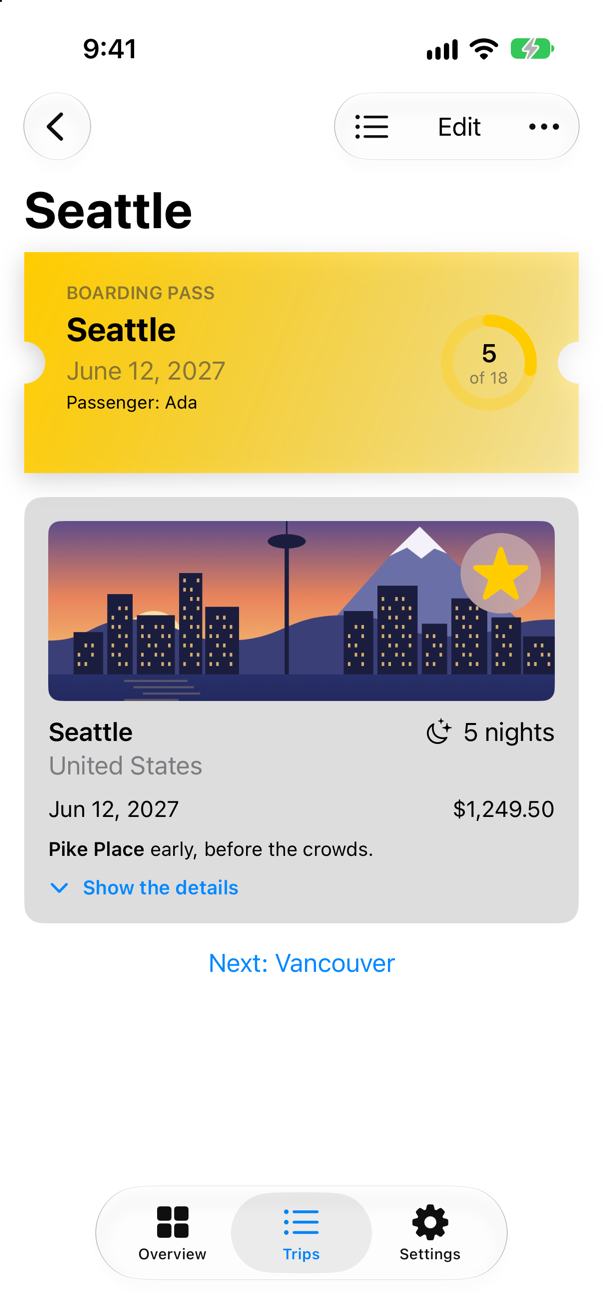
The name typed on one tab is on a pass on another, because both read the same settings. While the field had the keyboard, .submitLabel(.done) had made the key at the bottom right a blue tick — VoiceOver calls it "done":
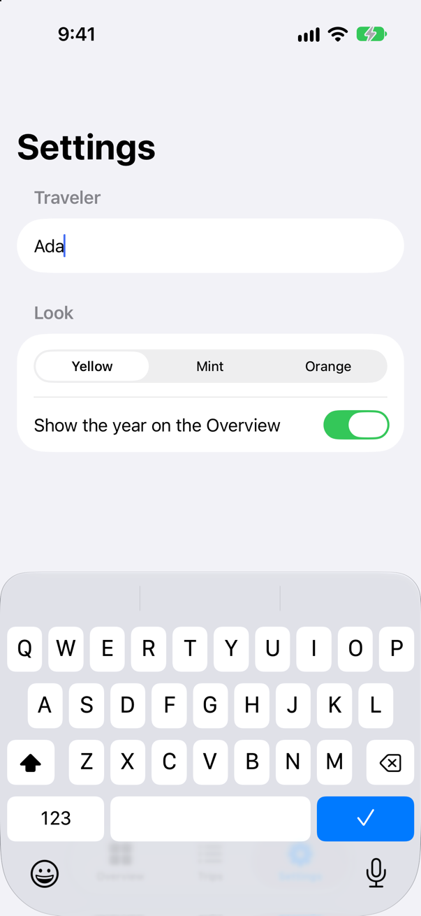
Pressing it ended the editing and put the keyboard away, as Return does in a field with no onSubmit of its own.
Where the keyboard goes
The trip editor's fields work, but the keyboard is no help: it opens with no field chosen, Return closes it, and the price cannot be edited at all. @FocusState fixes the first two. It is a value that SwiftUI keeps equal to whichever field has the keyboard — Apple: "When focus enters the modified view, the wrapped value of this property updates to match a given prototype value" — and that you can set, to move the keyboard: "Setting the property’s value programmatically has the reverse effect, causing focus to move to the view associated with the updated value."
So: the city gets the keyboard when the editor appears; its Return key becomes a next key and moves to the country. The price is a TextField bound to a Decimal with a currency format, typed on the decimal pad — and the decimal pad has no Return key, so a Done button in the keyboard's toolbar takes the focus away. In TripEditor.swift:
struct TripEditor: View { @State private var draft: Trip let onSave: (Trip) -> Void @Environment(\.dismiss) private var dismiss @FocusState private var focus: Field? /// The fields that can have the keyboard. enum Field { case city, country, price } init(trip: Trip, onSave: @escaping (Trip) -> Void) { _draft = State(initialValue: trip) self.onSave = onSave } var body: some View { NavigationStack { Form { TextField("City", text: $draft.city) .focused($focus, equals: .city) .submitLabel(.next) .onSubmit { focus = .country } TextField("Country", text: $draft.country) .focused($focus, equals: .country) .submitLabel(.done) Stepper(value: $draft.nights, in: 1...60) { Text("^[\(draft.nights) night](inflect: true)") } TextField("Price", value: $draft.price, format: .currency(code: "USD")) .focused($focus, equals: .price) .keyboardType(.decimalPad) } .onAppear { focus = .city } .navigationTitle("Edit trip") .navigationBarTitleDisplayMode(.inline) .toolbar { ToolbarItem(placement: .cancellationAction) { Button("Cancel") { dismiss() } } ToolbarItem(placement: .confirmationAction) { Button("Save") { onSave(draft) dismiss() } } ToolbarItemGroup(placement: .keyboard) { Spacer() Button("Done") { focus = nil } } } } }}struct TripEditor: View {
@State private var draft: Trip
let onSave: (Trip) -> Void
@Environment(\.dismiss) private var dismiss
@FocusState private var focus: Field?
/// The fields that can have the keyboard.
enum Field {
case city, country, price
}
init(trip: Trip, onSave: @escaping (Trip) -> Void) {
_draft = State(initialValue: trip)
self.onSave = onSave
}
var body: some View {
NavigationStack {
Form {
TextField("City", text: $draft.city)
.focused($focus, equals: .city)
.submitLabel(.next)
.onSubmit { focus = .country }
TextField("Country", text: $draft.country)
.focused($focus, equals: .country)
.submitLabel(.done)
Stepper(value: $draft.nights, in: 1...60) {
Text("^[\(draft.nights) night](inflect: true)")
}
TextField("Price", value: $draft.price, format: .currency(code: "USD"))
.focused($focus, equals: .price)
.keyboardType(.decimalPad)
}
.onAppear { focus = .city }
.navigationTitle("Edit trip")
.navigationBarTitleDisplayMode(.inline)
.toolbar {
ToolbarItem(placement: .cancellationAction) {
Button("Cancel") { dismiss() }
}
ToolbarItem(placement: .confirmationAction) {
Button("Save") {
onSave(draft)
dismiss()
}
}
ToolbarItemGroup(placement: .keyboard) {
Spacer()
Button("Done") { focus = nil }
}
}
}
}
}Run the app, open Seattle and tap Edit:
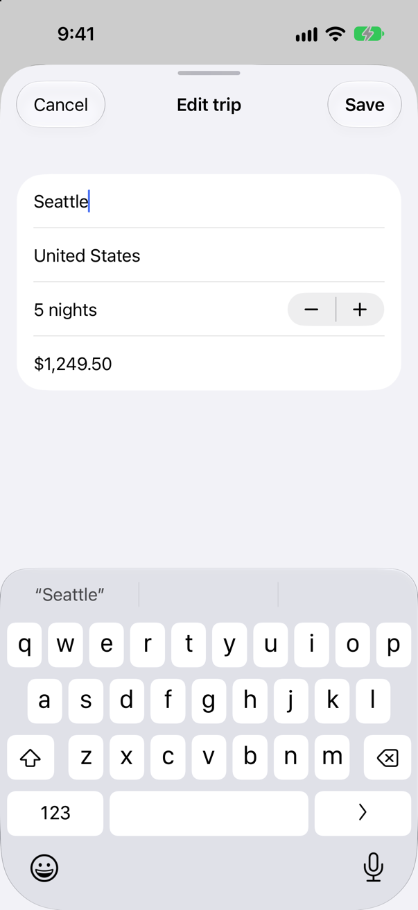
Press the arrow — VoiceOver calls it "next" — and the keyboard moves to Country. Then tap the price:
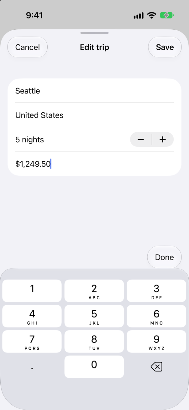
Digits, a point and delete — nothing to press to finish, which is why the Done button is there. When the toolbar appears, the console gets a line from SwiftUI itself: "Invalid frame dimension (negative or non-finite)." iOS 27 writes it whenever a keyboard toolbar appears — with or without the Spacer, on any keyboard, and in a new project with nothing but a field and one toolbar item — so it is not about your code. Tap Done, and the keyboard goes:
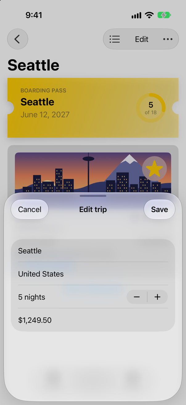
While the keyboard was up, the sheet was at its full height; with the keyboard gone, it is back at its medium detent from lesson 23. Setting focus to nil moved the keyboard to nowhere. Apple: "Set the focus binding to false or nil as appropriate to remove focus from all bound fields. You can also use this to remove focus from a TextField and thereby dismiss the keyboard."
What you built
- A Settings tab: a
Formwith a segmentedPicker, aToggleand aTextField, all bound to one@Observablesettings object in the environment. - The whole app's highlight color chosen in Settings, and the year shown or hidden.
- A
ButtonStyleof your own that presses the boarding pass in. - A trip editor with
@FocusState: City first, next to Country, a currency price on the decimal pad, and a keyboard Done button.
Next, gestures: the big photo on the Overview learns to be dragged away, pinched to zoom and tapped twice.
The finished project
Stuck, or want to compare with your own? This is the project as it stands at the end of this lesson, built and run before it was put here.
- Trips-lesson-30.zip — unzip it, then open
Trips.xcodeprojin Xcode.
Flash cards
22 cards for this lesson, each labelled with its topic. 14 ask how you would write something; the other 8 are trick questions, written to catch a misunderstanding. Answer in your head first, then tap the card.
Syntax · ControlsA switch bound to a Boolean.
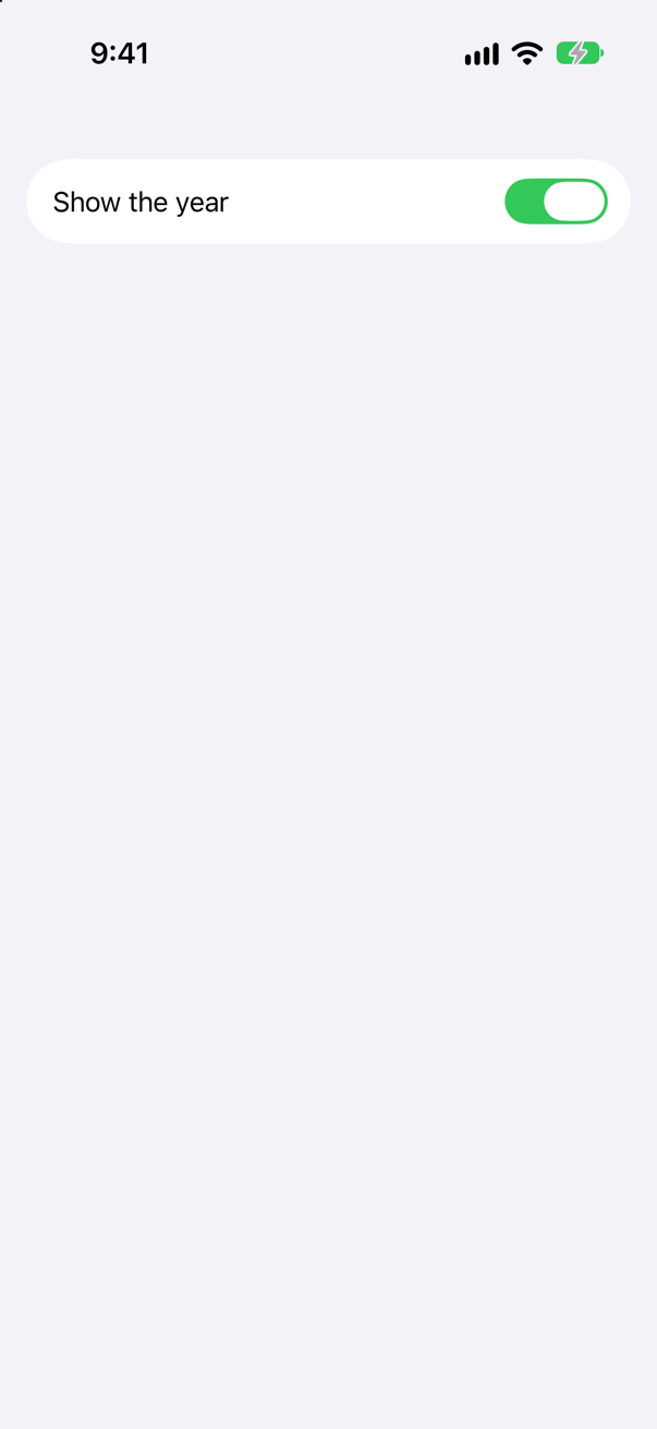
Toggle(_:isOn:), handed a binding. The toggle changes the Boolean itself; nothing else is needed to hear about it.
Syntax · ControlsChoose one of a few options, shown side by side.
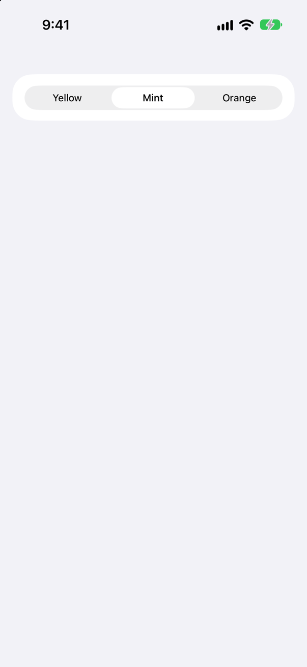
A Picker with a selection binding and a .tag on each option — of the same type as the selection — and .pickerStyle(.segmented). In a Form without a style, it would be a menu.
Syntax · ControlsA number that goes up and down in steps, within limits.
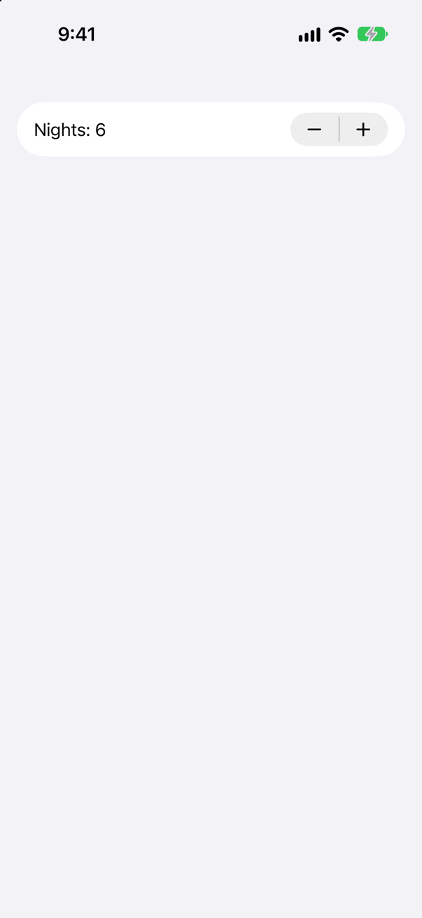
Stepper(_:value:in:). The range limits the control: at either end, the button that would leave it is disabled. The picture is after one tap on +.
Syntax · ControlsChoose a value from a continuous range by dragging.
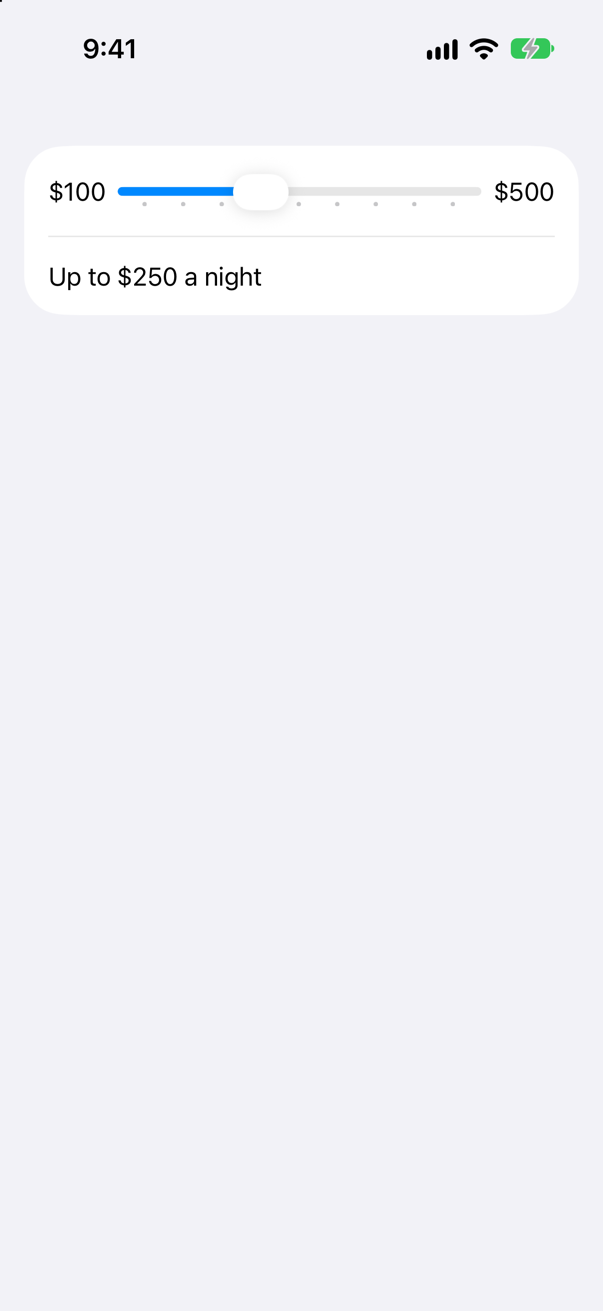
Slider(value:in:step:) with a label and labels for its ends. step makes it move in fifties; without it the value is continuous.
Syntax · ControlsPick a date, compactly, within a range.
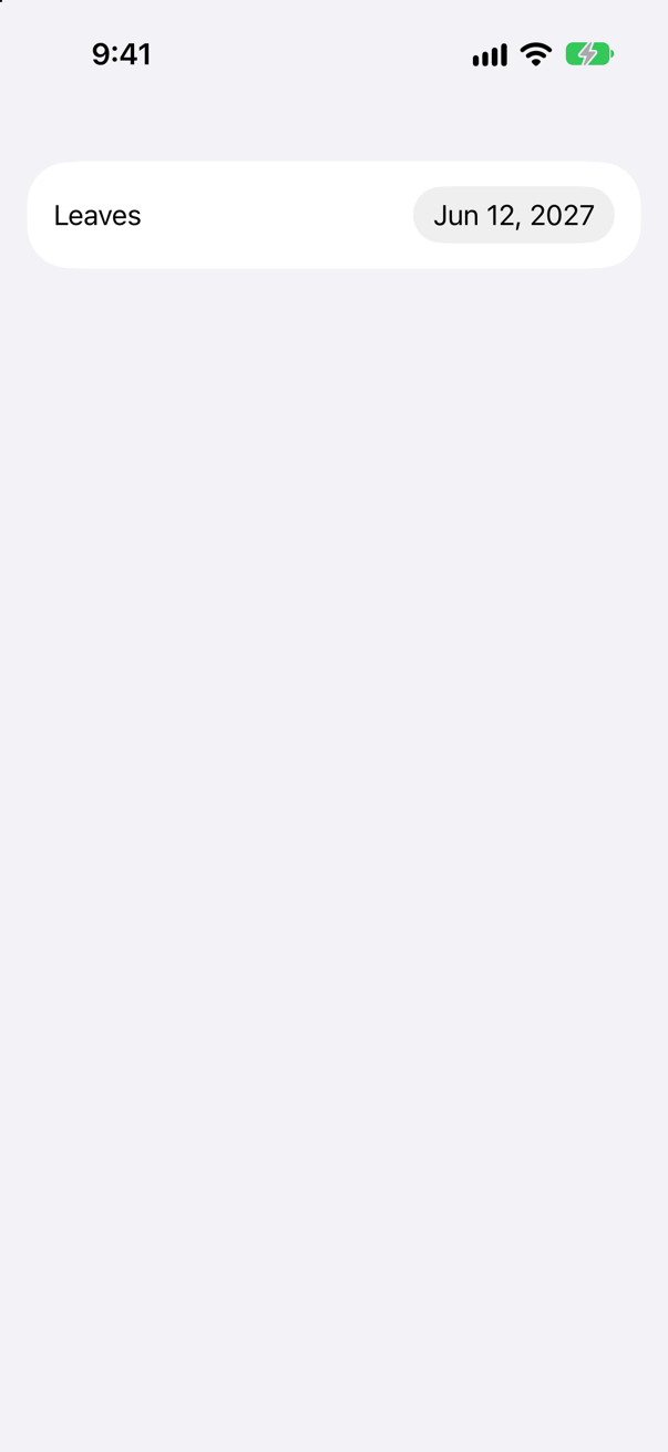
DatePicker(_:selection:in:displayedComponents:). In a form it shows the date as a button that opens a calendar; in: limits the choice and displayedComponents drops the time.
Syntax · FormsA settings screen, grouped into sections with headers.
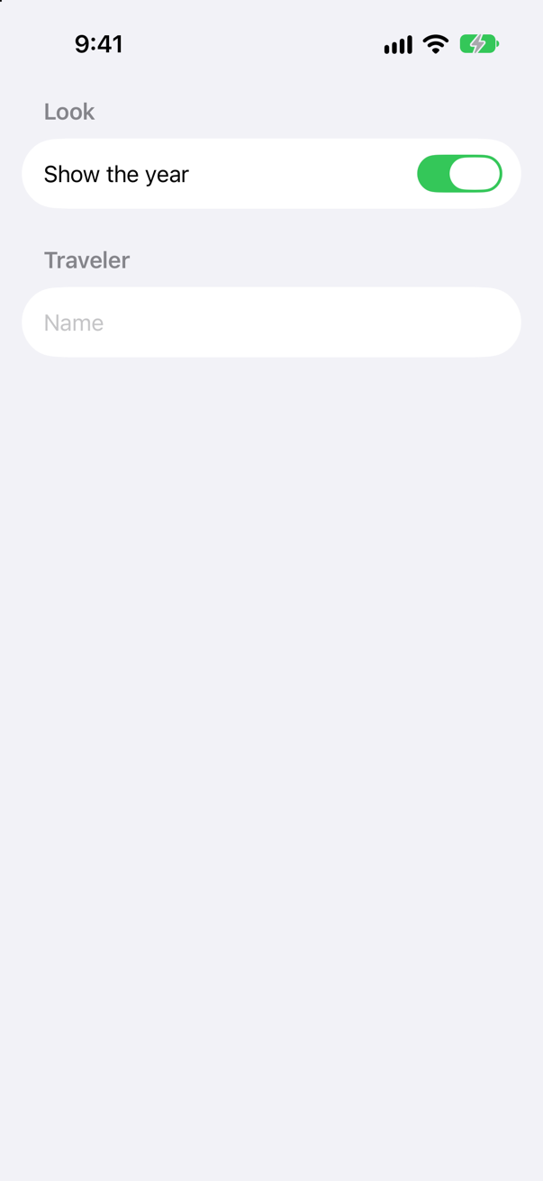
Form with Section(_:). On iOS a form is a grouped list, and it styles each control inside it — Apple: "Form-specific styling applies to things like buttons, toggles, labels, lists, and more."
Syntax · FormsA read-only row: a label, and a value at the trailing edge.
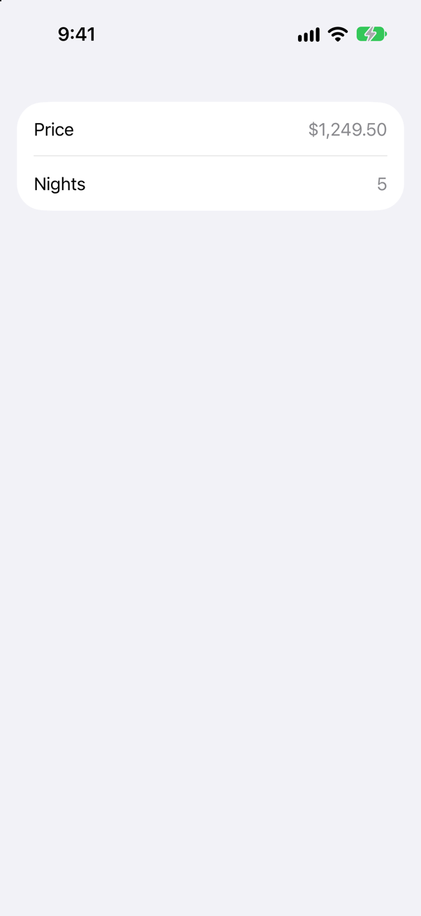
LabeledContent: a label and its content, laid out the way the form lays out its controls. VoiceOver reads the row as one element: "Price, $1,249.50".
Syntax · ControlsGive every button in a view hierarchy one look of your own, which changes while pressed.
A type that conforms to ButtonStyle and draws configuration.label, reading configuration.isPressed. Apply it with .buttonStyle(_:) — to one button, or to a container, for every button in it.
Syntax · Text inputA text field for a number, shown and parsed with a format.
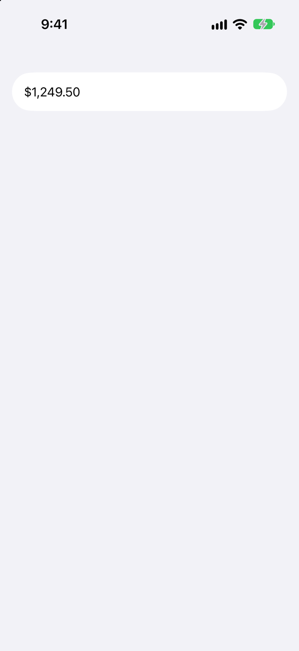
TextField(_:value:format:): the format turns the value into text and the typed text back into a value. Pair it with a keyboard that suits it — here the decimal pad.
Syntax · Text inputMove the keyboard from one field to the next with Return.
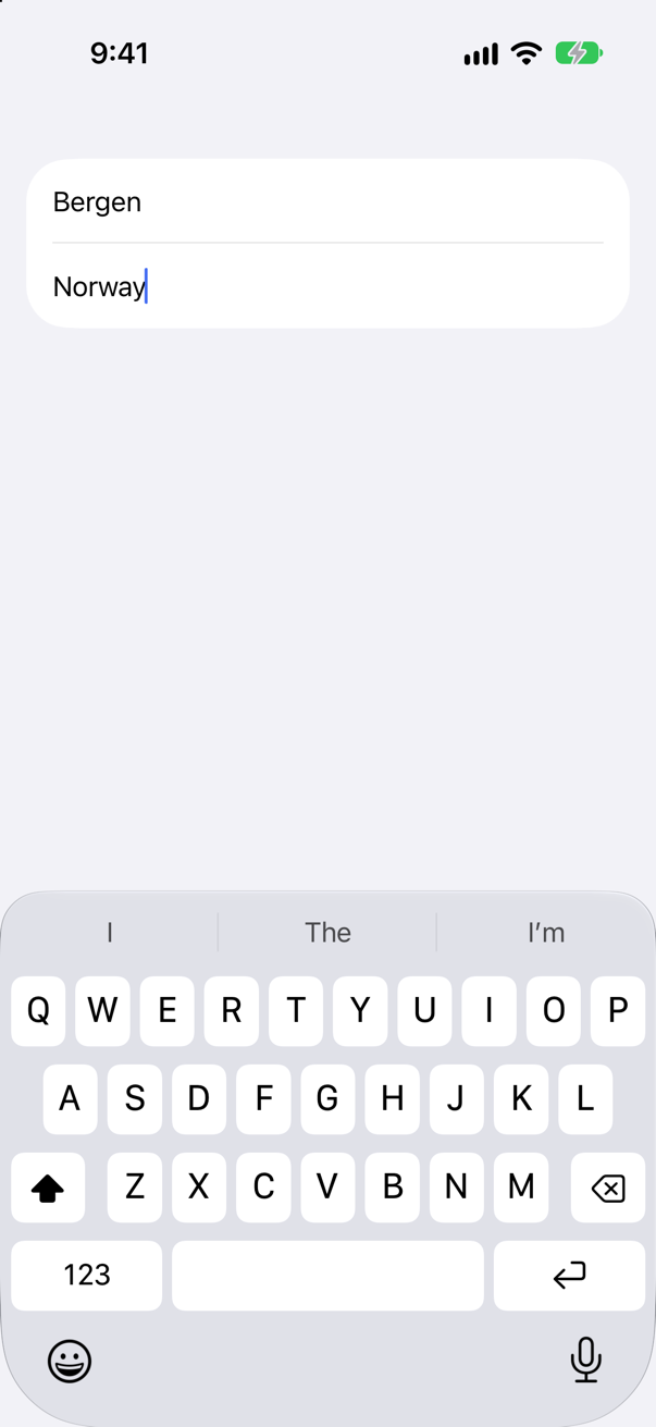
@FocusState with an optional enum of fields, .focused(_:equals:) on each, and onSubmit setting the next. The picture is after typing a city, pressing the next key, and typing a country.
Syntax · Text inputPut the keyboard away from code.
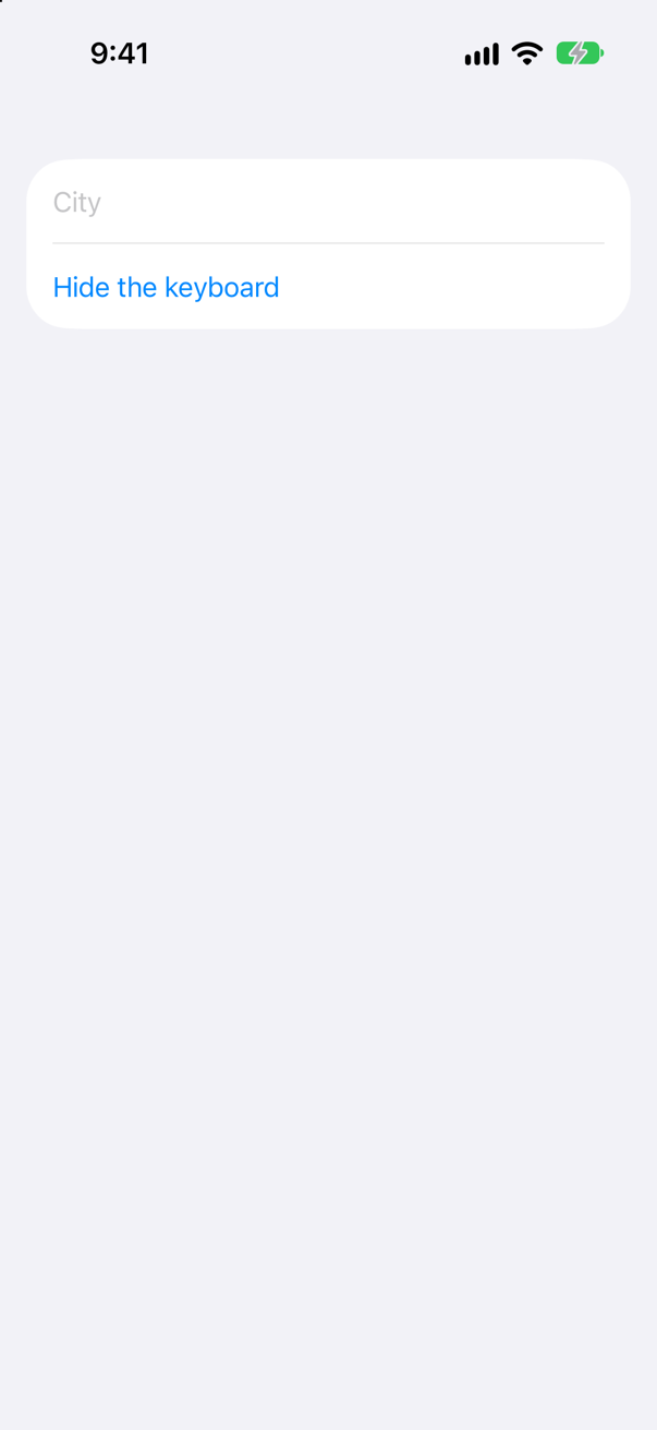
A Boolean @FocusState with .focused(_:), set to false. Apple: "You can also use this to remove focus from a TextField and thereby dismiss the keyboard." The picture is after the tap: no keyboard.
Syntax · Text inputA field that hides what is typed.
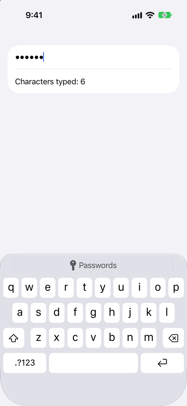
SecureField(_:text:): dots on the screen, the real text in the binding. The picture is after typing six letters.
Syntax · Text inputA text field that grows to several lines as the text does.
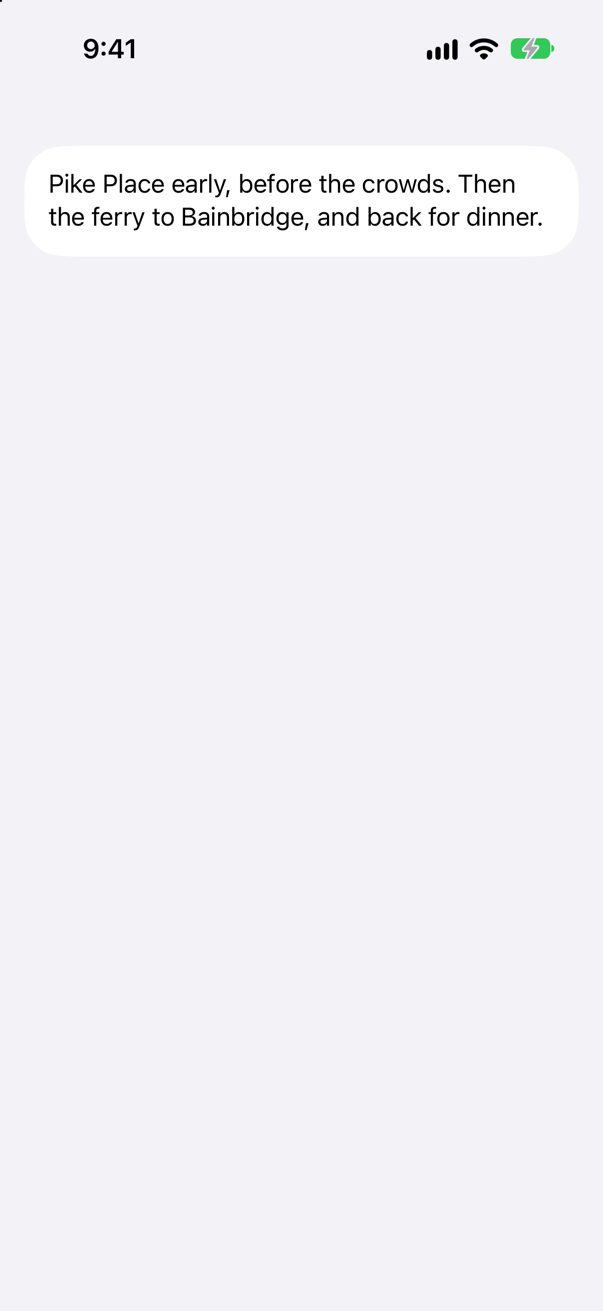
TextField(_:text:axis:) with .vertical, and .lineLimit(2...5) for its height range. Unlike TextEditor, it shows its title as a placeholder when empty.
Syntax · Text inputSay what a field is for, so the keyboard can suggest the right thing.
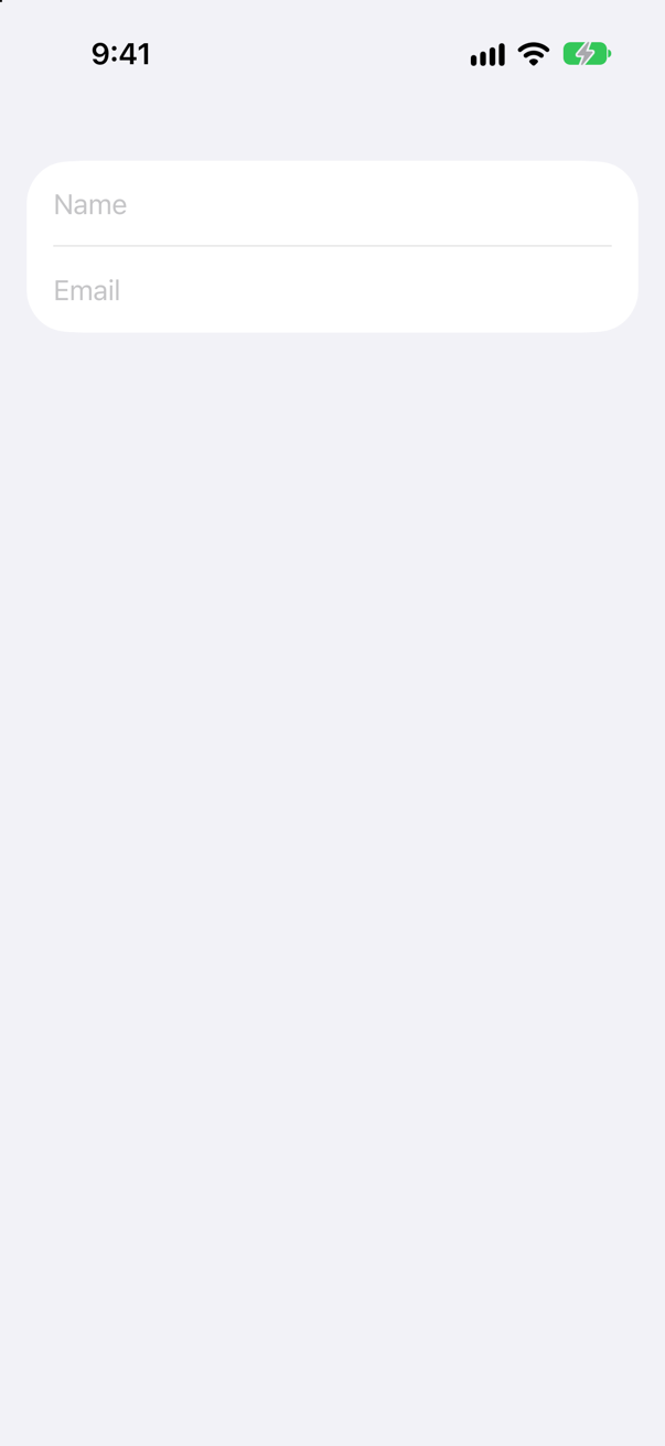
.textContentType(_:) for meaning (names, addresses, one-time codes), .keyboardType(_:) for keys, .textInputAutocapitalization(_:) for capitals, and .submitLabel(_:) for the Return key.
Trick question · Text inputTextField("Nights", value: $nights, format: .number). The user replaces 5 with 9 and has not pressed Return yet. What does nights hold?
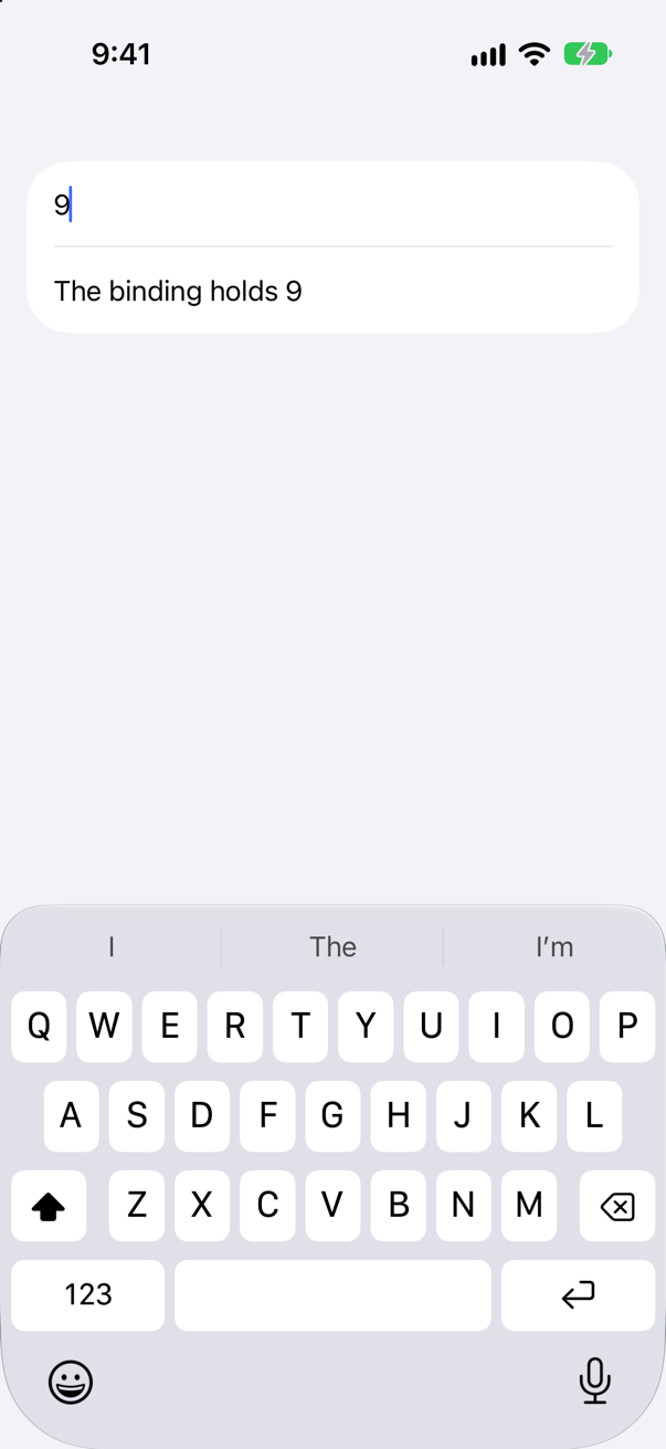
9 — already. On iOS 27 a formatted field writes the value as soon as the text parses. Apple's overview of TextField still says non-string values update "when the user commits their edits"; its page for this initializer says "Editing the text field updates the bound value, as long as the format style can parse the text." The second is what the simulator did.
Trick question · Text inputThe same nights field: the user types "abc" after the 5 and presses Return. What does the binding hold, and what does the field show?
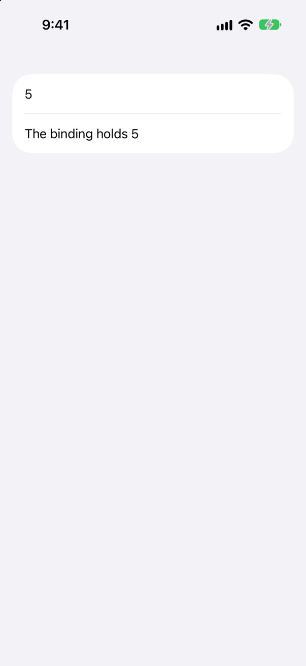
5, and 5. Text that does not parse never reaches the binding, and when editing ends the field puts back the last good value. Apple: "If the user stops editing the text in an invalid state, the text field updates the field’s text to the last known valid value."
Trick question · ControlsIn a Form, the user taps the words of a Toggle, not its switch. Does it change?
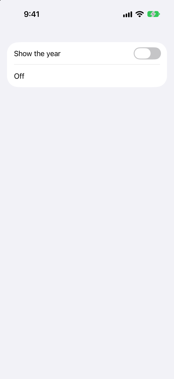
No. The picture is after a tap on the words: still off. Only the switch, at the trailing edge of the row, turns it.
Trick question · ControlsA button has .disabled(false), inside a section with .disabled(true). Can it be tapped?
No — nothing is printed. Apple: "The higher views in a view hierarchy can override the value you set on this view." A disabled container disables everything in it, whatever the children say.
Trick question · Controls@State private var choice: String? = nil, and a Picker whose options are tagged "Yellow" and "Mint". What does SwiftUI say when the screen appears?
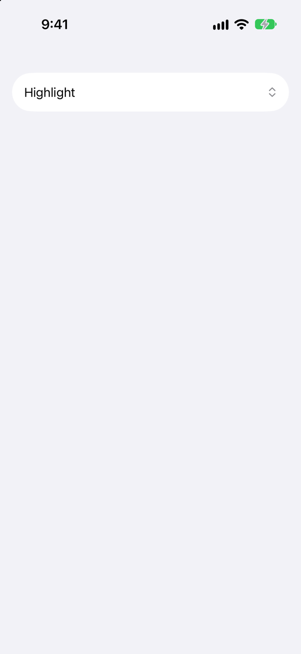
A warning: "Picker: the selection "nil" is invalid and does not have an associated tag, this will give undefined results." No option is tagged nil, so the current selection matches nothing. Add one — Text("None").tag(String?.none) — or start the selection at a real option.
Trick question · Text inputA field has .submitLabel(.next) and nothing else. The user presses the next key. Where does the keyboard go?
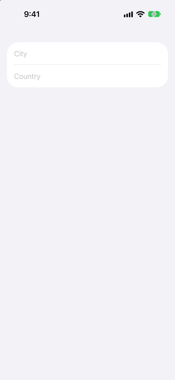
Away. .submitLabel only changes the key — how it looks, and what VoiceOver calls it; pressing it ends editing, and the keyboard closes. Moving to the next field is yours to write, with @FocusState and onSubmit.
Trick question · Text input@FocusState private var focus: Field — an enum of fields, not optional. Does it compile?
No: "initializer 'init()' requires the types 'ContentView.Field' and 'Bool' be equivalent" Apple: "the wrapped value must be either an optional or a Boolean" — there must be a value for no field has the keyboard. Make it Field?.
Trick question · Text inputA price field uses .keyboardType(.decimalPad). How does the user finish typing?
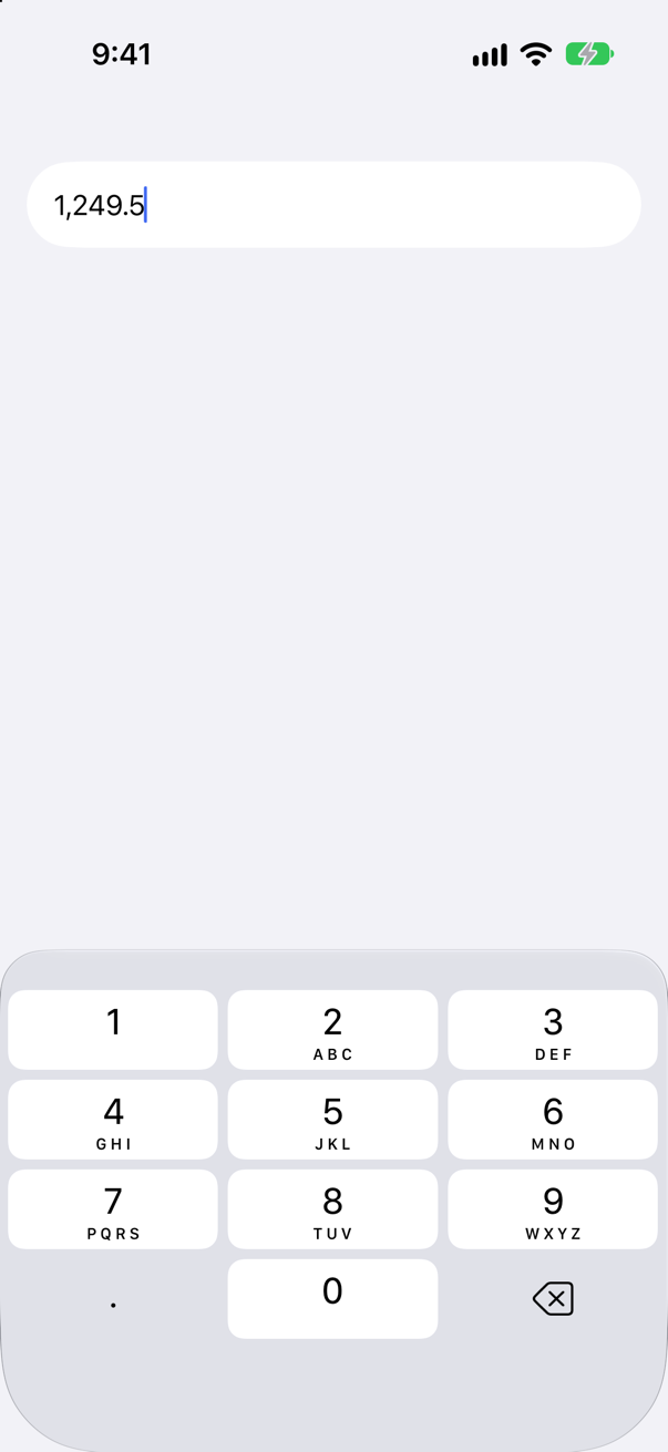
They cannot, from the keyboard — the picture shows digits, a point and delete, and no Return. Add a button in a ToolbarItemGroup(placement: .keyboard) that sets the focus to nil, as this lesson's editor does.
Edge cases and tricky questions
20 questions of the kind an interviewer uses to find out whether you really know this — the corners, the traps, and the things that changed recently. Each has its source. Wherever the answer is what some code does, that code was compiled and run, and what you see under “Show the answer” is what it really did. Say your answer aloud before you open it.
Controls and forms
In UIKit a switch told you about a change through target–action. A SwiftUI Toggle is handed a binding. How does other code learn that the user flipped it?
Show the answer
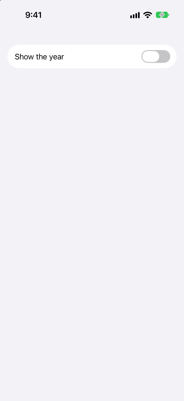
It watches the value, not the control. The toggle wrote false into showsYear through its binding; .onChange(of:) saw the value change and printed:
showsYear is now falseMost of the time nothing needs to "hear" at all: every view that reads showsYear simply runs again. onChange is for side effects — saving, logging, starting a request. The same holds for every control in this lesson: a picker, a stepper and a text field all write to their binding, and the binding is the only connection.
Where this comes from: Toggle · onChange(of:initial:_:) — Measured on iOS 27.
A Toggle("Show the year", isOn: $showsYear) in a form, switched off. The user taps the words "Show the year". What happens?
Show the answer
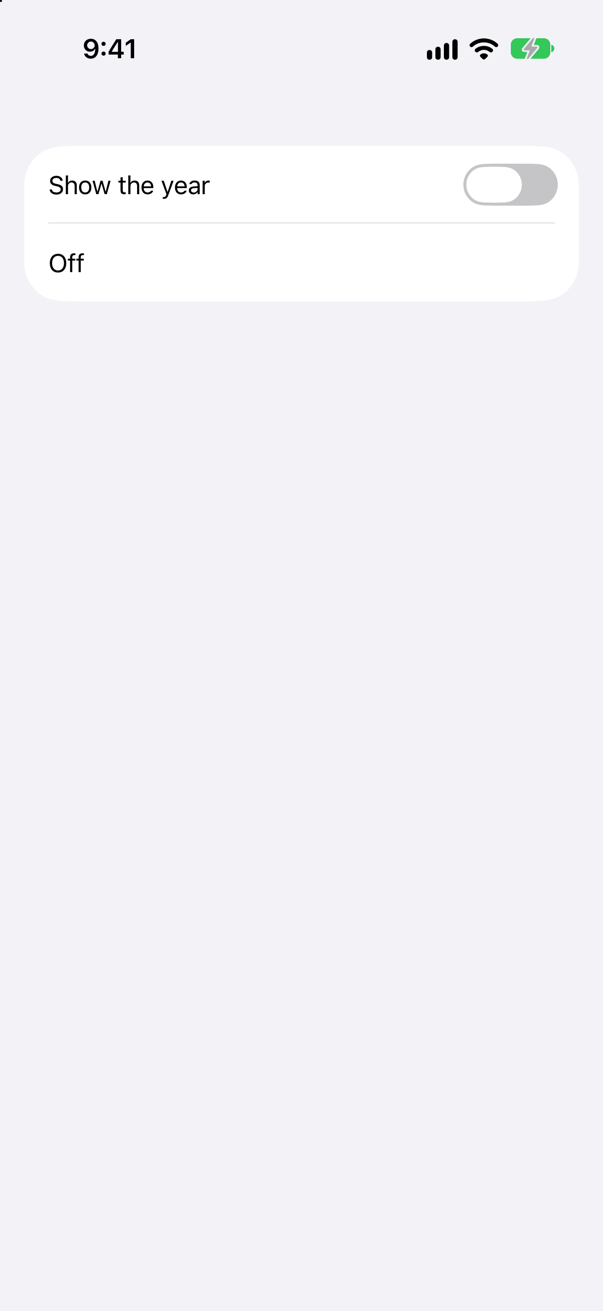
Nothing. The run tapped the words, near the leading edge of the row, and the toggle stayed off. Only the switch turns it — the same run with a tap on the switch itself, at the trailing end of the row:
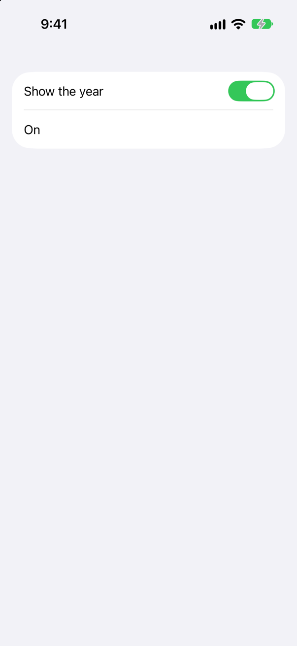
In a form, the row is the toggle's label and the switch side by side, and the label only describes it. If a whole row must be one big target, make the row a control of its own — a Button that flips the value, for one.
Where this comes from: Toggle — Measured on an iPhone 17 simulator.
A picker's selection is String?, starting at nil; its options are tagged "Yellow" and "Mint". What does SwiftUI do at launch — and can the user still choose?
Show the answer
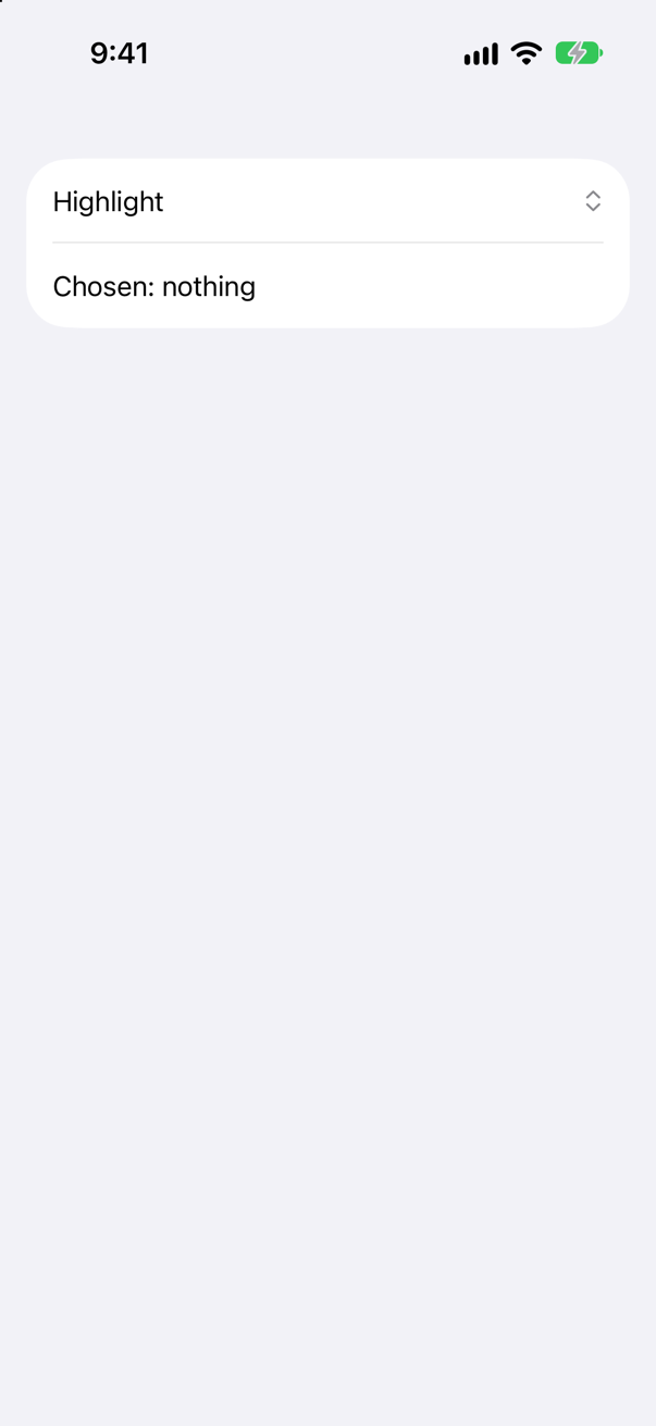
It logs a warning, and the picker starts with nothing chosen. SwiftUI's own words:
SwiftUI wrote this while the app ran
Picker: the selection "nil" is invalid and does not have an associated tag, this will give undefined results.Choosing still works: the run chose Mint, and choice became "Mint". The tag modifier writes each value "for the type V, as well as Optional<V> if includeOptional is enabled", and that is on by default. What has no match is the starting value, nil. Apple's rule for pickers: "Append a tag to each of these content views using the View/tag(_:) view modifier so that the type of each selection matches the type of the bound state variable." An option tagged nil gives the start a match:
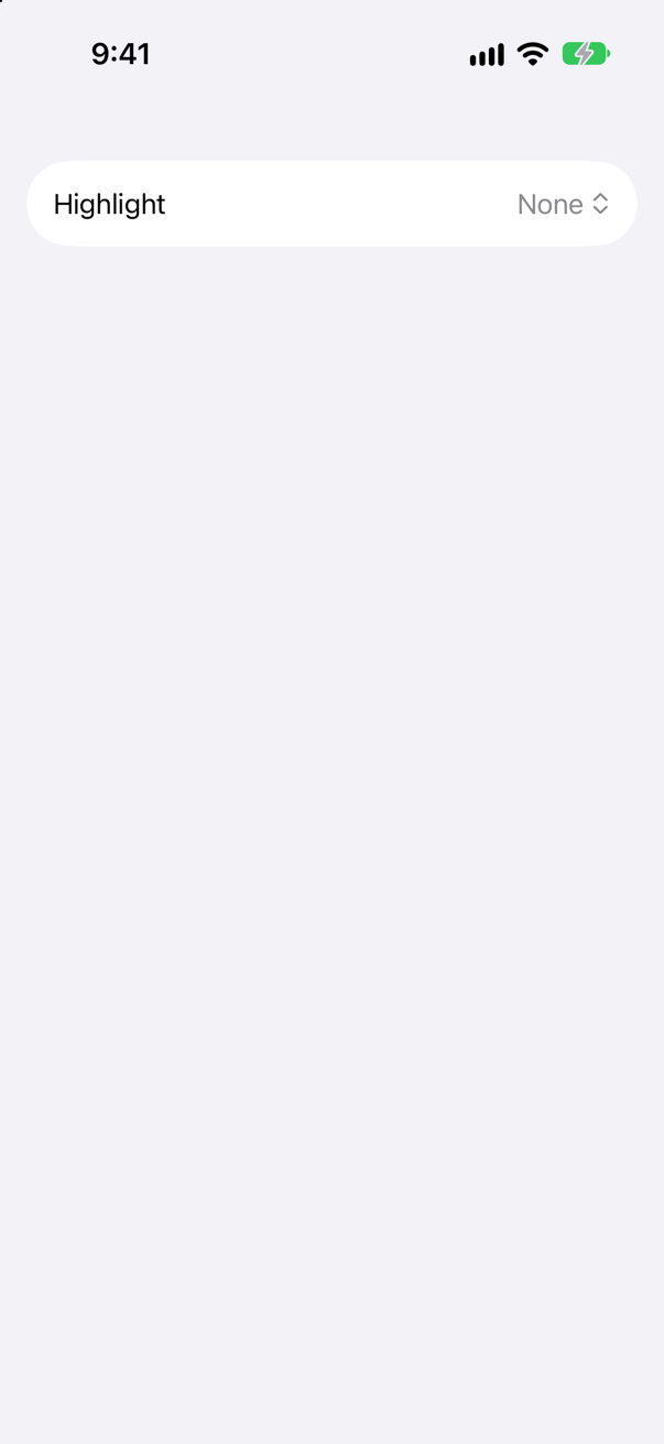
No warning, and the picker shows None until something else is chosen.
Where this comes from: Picker · tag(_:includeOptional:) — The warning is SwiftUI's own, read from the simulator's log.
A picker in a Form, with no style. What does a tap on it show? And with .pickerStyle(.navigationLink), in a form inside a NavigationStack?
Show the answer
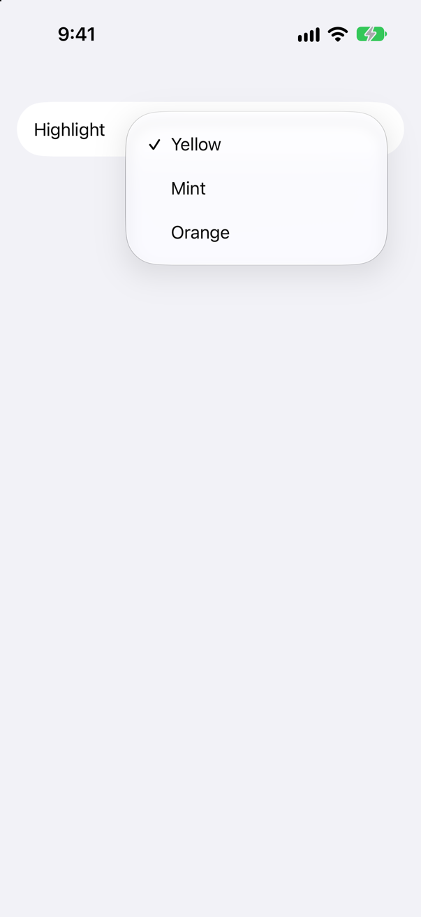
A menu — and, with the style, a page of its own. With no style, the form row shows the label and the current choice, and a tap opens a menu of the options. With .navigationLink, a tap pushes a screen that lists them:
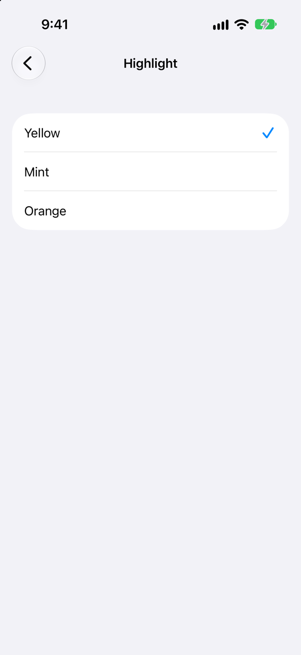
Apple: "The exact appearance of the picker depends on the context." The style says what kind of choice it is, and the container decides the details. The same Picker and binding can be .menu, .segmented (this lesson's Settings uses it), .navigationLink, .inline, .wheel or .palette, so changing your mind later is one line.
Where this comes from: Picker · PickerStyle — Measured on an iPhone 17 simulator.
Stepper("Nights", value: $nights, in: 1...60) with nights at 60. What happens to the + button? And if your own code starts nights at 100?
Show the answer
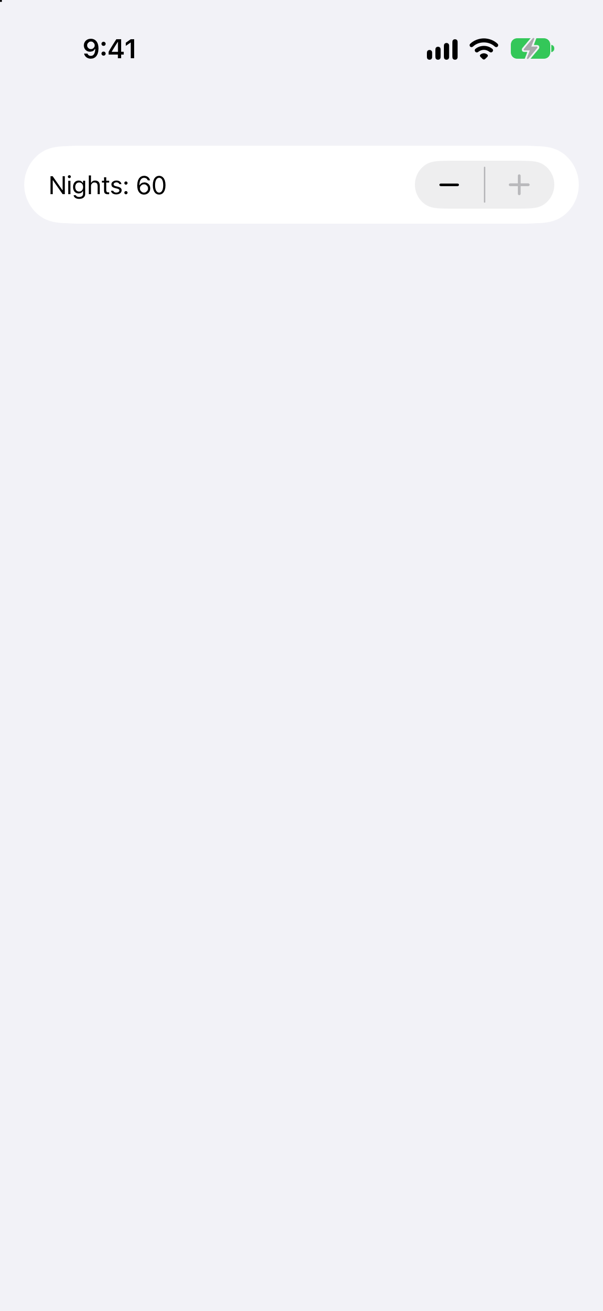
The + is dimmed, and a tap on it does nothing — still 60. The range is part of the control: it disables the button that would step outside it.
It limits the control, though, not the value. Start nights at 100:
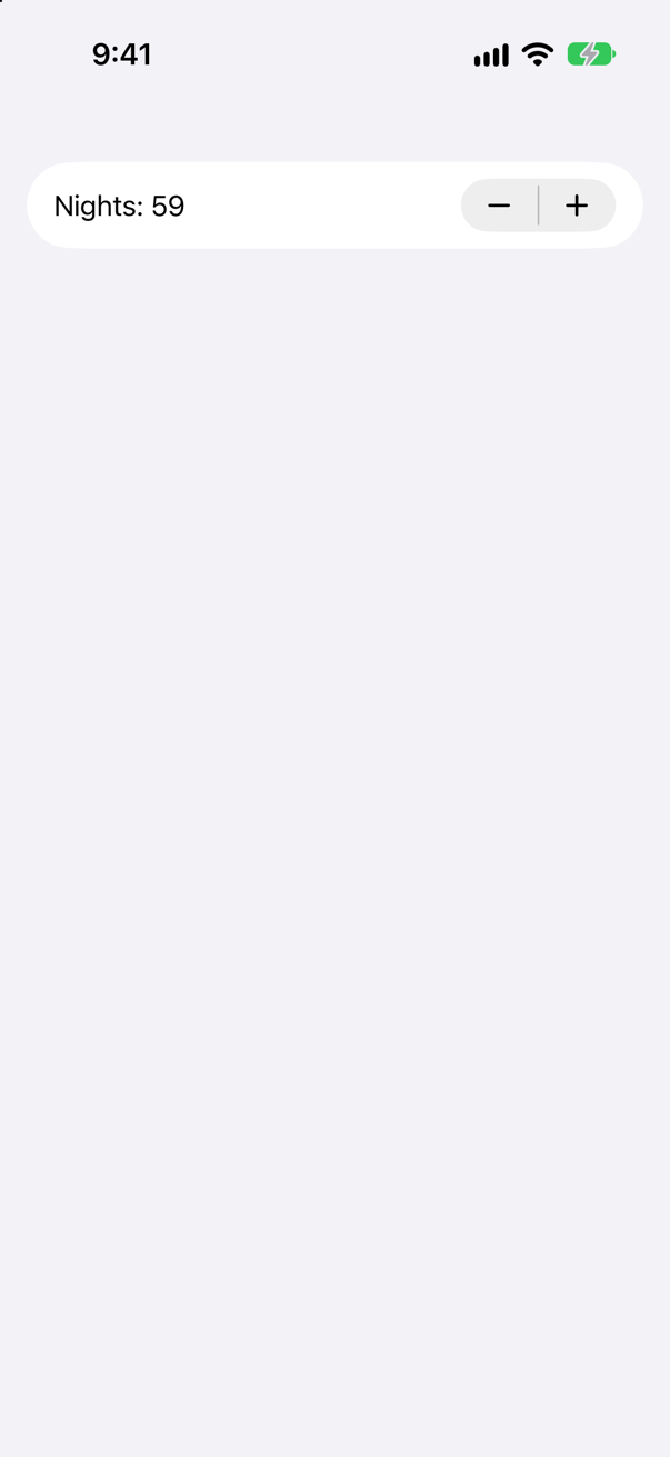
The stepper showed 100, and one tap on − made it 59, not 99 — it pulled the value into its range first, then stepped. If a limit is a rule of your app rather than a convenience of the control, enforce it in the model.
Where this comes from: Stepper — Measured on an iPhone 17 simulator.
A Save button has .disabled(false), inside a section that has .disabled(true). Can it be tapped?
Show the answer
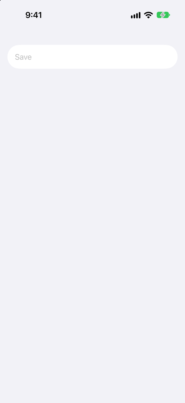
No. The tap printed nothing, and the button is dimmed. Apple: "The higher views in a view hierarchy can override the value you set on this view" — disabled passes down through the environment, and a child cannot switch it back on.
That is usually what you want: disable a whole form while it saves, and every control in it follows. When one control must stay live, it has to sit outside the disabled container.
Where this comes from: disabled(_:) — Measured on iOS 27.
A button with a custom ButtonStyle prints when configuration.isPressed changes; its action prints too. The user holds it for two seconds and lets go. What is printed, in what order?
Show the answer
pressed: true, then the action, then pressed: false:
pressed: true
action
pressed: false
The action runs when the finger lifts inside the button, however long it was held, and the style hears of the press as it starts and as it ends. Apple's page calls a ButtonStyle "A type that applies standard interaction behavior and a custom appearance to all buttons within a view hierarchy": the look is yours, the interaction — including when the action runs — stays the platform's. ("To create a button with custom interaction behavior, use PrimitiveButtonStyle instead.")
Two consequences. Pressed feedback belongs in the style, not in the action, which comes too late for it. And a long press is still a tap to a Button: for a separate long-press action, use a context menu or a gesture (the next lesson).
Where this comes from: ButtonStyle — Measured on iOS 27.
A form should show a trip's price and nights as read-only rows. What is the SwiftUI way, and how does VoiceOver find them?
Show the answer
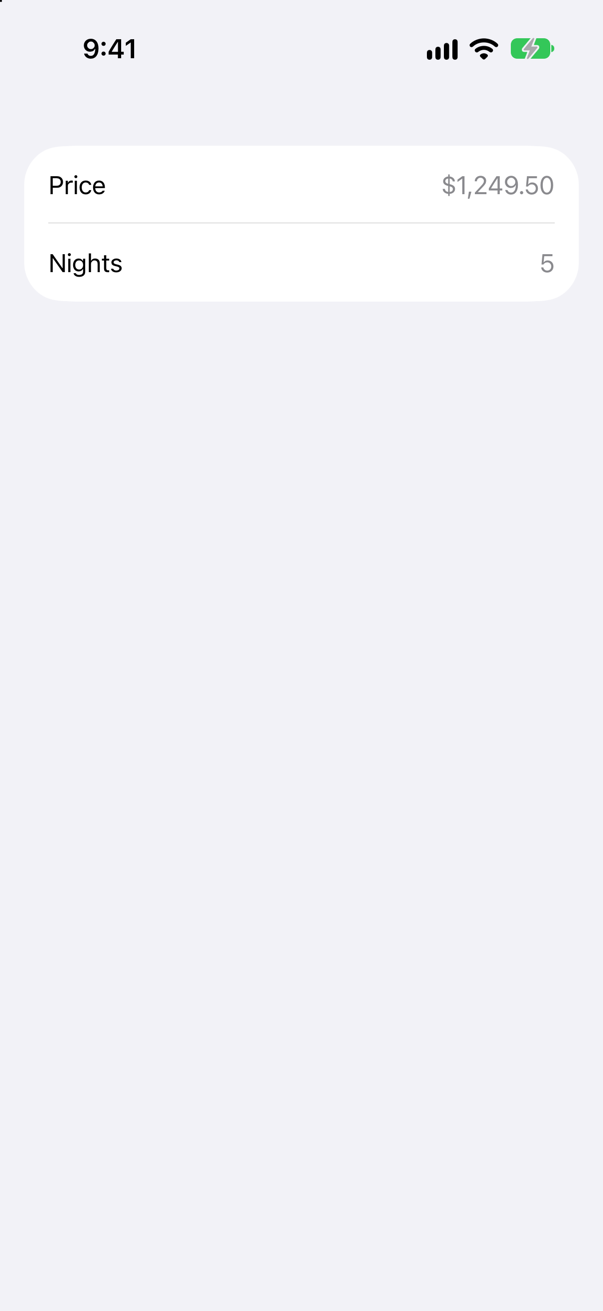
LabeledContent — a label and its content, laid out the way the form lays out its controls. Apple: "The resulting element has a layout that’s consistent with other framework controls and automatically adapts to its container, like a form or toolbar." VoiceOver finds each row as one element, "Price, $1,249.50" and "Nights, 5", and the form draws the values in the secondary color. value:format: formats the value for you.
An HStack of two texts and a Spacer looks much the same:
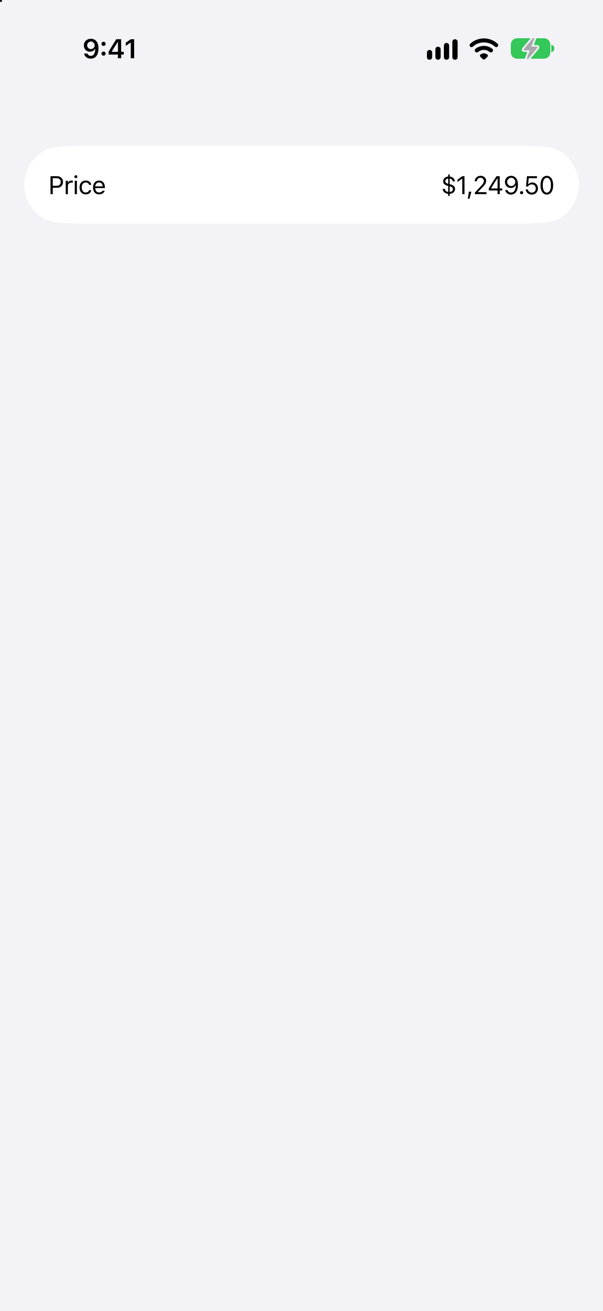
But VoiceOver finds two separate texts in it, "Price" and "$1,249.50", and the value is drawn like the label. A person moving through the form with VoiceOver hears a price with no name, or a name with no price.
Where this comes from: LabeledContent — Measured on iOS 27.
The same three controls — a toggle, a picker and a button — in a VStack, and in a Form. What changes?
Show the answer
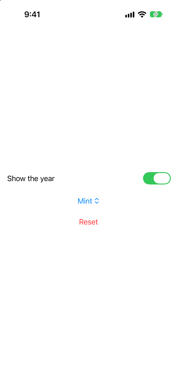
The form styles them. In the stack, each control draws its plain self — and the picker, a menu button there, shows only its choice: its title, "Highlight", is not drawn at all. In the form:
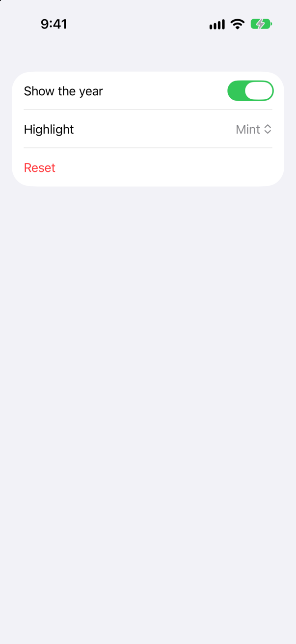
Each control becomes a row of a grouped list: the picker's row shows its title and its choice, and the Reset button sits at the leading edge of its row. Apple: "SwiftUI applies platform-appropriate styling to views contained inside a form, to group them together. Form-specific styling applies to things like buttons, toggles, labels, lists, and more." And: "forms appear as grouped lists on iOS, and as aligned vertical stacks on macOS." That is the point of a form: you describe the controls, and it decides how a settings screen looks on each platform.
Where this comes from: Form — Measured on an iPhone 17 simulator.
A DatePicker for a trip's start, in: Date.on(2027, 6, 10)... and showing only the date. What does it look like in a form, and what does a tap on an earlier day do?
Show the answer
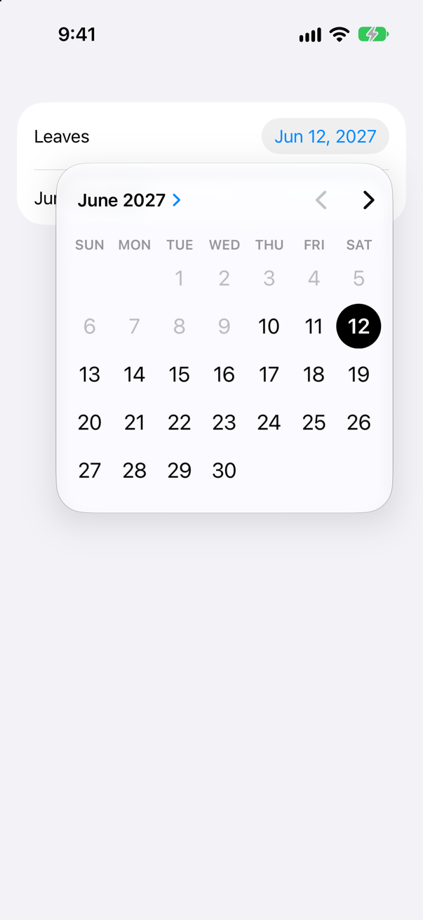
A label and the date in a small button; a tap on it opens a calendar over the form. That is the compact style, which a form uses unless told otherwise. displayedComponents: .date leaves the time out, and the range greys out every day before it starts, and the arrow back to the month before. The run tapped the 9th: the date stayed on the 12th.
Apple: "You can limit the DatePicker to specific ranges of dates, allowing selections only before or after a certain date, or between two dates." Like every control in this lesson, the picker writes to its binding — here a Date — and the text under it reads the same value, formatted.
Where this comes from: DatePicker — Measured on an iPhone 17 simulator with the English (US) region.
Text input and focus
TextField("Nights", value: $nights, format: .number). The user replaces 5 with 9. Is nights 9 before Return is pressed? (Apple's pages disagree.)
Show the answer
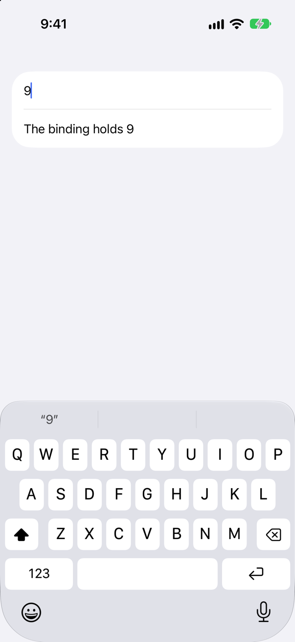
Yes, on iOS 27. The value changed as soon as the text parsed. Apple's overview of TextField says otherwise: "If the value is a string, the text field updates this value continuously as the user types or otherwise edits the text in the field. For non-string types, it updates the value when the user commits their edits, such as by pressing the Return key." The page for this initializer agrees with the simulator: "Editing the text field updates the bound value, as long as the format style can parse the text."
So rely on neither reading. If work must wait until the user is finished — checking, saving — put it in onSubmit, which runs on Return, rather than in an onChange of a formatted value.
Where this comes from: TextField · TextField: init(_:value:format:prompt:) — Measured on an iPhone 17 simulator with iOS 27; both quotations are from Apple's current pages.
The same field: the user types "abc" after the 5, and presses Return. What does the binding hold while they type, and what does the field show afterwards?
Show the answer
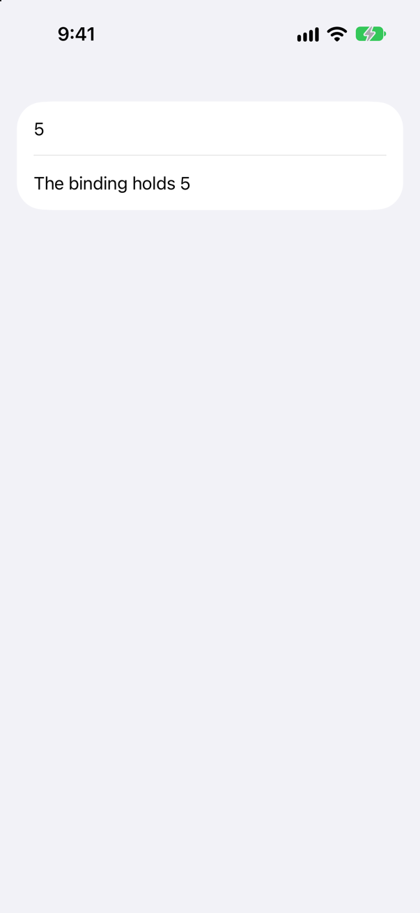
5 the whole time, and the field goes back to 5. "5abc" is not a number, so the binding was never touched; and when editing ended, the field replaced its text with the last good value. Apple: "If format can’t perform the conversion, the text field leaves binding.value unchanged. If the user stops editing the text in an invalid state, the text field updates the field’s text to the last known valid value."
That is safe but silent: the user's typing disappears without a word. Where it matters, keep the text as a String and check it yourself, so that you can say what is wrong.
Where this comes from: TextField: init(_:value:format:prompt:) — Measured on iOS 27.
Two fields in a form: TextField("Name", text: $name, prompt: Text("Required")) and TextField("City", text: $city). What does each show when empty — and what does VoiceOver get for the first one?
Show the answer
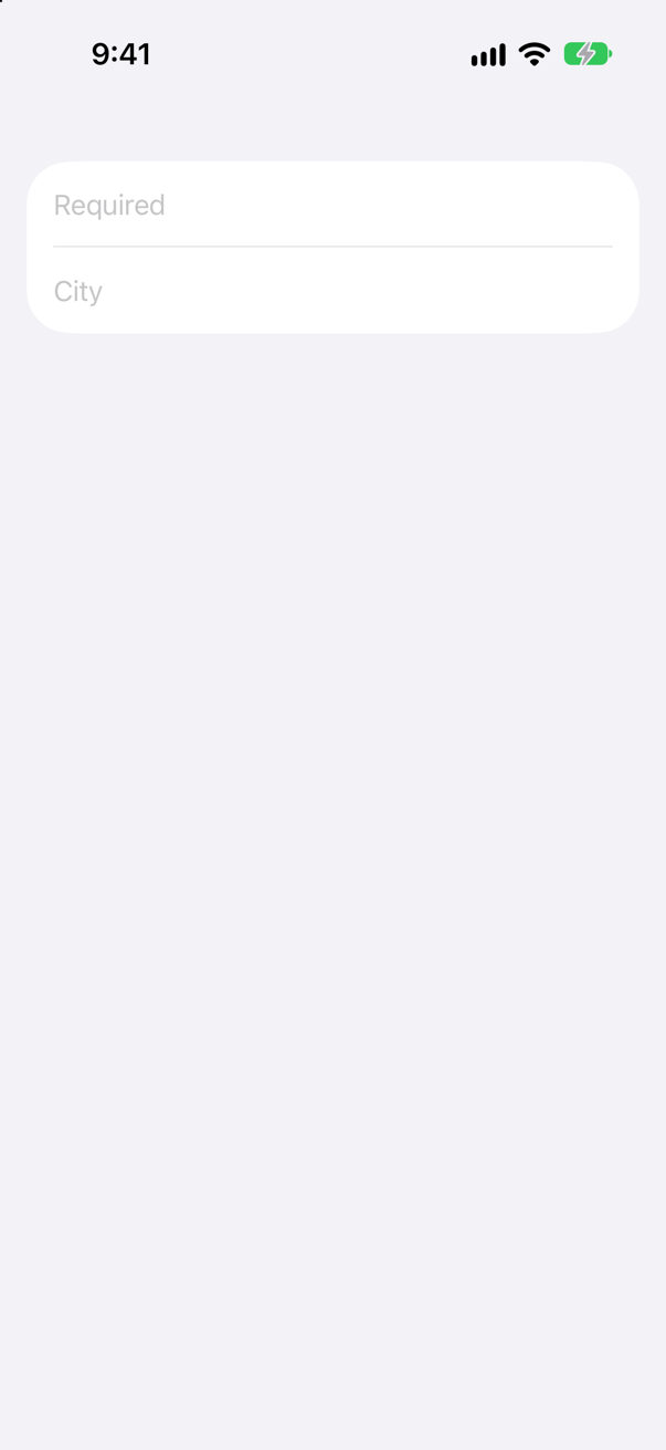
"Required", and "City" — and for VoiceOver, nothing called "Name". In an iOS form, a field shows its prompt as the placeholder when it has one, and its title when it does not. Apple: "In the same context on iOS, the text field uses either the prompt or label as placeholder text, depending on whether the initializer provided a prompt."
The title does not survive anywhere else. The run read both fields' accessibility labels — empty — and their placeholders, "Required" and "City", which is all VoiceOver has to go on. With a prompt, the word "Name" is gone for everyone. Give it back with a label the form shows:
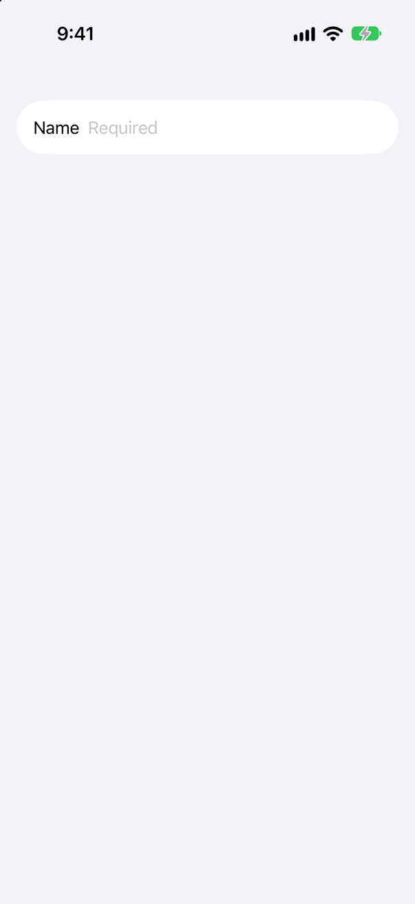
Now "Name" is on the screen, and the run read the field's accessibility label as "Name". For a field whose name should stay off the screen, .accessibilityLabel gives VoiceOver the word alone:
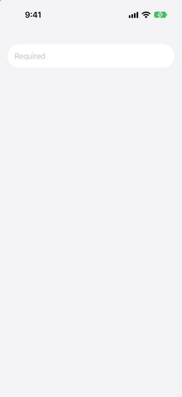
Where this comes from: TextField · LabeledContent — Measured on an iPhone 17 simulator: the labels and placeholders were read the way VoiceOver reads them.
A city field has .submitLabel(.next) — and no @FocusState, no onSubmit. The user presses the next key. Where does the keyboard go?
Show the answer
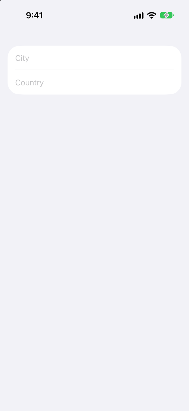
Away — it closes. The key showed an arrow, and VoiceOver called it "next" — but .submitLabel only chooses the key; pressing it ends editing, as Return always does. Apple's description of the modifier is one line — "Sets the submit label for this view" — and that is all it does.
Moving on is your job: give each field a .focused($focus, equals:) and the first an .onSubmit { focus = .country }, as this lesson's editor does.
Where this comes from: submitLabel(_:) · FocusState — Measured on iOS 27.
@FocusState private var focus: Field, where Field is an enum of the form's fields. Does it compile?
Show the answer
It does not compile. Xcode reports
initializer 'init()' requires the types 'ContentView.Field' and 'Bool' be equivalent
'ContentView' initializer is inaccessible due to 'private' protection level
No. Apple: "To allow for cases where focus is completely absent from a view tree, the wrapped value must be either an optional or a Boolean." A plain enum has no value meaning no field has the keyboard, and SwiftUI must be able to set that.
Make it Field?. nil is then a real state — at launch, after Done, after the keyboard is put away — and setting it yourself is how you put the keyboard away.
Where this comes from: FocusState — Measured with Xcode 27.
A form should open with the keyboard already in the City field, and Return should move to Country. What is the whole of the code?
Show the answer
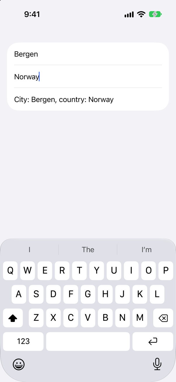
A @FocusState, a .focused on each field, an onSubmit on the first, and focus = .city when the form appears. The run typed "Bergen", pressed the next key and typed "Norway" without tapping a field: the keyboard started in City and moved on by itself.
Apple: "Setting the property’s value programmatically has the reverse effect, causing focus to move to the view associated with the updated value." Setting it in onAppear is the plain way to choose a first field; a sheet that opens with the keyboard up, as this lesson's editor does, saves the user a tap every time.
Where this comes from: FocusState · focused(_:equals:) — Measured on iOS 27: the text was typed with no taps in between.
A price field has .keyboardType(.decimalPad). How does the user say they are done?
Show the answer
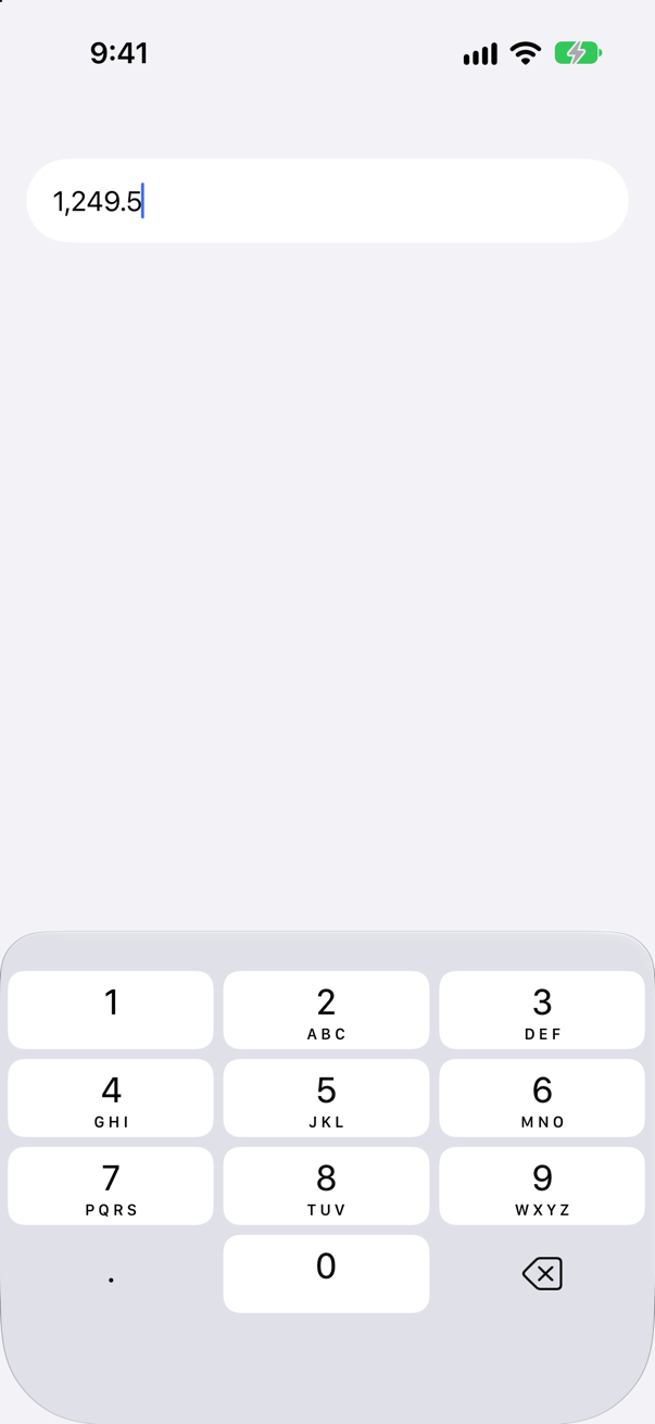
From the keyboard, they cannot. The pad has digits, a point and delete, and nothing to submit with — so onSubmit never runs, and nothing on the pad puts it away. Give the keyboard a button of your own:
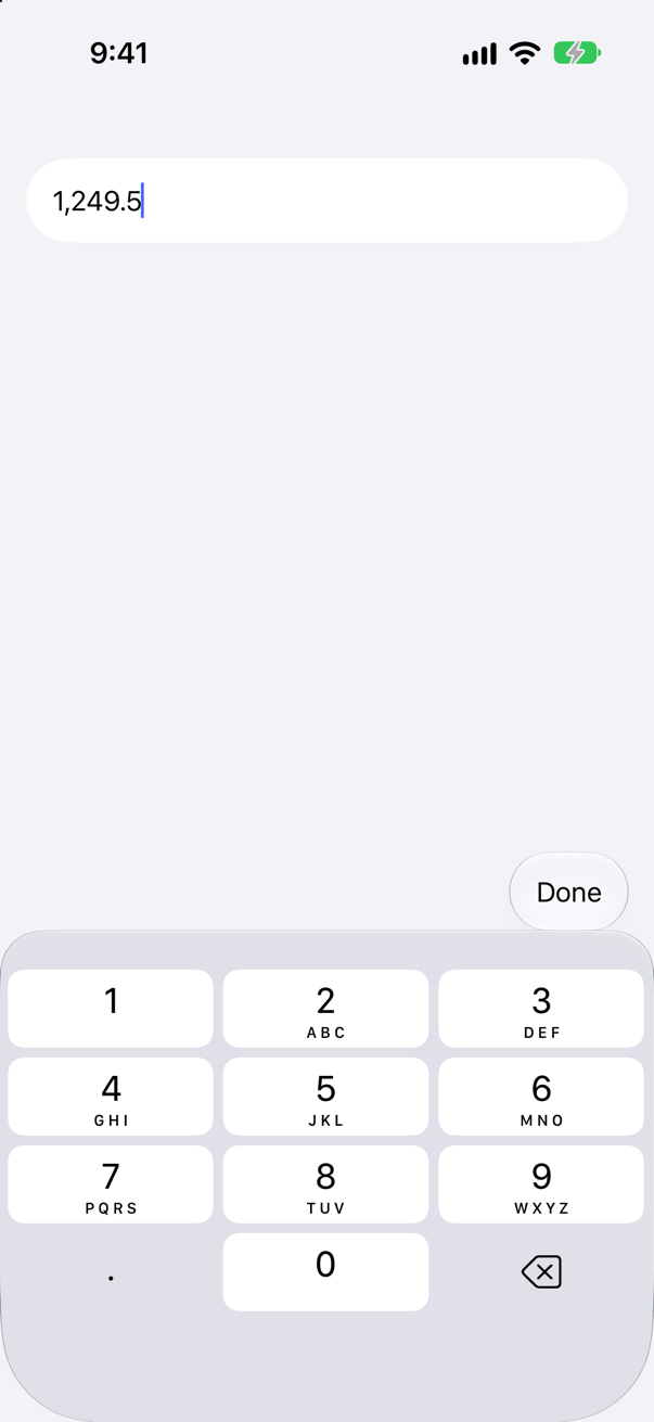
A toolbar item with the .keyboard placement sits above the keyboard while a field in that view has it, and setting the focus to false takes the keyboard away. (When it appears, SwiftUI writes "Invalid frame dimension (negative or non-finite)." to the console. iOS 27 does that for every keyboard toolbar, so it is not about your code.)
Where this comes from: keyboardType(_:) · ToolbarItemPlacement.keyboard — Measured on an iPhone 17 simulator.
A SecureField holds "secret". What can VoiceOver — or a UI test — read of it?
Show the answer
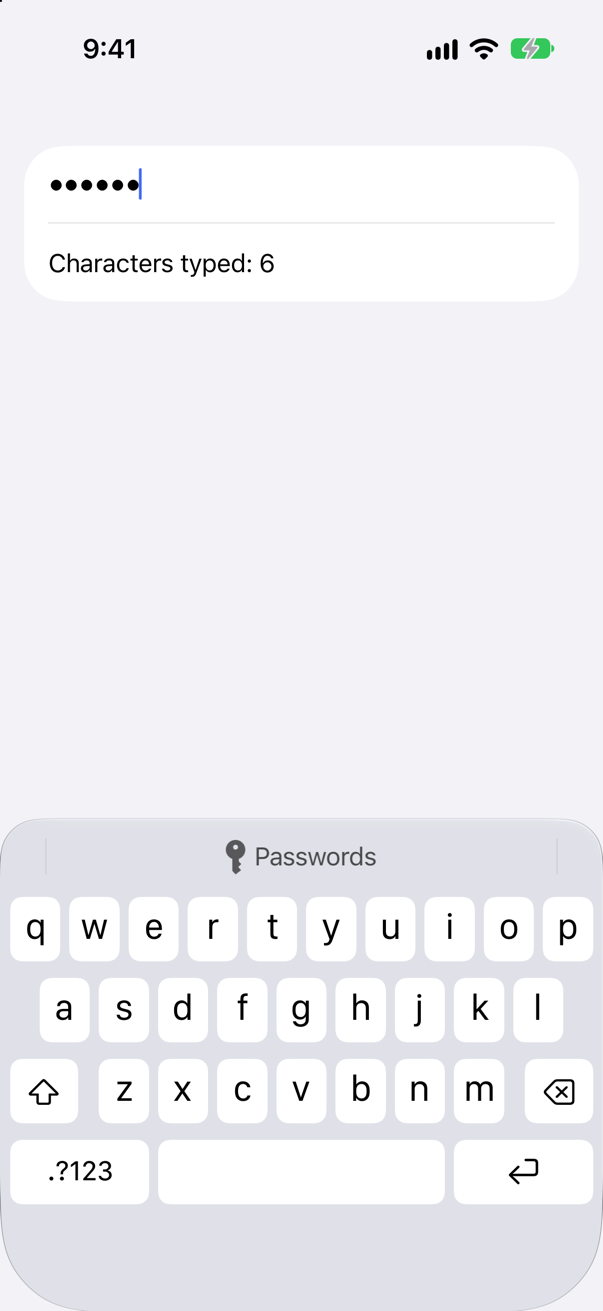
Its name, not its text. The run found a secure text field called "Passcode" and the count below it, and the word "secret" nowhere; the screen shows dots. The binding holds the real text, which is the point — your code needs it, nobody looking at the screen does.
Notice the keyboard, too: it offers saved passwords — the Passwords button above the keys — with no modifier asking for them. Keep the value out of logs and analytics: the field hides it, and your code must too.
Where this comes from: SecureField — Measured on iOS 27.
Notes need several lines. TextEditor(text: $notes) and TextField("Summary, growing", text: $summary, axis: .vertical), both empty. Which shows a placeholder — and what does the growing one do with a long sentence?
Show the answer
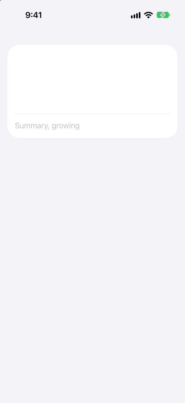
Only the text field. TextEditor has no title and no prompt, so empty it is just an empty box. A TextField with axis: .vertical keeps its placeholder — and given a long sentence, it grows to fit:
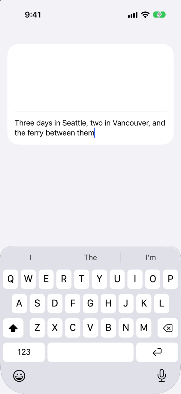
Apple describes axis as "The axis in which to scroll text when it doesn’t fit in the available space." That makes a growing field the better choice for short-to-medium text — notes, a description, a message — and TextEditor the one for real documents: long text, scrolling, and, since iOS 26, rich text through AttributedString. Give a TextEditor a label of your own, such as a section header, so that people know what goes in it.
Where this comes from: TextEditor · TextField: init(_:text:axis:) — Measured on an iPhone 17 simulator.
A form opens with the keyboard in its City field. A button below should put the keyboard away. What does the button do?
Show the answer
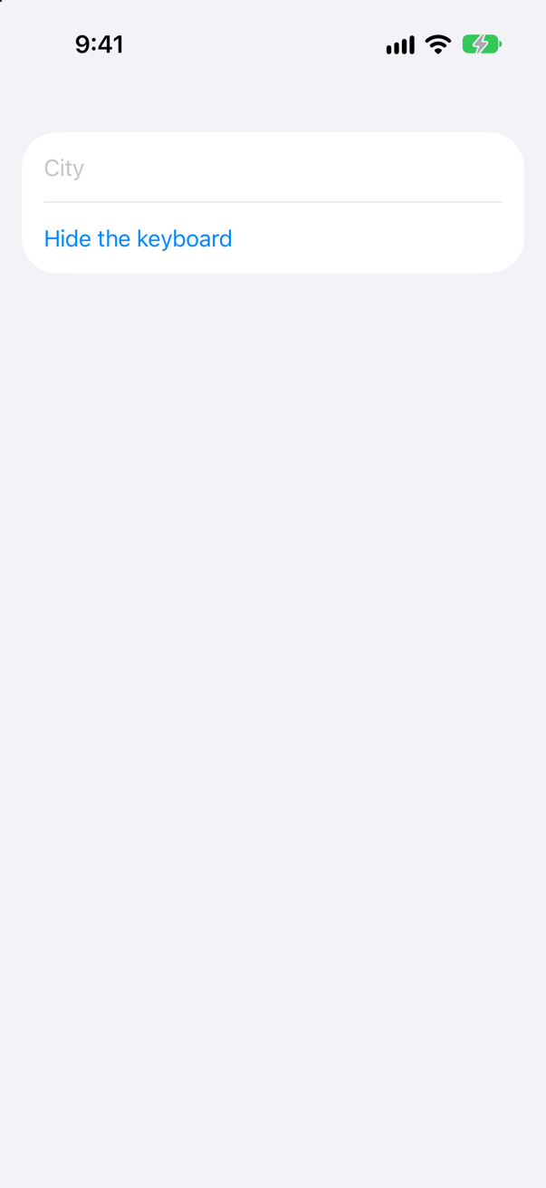
It sets the focus state to false. With one field, a Boolean is enough: .focused($cityFocused) is true while the field has the keyboard. Before the tap, the keyboard's keys were on the screen; after it, only the button was left.
Apple: "Set the focus binding to false or nil as appropriate to remove focus from all bound fields. You can also use this to remove focus from a TextField and thereby dismiss the keyboard." It does the job of UIKit's resignFirstResponder(), with no need to reach for UIKit to do it.
Where this comes from: FocusState · focused(_:equals:) — Measured on iOS 27.