Trips in the dark
Dark mode and theming
You will buildTrips run in dark mode, unchanged; an accent color of its own in the asset catalog, with a dark variant; an Appearance choice in Settings — System, Light or Dark; and a boarding pass that is drawn differently in the dark.
TimeAbout 45 minutes
WhyPart 13 is about the platform around the code: how the app looks in the dark and in Liquid Glass, who can use it, in which languages — and then widgets, and shipping. It starts with dark mode, because there the lesson is mostly a reward for habits already formed. A color that says what it is for — .primary for text, .secondary for less important text, a material for a panel — has a light and a dark version, and SwiftUI picks one. Hard-coded colors are the ones to hunt down. And when a design needs something other than a different color in the dark — a different drawing — the view reads @Environment(\.colorScheme) and decides.
Open your project
Open your
Tripsproject as lesson 48 left it: double-clickTrips.xcodeprojin Finder, or use File ▸ Open… (⌘O) in Xcode.If you did not finish lesson 48, or would rather start from a known state, download Trips-lesson-48.zip instead. It is the project exactly as it stood at the end of lesson 48. Unzip it and open
Trips.xcodeproj.Run it (⌘R) to check that it builds. You should see where lesson 48 ended:
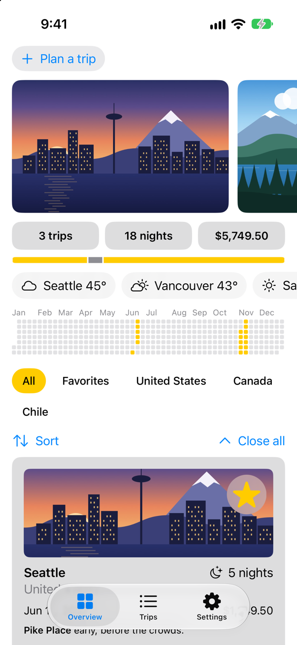
Trips, as it stood at the end of lesson 48Screenshot · iPhone 17, iOS 27.0
Run it in the dark
Trips has never mentioned dark mode. Run it, and while it runs choose Debug ▸ View Debugging ▸ Configure Environment Overrides… in Xcode; in the panel that opens, turn on Appearance and choose Dark. (Or set the whole simulator dark, in its Settings app.)
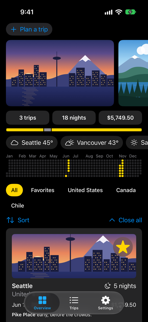
Nearly everything followed: the backgrounds, the text, the cards, the materials behind the weather and the controls. Those are semantic colors — .primary and .secondary text, the .quaternary card fill, .thinMaterial — each with a light and a dark version. The yellow highlight stayed yellow: it is a plain color, chosen in Settings, and yellow works on black. The blue of the buttons is the system's default accent color, which has a dark version of its own.
An accent color of your own
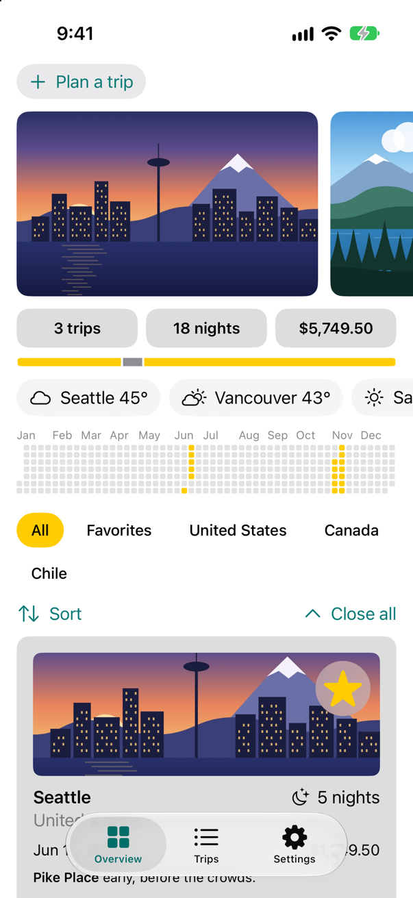
Every new project's asset catalog has a color set called AccentColor, empty, and the target's build settings name it as the app's accent: give it a color, and every button, link, toggle and selected tab takes it. A color set can hold one color for each appearance. Trips' accent becomes a deep teal in light mode, and a lighter one in dark mode, where a deep color would be hard to see:
In the Project navigator, select Assets, then AccentColor.
In the Attributes inspector, set Appearances to Any, Dark. The color set now has two swatches: Any Appearance and Dark.
Select the Any Appearance swatch. In the Attributes inspector, set Input Method to 8-bit Hexadecimal, and type
0B7A75into Hex.Select the Dark swatch, and type
5FD4CCinto its Hex the same way.
Run the app (⌘R):
And in dark mode:
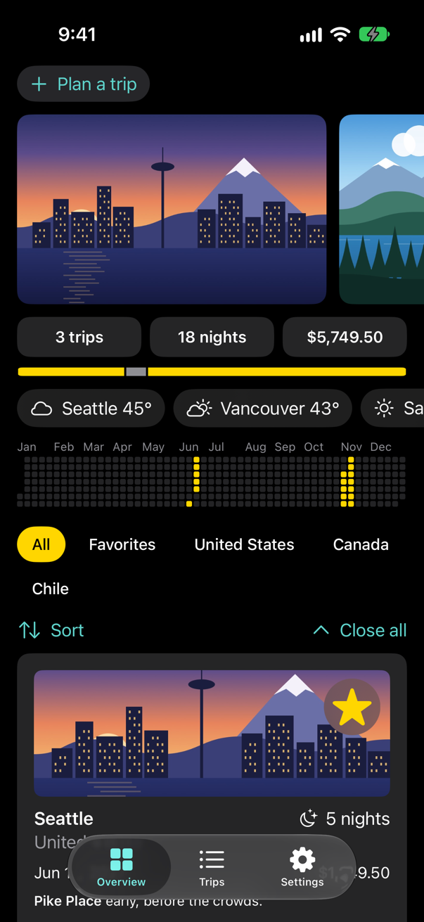
No code changed: the buttons asked for the accent color, and the asset catalog answered with one of its two, depending on the appearance.
Light or dark, by choice
Some people want an app dark whatever the system does. .preferredColorScheme(_:) asks for one appearance for the window it is in, and nil means "as the system is". The choice is a setting like any other, kept by @AppStorage.
Add the key under the other two, and the enum at the end of the class:
import SwiftUI/// The choices made on the Settings tab. The look is kept in UserDefaults by @AppStorage, under the keys below;/// the traveler's name is personal, so it is not. `@MainActor`: the screens read them.@MainActor@Observablefinal class Settings { var travelerName = "" /// The keys of the choices kept in UserDefaults, in one place, so that no view misspells one. static let highlightKey = "highlight" static let showsYearKey = "showsYear" static let appearanceKey = "appearance" /// The colors the app can be drawn in. `Sendable`: plain data — and a type nested in the class /// does not take the class's actor, so it says so itself. enum Highlight: String, CaseIterable, Identifiable, Sendable { case yellow, mint, orange var id: Self { self } var color: Color { switch self { case .yellow: .yellow case .mint: .mint case .orange: .orange } } } /// Light or dark: as the system is, or always one of them. enum Appearance: String, CaseIterable, Identifiable { case system, light, dark var id: Self { self } /// What `preferredColorScheme` takes; `nil` follows the system. var colorScheme: ColorScheme? { switch self { case .system: nil case .light: .light case .dark: .dark } } }}import SwiftUI
/// The choices made on the Settings tab. The look is kept in UserDefaults by @AppStorage, under the keys below;
/// the traveler's name is personal, so it is not. `@MainActor`: the screens read them.
@MainActor
@Observable
final class Settings {
var travelerName = ""
/// The keys of the choices kept in UserDefaults, in one place, so that no view misspells one.
static let highlightKey = "highlight"
static let showsYearKey = "showsYear"
static let appearanceKey = "appearance"
/// The colors the app can be drawn in. `Sendable`: plain data — and a type nested in the class
/// does not take the class's actor, so it says so itself.
enum Highlight: String, CaseIterable, Identifiable, Sendable {
case yellow, mint, orange
var id: Self {
self
}
var color: Color {
switch self {
case .yellow: .yellow
case .mint: .mint
case .orange: .orange
}
}
}
/// Light or dark: as the system is, or always one of them.
enum Appearance: String, CaseIterable, Identifiable {
case system, light, dark
var id: Self {
self
}
/// What `preferredColorScheme` takes; `nil` follows the system.
var colorScheme: ColorScheme? {
switch self {
case .system: nil
case .light: .light
case .dark: .dark
}
}
}
}Keep the choice with the others, and give it a picker under the toggle:
struct SettingsView: View { @Environment(Settings.self) private var settings @AppStorage(Settings.highlightKey) private var highlight = Settings.Highlight.yellow @AppStorage(Settings.showsYearKey) private var showsYear = true @AppStorage(Settings.appearanceKey) private var appearance = Settings.Appearance.system var body: some View { @Bindable var settings = settings NavigationStack { Form { Section("Traveler") { TextField("Name", text: $settings.travelerName) .textContentType(.name) .submitLabel(.done) } Section("Look") { Picker("Highlight", selection: $highlight) { ForEach(Settings.Highlight.allCases) { choice in Text(choice.rawValue.capitalized) } } .pickerStyle(.segmented) Toggle("Show the year on the Overview", isOn: $showsYear) Picker("Appearance", selection: $appearance) { ForEach(Settings.Appearance.allCases) { choice in Text(choice.rawValue.capitalized) } } .pickerStyle(.segmented) } } .navigationTitle("Settings") } }}struct SettingsView: View {
@Environment(Settings.self) private var settings
@AppStorage(Settings.highlightKey) private var highlight = Settings.Highlight.yellow
@AppStorage(Settings.showsYearKey) private var showsYear = true
@AppStorage(Settings.appearanceKey) private var appearance = Settings.Appearance.system
var body: some View {
@Bindable var settings = settings
NavigationStack {
Form {
Section("Traveler") {
TextField("Name", text: $settings.travelerName)
.textContentType(.name)
.submitLabel(.done)
}
Section("Look") {
Picker("Highlight", selection: $highlight) {
ForEach(Settings.Highlight.allCases) { choice in
Text(choice.rawValue.capitalized)
}
}
.pickerStyle(.segmented)
Toggle("Show the year on the Overview", isOn: $showsYear)
Picker("Appearance", selection: $appearance) {
ForEach(Settings.Appearance.allCases) { choice in
Text(choice.rawValue.capitalized)
}
}
.pickerStyle(.segmented)
}
}
.navigationTitle("Settings")
}
}
}Read the choice, and apply it to the whole window:
import SwiftUIimport SwiftData@mainstruct TripsApp: App { @Environment(\.scenePhase) private var scenePhase /// The saved trips — or, when a UI test asks for a fresh start, the samples. @State private var store = ProcessInfo.processInfo.arguments.contains("-fresh-start") ? TripStore(trips: Trip.samples) : TripStore() @State private var settings = Settings() @AppStorage(Settings.highlightKey) private var highlight = Settings.Highlight.yellow @AppStorage(Settings.appearanceKey) private var appearance = Settings.Appearance.system var body: some Scene { WindowGroup { MainTabs() .environment(store) .environment(settings) .environment(\.highlight, highlight.color) .preferredColorScheme(appearance.colorScheme) .task { // On the main actor, as the store is: `.task` and the closure take // the actor of the code they are written in. Each value is a [Trip], // handed on because a trip is Sendable. for await _ in Observations({ store.trips }) { store.save() } } } .modelContainer(for: PackingItem.self) .onChange(of: scenePhase) { _, new in if new == .background { store.save() } } }}import SwiftUI
import SwiftData
@main
struct TripsApp: App {
@Environment(\.scenePhase) private var scenePhase
/// The saved trips — or, when a UI test asks for a fresh start, the samples.
@State private var store = ProcessInfo.processInfo.arguments.contains("-fresh-start")
? TripStore(trips: Trip.samples) : TripStore()
@State private var settings = Settings()
@AppStorage(Settings.highlightKey) private var highlight = Settings.Highlight.yellow
@AppStorage(Settings.appearanceKey) private var appearance = Settings.Appearance.system
var body: some Scene {
WindowGroup {
MainTabs()
.environment(store)
.environment(settings)
.environment(\.highlight, highlight.color)
.preferredColorScheme(appearance.colorScheme)
.task {
// On the main actor, as the store is: `.task` and the closure take
// the actor of the code they are written in. Each value is a [Trip],
// handed on because a trip is Sendable.
for await _ in Observations({ store.trips }) {
store.save()
}
}
}
.modelContainer(for: PackingItem.self)
.onChange(of: scenePhase) { _, new in
if new == .background {
store.save()
}
}
}
}Run the app with the simulator in light mode, open Settings, and choose Dark:
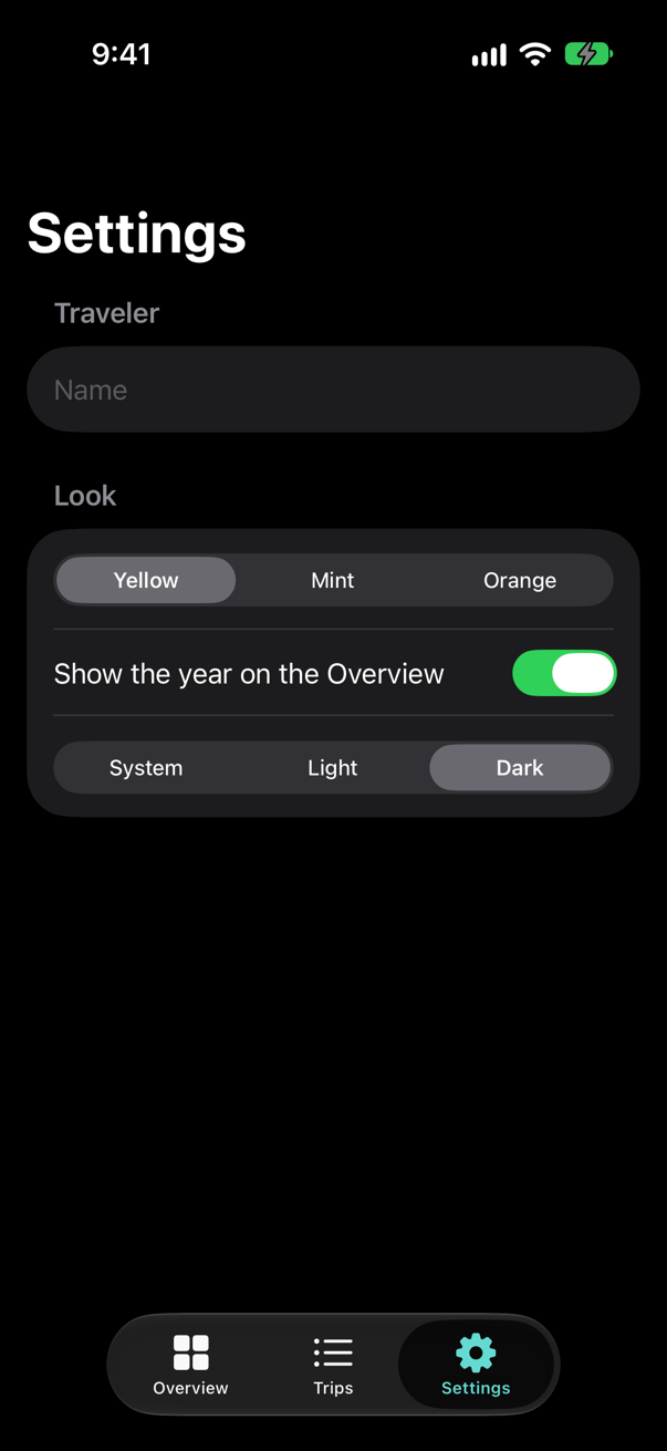
The whole app went dark at once, while the system stayed light. Because the modifier sits on the window's root view, every screen follows it.
Different drawing in the dark
Colors adapt by themselves; a design sometimes needs more. The boarding pass casts a shadow, and a shadow is darkness: on a black background it disappears. In dark mode the pass is better with a thin light outline instead. That is a decision, not a color, so the view reads the appearance — @Environment(\.colorScheme) — and draws accordingly.
Read the appearance, and choose shadow or outline:
struct BoardingPass: View { let trip: Trip let totalNights: Int @Environment(\.highlight) private var highlight @Environment(\.colorScheme) private var colorScheme @Environment(Settings.self) private var settings @State private var isCheckedIn = false var body: some View { Button { withAnimation(.spring(duration: 0.5, bounce: 0.3)) { isCheckedIn.toggle() } completion: { print(isCheckedIn ? "Checked in to \(trip.city)" : "Check-in undone for \(trip.city)") } } label: { HStack(spacing: 16) { VStack(alignment: .leading, spacing: 4) { Text("Boarding pass") .font(.caption.weight(.semibold)) .textCase(.uppercase) .foregroundStyle(.secondary) Text(trip.city) .font(.title2.weight(.bold)) Text(trip.start, format: .dateTime.day().month(.wide).year()) .foregroundStyle(.secondary) if !settings.travelerName.isEmpty { Text("Passenger: \(settings.travelerName)") .font(.caption) } Label("Checked in", systemImage: "checkmark.seal.fill") .font(.caption.weight(.semibold)) .opacity(isCheckedIn ? 1 : 0) } Spacer() NightsRing(nights: trip.nights, total: totalNights) } .padding(.vertical, 20) .padding(.horizontal, 28) .background { Ticket(notch: isCheckedIn ? 22 : 14) .fill(LinearGradient(colors: [highlight, highlight.opacity(0.35)], startPoint: .topLeading, endPoint: .bottomTrailing)) .shadow(color: .black.opacity(0.2), radius: 8, y: 4) // a shadow cannot be seen on black: in the dark, an outline instead .shadow(color: .black.opacity(colorScheme == .dark ? 0 : 0.2), radius: 8, y: 4) .overlay { if colorScheme == .dark { Ticket(notch: isCheckedIn ? 22 : 14) .stroke(.white.opacity(0.35), lineWidth: 1) } } } } .buttonStyle(PressableStyle()) .accessibilityLabel("Boarding pass for \(trip.city)") .accessibilityHint(isCheckedIn ? "Undoes the check-in" : "Checks in") .padding(.horizontal) }}struct BoardingPass: View {
let trip: Trip
let totalNights: Int
@Environment(\.highlight) private var highlight
@Environment(\.colorScheme) private var colorScheme
@Environment(Settings.self) private var settings
@State private var isCheckedIn = false
var body: some View {
Button {
withAnimation(.spring(duration: 0.5, bounce: 0.3)) {
isCheckedIn.toggle()
} completion: {
print(isCheckedIn ? "Checked in to \(trip.city)" : "Check-in undone for \(trip.city)")
}
} label: {
HStack(spacing: 16) {
VStack(alignment: .leading, spacing: 4) {
Text("Boarding pass")
.font(.caption.weight(.semibold))
.textCase(.uppercase)
.foregroundStyle(.secondary)
Text(trip.city)
.font(.title2.weight(.bold))
Text(trip.start, format: .dateTime.day().month(.wide).year())
.foregroundStyle(.secondary)
if !settings.travelerName.isEmpty {
Text("Passenger: \(settings.travelerName)")
.font(.caption)
}
Label("Checked in", systemImage: "checkmark.seal.fill")
.font(.caption.weight(.semibold))
.opacity(isCheckedIn ? 1 : 0)
}
Spacer()
NightsRing(nights: trip.nights, total: totalNights)
}
.padding(.vertical, 20)
.padding(.horizontal, 28)
.background {
Ticket(notch: isCheckedIn ? 22 : 14)
.fill(LinearGradient(colors: [highlight, highlight.opacity(0.35)],
startPoint: .topLeading, endPoint: .bottomTrailing))
// a shadow cannot be seen on black: in the dark, an outline instead
.shadow(color: .black.opacity(colorScheme == .dark ? 0 : 0.2), radius: 8, y: 4)
.overlay {
if colorScheme == .dark {
Ticket(notch: isCheckedIn ? 22 : 14)
.stroke(.white.opacity(0.35), lineWidth: 1)
}
}
}
}
.buttonStyle(PressableStyle())
.accessibilityLabel("Boarding pass for \(trip.city)")
.accessibilityHint(isCheckedIn ? "Undoes the check-in" : "Checks in")
.padding(.horizontal)
}
}Run the app in dark mode, and open Seattle:
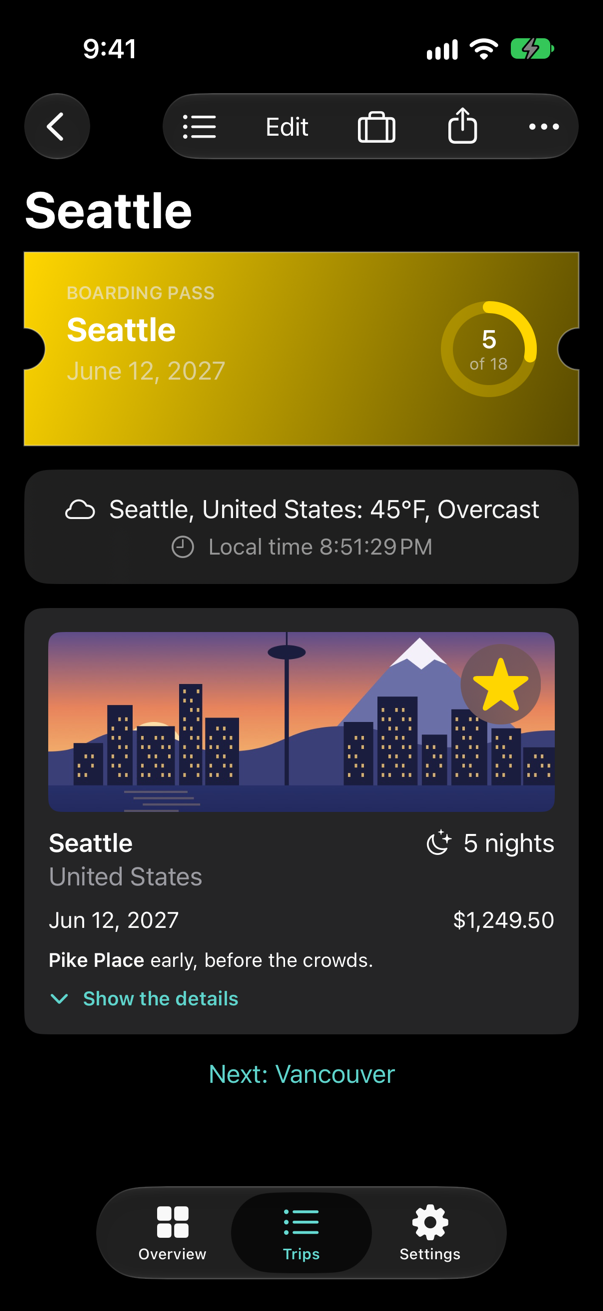
Use colorScheme like this sparingly: for a color, a color set or a semantic color is simpler, and adapts without a line of code.
What you built
- A look at Trips in dark mode: semantic colors adapt by themselves.
- An accent color in the asset catalog, teal in light mode and lighter in dark mode.
- An Appearance setting — System, Light or Dark — applied with
.preferredColorScheme. - A boarding pass that trades its shadow for an outline in the dark, by reading
colorScheme.
Next, Liquid Glass: the material of iOS 26 and 27, and floating controls of your own.
The finished project
Stuck, or want to compare with your own? This is the project as it stands at the end of this lesson, built and run before it was put here.
- Trips-lesson-49.zip — unzip it, then open
Trips.xcodeprojin Xcode.
Flash cards
8 cards for this lesson, each labelled with its topic. 6 ask how you would write something; the other 2 are trick questions, written to catch a misunderstanding. Answer in your head first, then tap the card.
Syntax · Dark modeColor text and a panel so that both work in light and dark mode, with no code for either.
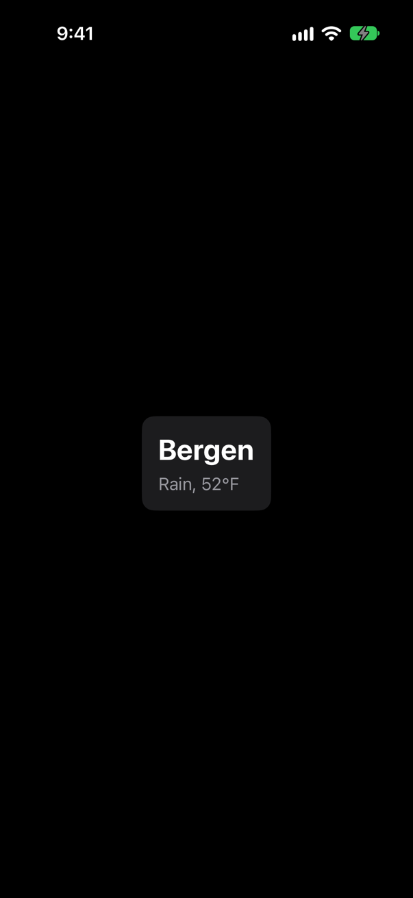
Semantic styles: text is .primary unless told otherwise, .secondary for less important text, and .background.secondary for a panel on the page. Each has a light and a dark version; the picture is the dark one.
Syntax · Dark modeDefine, in code, a color with one value for light mode and another for dark mode.
A UIColor made with a closure is asked again whenever the traits change, and Color(uiColor:) brings it to SwiftUI. The picture is dark mode: teal. A color set in the asset catalog does the same with no code, and is the usual way.
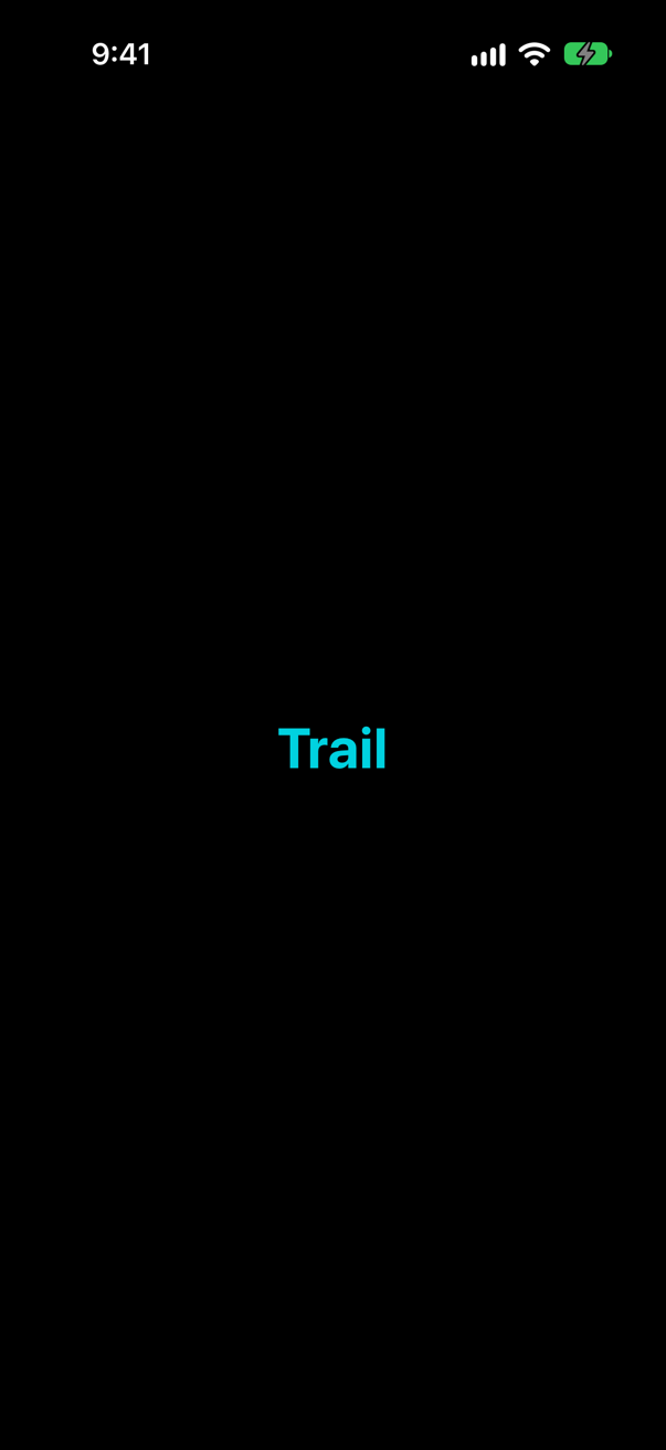
Syntax · Dark modeUse a color from the asset catalog that has a light and a dark variant.
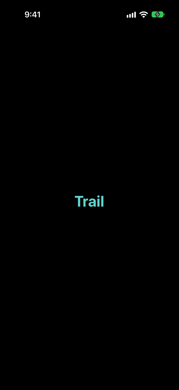
Xcode generates a symbol for every color set: a set named Trail is Color(.trail), checked by the compiler (Color("Trail") works too, unchecked). With Appearances set to Any, Dark, the set holds both colors; the picture is dark mode.
Syntax · Dark modeFind out exactly what a color is, in light and in dark mode.

resolve(in:) turns a Color into its components for an environment: "light: 1.000 0.220 0.235" and "dark: 1.000 0.259 0.271" — Color.red is a different red in dark mode. Handy in a test, or to check a contrast ratio.
Syntax · Dark modeDraw one part of a screen in dark mode while the rest stays light.
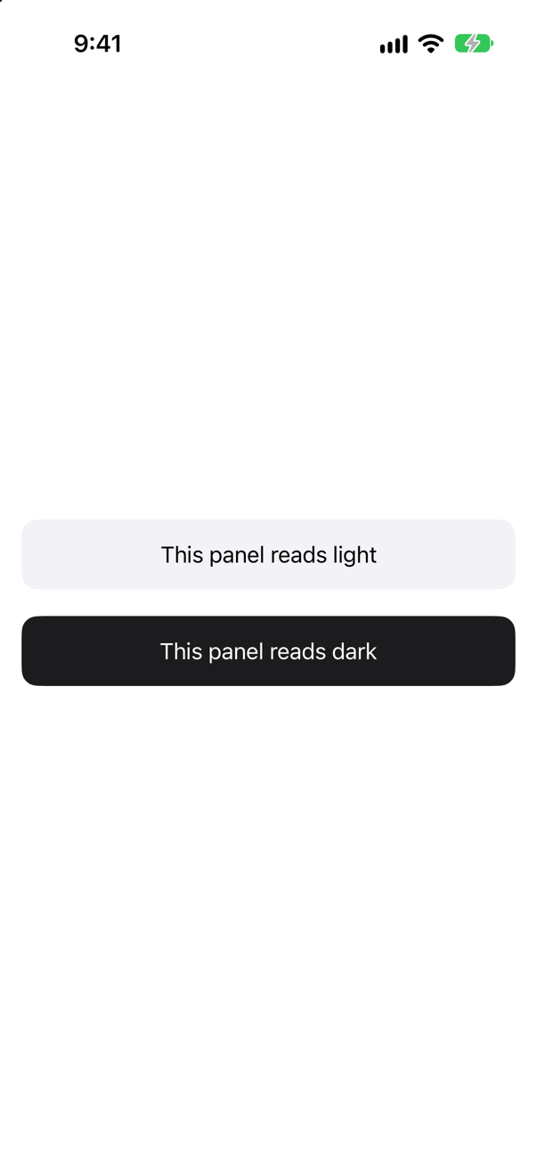
Set the colorScheme environment value on that view: everything below it draws, and reads, as dark. .preferredColorScheme would instead ask for dark for the whole window.
Syntax · ThemingGive one part of a screen an accent color of its own.
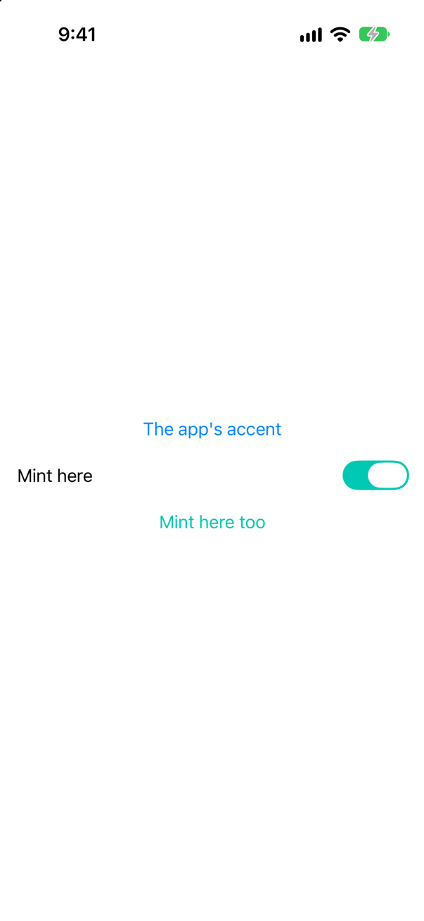
.tint(_:) sets the accent for everything below it — buttons, toggles, links. The app-wide accent comes from the asset catalog's AccentColor.
Trick question · Dark modeA label is drawn in .foregroundStyle(.black). The phone is in dark mode. Can a VoiceOver user still find it?
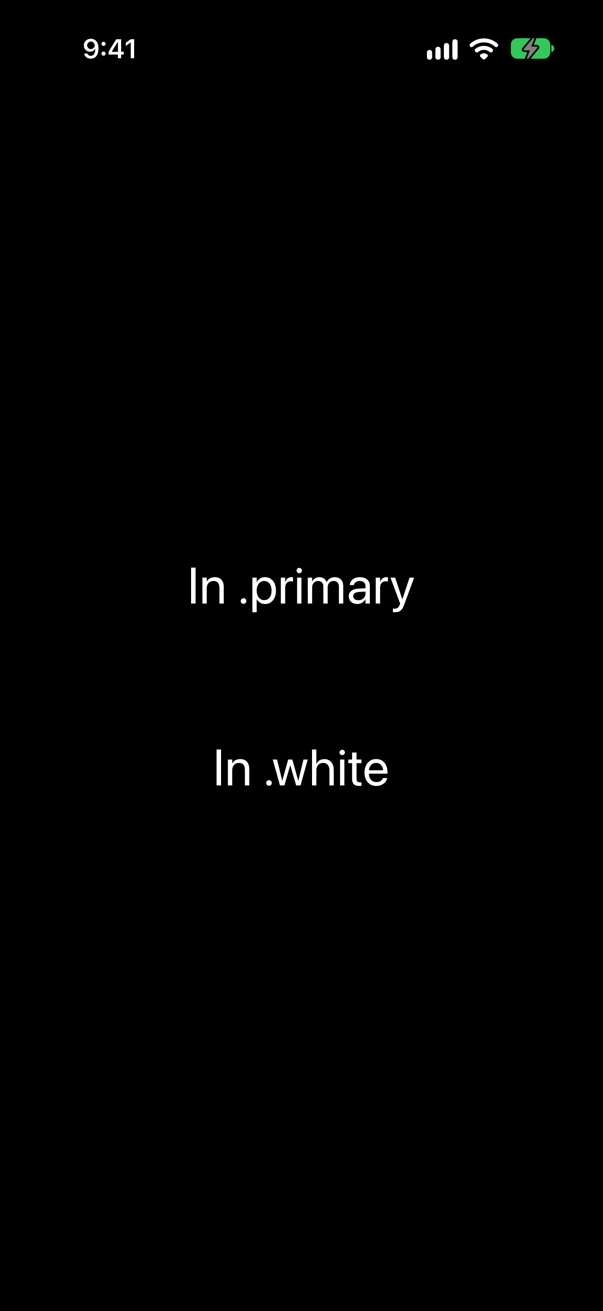
Yes — but nobody else can see it. The middle line is black on black; accessibility still reports all three texts. A hard-coded color looks fine in the mode it was tried in and disappears in the other; .white would vanish in light mode the same way. Prefer .primary and friends.
Trick question · Dark mode.preferredColorScheme(nil) on the root view, with the phone in dark mode. Light or dark?
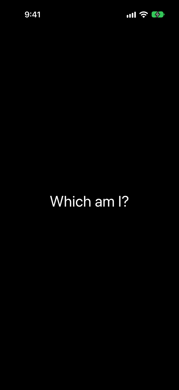
Dark — nil is not "light", it is "no preference": the window follows the system. That is why this lesson's Appearance.system is nil.
Edge cases and tricky questions
8 questions of the kind an interviewer uses to find out whether you really know this — the corners, the traps, and the things that changed recently. Each has its source. Wherever the answer is what some code does, that code was compiled and run, and what you see under “Show the answer” is what it really did. Say your answer aloud before you open it.
A sheet's content says .preferredColorScheme(.dark). The phone is in light mode. What turns dark: the sheet, or the whole app?
Show the answer
Only the sheet. The screen underneath stayed light:
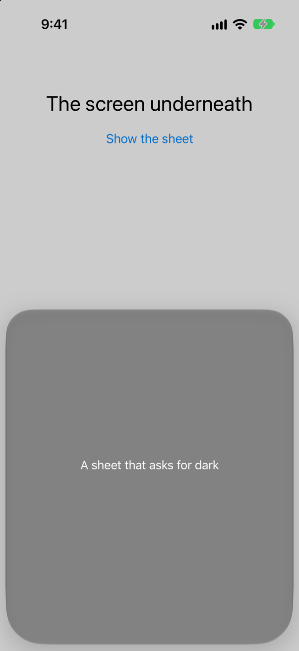
Apple: the preference "applies to the nearest enclosing presentation, such as a popover or window". In a sheet, the nearest presentation is the sheet; on the root view of the app, it is the window — which is how this lesson's Appearance setting reaches every screen. (Lesson 19 showed that two panels in one window cannot disagree: whichever asks, the window follows.)
Where this comes from: preferredColorScheme(_:) · ColorScheme — Measured in the iOS 27 simulator.
Is Color.red the same red in light mode and in dark mode?
Show the answer

No:
What the colors resolve to
red light: 1.000 0.220 0.235
red dark:  1.000 0.259 0.271
blue light: 0.000 0.533 1.000
blue dark:  0.000 0.569 1.000
primary light: 0.000 0.000 0.000
primary dark:  1.000 1.000 1.000
The system's named colors — .red, .blue, all of them — are slightly brighter in dark mode, to keep their contrast against a dark background; .primary flips from black to white. A color written as numbers, Color(red: 1, green: 0.22, blue: 0.24), is the same in both modes, which is exactly what an app usually does not want.
Where this comes from: Human Interface Guidelines: Color · ColorScheme — Measured in the iOS 27 simulator.
The user turns on Increase Contrast in Settings ▸ Accessibility. What happens to Color.blue, and to a color from the asset catalog that has light and dark variants but nothing more?
Show the answer
The system color changes; the catalog color does not. With the setting off:
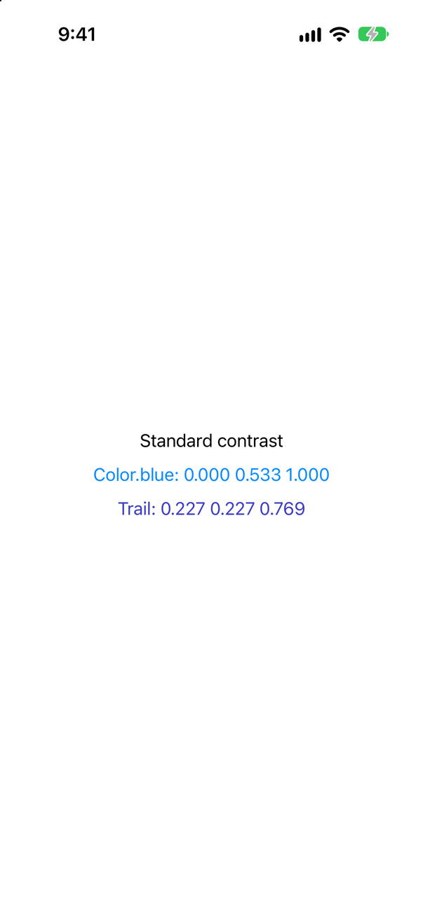
And on:
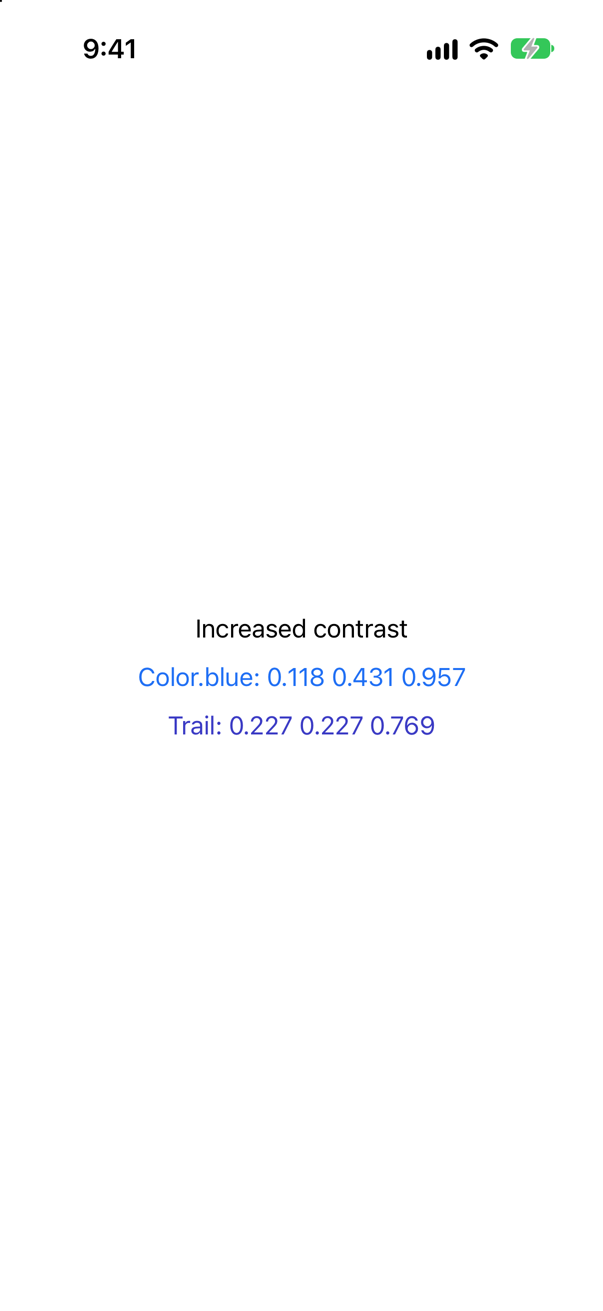
Color.blue became a darker blue, to stand out more against white; the asset color stayed exactly what it was, because it has no high-contrast variant to switch to. A color set can hold one — the asset catalog calls the option High Contrast — and a view can read @Environment(\.colorSchemeContrast) for anything else. Xcode's Debug ▸ View Debugging ▸ Configure Environment Overrides… turns Increase Contrast on for the running app.
Where this comes from: EnvironmentValues colorSchemeContrast · Human Interface Guidelines: Color — Measured in the iOS 27 simulator, with Increase Contrast set by simctl ui increase_contrast.
In dark mode, an app's main screen is black — but a sheet or a popover over it is a dark gray, though both use UIColor.systemBackground. Why?
Show the answer

Because it is elevated. The same color resolves differently for the two levels:
systemBackground in dark mode
base level: 0.000 0.000 0.000
elevated level: 0.110 0.110 0.118
In dark mode iOS draws content that floats above other content — sheets, popovers — a little lighter, so that layers can be told apart without shadows, which do not show on black. The trait is userInterfaceLevel; the background colors have a version for each level. Another reason to use them rather than Color.black.
Where this comes from: Human Interface Guidelines: Dark Mode · UITraitCollection userInterfaceLevel — Measured in the iOS 27 simulator.
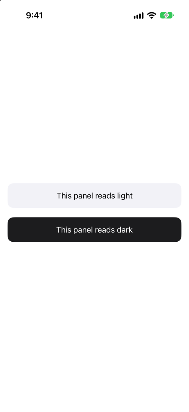
Old code makes one panel dark with .colorScheme(.dark). The SDK marks that modifier as renamed to .preferredColorScheme(_:). Make the rename — what changes?
Show the answer
Everything. The old modifier darkened one panel:
The "renamed" one darkens the whole window:
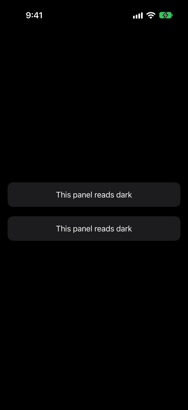
In the SDK, colorScheme(_:) is one line — environment(\.colorScheme, colorScheme) — so it sets the value for the views below it and nothing else, while preferredColorScheme(_:) asks the presentation for an appearance. The deprecation is a future one (the compiler says nothing yet), and the suggested replacement does a different job. For one subtree, write .environment(\.colorScheme, .dark).
Where this comes from: preferredColorScheme(_:) · ColorScheme — Measured in the iOS 27 simulator; the one-line body is in SwiftUICore's interface in the iOS 27 SDK.
A UIKit UILabel, wrapped with UIViewRepresentable, sits under .environment(\.colorScheme, .dark) while the phone is light. Does the label know it is in the dark?
Show the answer
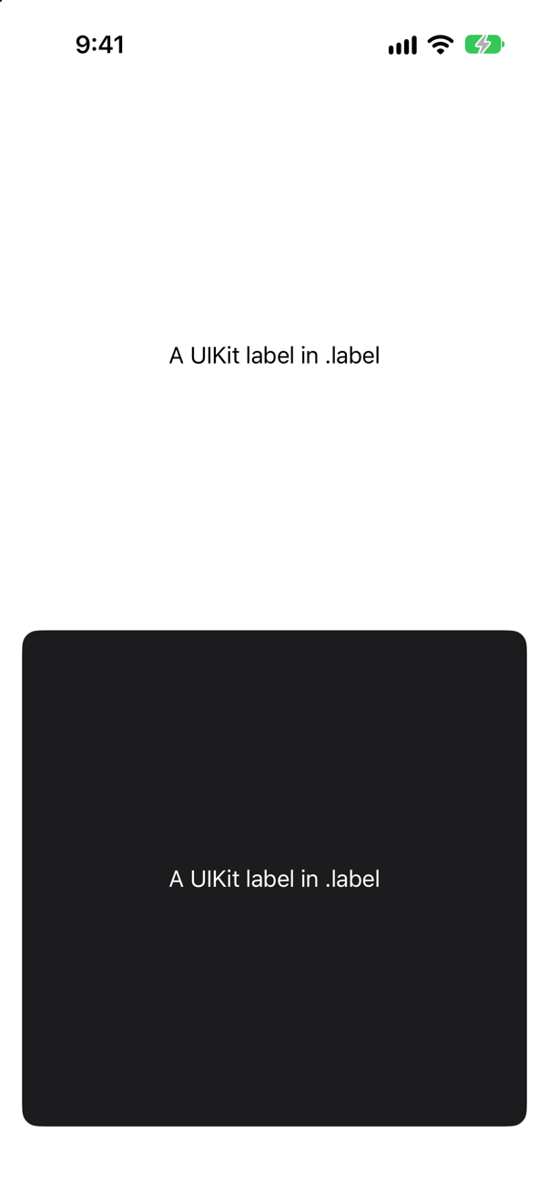
Yes: its trait collection said dark, and its .label text is white:
What each label's traits said
UIKit sees light
UIKit sees dark
SwiftUI hands the environment's color scheme on to a wrapped UIKit view as its userInterfaceStyle, so UIKit's own semantic colors — .label, .systemBackground — follow it too. One more reason to use them inside representables rather than fixed colors.
Where this comes from: UIViewRepresentable · ColorScheme — Measured in the iOS 27 simulator.
The phone is in light mode, and the app asks for dark with .preferredColorScheme(.dark) on its root view. A text field is tapped. A light keyboard, or a dark one?
Show the answer
Dark:
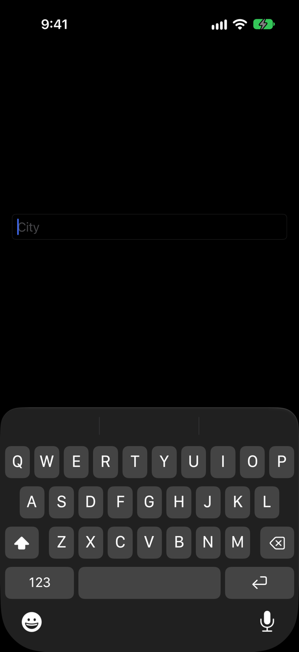
The keyboard follows the text field it types into. Its traits — the color scheme SwiftUI hands down to it — say dark, so the system shows the dark keyboard. The window does not decide: a field darkened on its own, with .environment(\.colorScheme, .dark) on an otherwise light screen, got the dark keyboard too:
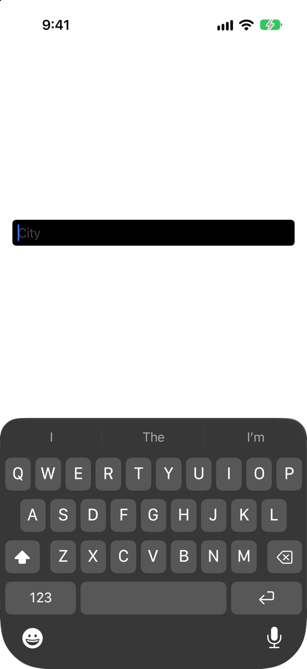
So a dark panel inside a light screen brings a dark keyboard with it — usually what you want, since the keyboard then matches the field the person is looking at.
Where this comes from: preferredColorScheme(_:) · Human Interface Guidelines: Dark Mode — Measured in the iOS 27 simulator.
An app is not ready for dark mode, and must stay light whatever the phone is set to — on every screen, with no code. Where is that said? And what does @Environment(\.colorScheme) read on a phone that is dark?
Show the answer
In the target's Build Settings: User Interface Style, set to Light. The phone was in dark mode; the app stayed light, and colorScheme read light:
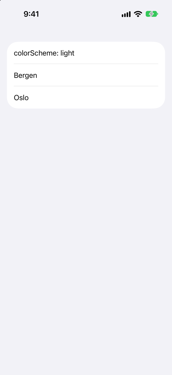
To set it: in the Project navigator select the project, under TARGETS select the app, open Build Settings, click All, type User Interface Style in the search field, and choose Light. Xcode writes the UIUserInterfaceStyle key into the app's Info.plist, and the system draws the app light even when the phone is dark. Use it as a stopgap while dark mode is built, not as a feature: Apple's guidelines say people "generally expect all apps and games to respect their preference", and "may think your app is broken" when one does not.
Where this comes from: UIUserInterfaceStyle (Information Property List) · Human Interface Guidelines: Dark Mode — Measured in the iOS 27 simulator. The setting's name and what it writes are from Xcode 27's own description of its build settings.