Controls made of glass
Liquid Glass
You will buildA look at the Liquid Glass Trips already has; a tab bar that shrinks while the Overview scrolls; the Sort and Close-all controls floating over the cards as glass buttons that open out of one another; and glass button styles in the planner.
TimeAbout 45 minutes
WhyLiquid Glass is the material of iOS 26 and later: a translucent layer that bends and reflects whatever is behind it. Apple uses it for the parts of an app that float above the content — bars, toolbars, sheets, controls — so that the content can run underneath them. An app built with the current SDK gets it for the standard components without a line of code. The work left is for controls of your own: what should float, how glass shapes sit together, and what should not be glass at all.
Open your project
Open your
Tripsproject as lesson 49 left it: double-clickTrips.xcodeprojin Finder, or use File ▸ Open… (⌘O) in Xcode.If you did not finish lesson 49, or would rather start from a known state, download Trips-lesson-49.zip instead. It is the project exactly as it stood at the end of lesson 49. Unzip it and open
Trips.xcodeproj.Run it (⌘R) to check that it builds. You should see where lesson 49 ended:
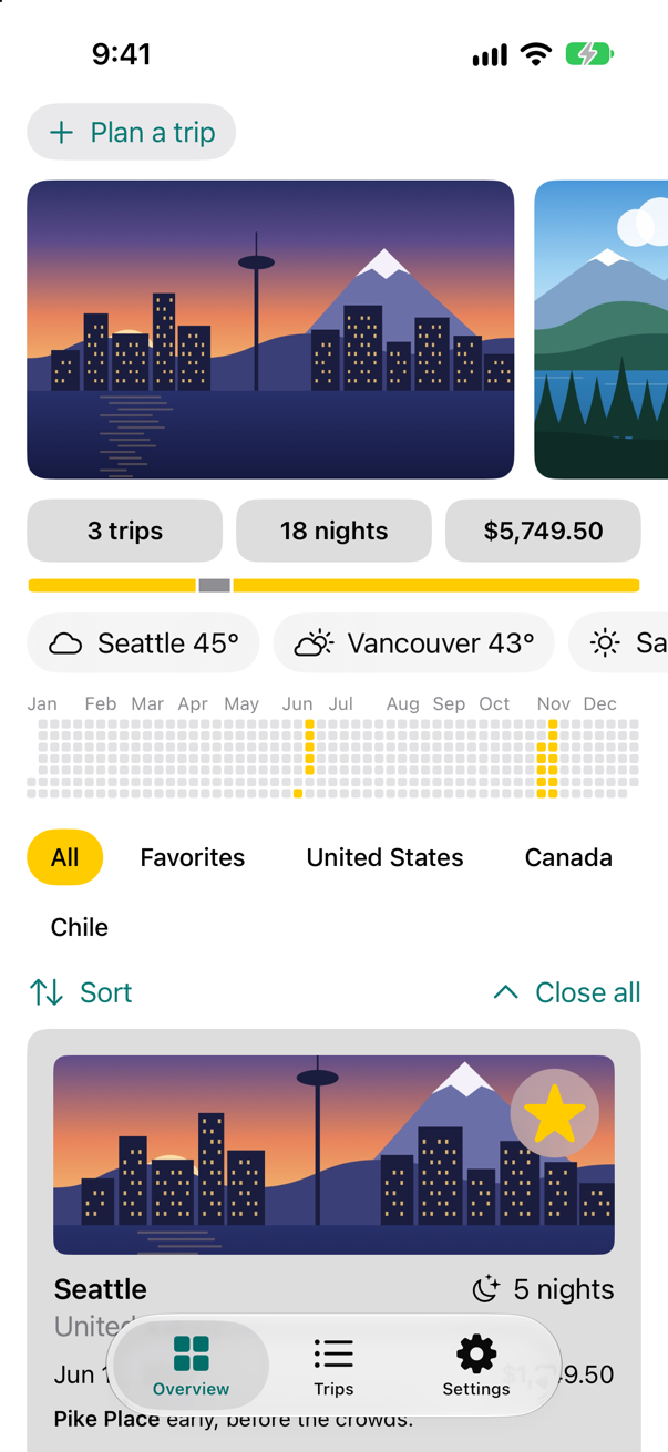
Trips, as it stood at the end of lesson 49Screenshot · iPhone 17, iOS 27.0
The glass you already have
Open a trip and look at the top and the bottom of the screen. The toolbar's buttons sit together in one capsule of glass, and the tab bar is another, floating over the content rather than standing on a bar of its own. Trips never asked for either: toolbar and TabView are drawn in Liquid Glass whenever the app is built with the iOS 26 SDK or later.
Run the app, and open Seattle:
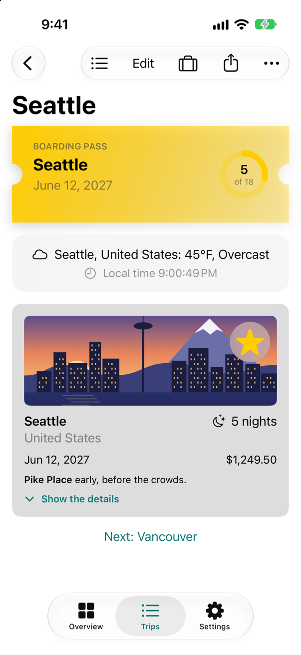
The tab bar steps aside
A floating tab bar covers the bottom of the content. .tabBarMinimizeBehavior(.onScrollDown) lets it shrink out of the way while the person scrolls down, and come back when they scroll up.
Add the modifier to the TabView:
import SwiftUI/// The app's three tabs. The one in front is scene storage: the system keeps it for this window.struct MainTabs: View { @SceneStorage("tab") private var tab = "overview" var body: some View { TabView(selection: $tab) { Tab("Overview", systemImage: "square.grid.2x2", value: "overview") { ContentView() } Tab("Trips", systemImage: "list.bullet", value: "trips") { TripList() } Tab("Settings", systemImage: "gearshape", value: "settings") { SettingsView() } } .tabBarMinimizeBehavior(.onScrollDown) }}import SwiftUI
/// The app's three tabs. The one in front is scene storage: the system keeps it for this window.
struct MainTabs: View {
@SceneStorage("tab") private var tab = "overview"
var body: some View {
TabView(selection: $tab) {
Tab("Overview", systemImage: "square.grid.2x2", value: "overview") {
ContentView()
}
Tab("Trips", systemImage: "list.bullet", value: "trips") {
TripList()
}
Tab("Settings", systemImage: "gearshape", value: "settings") {
SettingsView()
}
}
.tabBarMinimizeBehavior(.onScrollDown)
}
}Run the app, and scroll the Overview down:
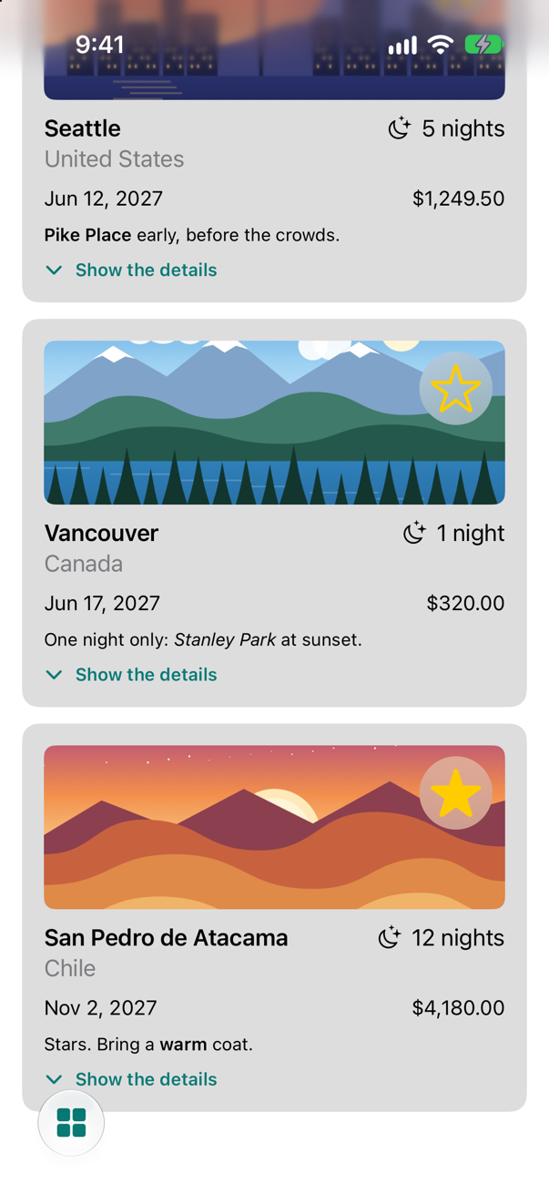
Controls that float
The Sort menu and the Close-all button sit in a row above the cards, taking a line of the screen. They are controls, and controls are what glass is for: they can float over the cards in the corner, out of the way until wanted. TripControls becomes one round glass button that opens into three. Glass shapes inside a GlassEffectContainer that come close enough flow into one another, and glassEffectID names each shape so that, when the row opens, the new buttons grow out of the one that was there.
import SwiftUI/// Sorting the trips, and closing every open card./// Sorting the trips, and closing every open card: one glass button, floating over the cards, that opens into three.struct TripControls: View { @Environment(TripStore.self) private var store @Binding var closings: Int @State private var isOpen = false @Namespace private var glass var body: some View { HStack { Menu("Sort", systemImage: "arrow.up.arrow.down") { Button("By date") { store.trips.sort { $0.start < $1.start } } Button("By price") { store.trips.sort { $0.price < $1.price } } GlassEffectContainer(spacing: 12) { HStack(spacing: 12) { if isOpen { action("By date", systemImage: "calendar", id: "date") { store.trips.sort { $0.start < $1.start } } action("By price", systemImage: "dollarsign", id: "price") { store.trips.sort { $0.price < $1.price } } action("Close all", systemImage: "chevron.up", id: "close") { closings += 1 } } action(isOpen ? "Done" : "Sort and close", systemImage: isOpen ? "xmark" : "ellipsis", id: "toggle") { withAnimation { isOpen.toggle() } } } Spacer() Button("Close all", systemImage: "chevron.up") { closings += 1 } } .padding(.horizontal) } /// One round glass button that can melt into its neighbors. private func action(_ title: String, systemImage: String, id: String, perform: @escaping () -> Void) -> some View { Button(action: perform) { Label(title, systemImage: systemImage) .labelStyle(.iconOnly) .font(.title2) .padding(14) } .glassEffect() .glassEffectID(id, in: glass) }}#Preview { @Previewable @State var closings = 0 TripControls(closings: $closings) .environment(TripStore())}import SwiftUI
/// Sorting the trips, and closing every open card: one glass button, floating over the cards, that opens into three.
struct TripControls: View {
@Environment(TripStore.self) private var store
@Binding var closings: Int
@State private var isOpen = false
@Namespace private var glass
var body: some View {
GlassEffectContainer(spacing: 12) {
HStack(spacing: 12) {
if isOpen {
action("By date", systemImage: "calendar", id: "date") {
store.trips.sort { $0.start < $1.start }
}
action("By price", systemImage: "dollarsign", id: "price") {
store.trips.sort { $0.price < $1.price }
}
action("Close all", systemImage: "chevron.up", id: "close") {
closings += 1
}
}
action(isOpen ? "Done" : "Sort and close", systemImage: isOpen ? "xmark" : "ellipsis", id: "toggle") {
withAnimation { isOpen.toggle() }
}
}
}
}
/// One round glass button that can melt into its neighbors.
private func action(_ title: String, systemImage: String, id: String, perform: @escaping () -> Void) -> some View {
Button(action: perform) {
Label(title, systemImage: systemImage)
.labelStyle(.iconOnly)
.font(.title2)
.padding(14)
}
.glassEffect()
.glassEffectID(id, in: glass)
}
}
#Preview {
@Previewable @State var closings = 0
TripControls(closings: $closings)
.environment(TripStore())
}The Overview no longer shows the controls in its list; it lays them over the scroll view instead: delete the line TripControls(closings: $closings) from the LazyVStack, and add an overlay.
The overlay goes after the ScrollView's closing brace, before .sensoryFeedback:
struct ContentView: View { @Environment(TripStore.self) private var store @AppStorage(Settings.showsYearKey) private var showsYear = true @State private var filter = TripFilter.all @State private var closings = 0 var body: some View { ScrollView { LazyVStack(spacing: 12) { TripPlanner() .environment(\.highlight, .mint) PhotoStrip(trips: store.trips) TripSummary(trips: store.trips) WeatherStrip(cities: store.trips.map(\.city)) if showsYear { YearGrid(trips: store.trips) } FilterBar(filters: TripFilter.choices(for: store.trips), selection: $filter) { trips in store.makeFavorites(trips) } .frame(maxWidth: .infinity, alignment: .leading) .padding(.horizontal) TripControls(closings: $closings) TripGrid(filter: filter, closings: closings) } } .overlay(alignment: .bottomTrailing) { TripControls(closings: $closings) .padding() } .sensoryFeedback(.success, trigger: store.trips.filter(\.isFavorite).count) }}struct ContentView: View {
@Environment(TripStore.self) private var store
@AppStorage(Settings.showsYearKey) private var showsYear = true
@State private var filter = TripFilter.all
@State private var closings = 0
var body: some View {
ScrollView {
LazyVStack(spacing: 12) {
TripPlanner()
.environment(\.highlight, .mint)
PhotoStrip(trips: store.trips)
TripSummary(trips: store.trips)
WeatherStrip(cities: store.trips.map(\.city))
if showsYear {
YearGrid(trips: store.trips)
}
FilterBar(filters: TripFilter.choices(for: store.trips), selection: $filter) { trips in
store.makeFavorites(trips)
}
.frame(maxWidth: .infinity, alignment: .leading)
.padding(.horizontal)
TripGrid(filter: filter, closings: closings)
}
}
.overlay(alignment: .bottomTrailing) {
TripControls(closings: $closings)
.padding()
}
.sensoryFeedback(.success, trigger: store.trips.filter(\.isFavorite).count)
}
}Run the app:
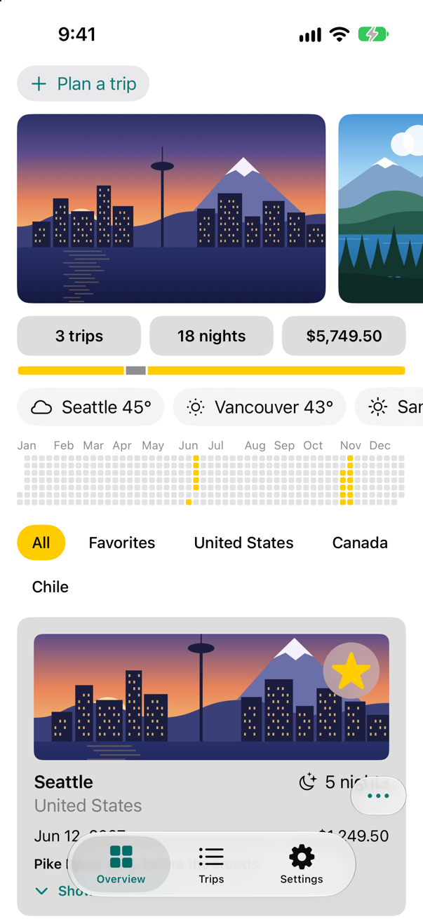
Tap it:
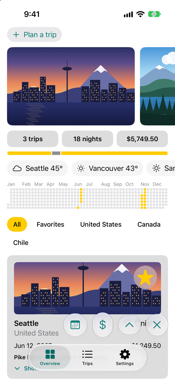
Each button is ordinary SwiftUI with .glassEffect() added; the container decides how the shapes meet, and the animation of isOpen moves them. The overlay keeps clear of the tab bar by itself, because an overlay stays inside the safe area.
Buttons made of glass
Standard buttons have glass styles too: .glass, and .glassProminent for the one action that matters most.
Change .bordered to .glass on the Plan-a-trip button, and .borderedProminent to .glassProminent on Add to my trips:
struct TripPlanner: View { @Environment(TripStore.self) private var store @State private var isOpen = false @State private var draft = TripDraft() @State private var weather = PlannerWeather() @Environment(\.horizontalSizeClass) private var sizeClass var body: some View { VStack(spacing: 12) { VStack(alignment: .leading, spacing: 12) { Button(isOpen ? "Close the planner" : "Plan a trip", systemImage: isOpen ? "xmark" : "plus") { isOpen.toggle() } .buttonStyle(.bordered) .buttonStyle(.glass) if isOpen { IdeasRow { idea in draft.city = idea.city draft.country = idea.country draft.nights = idea.suggestedNights } let fields = sizeClass == .regular ? AnyLayout(HStackLayout()) : AnyLayout(VStackLayout(alignment: .leading)) fields { TextField("City", text: $draft.city) TextField("Country", text: $draft.country) } if let preview = weather.preview { Label("\(preview.place): \(preview.temperature, format: .number.precision(.fractionLength(0)))°F, \(preview.sky.words)", systemImage: preview.sky.symbol) .font(.subheadline) } Stepper(value: $draft.nights, in: 1...60) { Text("^[\(draft.nights) night](inflect: true)") } Stepper(value: $draft.price, in: 0...20_000, step: 250) { Text(draft.price, format: .currency(code: "USD")) } HStack { PicturePicker(selection: $draft.imageName) Spacer() FavoriteButton(isFavorite: $draft.isFavorite) } Button("Add to my trips") { store.add(draft) draft = TripDraft() isOpen = false } .buttonStyle(.borderedProminent) .buttonStyle(.glassProminent) .disabled(draft.city.isEmpty) } } .textFieldStyle(.roundedBorder) .frame(maxWidth: .infinity, alignment: .leading) .padding(.horizontal) .task(id: draft.city) { await weather.update(for: draft.city) } if isOpen { TripCard(trip: Binding( get: { draft.trip(id: 0) }, set: { draft.isFavorite = $0.isFavorite } )) } } }}struct TripPlanner: View {
@Environment(TripStore.self) private var store
@State private var isOpen = false
@State private var draft = TripDraft()
@State private var weather = PlannerWeather()
@Environment(\.horizontalSizeClass) private var sizeClass
var body: some View {
VStack(spacing: 12) {
VStack(alignment: .leading, spacing: 12) {
Button(isOpen ? "Close the planner" : "Plan a trip", systemImage: isOpen ? "xmark" : "plus") {
isOpen.toggle()
}
.buttonStyle(.glass)
if isOpen {
IdeasRow { idea in
draft.city = idea.city
draft.country = idea.country
draft.nights = idea.suggestedNights
}
let fields = sizeClass == .regular ? AnyLayout(HStackLayout()) : AnyLayout(VStackLayout(alignment: .leading))
fields {
TextField("City", text: $draft.city)
TextField("Country", text: $draft.country)
}
if let preview = weather.preview {
Label("\(preview.place): \(preview.temperature, format: .number.precision(.fractionLength(0)))°F, \(preview.sky.words)",
systemImage: preview.sky.symbol)
.font(.subheadline)
}
Stepper(value: $draft.nights, in: 1...60) {
Text("^[\(draft.nights) night](inflect: true)")
}
Stepper(value: $draft.price, in: 0...20_000, step: 250) {
Text(draft.price, format: .currency(code: "USD"))
}
HStack {
PicturePicker(selection: $draft.imageName)
Spacer()
FavoriteButton(isFavorite: $draft.isFavorite)
}
Button("Add to my trips") {
store.add(draft)
draft = TripDraft()
isOpen = false
}
.buttonStyle(.glassProminent)
.disabled(draft.city.isEmpty)
}
}
.textFieldStyle(.roundedBorder)
.frame(maxWidth: .infinity, alignment: .leading)
.padding(.horizontal)
.task(id: draft.city) {
await weather.update(for: draft.city)
}
if isOpen {
TripCard(trip: Binding(
get: { draft.trip(id: 0) },
set: { draft.isFavorite = $0.isFavorite }
))
}
}
}
}Run the app, open the planner, and type a city:
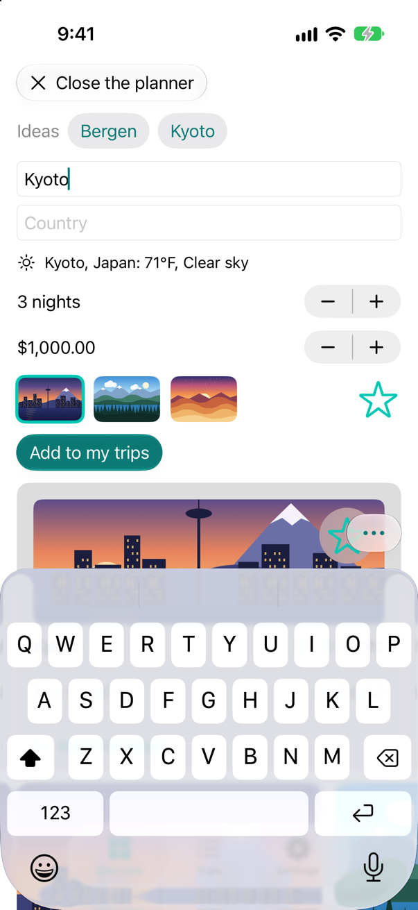
Where glass does not belong matters as much. The cards, the photos, the weather — the content — stay as they are. The Human Interface Guidelines say it in one line: "Don’t use Liquid Glass in the content layer." Glass is the layer that floats; the content is what it floats over.
What you built
- A tab bar that shrinks while the Overview scrolls down.
TripControlsas one floating glass button that opens into three, in aGlassEffectContainerwithglassEffectID.- Glass button styles in the planner.
Next, accessibility: VoiceOver, Dynamic Type, and what you have to add yourself.
The finished project
Stuck, or want to compare with your own? This is the project as it stands at the end of this lesson, built and run before it was put here.
- Trips-lesson-50.zip — unzip it, then open
Trips.xcodeprojin Xcode.
Flash cards
9 cards for this lesson, each labelled with its topic. 8 ask how you would write something; the other one is a trick question, written to catch a misunderstanding. Answer in your head first, then tap the card.
Syntax · Liquid GlassPut a view on a piece of Liquid Glass.
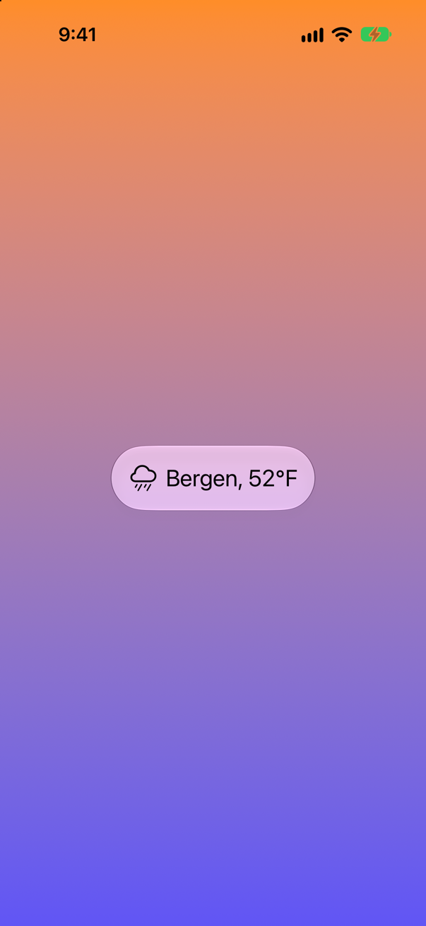
.glassEffect() puts the view on glass — a capsule unless told otherwise — that bends and lightens what is behind it. Pad the view first: the glass takes the shape of whatever it is attached to.
Syntax · Liquid GlassGive glass a shape of its own and a tint.
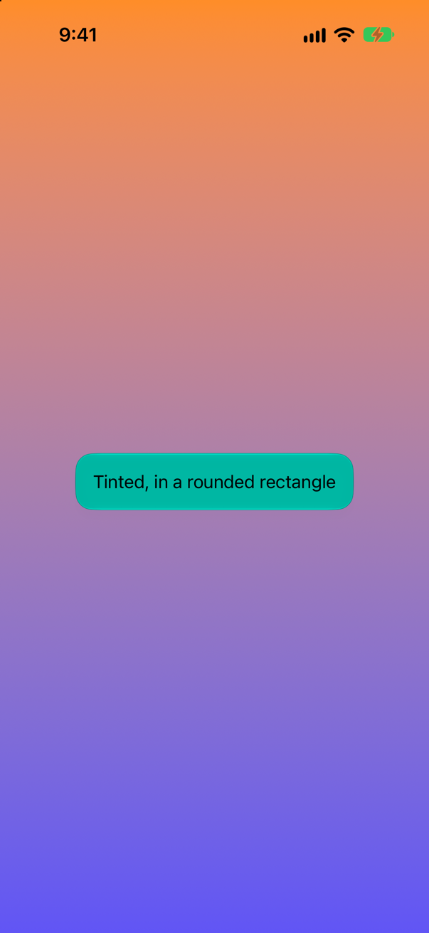
The first argument is the glass — .regular, .clear, or .identity for none — with .tint(_:) and .interactive() to adjust it; in: is the shape. Tint sparingly, for something that must stand out.
Syntax · Liquid GlassMake standard buttons out of glass.
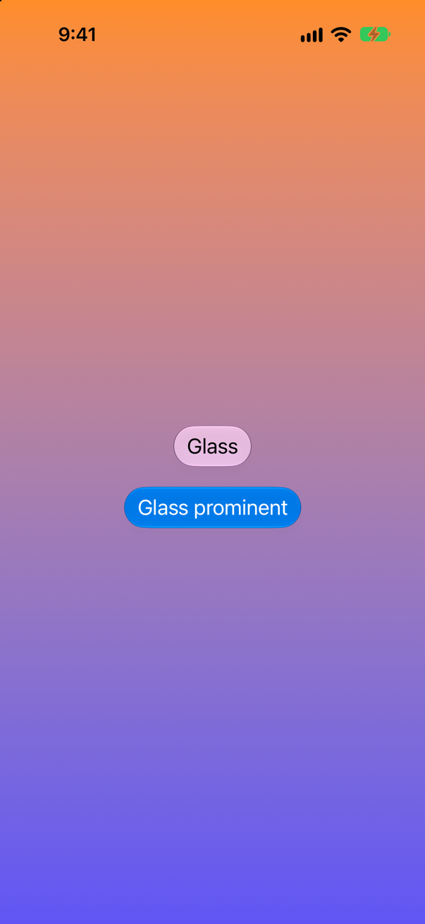
.glass for ordinary buttons, .glassProminent — tinted with the accent color — for the one action that matters most on the screen.
Syntax · Liquid GlassLet glass shapes that sit close together flow into one another.
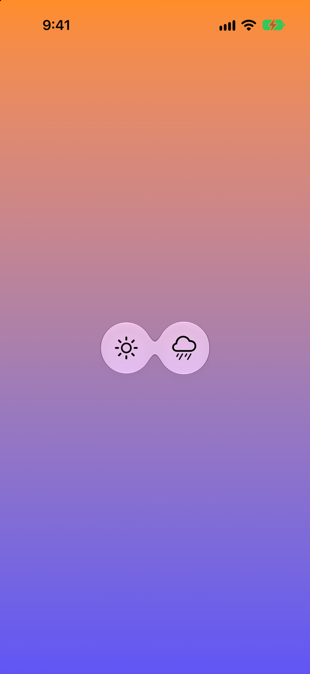
A GlassEffectContainer renders its glass shapes together: shapes closer than its spacing blend at the edges, and with glassEffectID they can grow out of one another as views appear and disappear.
Syntax · Liquid GlassLet a tab bar shrink while the content scrolls down.
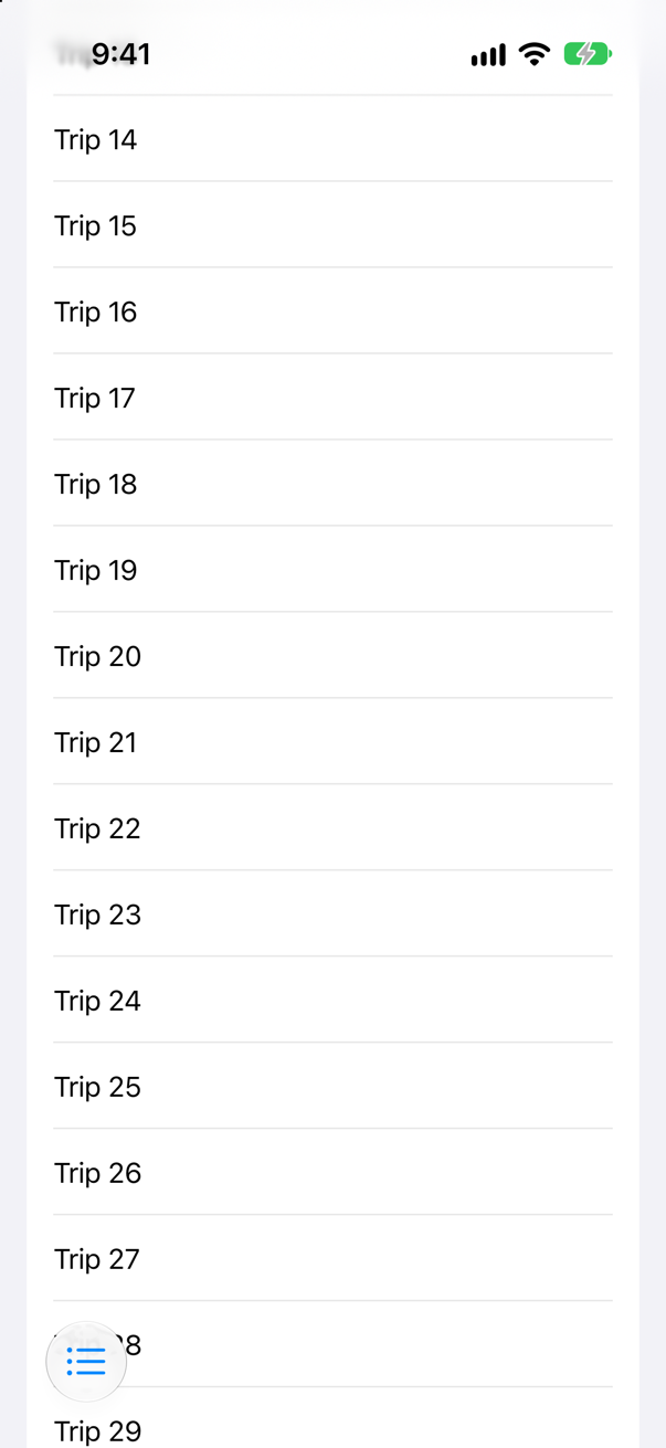
On the TabView. The bar shrinks to its selected tab while the person scrolls down, and comes back when they scroll up — the picture is after a scroll down. .onScrollUp does the opposite.
Syntax · Liquid GlassSeparate toolbar buttons into two groups of glass.
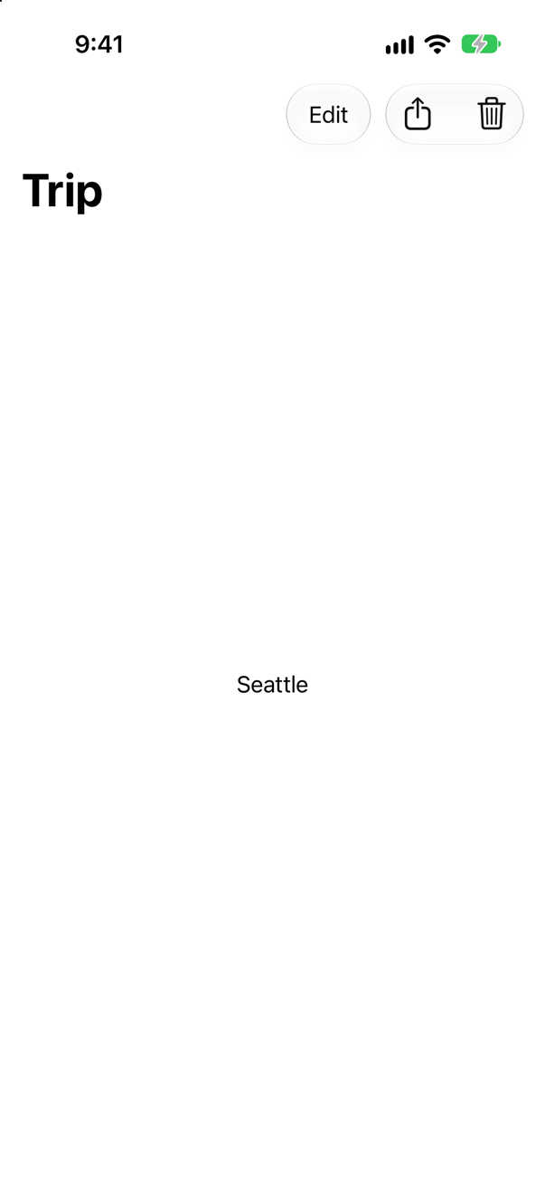
Toolbar items next to each other share one capsule of glass; a ToolbarSpacer splits them — .fixed for a gap, .flexible (the default) to push them apart.
Syntax · Liquid GlassMake your own glass control answer the finger, as system controls do.
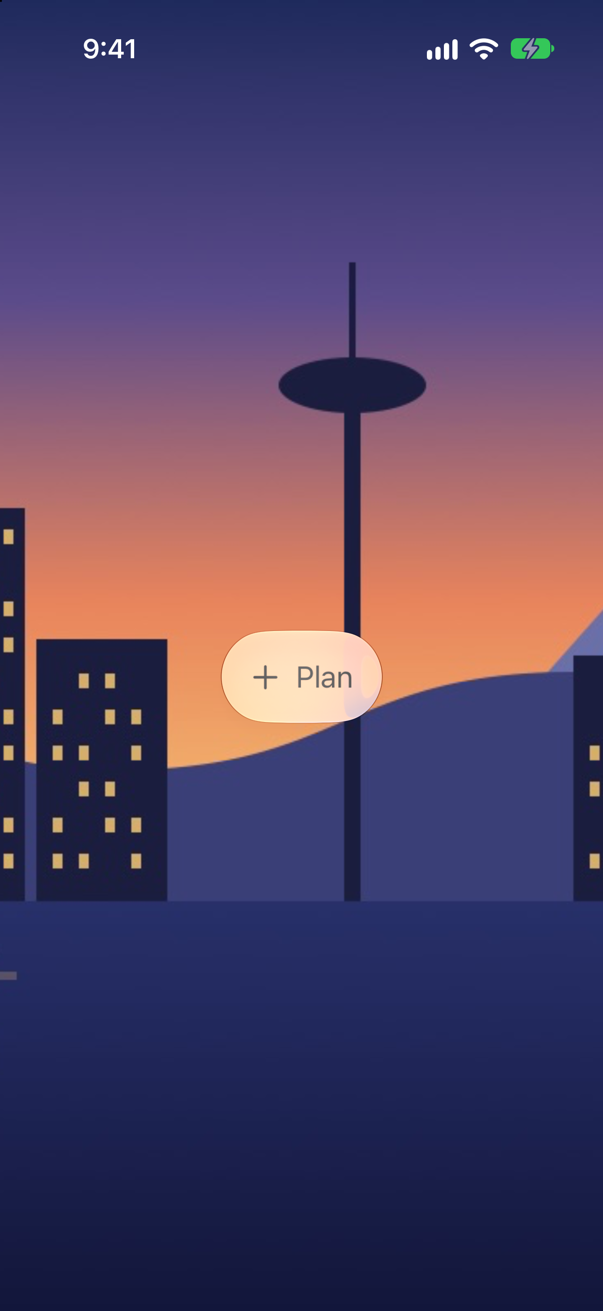
.interactive() on the glass. Pressed, the glass swells and brightens under the finger — the picture was taken halfway through a press; at rest, its edge was a few points further in. Use it for glass that can be tapped, not for glass that only holds text.
Syntax · Liquid GlassUse the more transparent glass, for controls over photos and video.
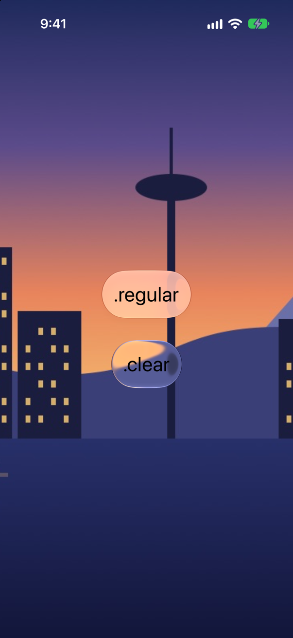
.glassEffect(.clear): far more of the picture behind shows through than with .regular — inside the clear capsule the color was close to the sky beside it. Apple's guidelines keep it for components over "visually rich backgrounds", and its documentation asks for "a dimming layer or other treatment beneath the glass" when the content behind is bright.
Trick question · Liquid GlassGlass is switched on and off with if on { label.glassEffect() } else { label }. The label counts taps in @State. Does the count survive a switch? And with .glassEffect(on ? .regular : .identity)?
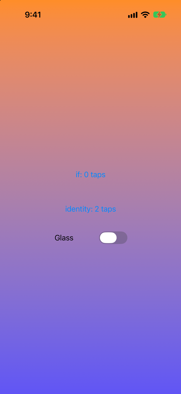
The if loses it; .identity keeps it. After two taps each and a switch, the screen says "if: 0 taps" and "identity: 2 taps". The two branches of an if are two different views, so switching makes a new one; .identity — glass that is not there — keeps the same view and only changes the effect.
Edge cases and tricky questions
9 questions of the kind an interviewer uses to find out whether you really know this — the corners, the traps, and the things that changed recently. Each has its source. Wherever the answer is what some code does, that code was compiled and run, and what you see under “Show the answer” is what it really did. Say your answer aloud before you open it.
Two round glass buttons sit 8 points apart. In one version they are inside a GlassEffectContainer(spacing: 20); in the other, not. How do they look?
Show the answer
The pair on its own above, the pair in a container below:
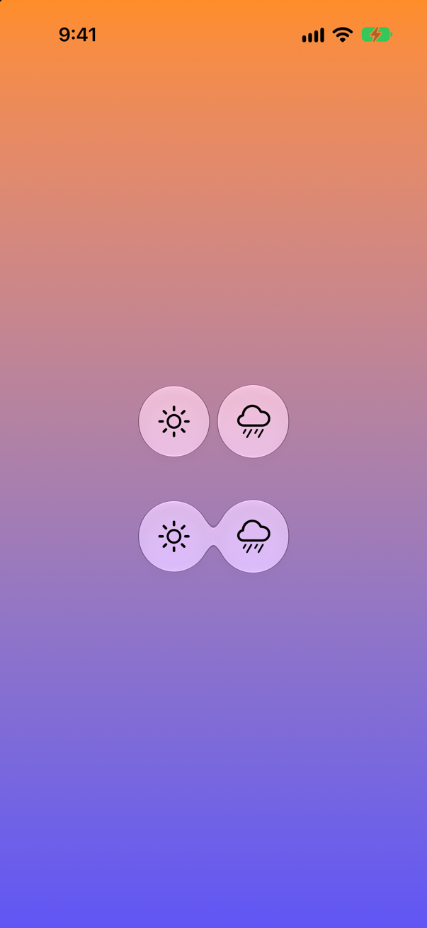
Without a container, two separate pieces of glass; inside one, they meet. A container renders its shapes together — Apple: "As shapes near one another, their paths start to blend into one another", and the larger the spacing, the sooner. It is also what lets shapes morph into one another, and it draws them more cheaply. Put neighbouring glass controls in one container.
Where this comes from: GlassEffectContainer · WWDC25: Build a SwiftUI app with the new design — Measured in the iOS 27 simulator.
A panel is made of glass, and the button inside it is made of glass too. What does the button look like?
Show the answer
Barely there:
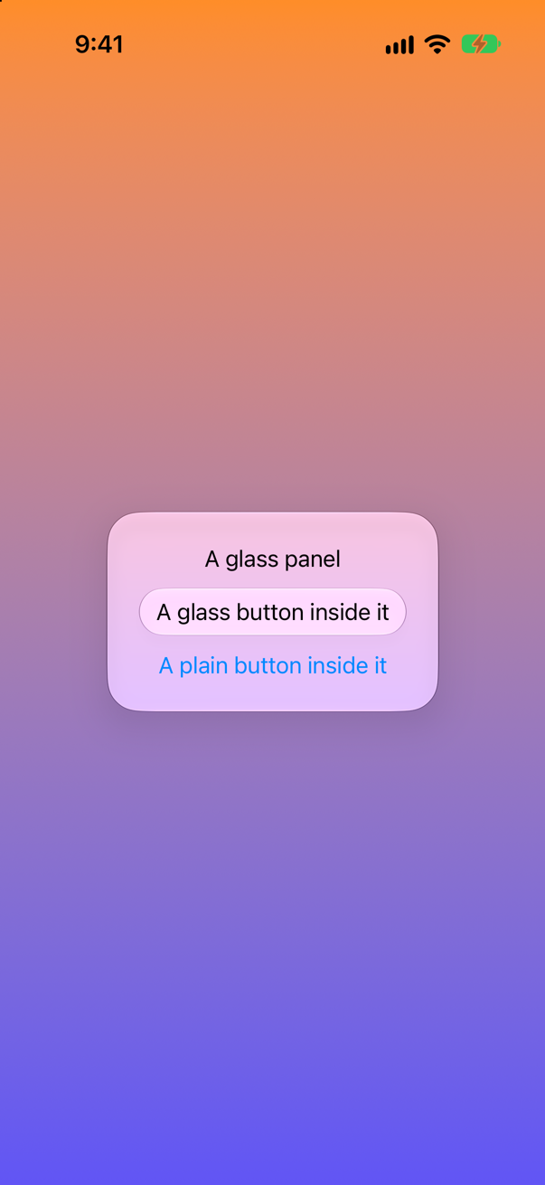
The glass button is a slightly paler pill on a pale panel; the plain button in the same panel reads better. Glass is made to stand out against content, and on glass it has nothing to stand out against. The Human Interface Guidelines: "Use Liquid Glass effects sparingly." Inside a glass panel, use plain controls.
Where this comes from: Human Interface Guidelines: Materials (Liquid Glass) · WWDC25: Build a SwiftUI app with the new design — Measured in the iOS 27 simulator.
Text("Bergen").padding().glassEffect() and Text("Bergen").glassEffect().padding(). Same picture?
Show the answer
No:
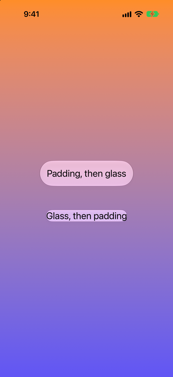
Apple: SwiftUI "anchors the Liquid Glass to a view's bounds". Padding first makes the bounds bigger, so the glass has room around the text; glass first fits the text tightly, and the padding after it only adds empty space outside. Modifier order is the order things are wrapped, as everywhere in SwiftUI.
Where this comes from: glassEffect(_:in:) · Applying Liquid Glass to custom views — Measured in the iOS 27 simulator.
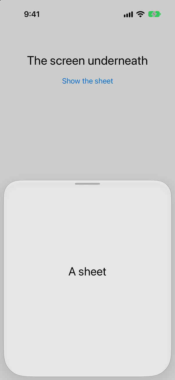
A sheet can be pulled to half height or to full height (.presentationDetents([.medium, .large])). Does it look the same at both?
Show the answer
No. At half height the sheet floats — inset from the edges, rounded, made of glass:
At full height it fills the screen and becomes solid:
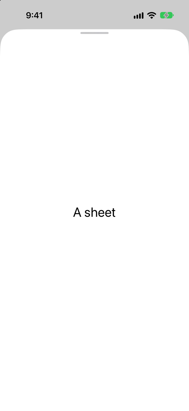
The system does it: a partial sheet is a layer over the content, so it is glass; a full one is the content now, so it is not. Nothing in the code chose either — another reason to keep custom backgrounds off sheets unless a design needs one.
Where this comes from: WWDC25: Build a SwiftUI app with the new design · presentationDetents(_:) — Measured in the iOS 27 simulator.
A tabViewBottomAccessory shows the next trip just above the tab bar, and the tab bar shrinks while the list scrolls down (.tabBarMinimizeBehavior(.onScrollDown)). Where does the accessory go when the person scrolls?
Show the answer
Before the scroll, the accessory sits on its own piece of glass above the tab bar:
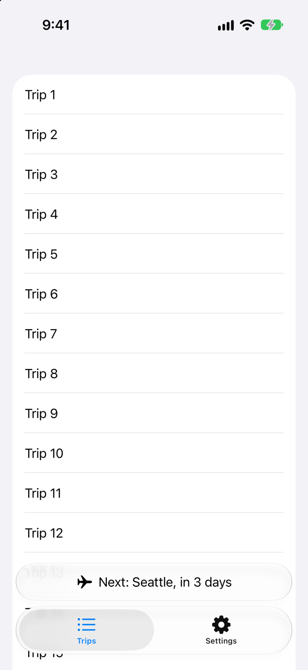
After it, the accessory moves down into the bar's place, beside the one button the tab bar shrank to:
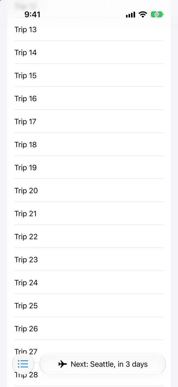
The system arranges the two, and a view inside the accessory can read where it is — @Environment(\.tabViewBottomAccessoryPlacement) — to show less when it is inline.
Where this comes from: WWDC25: Build a SwiftUI app with the new design · tabBarMinimizeBehavior(_:) — Measured in the iOS 27 simulator.
A view framed 110 × 110 points gets .glassEffect(). Square glass?
Show the answer
No — a circle. And the wide one is a pill:
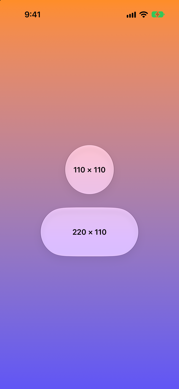
The default shape of glass is a capsule — Apple: "SwiftUI uses the regular variant by default along with a Capsule shape" — and a capsule's ends are half circles as tall as the view, so a square view gets a circle. For a rounded square, say so: .glassEffect(in: .rect(cornerRadius: 24)).
Where this comes from: glassEffect(_:in:) · DefaultGlassEffectShape — Measured in the iOS 27 simulator; the corners of the square were checked in the picture.
The person turns on Increase Contrast in Settings ▸ Accessibility. Does glass change?
Show the answer
Before, the glass lets the orange sky through:
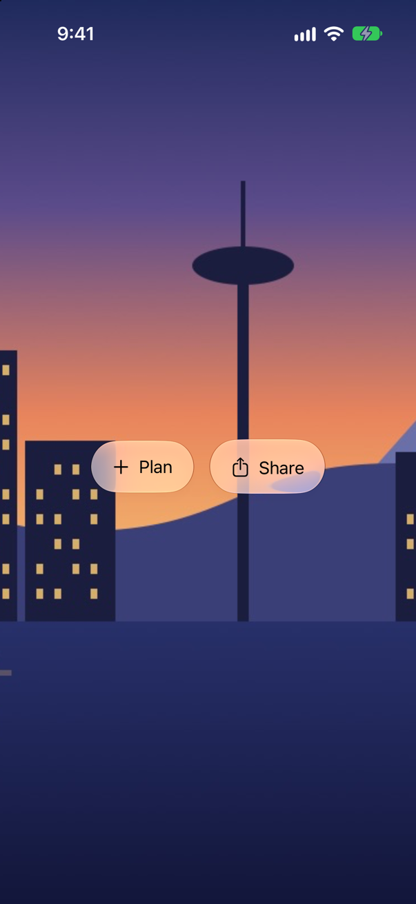
With Increase Contrast, the same glass turns paler and more opaque — the sky behind is unchanged, but much less of it shows through, so the labels stand out:
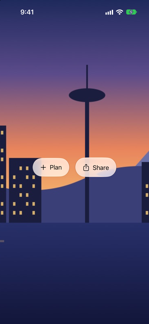
Apple's guidelines: the appearance of glass "can differ in response to certain system settings" — a preferred look chosen in Settings, or accessibility settings that "reduce transparency or increase contrast." The app does nothing; it gets this by using the system's glass. Check your own screens with the setting on — Xcode's environment overrides have it.
Where this comes from: Human Interface Guidelines: Materials (Liquid Glass) · glassEffect(_:in:) — Measured in the iOS 27 simulator; the colors inside the glass were compared in the two pictures.
Two glass circles sit 40 points apart in a GlassEffectContainer — too far apart to blend. Can they still be one piece of glass?
Show the answer
Yes — with glassEffectUnion. Above, two circles; below, the same two views with a union id, sharing one capsule:
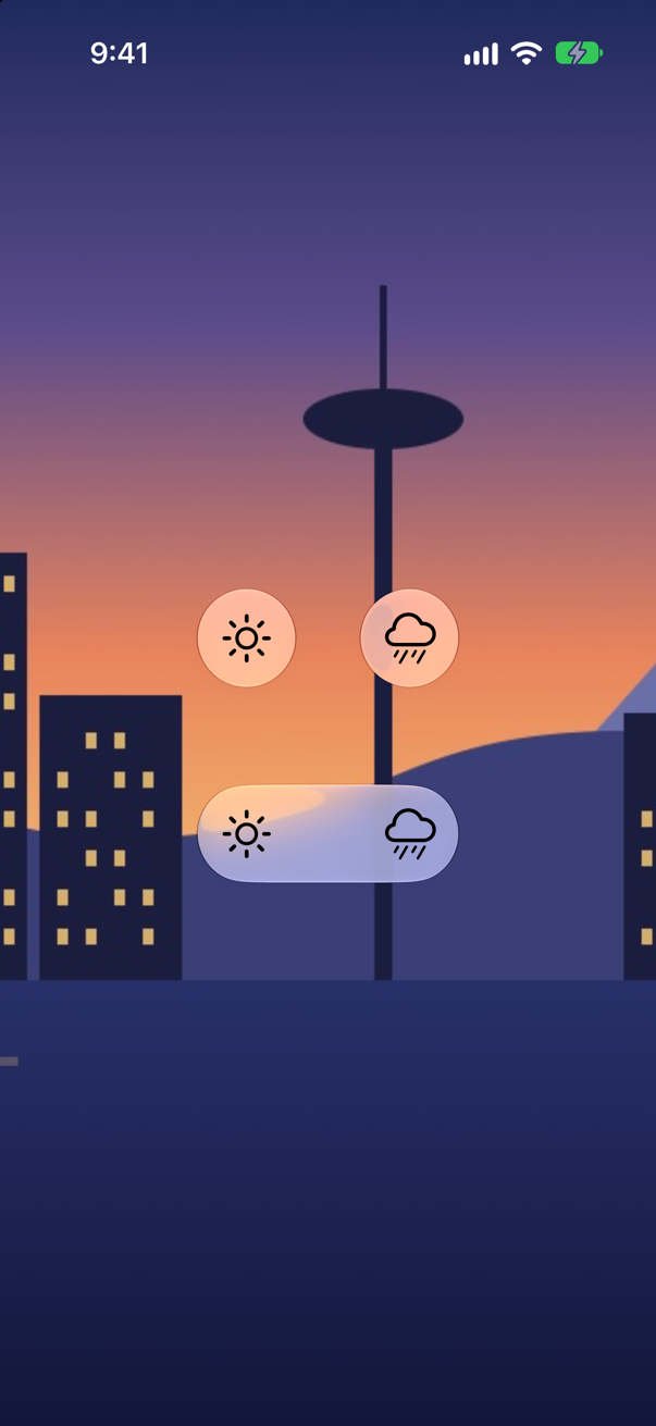
Apple: "All Liquid Glass effects with the same shape and Liquid Glass variant will be combined into a single shape." Use it for controls that belong together but are laid out apart — the container's spacing only blends shapes that are already close.
Where this comes from: glassEffectUnion(id:namespace:) · GlassEffectContainer — Measured in the iOS 27 simulator.
The same glass label, over the same backdrop, with the phone switched to dark mode. Does the glass change?
Show the answer
In light mode:
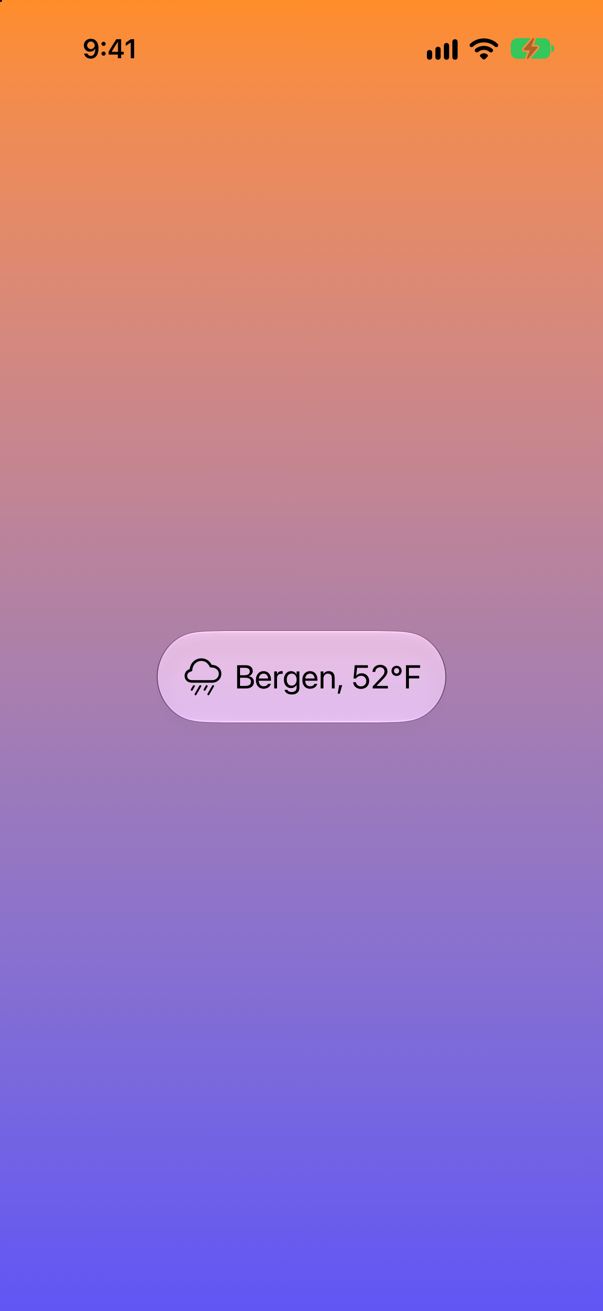
In dark mode the glass darkens and the label turns white, though the backdrop barely changed:
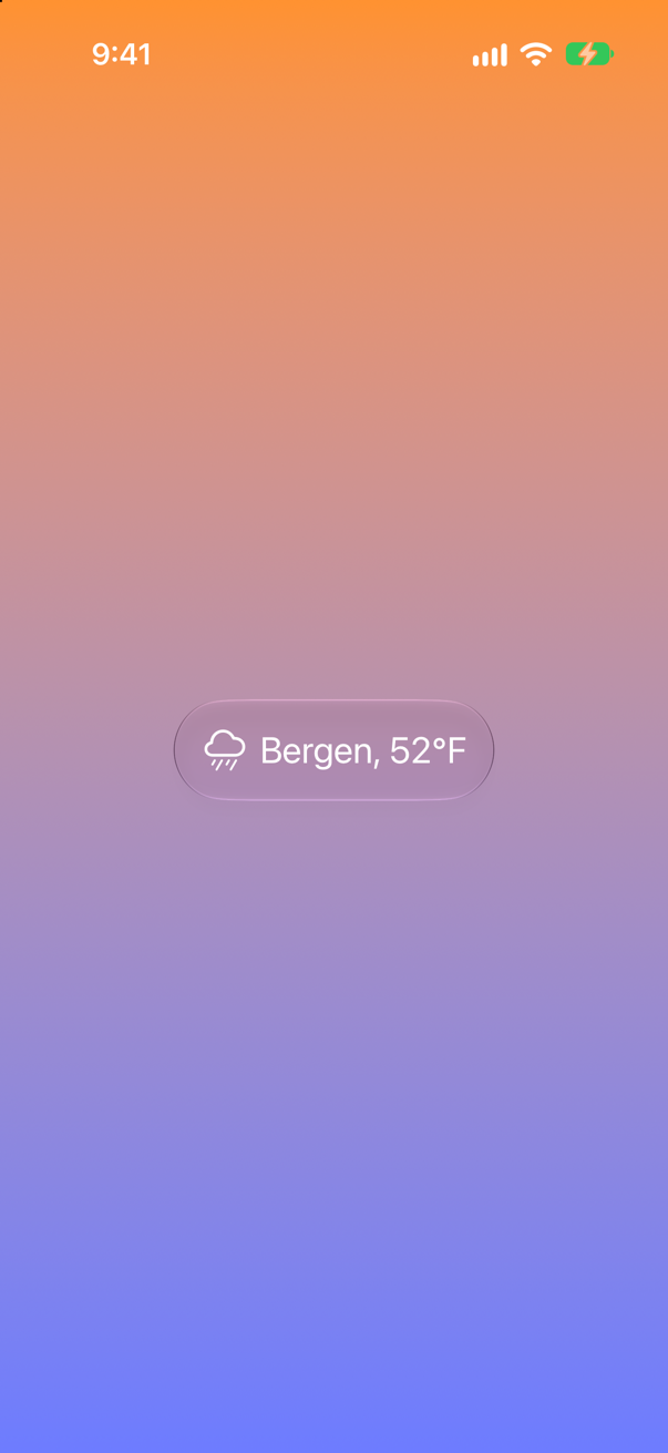
Glass is drawn for the appearance it is in, like the system's semantic colors, and the text on it switches with it — one more reason to leave its content in the default foreground style rather than a fixed color.
Where this comes from: Human Interface Guidelines: Materials (Liquid Glass) · Human Interface Guidelines: Dark Mode — Measured in the iOS 27 simulator; the colors inside the glass were compared in the two pictures.