Trips, by ear and by finger
Accessibility
You will buildA UI test that runs Xcode's accessibility audit over the Overview; filter chips that are big enough to hit and say which one is chosen; a boarding pass that says how many nights it stands for; the audit again, and what is left; and a look at the largest text size.
TimeAbout 50 minutes
WhyStandard SwiftUI controls come with their accessibility done: a Button says it is a button and reads its title, a Toggle says whether it is on. The work is in the gaps — custom controls, pictures, targets too small to hit, colors too faint, layouts that break at large text. You find them by using the app with VoiceOver and at the largest text size, and with an audit, which checks a screen against Apple's rules in a test. Interviewers at large companies ask about this, and want to hear how you check, not only what the modifiers are called.
Open your project
Open your
Tripsproject as lesson 50 left it: double-clickTrips.xcodeprojin Finder, or use File ▸ Open… (⌘O) in Xcode.If you did not finish lesson 50, or would rather start from a known state, download Trips-lesson-50.zip instead. It is the project exactly as it stood at the end of lesson 50. Unzip it and open
Trips.xcodeproj.Run it (⌘R) to check that it builds. You should see where lesson 50 ended:
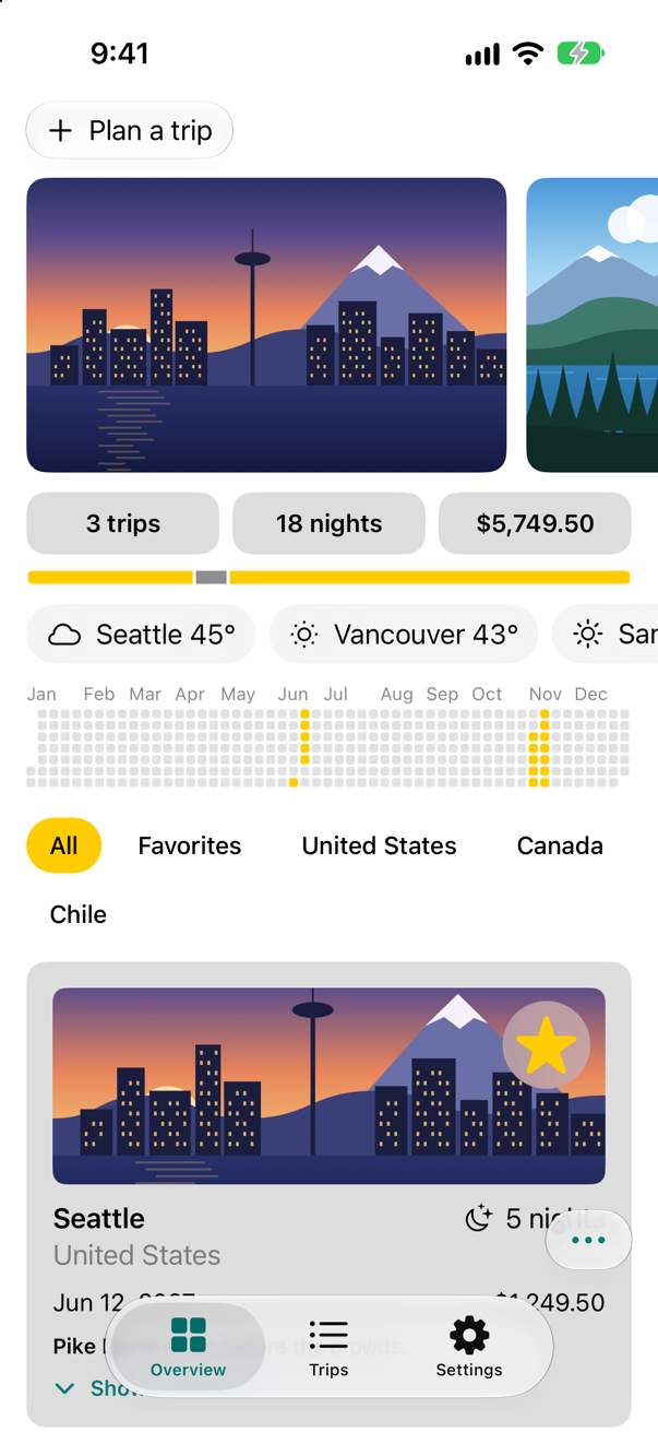
Trips, as it stood at the end of lesson 50Screenshot · iPhone 17, iOS 27.0
An audit, first
XCTest can audit a screen: performAccessibilityAudit() checks every element on it for common problems — targets too small, text that does not grow with the text size, colors without enough contrast, labels that say too little — and fails the test for each one. A closure given to it sees each issue first; returning true says "noted", and the audit carries on, so that one run lists them all.
Add the audit after testPlanningATripAddsItToTheList:
import XCTestfinal class TripsUITests: XCTestCase { override func setUpWithError() throws { // In a UI test each step depends on the one before: stop at the first failure. continueAfterFailure = false } @MainActor func testPlanningATripAddsItToTheList() throws { let app = XCUIApplication() // the samples, whatever an earlier run saved app.launchArguments = ["-fresh-start"] app.launch() // the app remembers its tab: do not assume one app.tabBars.buttons["Overview"].tap() app.buttons["Plan a trip"].tap() let city = app.textFields["City"] city.tap() city.typeText("Lisbon") let country = app.textFields["Country"] country.tap() country.typeText("Portugal") app.buttons["Add to my trips"].tap() app.tabBars.buttons["Trips"].tap() XCTAssertTrue(app.staticTexts["Lisbon"].waitForExistence(timeout: 2)) let screenshot = XCTAttachment(screenshot: app.screenshot()) screenshot.lifetime = .keepAlways add(screenshot) } @MainActor func testTheOverviewPassesAnAccessibilityAudit() throws { let app = XCUIApplication() app.launchArguments = ["-fresh-start"] app.launch() app.tabBars.buttons["Overview"].tap() var issues: [String] = [] try app.performAccessibilityAudit { issue in issues.append("\(issue.compactDescription): \(issue.element?.label ?? "—")") // noted here, so the audit carries on past it return true } XCTAssert(issues.isEmpty, issues.joined(separator: "\n")) }}import XCTest
final class TripsUITests: XCTestCase {
override func setUpWithError() throws {
// In a UI test each step depends on the one before: stop at the first failure.
continueAfterFailure = false
}
@MainActor
func testPlanningATripAddsItToTheList() throws {
let app = XCUIApplication()
// the samples, whatever an earlier run saved
app.launchArguments = ["-fresh-start"]
app.launch()
// the app remembers its tab: do not assume one
app.tabBars.buttons["Overview"].tap()
app.buttons["Plan a trip"].tap()
let city = app.textFields["City"]
city.tap()
city.typeText("Lisbon")
let country = app.textFields["Country"]
country.tap()
country.typeText("Portugal")
app.buttons["Add to my trips"].tap()
app.tabBars.buttons["Trips"].tap()
XCTAssertTrue(app.staticTexts["Lisbon"].waitForExistence(timeout: 2))
let screenshot = XCTAttachment(screenshot: app.screenshot())
screenshot.lifetime = .keepAlways
add(screenshot)
}
@MainActor
func testTheOverviewPassesAnAccessibilityAudit() throws {
let app = XCUIApplication()
app.launchArguments = ["-fresh-start"]
app.launch()
app.tabBars.buttons["Overview"].tap()
var issues: [String] = []
try app.performAccessibilityAudit { issue in
issues.append("\(issue.compactDescription): \(issue.element?.label ?? "—")")
// noted here, so the audit carries on past it
return true
}
XCTAssert(issues.isEmpty, issues.joined(separator: "\n"))
}
}Run the tests (⌘U). The new one fails, and lists what the audit found:
✓ TripsUITests › testPlanningATripAddsItToTheList(): passed (19.387 s)
✗ TripsUITests › testTheOverviewPassesAnAccessibilityAudit(): failed (13.213 s)
    XCTAssertTrue failed - Hit area is too small: Favorites
    Hit area is too small: United States
    Hit area is too small: Canada
    Hit area is too small: Chile
    Hit area is too small: Jun 12, 2027
    Hit area is too small: $1,249.50
    Contrast failed: Plan a trip
    Contrast failed: United States
    Contrast failed: Pike Place early, before the crowds.
    Contrast failed: Show the details
    Dynamic Type font sizes are partially unsupported: Seattle
    Dynamic Type font sizes are partially unsupported: United States
    Dynamic Type font sizes are partially unsupported: 5 nights
    Label not human-readable: $5,749.50
    Label not human-readable: $1,249.50
✓ FilterTests › oneChoicePerCountry(): passed (0.001 s)
✓ FilterTests › noTripsStillOffersAllAndFavorites(): passed (0.000 s)
✓ FilterTests › includesAtacama(filter:): passed (0.003 s)
    ✓ .all: passed
    ✓ .country("Chile"): passed
    ✓ .favorites: passed
✓ FilterTests › leavesOutAtacama(filter:): passed (0.000 s)
    ✓ .country("Canada"): passed
    ✓ .country("United States"): passed
✓ PlannerWeatherTests › asksOnceTypingPauses(): passed (0.513 s)
✓ PlannerWeatherTests › nothingBeforeTheWaitIsOver(): passed (0.004 s)
✓ PlannerWeatherTests › aNewLetterCancelsTheWait(): passed (0.004 s)
✓ TripRowPictures › atTheLargestTextSize(): passed (0.010 s)
✓ TripsTests › example(): passed (0.000 s)
✓ WeatherTests › showsTheWeatherItWasGiven(): passed (0.000 s)
✓ WeatherTests › saysWhatWentWrong(): passed (0.002 s)
✓ WeatherTests › asksOnceForTwoScreens(): passed (0.102 s)
A list of suspects, in four kinds. Targets too small to hit: four of the filter chips, and two texts on the first card. Text whose size "partially" cannot change. Labels the audit does not trust, such as a price. And text or buttons with too little contrast against what is behind them. Some are plainly right — a chip that is hard to hit is hard to hit — and some need a person, with VoiceOver on, to judge. An audit is where accessibility work starts, not where it ends.
Chips you can hit, that say which is chosen
Why are the chips too small? They are plain buttons, and a plain button takes a tap only where it draws something — and an unselected chip draws only its letters, on a clear background. The selected chip, with its yellow capsule, was not on the list. .contentShape(Capsule()) makes the whole capsule the target, drawn or not, and a minimum height of 44 points is the smallest target Apple recommends. While in the chip: it knows whether it is selected, so it can say so — .accessibilityAddTraits(.isSelected) makes VoiceOver read "selected" after the chosen chip's name.
In the Chip modifier, replace the vertical padding with a minimum height, and add the shape and the trait:
/// A filter chip: a capsule in the highlight color when it is selected, plain text when it is not.struct Chip: ViewModifier { let isSelected: Bool @Environment(\.highlight) private var highlight func body(content: Content) -> some View { content .padding(.horizontal, 14) .padding(.vertical, 8) .frame(minHeight: 44) // the smallest target Apple recommends .foregroundStyle(isSelected ? Color.black : Color.primary) .background(isSelected ? highlight : Color.clear, in: Capsule()) // the whole capsule takes the tap, drawn or not .contentShape(Capsule()) .accessibilityAddTraits(isSelected ? .isSelected : []) }}extension View { func chip(isSelected: Bool) -> some View { modifier(Chip(isSelected: isSelected)) }}/// A filter chip: a capsule in the highlight color when it is selected, plain text when it is not.
struct Chip: ViewModifier {
let isSelected: Bool
@Environment(\.highlight) private var highlight
func body(content: Content) -> some View {
content
.padding(.horizontal, 14)
.frame(minHeight: 44) // the smallest target Apple recommends
.foregroundStyle(isSelected ? Color.black : Color.primary)
.background(isSelected ? highlight : Color.clear, in: Capsule())
// the whole capsule takes the tap, drawn or not
.contentShape(Capsule())
.accessibilityAddTraits(isSelected ? .isSelected : [])
}
}
extension View {
func chip(isSelected: Bool) -> some View {
modifier(Chip(isSelected: isSelected))
}
}Run the app:
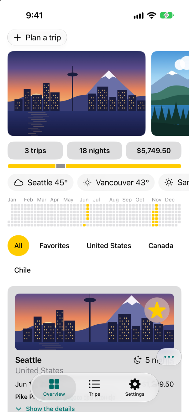
Overview
All
And run the tests again:
✓ TripsUITests › testPlanningATripAddsItToTheList(): passed (17.286 s)
✗ TripsUITests › testTheOverviewPassesAnAccessibilityAudit(): failed (10.178 s)
    XCTAssertTrue failed - Contrast failed: Plan a trip
    Contrast failed: United States
    Contrast failed: Jun 12, 2027
    Contrast failed: Pike Place early, before the crowds.
    Contrast nearly passed: Show the details
    Potentially inaccessible text: —
    Potentially inaccessible text: —
    Dynamic Type font sizes are partially unsupported: 5 nights
    Dynamic Type font sizes are partially unsupported: United States
    Dynamic Type font sizes are partially unsupported: Seattle
    Label not human-readable: $5,749.50
✓ FilterTests › oneChoicePerCountry(): passed (0.001 s)
✓ FilterTests › noTripsStillOffersAllAndFavorites(): passed (0.000 s)
✓ FilterTests › includesAtacama(filter:): passed (0.001 s)
    ✓ .all: passed
    ✓ .country("Chile"): passed
    ✓ .favorites: passed
✓ FilterTests › leavesOutAtacama(filter:): passed (0.000 s)
    ✓ .country("Canada"): passed
    ✓ .country("United States"): passed
✓ PlannerWeatherTests › asksOnceTypingPauses(): passed (0.515 s)
✓ PlannerWeatherTests › nothingBeforeTheWaitIsOver(): passed (0.003 s)
✓ PlannerWeatherTests › aNewLetterCancelsTheWait(): passed (0.003 s)
✓ TripRowPictures › atTheLargestTextSize(): passed (0.009 s)
✓ TripsTests › example(): passed (0.000 s)
✓ WeatherTests › showsTheWeatherItWasGiven(): passed (0.000 s)
✓ WeatherTests › saysWhatWentWrong(): passed (0.003 s)
✓ WeatherTests › asksOnceForTwoScreens(): passed (0.102 s)
The chips are off the list. What is left is the harder kind — contrast, text sizes, labels — where the audit is less sure and the fix is a design decision. While those are worked through with VoiceOver and the Accessibility Inspector (Xcode ▸ Open Developer Tool ▸ Accessibility Inspector), the test can hold on to what has been fixed: performAccessibilityAudit(for:) takes the kinds of check to run.
Name the kinds of check that pass now:
import XCTestfinal class TripsUITests: XCTestCase { override func setUpWithError() throws { // In a UI test each step depends on the one before: stop at the first failure. continueAfterFailure = false } @MainActor func testPlanningATripAddsItToTheList() throws { let app = XCUIApplication() // the samples, whatever an earlier run saved app.launchArguments = ["-fresh-start"] app.launch() // the app remembers its tab: do not assume one app.tabBars.buttons["Overview"].tap() app.buttons["Plan a trip"].tap() let city = app.textFields["City"] city.tap() city.typeText("Lisbon") let country = app.textFields["Country"] country.tap() country.typeText("Portugal") app.buttons["Add to my trips"].tap() app.tabBars.buttons["Trips"].tap() XCTAssertTrue(app.staticTexts["Lisbon"].waitForExistence(timeout: 2)) let screenshot = XCTAttachment(screenshot: app.screenshot()) screenshot.lifetime = .keepAlways add(screenshot) } @MainActor func testTheOverviewPassesAnAccessibilityAudit() throws { let app = XCUIApplication() app.launchArguments = ["-fresh-start"] app.launch() app.tabBars.buttons["Overview"].tap() var issues: [String] = [] try app.performAccessibilityAudit { issue in // Passed: targets big enough, and traits. Still to judge, with VoiceOver on: contrast, Dynamic Type, labels. try app.performAccessibilityAudit(for: [.hitRegion, .trait]) { issue in issues.append("\(issue.compactDescription): \(issue.element?.label ?? "—")") // noted here, so the audit carries on past it return true } XCTAssert(issues.isEmpty, issues.joined(separator: "\n")) }}import XCTest
final class TripsUITests: XCTestCase {
override func setUpWithError() throws {
// In a UI test each step depends on the one before: stop at the first failure.
continueAfterFailure = false
}
@MainActor
func testPlanningATripAddsItToTheList() throws {
let app = XCUIApplication()
// the samples, whatever an earlier run saved
app.launchArguments = ["-fresh-start"]
app.launch()
// the app remembers its tab: do not assume one
app.tabBars.buttons["Overview"].tap()
app.buttons["Plan a trip"].tap()
let city = app.textFields["City"]
city.tap()
city.typeText("Lisbon")
let country = app.textFields["Country"]
country.tap()
country.typeText("Portugal")
app.buttons["Add to my trips"].tap()
app.tabBars.buttons["Trips"].tap()
XCTAssertTrue(app.staticTexts["Lisbon"].waitForExistence(timeout: 2))
let screenshot = XCTAttachment(screenshot: app.screenshot())
screenshot.lifetime = .keepAlways
add(screenshot)
}
@MainActor
func testTheOverviewPassesAnAccessibilityAudit() throws {
let app = XCUIApplication()
app.launchArguments = ["-fresh-start"]
app.launch()
app.tabBars.buttons["Overview"].tap()
var issues: [String] = []
// Passed: targets big enough, and traits. Still to judge, with VoiceOver on: contrast, Dynamic Type, labels.
try app.performAccessibilityAudit(for: [.hitRegion, .trait]) { issue in
issues.append("\(issue.compactDescription): \(issue.element?.label ?? "—")")
// noted here, so the audit carries on past it
return true
}
XCTAssert(issues.isEmpty, issues.joined(separator: "\n"))
}
}Run the tests:
✓ FilterTests › oneChoicePerCountry(): passed (0.000 s)
✓ FilterTests › noTripsStillOffersAllAndFavorites(): passed (0.000 s)
✓ FilterTests › includesAtacama(filter:): passed (0.000 s)
    ✓ .all: passed
    ✓ .country("Chile"): passed
    ✓ .favorites: passed
✓ FilterTests › leavesOutAtacama(filter:): passed (0.000 s)
    ✓ .country("Canada"): passed
    ✓ .country("United States"): passed
✓ PlannerWeatherTests › asksOnceTypingPauses(): passed (0.511 s)
✓ PlannerWeatherTests › nothingBeforeTheWaitIsOver(): passed (0.002 s)
✓ PlannerWeatherTests › aNewLetterCancelsTheWait(): passed (0.002 s)
✓ TripRowPictures › atTheLargestTextSize(): passed (0.005 s)
✓ TripsTests › example(): passed (0.000 s)
✓ WeatherTests › showsTheWeatherItWasGiven(): passed (0.000 s)
✓ WeatherTests › saysWhatWentWrong(): passed (0.003 s)
✓ WeatherTests › asksOnceForTwoScreens(): passed (0.102 s)
✓ TripsUITests › testPlanningATripAddsItToTheList(): passed (15.953 s)
✓ TripsUITests › testTheOverviewPassesAnAccessibilityAudit(): passed (8.133 s)
Every test passes — and the comment says what the next pass at accessibility is for. Widen the list as each kind is dealt with, until the audit runs everything.
What the boarding pass is worth
To VoiceOver the boarding pass is one button: its label says what it is, its hint what a double tap does. What it does not say is the ring's number — five of the eighteen nights. A value does, read after the label.
Give the pass a value, beside its hint:
struct BoardingPass: View { let trip: Trip let totalNights: Int @Environment(\.highlight) private var highlight @Environment(\.colorScheme) private var colorScheme @Environment(Settings.self) private var settings @State private var isCheckedIn = false var body: some View { Button { withAnimation(.spring(duration: 0.5, bounce: 0.3)) { isCheckedIn.toggle() } completion: { print(isCheckedIn ? "Checked in to \(trip.city)" : "Check-in undone for \(trip.city)") } } label: { HStack(spacing: 16) { VStack(alignment: .leading, spacing: 4) { Text("Boarding pass") .font(.caption.weight(.semibold)) .textCase(.uppercase) .foregroundStyle(.secondary) Text(trip.city) .font(.title2.weight(.bold)) Text(trip.start, format: .dateTime.day().month(.wide).year()) .foregroundStyle(.secondary) if !settings.travelerName.isEmpty { Text("Passenger: \(settings.travelerName)") .font(.caption) } Label("Checked in", systemImage: "checkmark.seal.fill") .font(.caption.weight(.semibold)) .opacity(isCheckedIn ? 1 : 0) } Spacer() NightsRing(nights: trip.nights, total: totalNights) } .padding(.vertical, 20) .padding(.horizontal, 28) .background { Ticket(notch: isCheckedIn ? 22 : 14) .fill(LinearGradient(colors: [highlight, highlight.opacity(0.35)], startPoint: .topLeading, endPoint: .bottomTrailing)) // a shadow cannot be seen on black: in the dark, an outline instead .shadow(color: .black.opacity(colorScheme == .dark ? 0 : 0.2), radius: 8, y: 4) .overlay { if colorScheme == .dark { Ticket(notch: isCheckedIn ? 22 : 14) .stroke(.white.opacity(0.35), lineWidth: 1) } } } } .buttonStyle(PressableStyle()) .accessibilityLabel("Boarding pass for \(trip.city)") .accessibilityValue("\(trip.nights) of \(totalNights) nights") .accessibilityHint(isCheckedIn ? "Undoes the check-in" : "Checks in") .padding(.horizontal) }}struct BoardingPass: View {
let trip: Trip
let totalNights: Int
@Environment(\.highlight) private var highlight
@Environment(\.colorScheme) private var colorScheme
@Environment(Settings.self) private var settings
@State private var isCheckedIn = false
var body: some View {
Button {
withAnimation(.spring(duration: 0.5, bounce: 0.3)) {
isCheckedIn.toggle()
} completion: {
print(isCheckedIn ? "Checked in to \(trip.city)" : "Check-in undone for \(trip.city)")
}
} label: {
HStack(spacing: 16) {
VStack(alignment: .leading, spacing: 4) {
Text("Boarding pass")
.font(.caption.weight(.semibold))
.textCase(.uppercase)
.foregroundStyle(.secondary)
Text(trip.city)
.font(.title2.weight(.bold))
Text(trip.start, format: .dateTime.day().month(.wide).year())
.foregroundStyle(.secondary)
if !settings.travelerName.isEmpty {
Text("Passenger: \(settings.travelerName)")
.font(.caption)
}
Label("Checked in", systemImage: "checkmark.seal.fill")
.font(.caption.weight(.semibold))
.opacity(isCheckedIn ? 1 : 0)
}
Spacer()
NightsRing(nights: trip.nights, total: totalNights)
}
.padding(.vertical, 20)
.padding(.horizontal, 28)
.background {
Ticket(notch: isCheckedIn ? 22 : 14)
.fill(LinearGradient(colors: [highlight, highlight.opacity(0.35)],
startPoint: .topLeading, endPoint: .bottomTrailing))
// a shadow cannot be seen on black: in the dark, an outline instead
.shadow(color: .black.opacity(colorScheme == .dark ? 0 : 0.2), radius: 8, y: 4)
.overlay {
if colorScheme == .dark {
Ticket(notch: isCheckedIn ? 22 : 14)
.stroke(.white.opacity(0.35), lineWidth: 1)
}
}
}
}
.buttonStyle(PressableStyle())
.accessibilityLabel("Boarding pass for \(trip.city)")
.accessibilityValue("\(trip.nights) of \(totalNights) nights")
.accessibilityHint(isCheckedIn ? "Undoes the check-in" : "Checks in")
.padding(.horizontal)
}
}Run the app, and open Seattle:
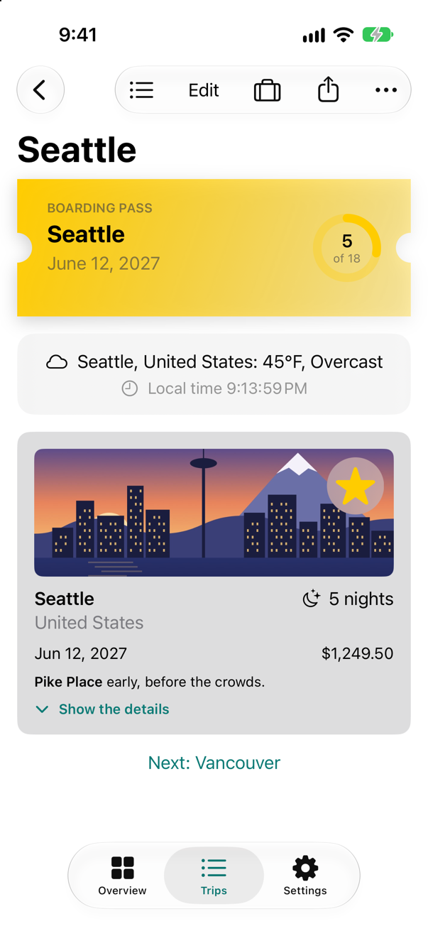
Asked for the pass's value, the running app answers "5 of 18 nights". The ring itself never reached VoiceOver: it is part of the button, whose label replaced everything inside it.
The largest text
Last, size. Trips uses text styles everywhere, so its text already grows with the reader's setting. Run it at the largest accessibility size — in Xcode, Debug ▸ View Debugging ▸ Configure Environment Overrides…, and turn up Dynamic Type — and look for what breaks.
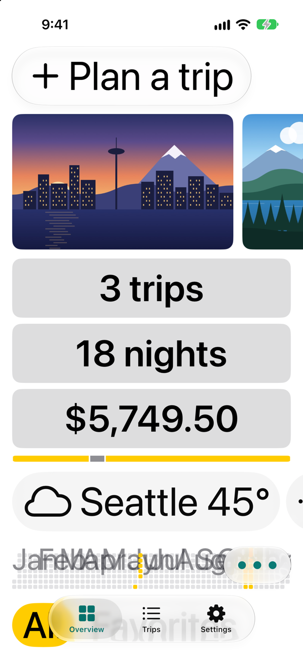
Almost everything grew and rearranged itself — the summary's tiles stack, as lesson 19 made them. One thing broke: the year chart's month names collide into a smear. They are drawn in a Canvas of a fixed size, so bigger text has nowhere to go. A chart's labels are a case where a limit is right: the chart stays legible, and VoiceOver reads its summary instead.
Cap the chart's text size, after its frame:
struct YearGrid: View { let trips: [Trip] var year = 2027 @Environment(\.highlight) private var highlight var body: some View { Canvas { context, size in let step = size.width / 53 let top = 16.0 let firstRow = Calendar.current.component(.weekday, from: Date.on(year, 1, 1)) - 1 for month in 1...12 { let day = Calendar.current.dateComponents([.day], from: Date.on(year, 1, 1), to: Date.on(year, month, 1)).day! let column = Double((day + firstRow) / 7) let name = Calendar.current.shortMonthSymbols[month - 1] context.draw(Text(name).font(.caption2).foregroundStyle(.secondary), at: CGPoint(x: column * step, y: 0), anchor: .topLeading) } let away = awayDays for day in 0..<daysInYear { let slot = day + firstRow let square = CGRect(x: Double(slot / 7) * step, y: top + Double(slot % 7) * step, width: step - 1.5, height: step - 1.5) let color = away.contains(day) ? highlight : Color.gray.opacity(0.25) context.fill(Path(roundedRect: square, cornerRadius: 1.5), with: .color(color)) } } .frame(height: 70) // a chart of fixed size: its month names stop growing at xxLarge, where they still fit; VoiceOver reads the summary .dynamicTypeSize(...DynamicTypeSize.xxLarge) .padding(.horizontal) .accessibilityElement() .accessibilityLabel(summary) } /// The days of the year — 0 is January 1 — on which a trip is under way. private var awayDays: Set<Int> { var days = Set<Int>() for trip in trips { let first = Calendar.current.dateComponents([.day], from: Date.on(year, 1, 1), to: trip.start).day! for night in 0..<trip.nights { days.insert(first + night) } } return days } /// What VoiceOver reads for the whole grid: the year, the days away, and the months they fall in. private var summary: String { var months: [String] = [] for day in awayDays.sorted() { let date = Calendar.current.date(byAdding: .day, value: day, to: Date.on(year, 1, 1))! let name = date.formatted(.dateTime.month(.wide)) if !months.contains(name) { months.append(name) } } let days = awayDays.count == 1 ? "1 day" : "\(awayDays.count) days" return "\(year): \(days) away, in \(months.formatted())" } /// How many days the year has: 365, or 366 in a leap year. private var daysInYear: Int { Calendar.current.range(of: .day, in: .year, for: Date.on(year, 1, 1))!.count }}struct YearGrid: View {
let trips: [Trip]
var year = 2027
@Environment(\.highlight) private var highlight
var body: some View {
Canvas { context, size in
let step = size.width / 53
let top = 16.0
let firstRow = Calendar.current.component(.weekday, from: Date.on(year, 1, 1)) - 1
for month in 1...12 {
let day = Calendar.current.dateComponents([.day], from: Date.on(year, 1, 1), to: Date.on(year, month, 1)).day!
let column = Double((day + firstRow) / 7)
let name = Calendar.current.shortMonthSymbols[month - 1]
context.draw(Text(name).font(.caption2).foregroundStyle(.secondary),
at: CGPoint(x: column * step, y: 0), anchor: .topLeading)
}
let away = awayDays
for day in 0..<daysInYear {
let slot = day + firstRow
let square = CGRect(x: Double(slot / 7) * step, y: top + Double(slot % 7) * step,
width: step - 1.5, height: step - 1.5)
let color = away.contains(day) ? highlight : Color.gray.opacity(0.25)
context.fill(Path(roundedRect: square, cornerRadius: 1.5), with: .color(color))
}
}
.frame(height: 70)
// a chart of fixed size: its month names stop growing at xxLarge, where they still fit; VoiceOver reads the summary
.dynamicTypeSize(...DynamicTypeSize.xxLarge)
.padding(.horizontal)
.accessibilityElement()
.accessibilityLabel(summary)
}
/// The days of the year — 0 is January 1 — on which a trip is under way.
private var awayDays: Set<Int> {
var days = Set<Int>()
for trip in trips {
let first = Calendar.current.dateComponents([.day], from: Date.on(year, 1, 1), to: trip.start).day!
for night in 0..<trip.nights {
days.insert(first + night)
}
}
return days
}
/// What VoiceOver reads for the whole grid: the year, the days away, and the months they fall in.
private var summary: String {
var months: [String] = []
for day in awayDays.sorted() {
let date = Calendar.current.date(byAdding: .day, value: day, to: Date.on(year, 1, 1))!
let name = date.formatted(.dateTime.month(.wide))
if !months.contains(name) {
months.append(name)
}
}
let days = awayDays.count == 1 ? "1 day" : "\(awayDays.count) days"
return "\(year): \(days) away, in \(months.formatted())"
}
/// How many days the year has: 365, or 366 in a leap year.
private var daysInYear: Int {
Calendar.current.range(of: .day, in: .year, for: Date.on(year, 1, 1))!.count
}
}Run it again at the same size:
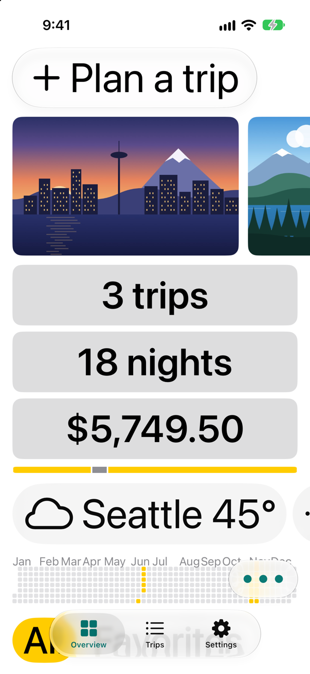
And open Seattle:
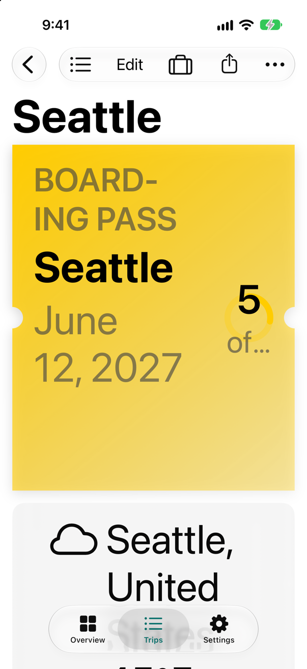
The months are legible again. On the boarding pass, the ring keeps its size and cuts its text to "5 of…" — sighted readers at this size lose the 18, while VoiceOver now has it. Giving the ring a size that grows with the text, with @ScaledMetric, is the exercise; a flash card shows how it scales.
What you built
- An accessibility audit, in a UI test.
- Filter chips at least 44 points tall that say which one is selected.
- A boarding pass with a value VoiceOver reads: how many nights it stands for.
Next, localization: Trips in another language, with plurals that come out right.
The finished project
Stuck, or want to compare with your own? This is the project as it stands at the end of this lesson, built and run before it was put here.
- Trips-lesson-51.zip — unzip it, then open
Trips.xcodeprojin Xcode.
Flash cards
8 cards for this lesson, each labelled with its topic. 7 ask how you would write something; the other one is a trick question, written to catch a misunderstanding. Answer in your head first, then tap the card.
Syntax · VoiceOverGive a picture-only button a label VoiceOver can read.

.accessibilityLabel(_:). Without it the first button is read by its picture's file name — the running app reported "seattle" for it, and "Photo of Seattle" for the second.
Syntax · VoiceOverMake two lines of text one stop for VoiceOver.

.accessibilityElement(children: .combine) makes the stack one element whose label joins its children's: "Bergen, July 3". One swipe instead of two, and the two facts stay together.
Syntax · VoiceOverLet a custom control say what it is set to.

.accessibilityValue(_:) — read after the label, and the place for whatever changes: a count, a level, an on or off. The running app reported "5 of 18 nights" as this gauge's value.
Syntax · VoiceOverPresent a custom control to VoiceOver as a standard one.

.accessibilityRepresentation { … }: VoiceOver is shown the Toggle instead of the drawing — a switch named Favorite, with its on or off, and a double tap that works. The running app reported one switch, "Favorite".
Syntax · Dynamic TypeLet a size that is not text — a ring, an icon — grow with the reader's text size.

@ScaledMetric: 40 points at the default size, scaled as body text scales. At the largest accessibility size it printed "ring: 112.66666666666666". relativeTo: scales it like another text style instead.
Syntax · Dynamic TypeKeep one view's text from growing past a size.

.dynamicTypeSize(_:) with a range. At the largest setting the free view saw accessibility5, the limited one xxxLarge. For things that truly cannot grow — a chart's labels — and never for whole screens.
Syntax · TestingAudit a screen's accessibility in a UI test.
try app.performAccessibilityAudit() checks the screen for small targets, low contrast, text that will not grow, missing labels, and more, and fails the test for each issue. Pass for: [.hitRegion, .trait] to run only some checks, and a closure to see each issue — returning true accepts it. This lesson's tutorial runs one.
Trick question · VoiceOverA button shows only the SF Symbol airplane.departure. What label does VoiceOver get?

"Airplane Ascending From Horizon" — symbols bring labels of their own, and the running app reported "Trash", "Share" and that. Usually good, sometimes not what you mean: an airplane taking off may be "Depart" in your app. Listen, and give it a label when the built-in one is wrong.
Edge cases and tricky questions
8 questions of the kind an interviewer uses to find out whether you really know this — the corners, the traps, and the things that changed recently. Each has its source. Wherever the answer is what some code does, that code was compiled and run, and what you see under “Show the answer” is what it really did. Say your answer aloud before you open it.
A star is an Image with .onTapGesture. It works with a finger. What does VoiceOver think it is?
Show the answer
A picture. The running app reported one image, labelled "Favorite" (the symbol's own label) — no button, no switch:

A tap gesture adds an action, but nothing tells VoiceOver that the picture can be tapped, or that it is on or off. Use a Button (with the symbol as its label), or add .accessibilityAddTraits(.isButton) — or, best for an on/off control, .accessibilityRepresentation { Toggle(…) }, which a flash card shows.
Where this comes from: accessibilityRepresentation(representation:) · Accessibility fundamentals — Measured in the iOS 27 simulator.
A decorative image gets .accessibilityHidden(true). VoiceOver skips it. Can a UI test still find it with app.images?
Show the answer
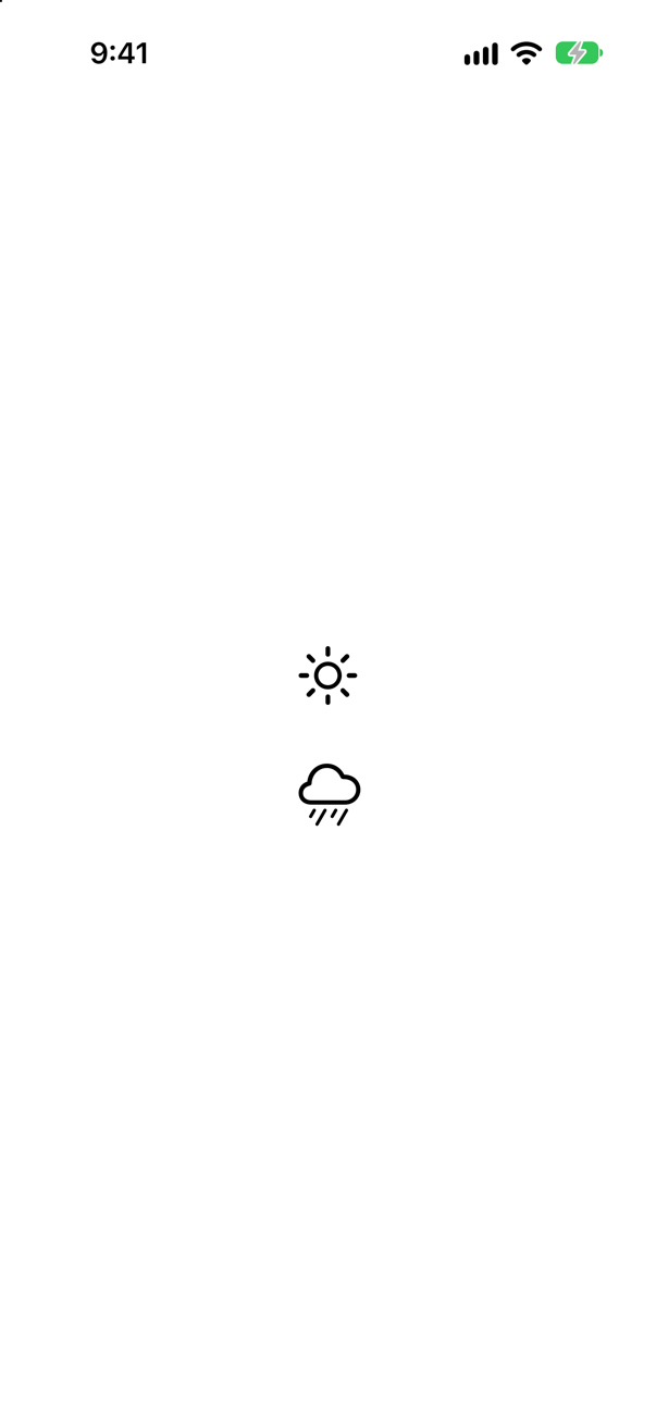
Yes. The UI test's app.images listed both — "Brightness Higher" for the sun and "Rain" for the hidden cloud.
accessibilityHidden(true) hides a view "from system accessibility features" — VoiceOver and the like. XCTest's queries still found it, so a UI test that finds an element cannot tell you that VoiceOver will. Listen with VoiceOver, or audit, for that.
Where this comes from: accessibilityHidden(_:) · XCUIElementQuery — Measured in the iOS 27 simulator, with Xcode 27's XCTest.
Two texts side by side in an HStack. The second gets .accessibilitySortPriority(1), and the stack is .accessibilityElement(children: .contain). Which does VoiceOver reach first?
Show the answer

The second. The accessibility order the app reported: "Second on screen", then "First on screen".
VoiceOver reads in layout order — leading to trailing, top to bottom — unless told otherwise. Higher sort priorities come first, among the elements of the same container; .contain makes the stack that container. Use it when the visual order is not the order of meaning — a price that should be read before the fine print beside it.
Where this comes from: accessibilitySortPriority(_:) · Accessibility fundamentals — Measured in the iOS 27 simulator.
@ScaledMetric var a = 40.0 and @ScaledMetric(relativeTo: .caption) var b = 40.0. At the largest accessibility text size, are they still equal?
Show the answer

No: "body-relative: 112.66666666666666 caption-relative: 127.66666666666666"
Each text style grows at its own rate — small styles grow proportionally more, so that they stay readable. A metric scales like the style it is relative to: body by default. Tie a size to the text it sits beside: an icon next to a caption, relative to .caption.
Where this comes from: ScaledMetric · Human Interface Guidelines: Typography — Measured in the iOS 27 simulator.
One label is set in .font(.custom("AvenirNext-Regular", size: 17)), another in .font(.custom("AvenirNext-Regular", fixedSize: 17)). At the largest accessibility text size, which grows?
Show the answer
The first — the size: one. At the default text size both were 23 points tall; at the largest, the console printed:
At the largest accessibility size
fixedSize: 23 points tall
size: 131 points tall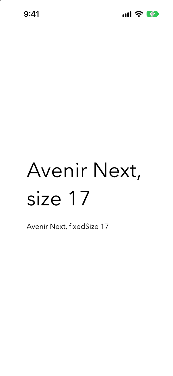
custom(_:size:) scales the font "with the body text style", in Apple's words — a custom font gets Dynamic Type for free. (In UIKit the same font has to go through UIFontMetrics' scaledFont(for:) first.) custom(_:fixedSize:) is the opt-out: "a fixed size that does not scale with Dynamic Type." Add relativeTo: .title to scale like another style.
Where this comes from: Font.custom(_:size:) · Font.custom(_:fixedSize:) · Applying custom fonts to text · Scaling fonts automatically (UIKit) — Measured in the iOS 27 simulator; Avenir Next comes with iOS.
A button shows only a trash can: its content is Label("Delete", systemImage: "trash"), with .labelStyle(.iconOnly). What does VoiceOver call it?
Show the answer
"Delete" — the running app reported that label, though the word is nowhere on the screen:

Apple, on .iconOnly: "The title of the label is still used for non-visual descriptions, such as VoiceOver." So an icon-only Label is the tidy way to draw an icon-only button: the title travels with the icon, and no .accessibilityLabel is needed.
Where this comes from: LabelStyle.iconOnly · Label — Measured in the iOS 27 simulator.
A photo is shown twice: once as Image("seattle"), once as Image(decorative: "seattle"). What label does each give VoiceOver?
Show the answer
The first, "seattle" — its file name. The second, none at all, which is right for a picture that only decorates:
Apple: Image(decorative:) "creates an unlabeled, decorative image", and "SwiftUI ignores this image for accessibility purposes." A picture that carries information needs a real label instead: Image("seattle").accessibilityLabel("The Seattle skyline at dusk"). (The UI test still listed the decorative image, with an empty label — as this lesson's second question found, XCTest's queries also reach what VoiceOver skips.)
Where this comes from: Image.init(decorative:bundle:) · accessibilityLabel(_:) — Measured in the iOS 27 simulator.
A button reads "Save". Someone adds .accessibilityLabel("Store this trip"), to say more. A person using Voice Control sees the word Save. What name does the button go by?
Show the answer
"Store this trip" — and "Save" is gone. The running app reported one button, labelled "Store this trip", and no text "Save" anywhere in its accessibility tree.

An accessibility label replaces the visible title. Voice Control and Full Keyboard Access go by input labels, and when there are none, Apple: "the user can still refer to the view using the accessibility label" — words the person cannot see. The W3C's accessibility guidelines make this a rule, Label in Name: the name must contain the text shown. Keep the visible word in the label — "Save trip" — or add .accessibilityInputLabels(["Save", "Store this trip"]).
Where this comes from: accessibilityInputLabels(_:) · W3C: Understanding Success Criterion 2.5.3, Label in Name (WCAG 2.2) · accessibilityLabel(_:) — Measured in the iOS 27 simulator.